We’ve all seen this effect of masking out an image inside a piece of type. Maybe you’ve seen it on a movie poster or on the cover of a photo book. For those of us who obsess over workflow and optimized editability in our projects, there are times when we stop and ask, “What is the best way to create this effect?”
If you’re like many of us, you’d classically create this photo/design treatment by building a type layer, making a selection of it, and then generating a layer mask.
If you are doing it this way, that’s totally fine. It’s accomplishing what you want, and that’s what matters. Create the things you want to create.
Here’s an example of how to achieve that traditional technique:
- Create the white frame on its own layer.
- Create the type layer and position the text over the white frame.
- Command-click (PC: Ctrl-click) on the type layer’s thumbnail in the Layers panel to activate a selection of the text.
- Go to the frame layer, and choose Select>Inverse from the menu.
- At the bottom of the Layers panel, click the Add Layer Mask icon (circle in a square).
- Click the Eye icon next to the type layer to hide it. Voilà! You’re done!
Visually, this works great, but it has limitations. The main one being that the type is no longer editable because there’s no intelligent link between the type layer and the mask. And, since this is a negative mask on the frame (the black is hiding the part of the white frame that allows us to see the image through the type form), if the project needed a change in the text, we’d have to repeat all those steps again.
Some of you may be thinking, “What about clipping groups?” The only live text/mask we can create is in fact done with a clipping group, which is when the image on one layer is clipped by the shape on the layer beneath it so the image is only visible through the shape. This works great for positive-masked shapes, but not negative ones like this example.
You may also be thinking, “Is doing it this way really that hard; it’s only six steps!” No, it’s not that hard, but if you multiplied those steps over many projects, it adds up. Plus, it’s a more limiting approach because of lack of editability and other available layer options.
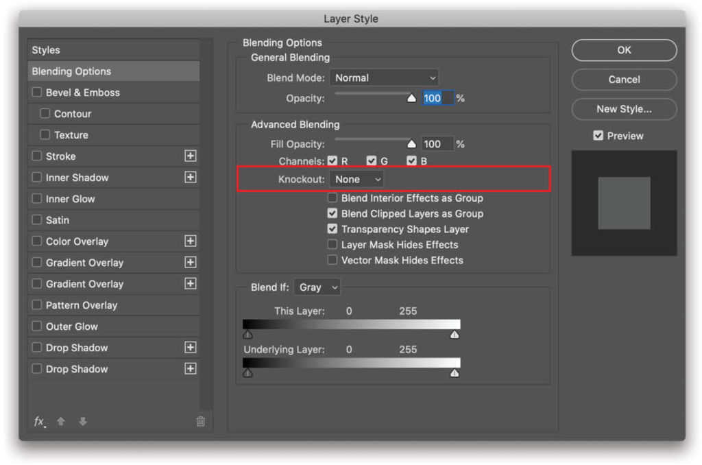
Knockout
Let’s learn about a different technique that emulates selections and masks, but actually isn’t part of either! These are called “knockouts.” You can find the Knockout settings in the Blending Options for a layer: just double-click on the gray area of the layer (not the thumbnail or name) in the Layers panel, and it will bring up the Blending Options in the Layer Style dialog. You can also find Blending Options in the flyout menu at the top right of the Layers panel.
This is where all the work is done. There are two major parts you’ll need to modify for this effect: Fill Opacity (not regular Opacity) and Knockout. We have the exact same number of layers that we had in the traditional technique, but this one will allow us to keep the text editable. Let’s take a look at the steps.
Step One: Just as with the classic technique, you need the frame layer. It’s best if you create it as a shape layer so it’s vector and won’t lose quality if you need to resize it. Simply choose the Rectangle tool (U), select the Foreground color you want to use, make sure the Pick Tool Mode drop-down menu in the Options Bar is set to Shape, and draw your frame all the way across the canvas.
Step Two: Create your type layer by choosing the Type tool (T) and clicking on the canvas away from the white frame shape layer. Type the text you want to knock out through the white frame to the picture layer.
Step Three: Using the Move tool (V), position the type layer where you want it above the white frame.
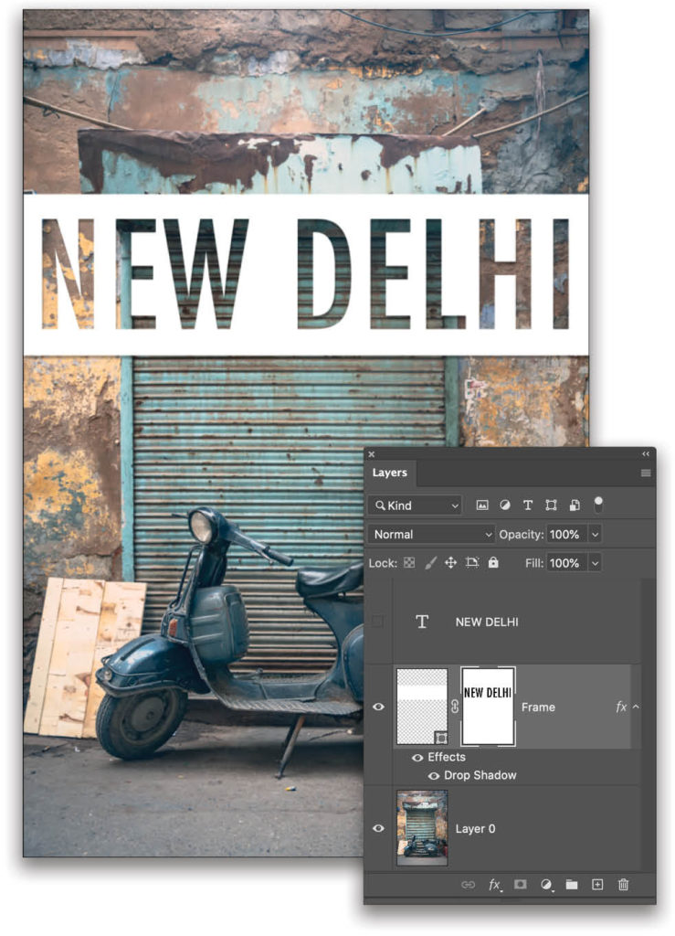
Step Four: With the type layer active, Shift-click the white frame shape layer in the Layers panel so both layers are selected. Click the Create a New Group icon (folder) at the bottom of the Layers panel to place the two layers into a group.
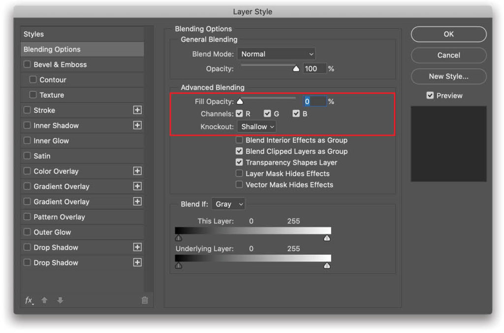
Step Five: Bring up the Blending Options for the type layer and change the Fill Opacity to 0%. This makes your text look as if it has disappeared. The difference is that Fill Opacity allows you to apply certain effects to the layer, as if the pixels were still visible as a guiding shape, whereas regular Opacity actually makes those pixels unusable.
Step Six: Change the Knockout value to Shallow, which in essence masks out the text through the white frame layer, revealing the first visible layer beneath the layer group, just like a mask would. Your settings should look like this.
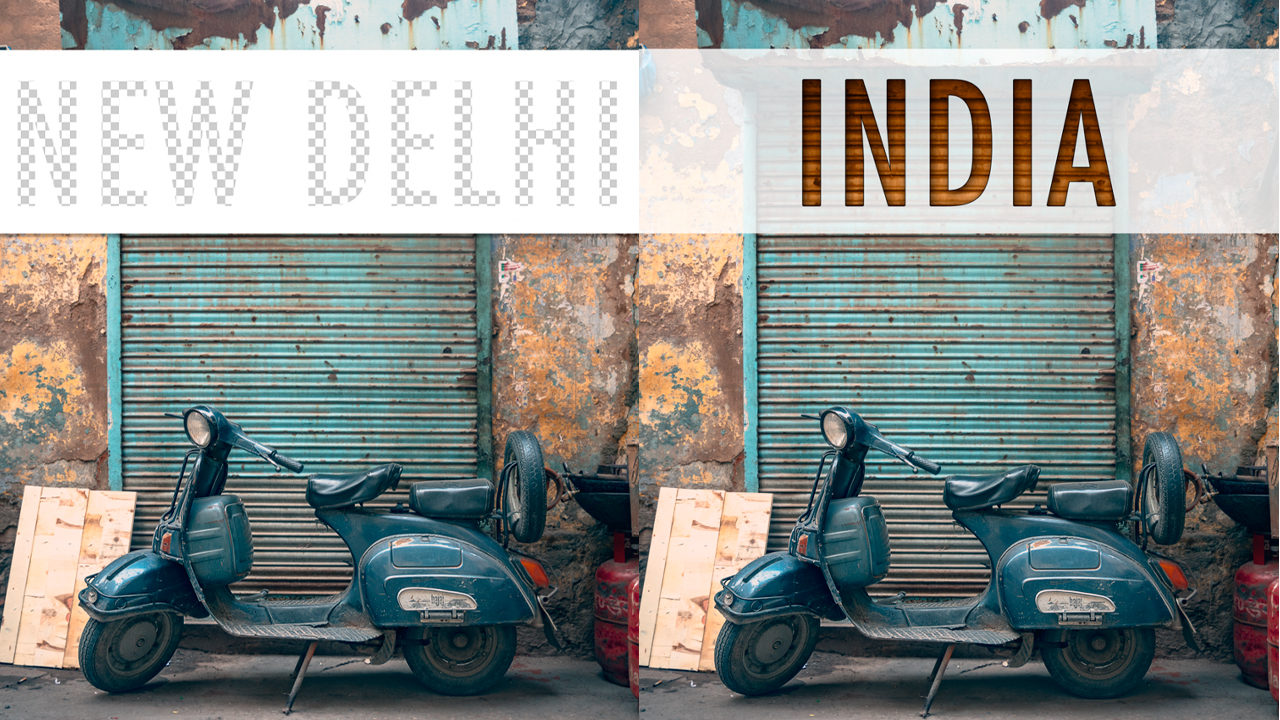
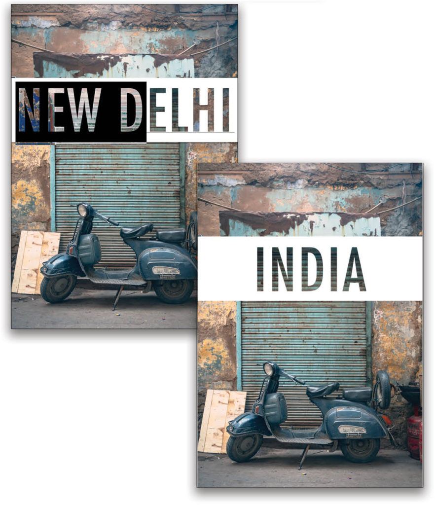
If you choose the Deep option, it will knock out the text all the way to the Background layer, ignoring all layers between the type layer and the Background layer. If your Background layer is unlocked (a regular layer), it actually shows the transparency grid in the text because there aren’t any other layers below the bottom image layer, as shown here in my picture from India.
To recap, Shallow knocks out to the first visible layer below the group, and Deep knocks out all the way to the Background layer. These options are helpful when you’re working on digital collages or composites because you can control what appears in the type layer. Note: If your Knockout layer is not in a group, both Shallow and Deep will always knock out to the locked Background layer, or transparency if there isn’t a locked Background layer. Tip: You can always designate which layer you want to be the locked Background layer by going to Layer>New>Background from Layer to control which layer the Deep option knocks out to.
Once this is set up, and you click OK in the Layer Style dialog, you can now modify your text to anything you want without losing the visual effect; you won’t need to generate a new mask on your vector frame layer. Just use your Type tool to highlight the text by clicking-and-dragging over it, or simply double-click the type layer thumbnail in the Layers panel to highlight all text on that layer.
Bonus Tip
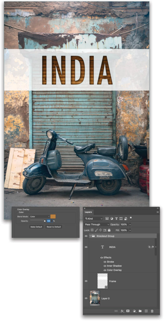
The Fill Opacity setting that was used on the type layer allows you to apply layer styles as if the text was still present as pixels. This means Knockout lets us see the textures from the photo beneath the white frame in the text, but we can still add things such as Inner Shadow, Color Overlay, and Stroke to add depth and graphical richness. The layer styles can interact with the photograph and not be influenced by the white frame, as shown here where the Color Overlay layer style is colorizing the background image through the text. We also reduced the Opacity of the white vector frame layer in the Layers panel so we got more of the original photograph blending into the design treatment.
Now you have a visually rich treatment that’s extremely easy to edit without having to make any new selections or masks. You can even drag the layer group to other documents to use as a template.
This article originally published in the September, 2020 issue of Photoshop User magazine.