One of the biggest challenges we face while creating a composite is to get the images to blend in a realistic fashion, right? Whenever we’re putting together two or more elements, we need to make sure that a set of five properties match: Type and direction of light, color, perspective, atmosphere, and depth of field. This issue, we’re going to focus on matching color, which doesn’t have to be difficult at all. In most cases, all you need are two buttons (sometimes three)!
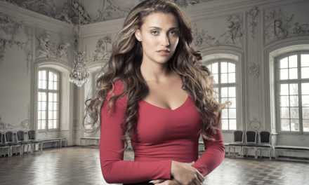
In this article, we’re going to place a woman hiker on a brand-new background and learn a few essential techniques to make it look like she’s actually hiking in those mountains even though the photo of her was taken in an indoor studio (after all, that’s the most she can do during this quarantine season). So without any further ado, let’s get started!
Step One: Open the Image
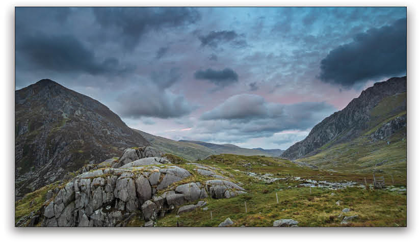
First, let’s open the image of the new background in Photoshop. Notice that it’s an overcast sky with the light coming from the right. We need to make sure that we have similar lighting with the subject, as well.
If you want to follow along with the photo used here, you may license the full-resolution version from Adobe Stock, or download the JPEG preview for free by clicking the Save to Library button here.
If you’re using your own image, go to File>Open, locate your image, and then click Open, or if you’re working in Application Frame, go to Finder (PC: File Explorer), locate your image, and drag-and-drop it into Photoshop. If you downloaded the image from Adobe Stock, you can load it from your Libraries panel (Window>Libraries) by double-clicking it.
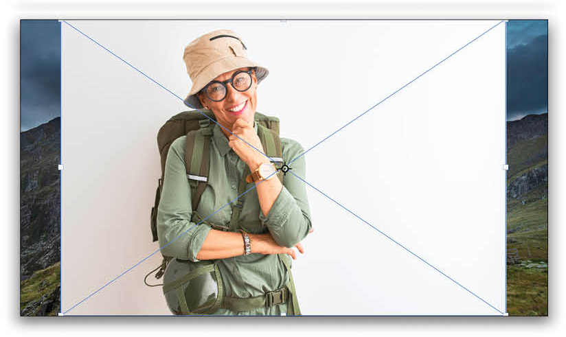
Step Two: Place the Subject
Locate the image of the subject in your Finder (PC: File Explorer), and drag-and-drop it over the canvas of the new background. Alternatively, you can download the image from Adobe Stock by clicking here, and then drag it to your canvas from the Libraries panel. Press Enter to confirm the placement of the subject.
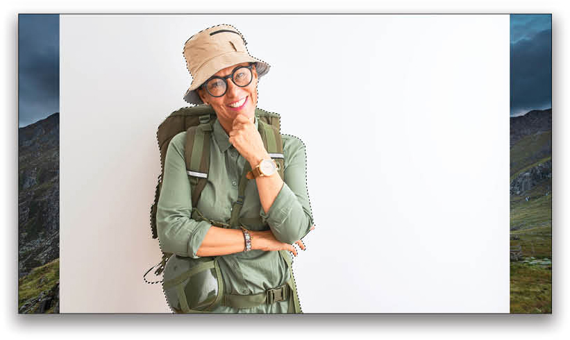
Step Three: Mask Out the Subject
Create a selection around the subject using your favorite technique. You can use the Quick Selection tool, the Pen tool, or even Select>Subject. After making the selection, you can refine it by clicking Select and Mask in the Options Bar. For an in-depth KelbyOne course on making selections by Dave Cross, click here.
In this example, I used the Quick Selection tool (nested below the Object Selection tool [W] in the Toolbar) to make a selection of the subject. With the selection active, click on the Add Layer Mask icon (circle in a square) in the Layers panel to turn it into a mask.
Step Four: Transform the Subject
With the subject layer active, press Command-T (PC: Ctrl-T) to enable the Free Transform tool. Adjust the size and the position of the subject according to the perspective of the image, as shown above. Press Enter to commit the transformation.
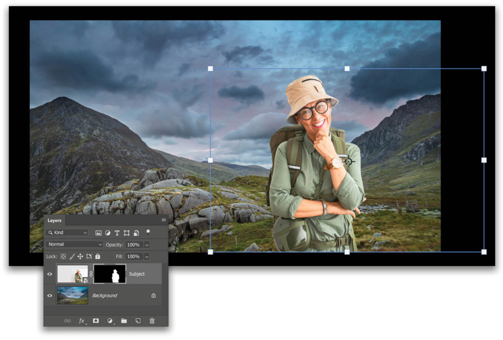
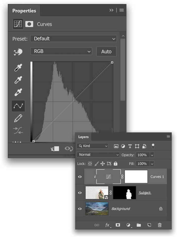
Step Five: Create a Clipped Curves Adjustment Layer
Click on the Create New Adjustment Layer icon (half-black/half-white circle) at the bottom of the Layers panel and choose Curves. At the bottom of the Curves Properties panel (Window>Properties), click the clipping mask icon (it’s the first one).
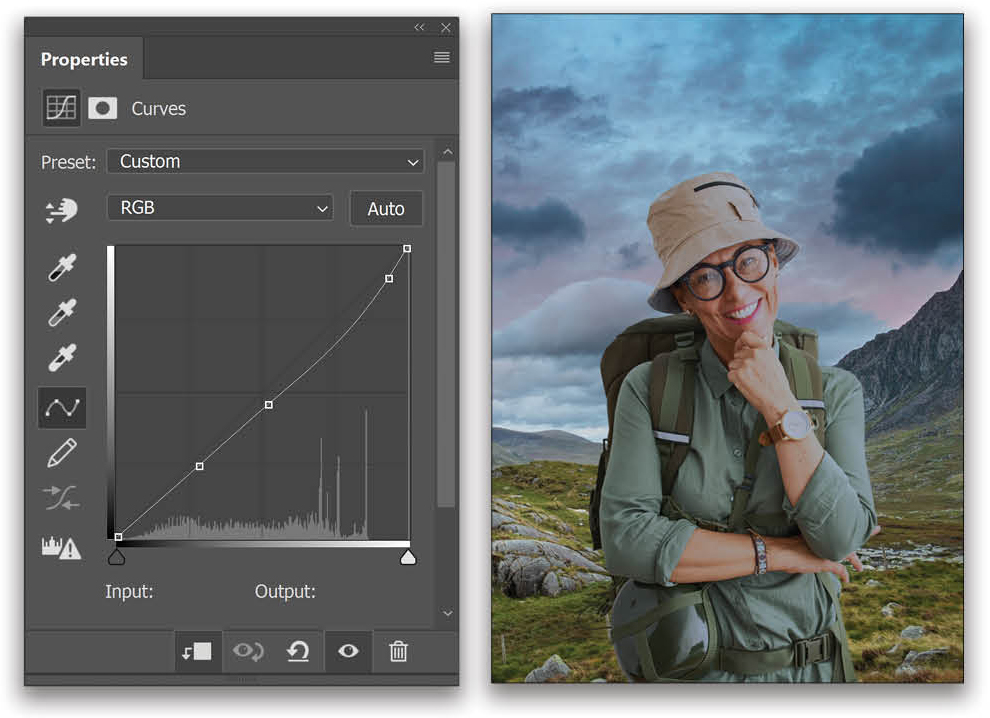
Step Six: Match the Highlights
Click on the thumbnail of the Curves adjustment layer in the Layers panel to make sure it’s active and not its mask. In the Properties panel, double-click on the White Point eyedropper (the one with the white tip). The Color Picker (Target Highlight Color) dialog will open.
Up in the Options Bar, set the sample size to 3 by 3 Average, and make sure it’s set to Sample All Layers. Click on the bright light source in the background. In this example, I sampled a bright cloud. Once the color is sampled, click OK.
A dialog will show up asking if you want to “Save the new target colors as defaults?” Choose No, because we don’t want to mess with the default values of the Curves, which might annoy us for future projects.
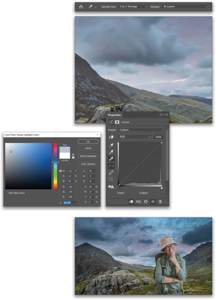
Now, with the White Point eyedropper still active, click on the brightest spot of the subject. For this example, I clicked on her watch. You’ll notice that immediately, the highlights of the subject match with that of the background! In the Curves Properties panel, you can see how the individual curves for the Red, Green, and Blue channels have been adjusted.
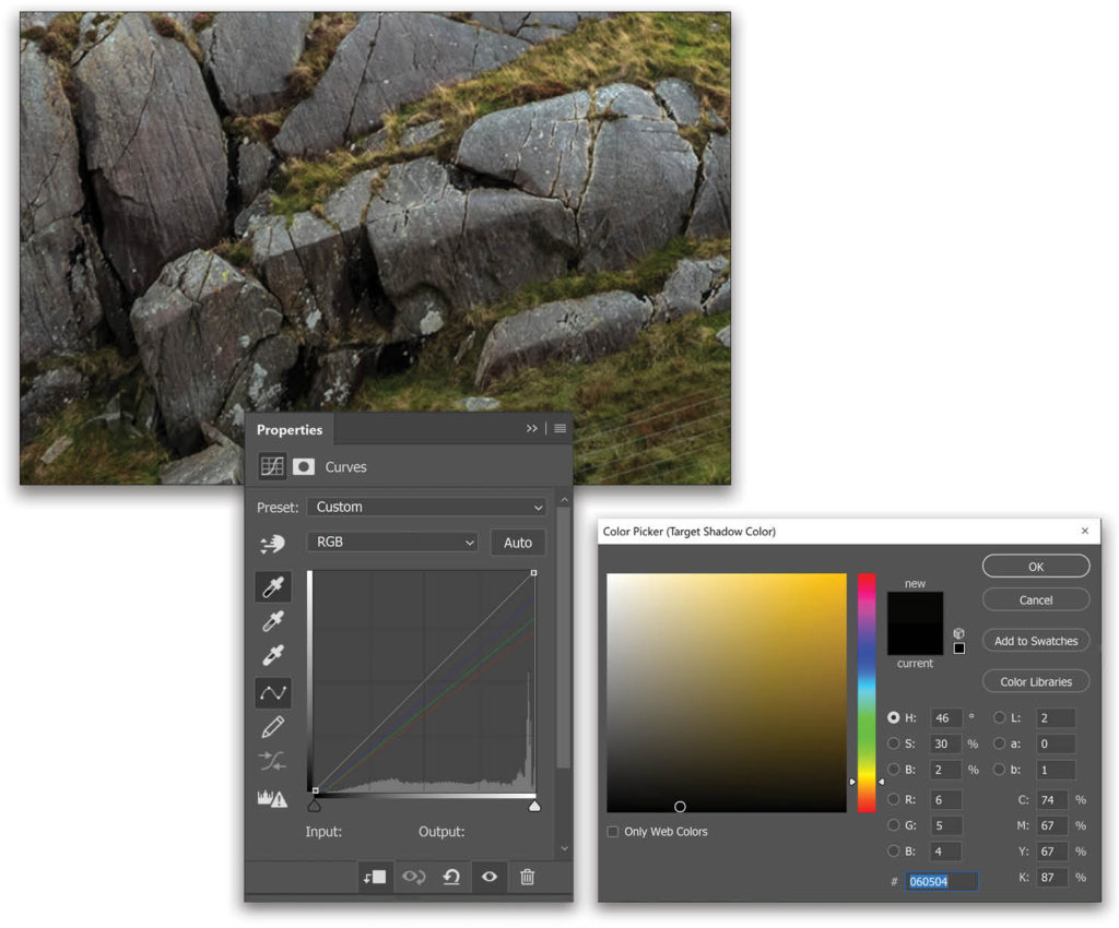
Step Seven: Match the Shadows
Similarly, as we did with the highlights, double-click on the Black Point eyedropper (the one with a black tip) in the Properties panel. Sample a shadow color from the background image and click OK to close the Color Picker. Again, click No when Photoshop asks if you want to “Save the new target colors as defaults?” Now, click on the darkest area on the subject, and the shadows will match too.
Step Eight: Match the Midtones (Optional)
As we matched the highlights and shadows, you can also use the Gray Point (middle) eyedropper to match the midtones by following the same steps and sampling a neutral color from the background, for instance, the gray stones; however, in this case, it’s not required. Why? Because I tried it and it looks like garbage. But it works wonders on some images.
Step Nine: Match the Contrast
Create another clipped Curves adjustment layer, as shown in Step Five. Reduce the contrast on the subject by dimming the highlights and slightly brightening up the shadows as shown here. In the Layers panel, reduce the Opacity of this Curves adjustment layer to 70%.
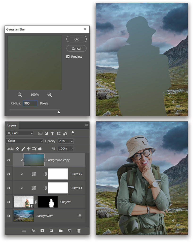
Step 10: Apply Atmospheric Color
Click on the Background layer in the Layers panel to make it active, and press Command-J (PC: Ctrl-J) to create a duplicate. Place the Background copy at the very top of the layer stack, and clip it by holding the Option (PC: Alt) key and clicking on the line between the Background copy layer and the layer beneath it in the Layers panel. You should notice a downward-pointing arrow on the left of the layer similar to what you see on the clipped Curves adjustment layers.
Go to Filter>Blur>Gaussian Blur. Apply a high enough blur to get a color gradient with no details. Because the Background copy is clipped to the subject layer, you’ll only see the blur inside the subject. Click OK.
Change the blend mode of the Background copy layer to Color, and set its Opacity to about 20%.
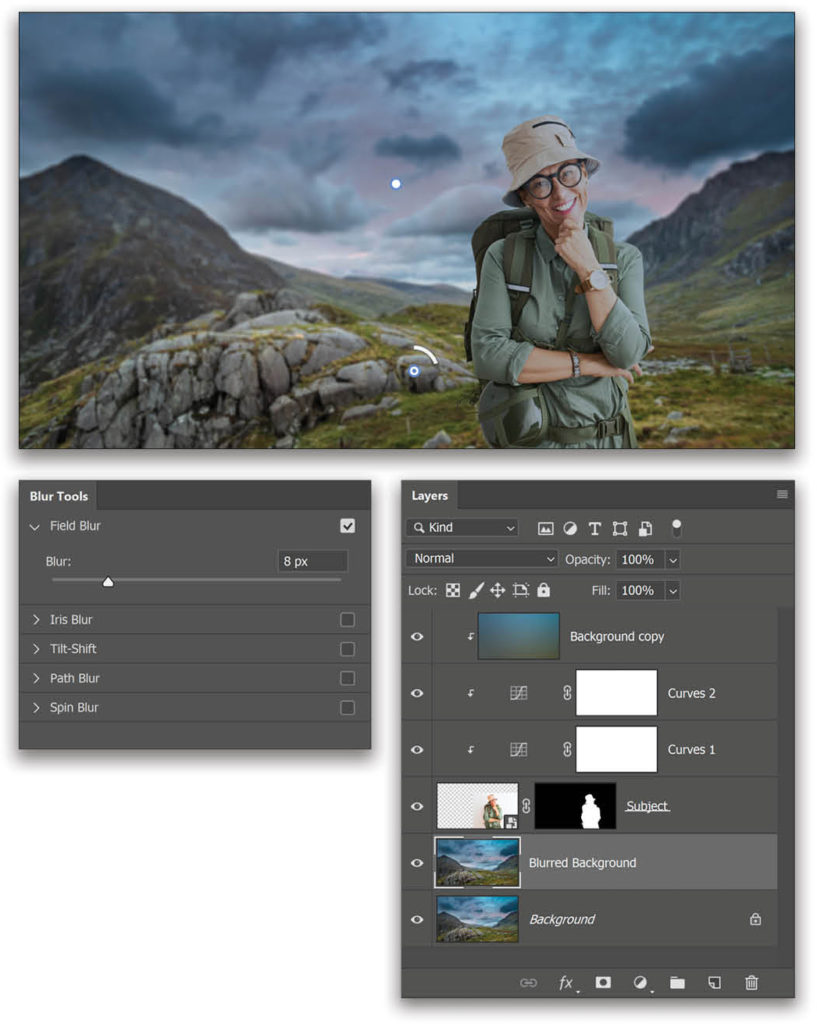
Step 11: Blur the Background (Optional)
Make the Background layer active, and again make a duplicate by pressing Command-J (PC: Ctrl-J). Let’s double-click the name of this layer and rename it “Blurred Background.”
Go to Filter>Blur Gallery>Field Blur. Increase the Blur in the Blur Tools panel to 15 px (if you’re using the low-res preview versions of the images, try 4 px). Create another point near the subject’s right elbow by simply clicking on the area, and for this point, set the Blur to 8 px (try 2 px for the low-res files). Click OK in the Options Bar to apply the blur.
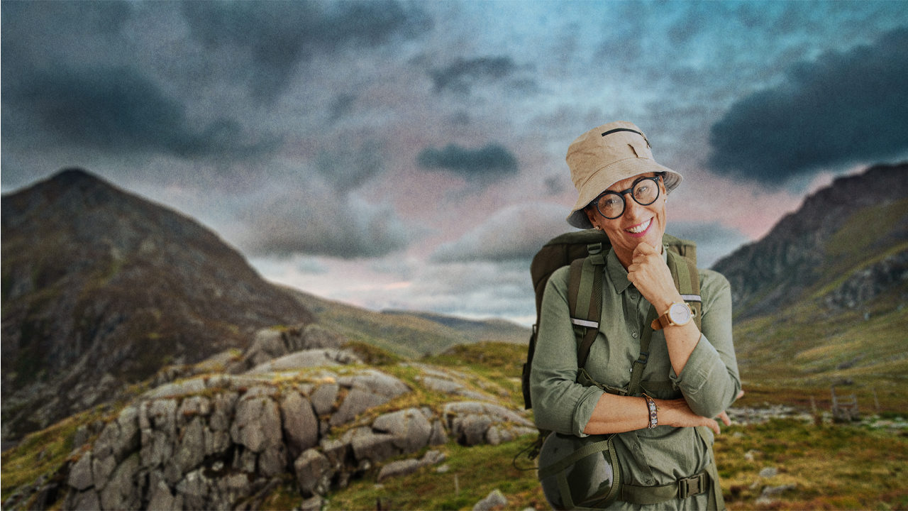
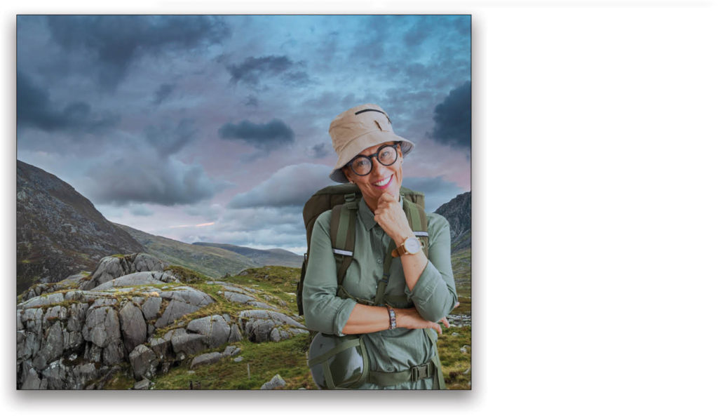
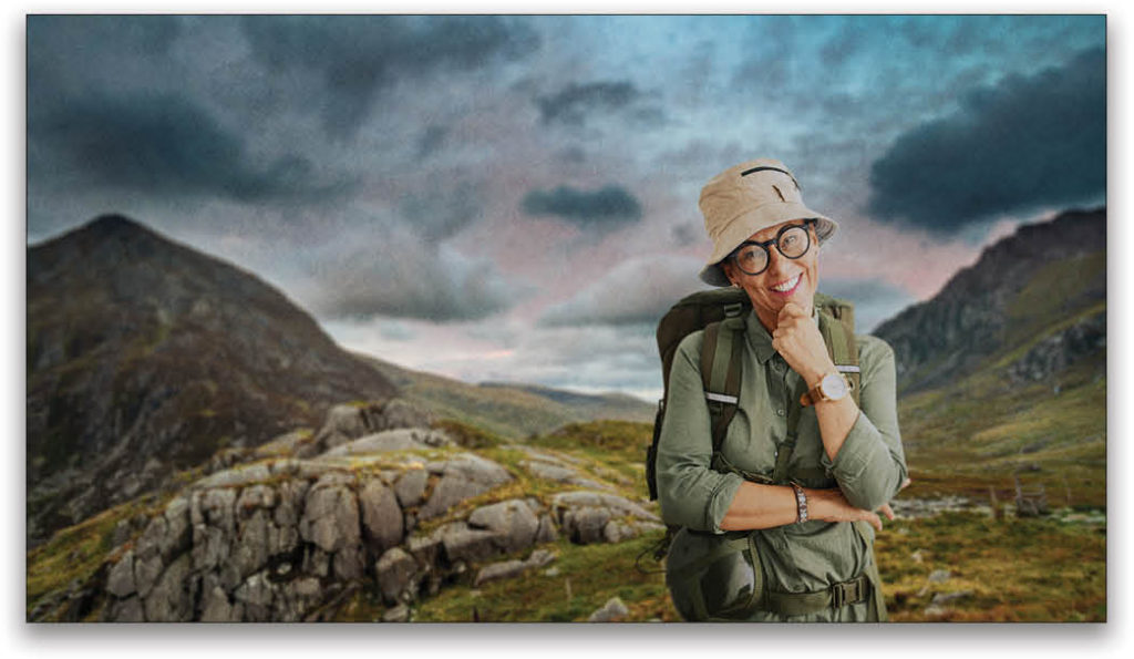
The three (or two in most cases) eyedroppers in the Curves adjustment layer will get 80% of the job done in blending the subject with that of the background. The composite isn’t over yet. In this example, you’d still need to work on the shadows and highlights with some manual dodging and burning, and maybe add some filters on top to blend the images even better. I also added a simple LUT and some texture at the top to make it blend better. Here’s what my final image looks like.
This hidden custom sampling feature inside the Curves adjustment layer will save you tons of time from having to adjust the individual color channels in the Curves Properties panel to match the colors of the composited elements with the naked eye. Just remember to double-click those three eyedroppers!
This article originally published in the May, 2020 issue of Photoshop User magazine.