This technique largely grew out of frustration because, a while back, I was doing a project and needed a really realistic branding effect on a wood grain. Every tutorial I found just fell short of what I needed. So, I started playing around and finally got a result I was happy with. You know the old saying: “If you want it done right…â€
STEP ONE:
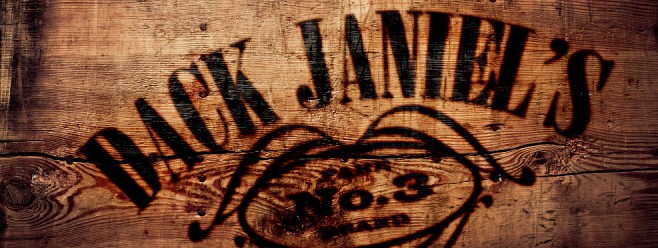
First, we need a cool background texture to apply the effect to, Here, I have a great aged-wood image that has some nice texture and the tonal range for the effect to be convincing, but we’re going to enhance it just a bit.

CREDIT: ©FOTOLIA/STOCKCREATIONS
STEP TWO:
Make a duplicate of the Background layer by pressing Command-J (PC: Ctrl-J). Then, press Command-Shift-U (PC: Ctrl-Shift-U) to remove the color information from this duplicate layer, and change the layer’s blend mode to Soft Light. This will punch up the contrast and color just a little.


STEP THREE:
Now, open a logo. This a .psd file for a logo that I created. Notice that it’s just black-filled text and a graphic on a transparent layer. You can also use a color logo if you like (you will just have to adjust the Blend If settings we’ll be using in a moment).

STEP FOUR:
Get the Move tool (V) from the Toolbox, and then drag-and-drop your logo into the main texture file (or copy-and-paste it). Once there, I rotated it slightly so it wasn’t so symmetrical. To do this, press Command-T (PC: Ctrl-T) to go into Free Transform, then move your cursor outside the bounding box, and it will become a curved, two-headed arrow. When it does, click-and-drag in the direction you want to rotate. Press Return (PC: Enter) when you’re done to lock in your rotation.

STEP FIVE:
Now, click on the Add a Layer Style icon at the bottom of the Layers panel and choose Outer Glow. In the Structure section at the top, click on the color swatch and, in the Color Picker, set the RGB numbers to R: 95, G: 31, B: 22, which is a nice dark brown. Click OK, then change the Blend Mode to Linear Burn and set the Opacity to 75%. Then, adjust the Size according to the size of your graphic. In this case, I set mine to 10 px. (Note: Make sure the Preview checkbox is turned on near the top right of the dialog, so you can see how the changes look in your image as you make them.)


STEP SIX:
Next, click on Drop Shadow on the left side of the dialog. Click on the color swatch and, this time, set the RGB numbers as you see here and click OK. Then, set the Blend Mode to Color Burn and bump the Opacity up to 100%. Keep the Distance low, but increase the Size to around 200 px. This will add subtle warm coloring to the area around the text.


STEP SEVEN:
Click on the Blending Options at the top of the Styles list on the left. You will see three sections of blending options: General Blending, Advanced Blending, and Blend If. It is the Blend If section we are interested in here. This feature lets you blend two layers based on the tonal range of each layer. You determine the intensity by way of a slider going from light to dark with sliders for each layer. You can affect what is visible by moving the sliders around. When you do this, you will notice the transition is harsh. Pressing-and-holding the Option (PC: Alt) key when you click on a slider knob allows you to split it, making the transition smooth. Which slider you use depends on the image. I just try them both until I find what I like. For this logo, I split the white slider for the Underlying Layer. This allowed the lighter areas of the wood texture to show through. Click OK when you like the way it looks.


STEP EIGHT:
Let’s add one last thing: Since this wood is old and has some large cracks and rough textures, the logo needs to appear to conform to these imperfections. We can achieve that with a simple displacement map. Go under the Image menu and choose Duplicate to make a copy of the file. Toss out the logo layer in this duplicate file and then go to the Layer menu and choose Flatten Image. Press Command-Shift-U (PC: Ctrl-Shift-U) to once again remove the color from the wood.


STEP NINE:
Save this document to the desktop or anywhere you can get to it quickly. I just named mine displace.psd (make sure you remember what you named it, since we’re going to use it in a moment). Then, close the displacement map document, switch back to your logo-branding document, go under the Filter menu, under Distort, and choose Displace.


STEP 10:
When the Displace dialog appears, you will need to enter a Horizontal and Vertical Scale. The higher the number, of course, the more it distorts the image. So, here, I have set both to 10. Click OK. You will then be prompted to locate the displacement map file. Once found, click on it, and click the Open button. You can now see the subtle distortion of the logo around the contours of the texture.


By Corey Barker
Excerpt from Photoshop Down & Dirty Tricks for Designers, Volume II
Learn how to do more from Photoshop Down & Dirty Tricks for Designers, Volume II here: http://kel.by/CoreyDD2