Since the beginning of time, the Color panel (Window>Color) in Photoshop has displayed as a gradient of color. Drag the arrow on the thin horizontal bar of color at the right to change the color (Hue), and then drag within the big box on the left to choose the brightness and saturation. Even though it’s flat, this is called the Hue Cube. Unknown to many, a number of years ago, Adobe added a much more useful way to view and select colors. You might not know, because Adobe still loads in the Hue Cube as the default (Photoshop users hate change).

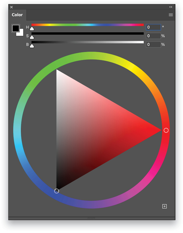
If you click the flyout menu at the top right of the Color panel, you’ll see several options, including Color Wheel. This is a much more natural way to look at color and it makes it easier to visualize things such as complementary colors. You can easily choose your hue from the outside ring and your brightness and saturation in the inner triangle. There’s also a square with a + in it at the bottom right of the panel. Click this to add the color to your swatches. This is a smart move for frequently used colors, so you don’t have to keep creating them every time.

This tip originally published in Colin Smith’s “Photoshop Tips” column in the June 2023 issue of Photoshop User magazine.


![Creating Reflections in Photoshop [Flashback Friday!]](https://insider.kelbyone.com/wp-content/uploads/2017/05/FeaturedIMage-1-440x264.png)
![Line Burst Background Effect [Flashback Friday!]](https://insider.kelbyone.com/wp-content/uploads/2017/05/Heroimage-440x264.jpg)
![Nondestructive Dodge & Burn Shortcut [Tip Thursday!]](https://insider.kelbyone.com/wp-content/uploads/2017/05/AfterContour-440x264.jpg)

