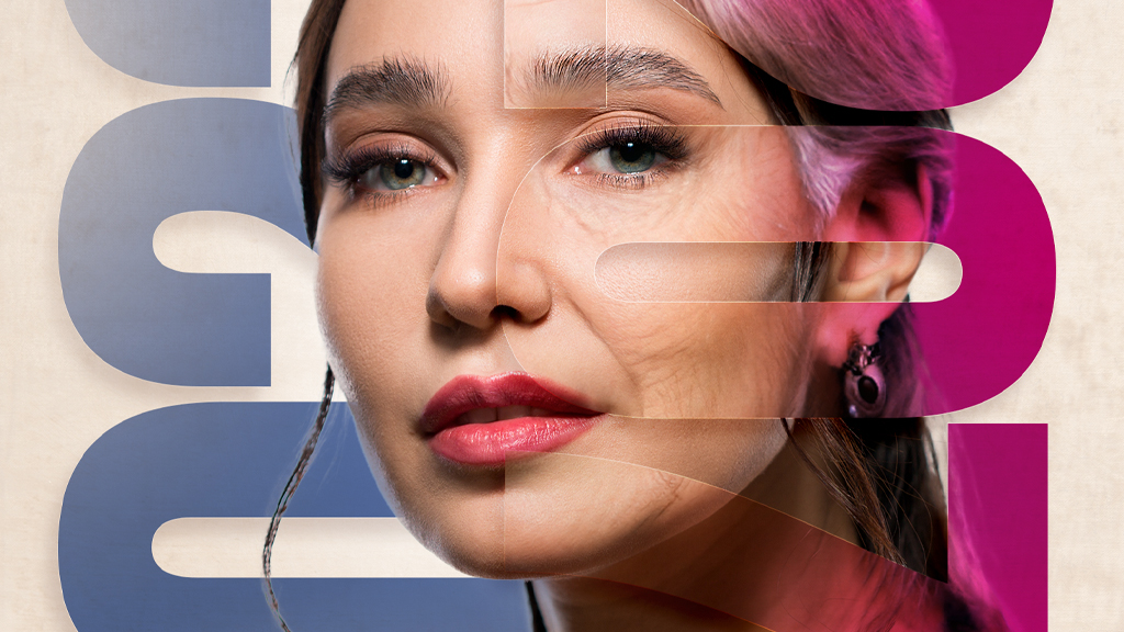
Fancy title, eh? Not long ago, Adobe released these things called Neural Filters that do some AI hocus-pocus to produce quite impressive effects. One of them is aging a person using Smart Portrait. I mostly saw this as a novelty after it was released, especially on social media, but I wanted to show you a way to employ it as a useful effect and compositing tool.
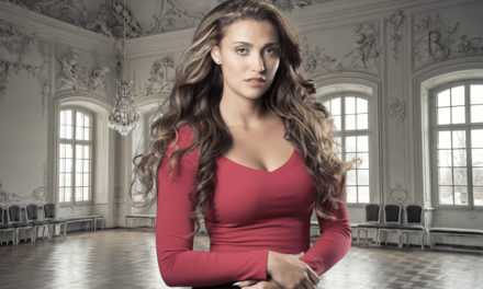
STEP ONE: First, we need a subject. For this exercise, we’ll use a younger subject like this one I found on Adobe Stock. You could actually go the other way and use a photo of an older person and make her look younger, but that can be a little trickier and take some experimenting.
If you’d like to download the low-res watermarked version of this image to follow along, click this link, log in with your Adobe ID, and click the Save to Library button. Double-click the image in the Libraries panel (Window>Libraries) to open it in Photoshop.
To make it easier to work with the image, increase the resolution of the practice file. (We normally don’t recommend enlarging images, but this is only for practice purposes.) Go to Image>Image Size, turn on the Resample checkbox, select Preserve Details 2.0 from the Resample drop-down menu, set the Width to 3,000 pixels, and click OK.
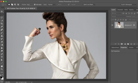
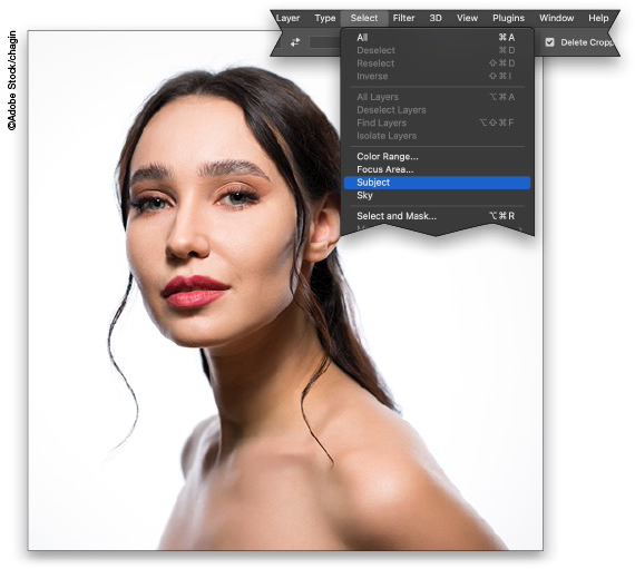
STEP TWO: We need to extract the subject from the background and, since she’s on a solid white background, it should be pretty easy. Just go under the Select menu and choose Subject.
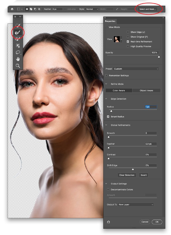
STEP THREE: Once the selection is created, make any major tweaks if needed, such as removing any areas that were unintentionally selected, using the standard selection tools. When you’re done, go to the Options Bar and click the Select and Mask button to open the Select and Mask workspace.
STEP FOUR: There’s very little that needs to be adjusted on this image, but it’s worth going into Select and Mask to check anyway. Just set the View mode to On Black (A) and the Opacity to 100%. Then, use the Refine Edge Brush tool (R) to clean up any of the white background, especially around her hair. Use the Bracket keys ([]) on your keyboard to quickly adjust the size of the brush. When it comes to the Refine Edge Brush, dabbing areas rather than brushing them often works much better. In the Properties panel, set the Radius to 1px, go all the way to the bottom to the Output Settings section, and set the Output To drop-down menu to New Layer. Click OK.
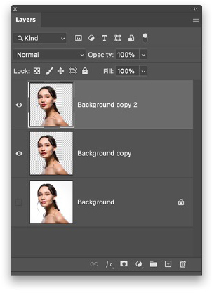
STEP FIVE: In the Layers panel, you’ll see the extracted subject on a new layer. Make a duplicate of the extracted layer by pressing Command-J (PC: Ctrl-J).
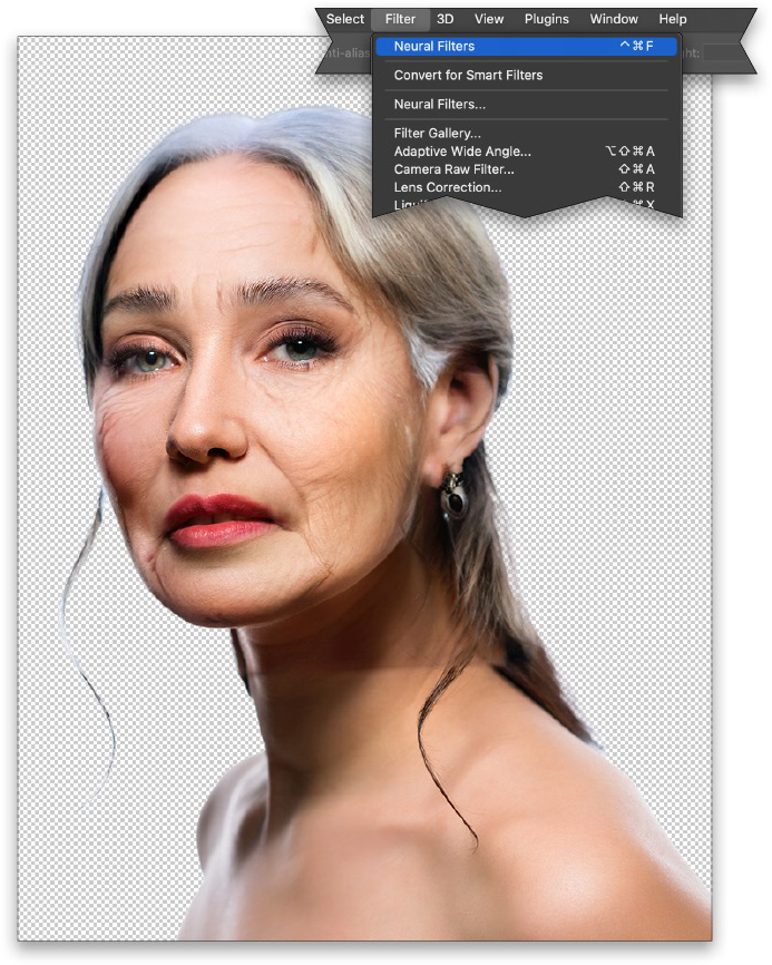
STEP SIX: Go under the Filter menu and choose Neural Filters. When the workspace opens, activate Smart Portrait at the top of the Neural Filters panel. Set the Facial Age to the max of +50. Just below Facial Age, set the Hair Thickness to +5. It may take a moment or two because it has to upload the image and then use AI to create the effect. Set the Output drop-down menu below to Current Layer, and click OK. Press Command-D (PC: Ctrl-D) to remove the selection.
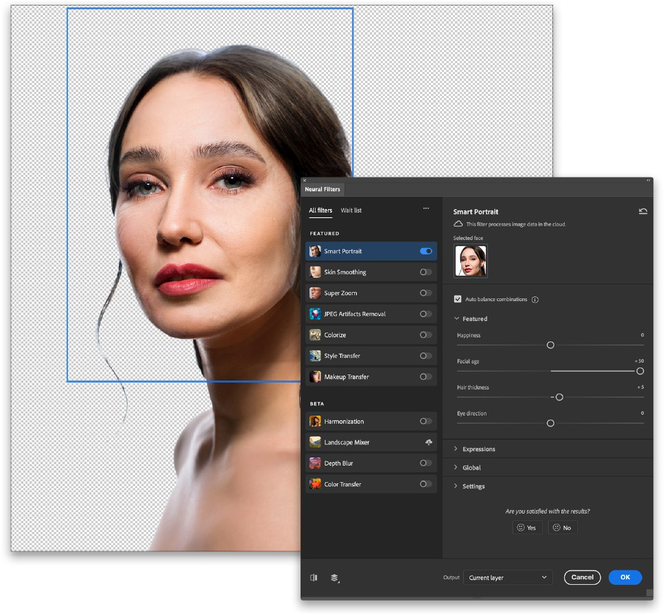
STEP SEVEN: It’s a good result but let’s age her some more. With the same layer selected, go under the Filter menu and select the very first item, which is the last filter applied, so it should be Neural Filters. This will basically double-down on the age effect. (Whoever this model is, I apologize. 🙂)
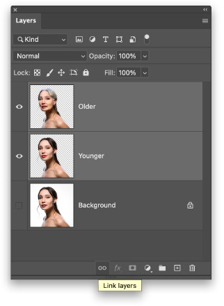
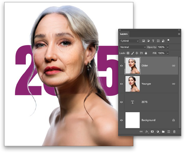
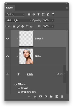
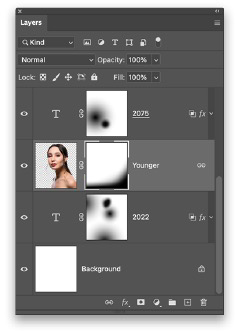
STEP EIGHT: Double-click the name of each of the extracted layers in the Layers panel, and rename them accordingly (e.g., “Younger” and “Older”) so it’s easier to manage them. Also, with the Older layer active, Shift-click the Younger layer in the Layers panel so they’re both selected, and click the Link Layers icon (chain link) at the bottom of the Layers panel to link them. You should see a chain link icon appear to the right of both layers.
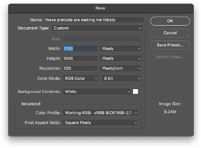
STEP NINE: Create a new document by pressing Command-N (PC: Ctrl-N). Set the Width to 1,700 pixels, the Height to 1,900 pixels, and the Resolution to 300 ppi. Leave the Background Contents set to White and click OK or Create.
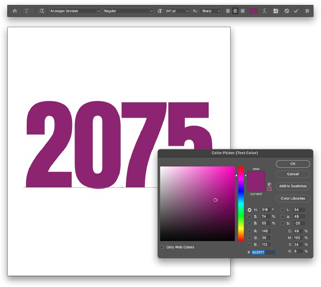
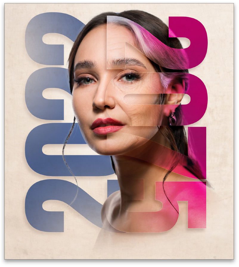
STEP 10: Before we bring the subject in, let’s set some text objects. Choose the Type tool (T) and, in the Options Bar, start by choosing a font. We’re using an Adobe Font called Anzeigen Grotesk Regular at a Size around 240 pts. To activate an Adobe Font, go to Type>More from Adobe Fonts and, when the Adobe Fonts website opens, search for the font you want to use. Click its Activate Font switch to sync it with your Adobe apps, and then return to Photoshop.
Click the Center Text option, and then click the color swatch to the right. Set the color to #8c2471, and click OK to close the Color Picker. Click in the document, and type the number “2075.” Select all the letters with the Type tool, and set the Tracking (space between letters) to –10 in the Properties panel (Window>Properties). Press Enter to commit the type, and then use the Move tool (V) to center it on the canvas using the smart guides to help you position it.
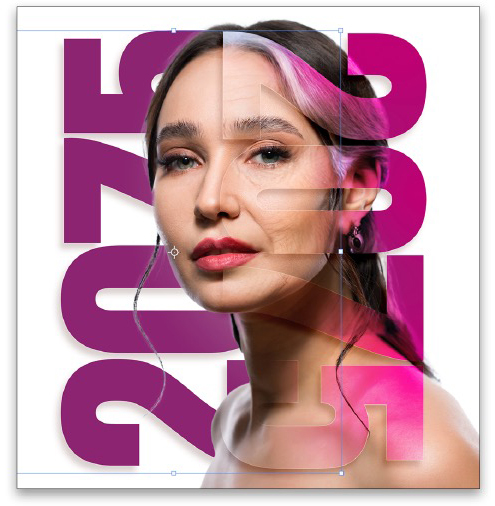
STEP 11: Now let’s go back to the subject file and bring the subject layers over. Since they’re linked, you can just grab one of them with the Move tool and drag them both at the same time to the working canvas. Add Shift before releasing the mouse button and she will land in the center of the document. (You can copy-and-paste as well but you’ll have to select both layers before you copy.)
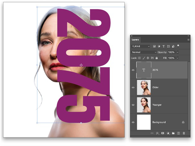
We will fine-tune the subject’s position in a moment but for now just use Free Transform (Command-T [PC: Ctrl-T]) to scale and position the two layers in the center of the canvas, as shown here. Press Enter to commit the transformation.
STEP 12: To help us position the text, drag the text layer to the top of the layer stack in the Layers panel so it’s in front of the subject. Activate Free Transform, Right-click inside the bounding box, and choose Rotate 90° Clockwise. Position and resize the text similar to the way it’s shown here. Press Enter, when done.
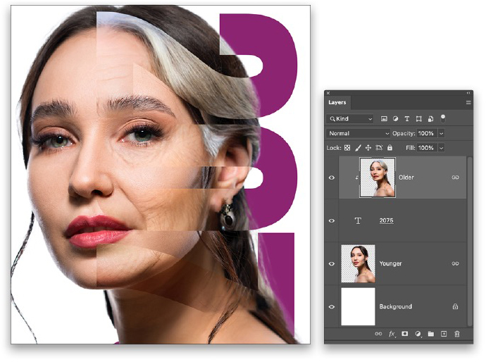
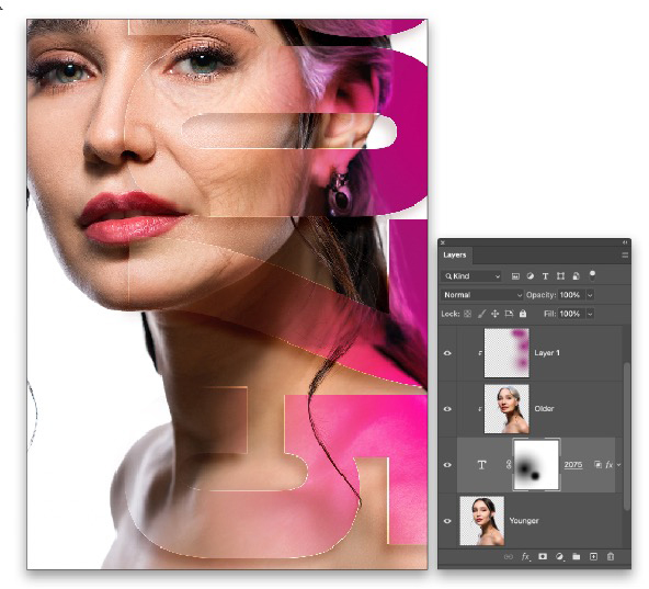
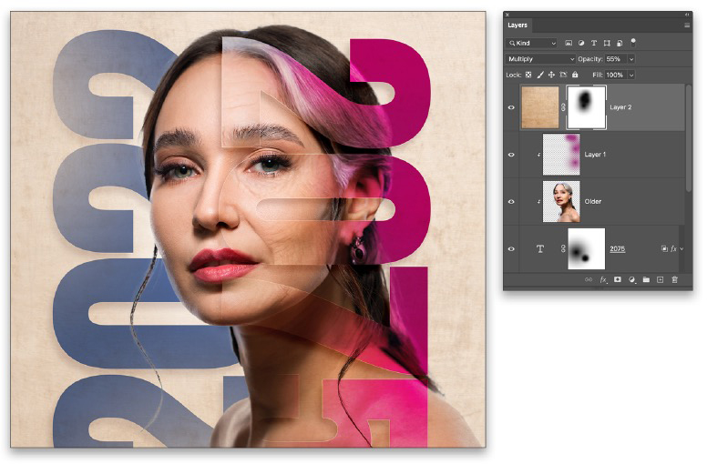
STEP 13: In the Layers panel, move the text layer between the Older and Younger subject layers. Then, click on the Older subject layer to make it active, and press Option-Command-G (PC: Alt-Ctrl-G) to create a clipping group that only lets you see the clipped layer through the text layer below, essentially masking the subject with the text layer. While this is somewhat apparent, we need to add some effects to help it really stand out.
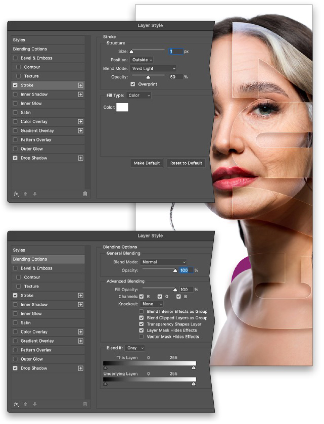
STEP 14: Click on the text layer in the Layers panel to make it active. Click the Add a Layer Style icon (ƒx) at bottom of the Layers panel, and choose Drop Shadow. Click the color swatch and choose a warm, dark shadow color (#46160b) since it will be on the subject. Set the Blend Mode to Linear Burn and lower the Opacity to 20%. Turn off Use Global Light, and set the Size to 24 px.
I like to manually adjust the shadow by clicking directly on the canvas and moving it around to put it in its final position (remember, it’s a layer style so you can always adjust it later). Don’t click OK in the Layer Style dialog yet.
STEP 15: Next click on the word “Stroke” in the list on the left of the Layer Style dialog to activate it and access its settings. Starting at the bottom, change the Color to white. Then, adjust the settings as you see here to get a thin highlighted edge along the text. Don’t click OK yet.
STEP 16: One last thing: Click Blending Options at the top of the list on the left, and under the Advanced Blending section, check on Layer Mask Hides Effects. Now you can click OK to apply the layer styles. You can see the text is more defined, but with style. Let’s add some more.
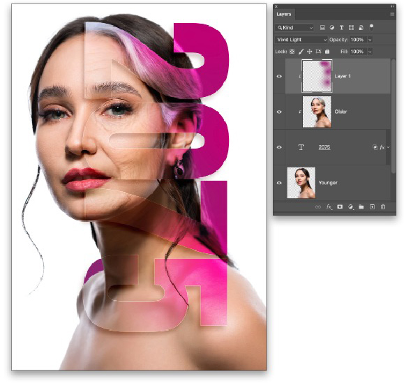
STEP 17: Select the Older subject layer then add a new blank layer above it by clicking the Create a New Layer icon (+) at the bottom of the Layers panel. Then include this layer in the clipping group with the subject by again pressing Option-Command-G (PC: Alt-Ctrl-G). Change the blending mode of the blank layer to Vivid Light. I found that Vivid Light worked great with this image and the color we’re about to choose, but you can definitely play with other blending modes and see what other results you might get.
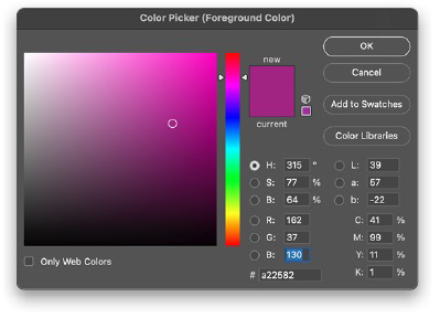
STEP 18: Click on the Foreground color swatch at the bottom of the Toolbar and choose a color similar to the text but go several shades brighter (#a22582). Once done, click OK to close the Color Picker.
STEP 19: Select the Gradient tool (G) in the Toolbar, go up to the Options Bar, and click on the gradient preview thumbnail to open the Gradient Editor. Choose the Foreground to Transparent preset in the Basics set, and click OK. Back in the Options Bar, click on the Radial Gradient icon.

STEP 20: Once you have the Gradient tool set up, draw a few gradients along the right side of the text area to create an edge light effect that only appears on the older subject layer, which creates a cool effect.
STEP 21: Select the 2075 text layer and add a layer mask by clicking the Add Layer Mask icon (circle in a square) at the bottom of the Layers panel. Press D then X to make sure the Foreground color is set to black. Using the same Foreground to Transparent Radial Gradient, start a bit to the left of the text and draw out a rather large gradient so you get a smooth, subtle fade of the numbers on the face. Don’t fade the edges of the numbers out completely, just enough to where you can still make them out. This blends the subject a little better with the text rather than the text just sitting in front of her face. I also faded out the 5 where it was sticking out beyond her right shoulder and neck.
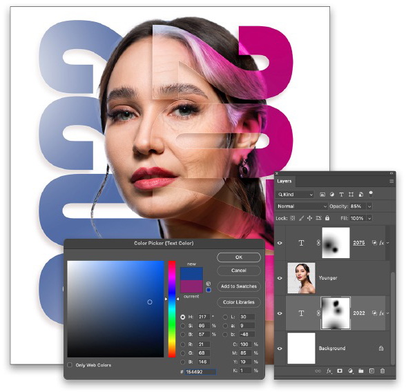
STEP 22: Now make a duplicate of the text layer by pressing Command-J (PC: Ctrl-J). Drag the original text layer below the Younger layer (if you move the duplicate text layer, you’ll break the clipping group). Press Command-T (PC: Ctrl-T) to activate Free Transform, hold down the Shift key, and click-and drag outside the bounding box to rotate the text 180°. Still holding the Shift key, drag the duplicate text to the left of the original 2075 text as shown here. Press Enter to commit the transformation.
STEP 23: Grab the Type tool, select all the numbers in the duplicate text, and change it from 2075 to 2022. Select all the text again, click the color swatch in the Options Bar, and change the text to a blue (#154492), as we have here, or some other color that works well with your design. Lower the Opacity of this layer to around 85%. Add more gradients to the layer mask to fade this text in areas that will make it a little less prominent so it doesn’t compete with the main focus of the design, which is the 2075 with the older subject inside.
Be sure to experiment with colors along the way. It will all depend on the subject image and how you want to portray it.
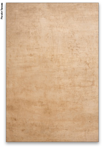
STEP 24: Now to add a finishing touch. While it doesn’t look bad against a white background, let’s add a subtle texture to the background. Here we’re using one courtesy of PhotoArt Textures, but just about any similar texture will work. You can even find lots of textures in the Free section of Adobe Stock like this one here.
STEP 25: With your texture image open in Photoshop, use the Move tool to drag it into the working image and make sure it’s at the top of the layer stack. Press Command-T (PC: Ctrl-T) for Free Transform, then press Command-0 (PC: Ctrl-0), which will cause the image to zoom out to reveal the transform box. Scale the texture to fit the canvas area. Hold down the Option (PC: Alt) key to scale it from the center. Press Enter when done.
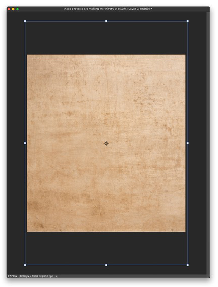
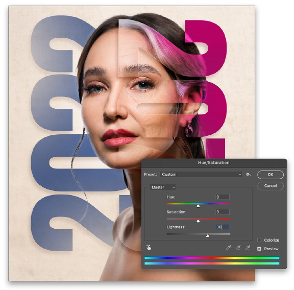
STEP 26: Set the layer blend mode of the texture layer to Multiply and lower the layer Opacity to around 55%. Add a layer mask to this layer and, using the same Foreground to Transparent Radial Gradient, add a few gradients around the face area to remove the texture and bring back the highlights on her face.
STEP 27: I want to lighten the texture a tad more but lowering the Opacity more will lose detail in the texture. Instead, click back on the layer thumbnail of the texture layer in the Layers panel so it’s active and not the layer mask, and press Command-U (PC: Ctrl-U) to open the Hue/Saturation dialog. Just adjust the Lightness to around 30, and click OK.
STEP 28: Finally, add a layer mask to the Younger layer and use the same Foreground to Transparent gradient but this time use a Linear Gradient and add just a couple gradients at the bottom of the image to fade the subject from the canvas edge. You’ll want to start the gradients outside the canvas and drag into the image.
And there you have a stylish way to illustrate aging using one photo. Always think of different ways to use the tools and features in Photoshop to create something unique. I hope you enjoyed this month’s installment of “Down & Dirty Tricks” and, until next time, have fun and experiment with your new skills!
This article originally published in the September, 2022 issue of Photoshop User magazine.
About Photoshop User and KelbyOne
Photoshop User magazine comes out digitally 12 times a year and is part of KelbyOne, the leading educational resource for Photoshop, Lightroom, and photography. Pro members have access to more than 900 video courses and 100 back issues of Photoshop User. To learn more about KelbyOne, click here.