We all have our bucket list of photos that we’d like to capture. Whether it’s photographing the aurora borealis or that perfectly lit portrait, we have a ticker tape of ideas that fuels ourselves to keep traveling, keep looking, and keep shooting. And when we get those rare opportunities to tick off items from the bucket list, we wear them like badges of honor because they truly mean something.
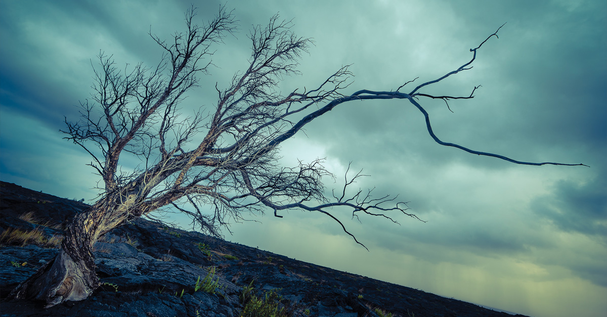
One such item on my list was to photograph a gnarly, solitary tree in the middle of a barren area like a desert or, in this case, an expanse of wet lava rock sitting at the base of a volcano on the Big Island of Hawaii.
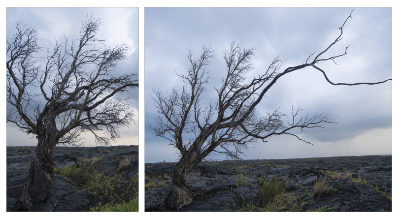
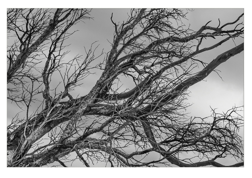
capturing the tree
Shortly before (literally) stumbling onto this gnarly tree, I was by my rental Jeep wringing out my rain jacket after being positively drenched from the heavy rain in the Volcano area. I was testing out my newest gear, the Sony A7 camera fitted with my Canon 14mm f/2.8L ultra-wide-angle lens and Really Right Stuff travel tripod. In the distance, well off of the trail that I was on, I saw my tree. It was standing there by itself, with nothing else in its immediate vicinity. So, I hustled over, making sure I didn’t trip on the ever-shifting lava rock, and set my tripod intentionally low while pivoting my camera up to embellish the size of the tree via optical distortion.
My original intent was to make the tree the center of attention, and the moody storm clouds in the background really helped accentuate that, but I knew that filling the frame with the tree was paramount. To ensure that I’d have all of the exposure information I’d need, I set my camera to shoot three bracketed exposures at 2-stop increments (–2, 0, and +2). From there, I experimented with a number of vantage points and angles, never really being satisfied with the results.
It wasn’t until I took a moment to really study the tree that I found the composition I was going for. One of the defining elements of the tree was that long branch jutting out of its right side. In all of my compositions, that branch was tilted or angled because I kept insisting on having a leveled horizon line. And then I remembered my good old friend, the Dutch tilt. By skewing my camera to the right, I was able to establish my level on the long branch while also introducing a sense of tension due to the angled horizon. When I chimped the shots on my camera’s LCD, I knew that I had found my winner.
editing the tree
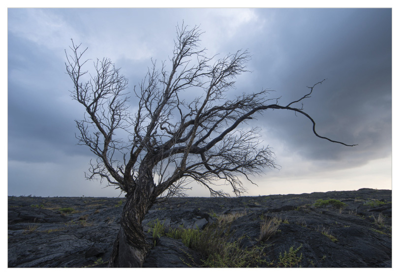
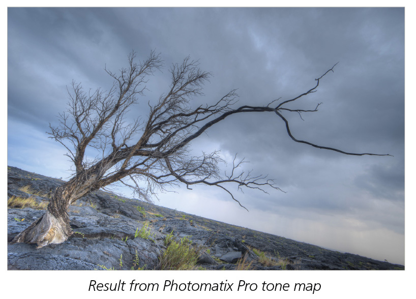
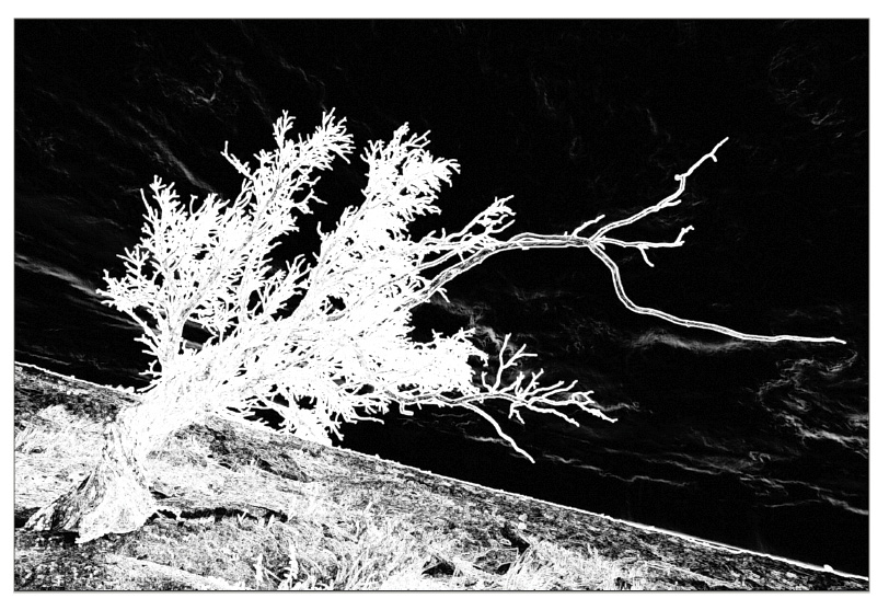
When I opened the three bracketed photos in Lightroom, I almost certainly knew that I’d need to tone map the images to create an HDR photo. The three brackets had a rather large shift in tonal range from the dark shadows of the tree to the bright areas of the sky. I used HDRsoft’s Photomatix Pro to do the tone mapping here, but when I studied the resulting image in Lightroom, I couldn’t help but think that the tone mapping really didn’t introduce anything beneficial. In short, I wasn’t very happy with the results of tone mapping, so I turned my attention to the 0 exposure of the bracket series to study the histogram. By looking at it, I could tell that I actually had all of the data I’d need to work off of that single image. So I went to work in the Lightroom Develop module.
step one: The first thing I wanted to do was bring out the shadows of the foreground, as well as the tree trunk and branches. For the foreground, I applied a Graduated Filter (M) from the lower-left corner, dragging up and to the right. Then I increased the Shadows slider until more detail appeared.
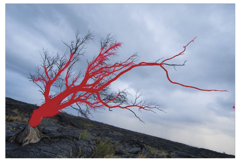
step two: Next, I clicked on the Adjustment Brush, dialed in the same Shadows value, and painted the rest of the tree, focusing on the thicker branches.
step three: Next, I went to work on getting the image to a proper starting point using the various sliders and tools in the Basic and Tone Curve panels. The first step is ensuring that I have a correct White Balance point and making sure that the white and black points of the image teeter off the right and left sides of the histogram, respectively. I do this by pressing-and-holding the Option (PC: Alt) key while dragging on the Whites and Blacks sliders in the Basic panel until some colors appear. When that happens, I know that I’m going too far and I reverse on the slider until I barely see anything.
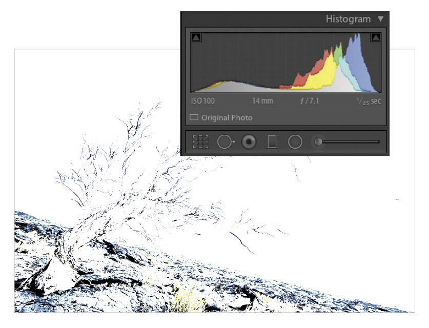
step four: In the Tone Curve panel, I changed the Point Curve from Linear (which is a default value) to Medium Contrast.
photo stylization
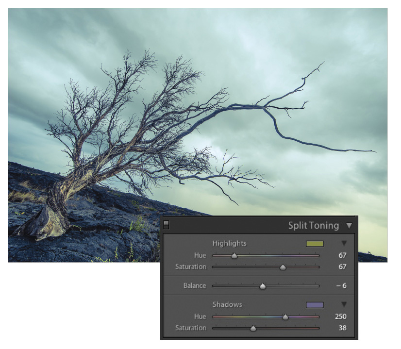
For the stylization of the photo, I imagined this tree being a remnant of a postapocalyptic world and wanted to change the look accordingly using the Split Toning panel.
step five: To start, I selected a Hue in the orange/green range for the Highlights and a bluish color for the Shadows. Next, I cranked up the Saturation for both and skewed the Balance in favor of the Shadows color until I was happy with the result.
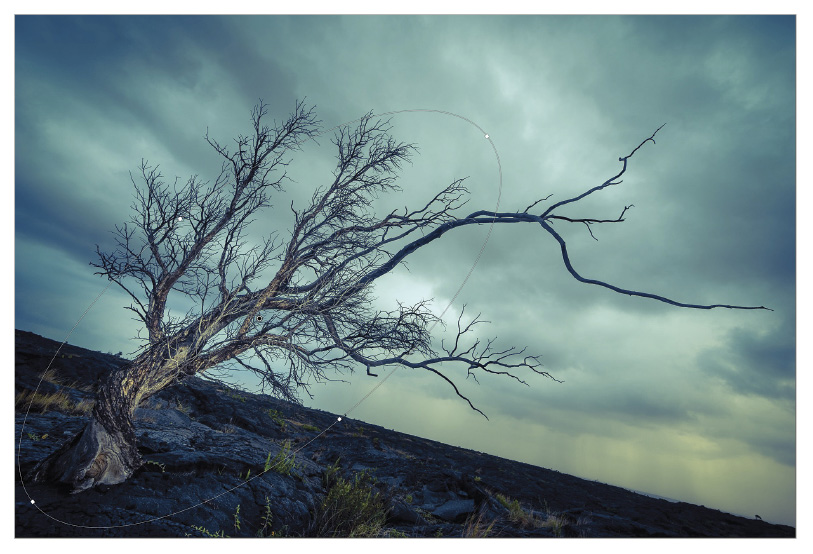
step six: With the basics dialed in and the particular look I was going for achieved, the next step is to draw the eye to the tree itself. An easy way to do so is to draw a Radial Filter (Shift-M) around the main part of the tree, angled appropriately (click-and-drag the filter outline to rotate), and then drop the Exposure while slightly increasing Contrast.
step seven: I used the Adjustment Brush again, focusing on the Exposure and Saturation sliders, to help bring out the little bit of grass in the foreground.
step eight: Now we’re approaching the finish line. These are the same last steps I apply to virtually every image I edit. First up is Sharpening in the Detail panel. To see the effect of the Sharpening, zoom in to a 1:1 view in the Navigator panel and focus on an area with a lot of high-contrast edges. In this case, I chose to view the small tree branches against the smooth sky. To make it easier to visualize the sharpening effect, press-and-hold the Option (PC: Alt) key while dragging on the Amount slider. This presents the image in a grayscale view, which is much easier to see the sharpening being applied.
step nine: Use the same Option (PC: Alt) key trick while dragging the Masking slider to ensure that the sharpening is only being applied to the sharper, high-contrast edges. Anything that appears black indicates that no sharpening is being applied.
step ten: After sharpening, the last thing I apply is a vignette in the Effects panel to further help draw the eye to the center of the frame. And with that, I’m finally able to tick this photo off of my ever-growing bucket list of things, people, and places to photograph.
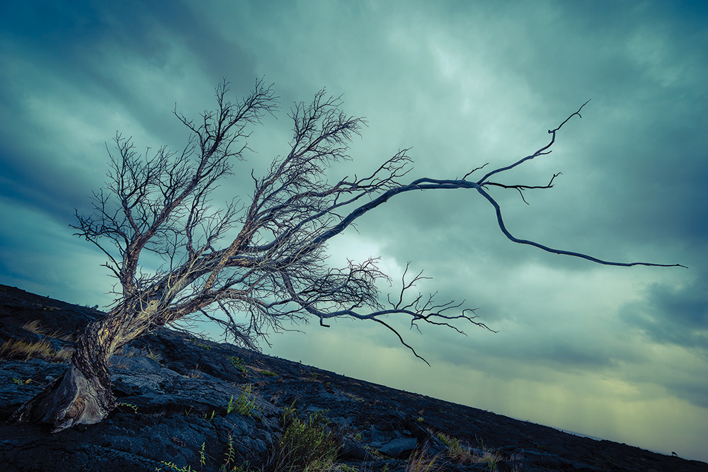
A windblown, gnarly tree stands the test of time and nature
Originally published in the February, 2014 issue of Photoshop User magazine.
![Creating Reflections in Photoshop [Flashback Friday!]](https://insider.kelbyone.com/wp-content/uploads/2017/05/FeaturedIMage-1-440x264.png)
![Line Burst Background Effect [Flashback Friday!]](https://insider.kelbyone.com/wp-content/uploads/2017/05/Heroimage-440x264.jpg)
![Nondestructive Dodge & Burn Shortcut [Tip Thursday!]](https://insider.kelbyone.com/wp-content/uploads/2017/05/AfterContour-440x264.jpg)