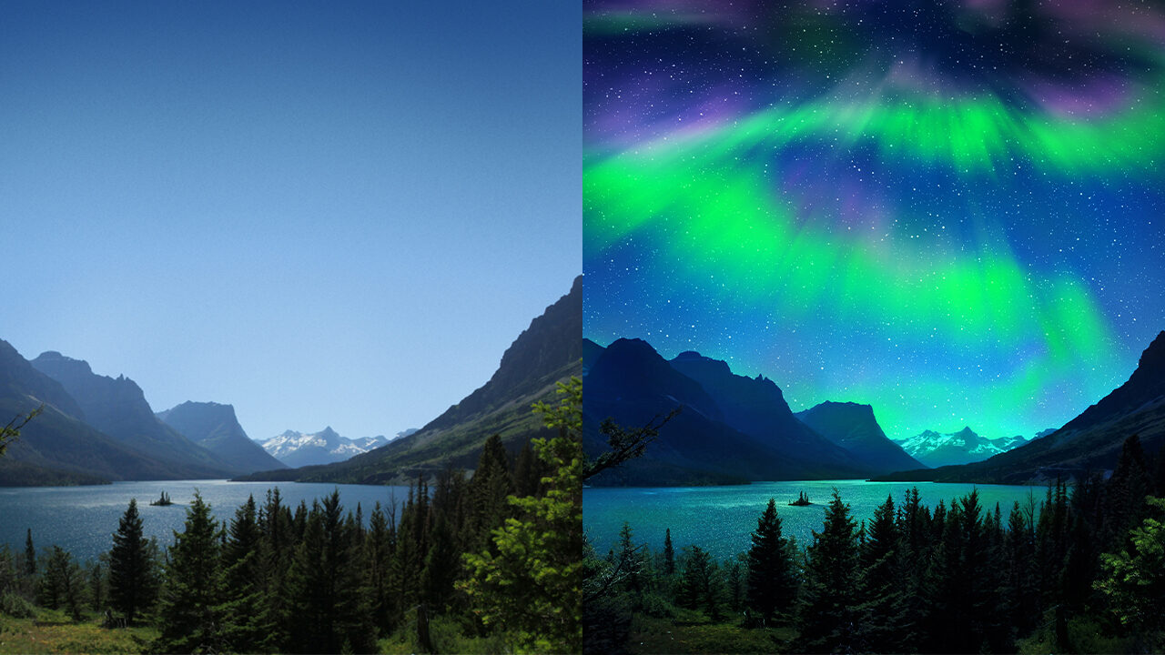
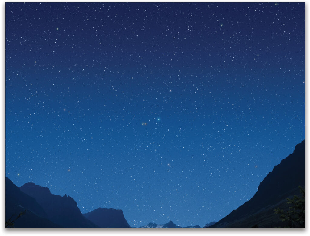
Night skies are a delight. They fascinate us, draw us in, and inspire our imagination and curiosity. This is especially true for the aurora borealis. But night skies are often tricky to photograph even under ideal circumstances. Most recently, it has also been quite difficult to journey to those optimal locations that have little-to-no light pollution.
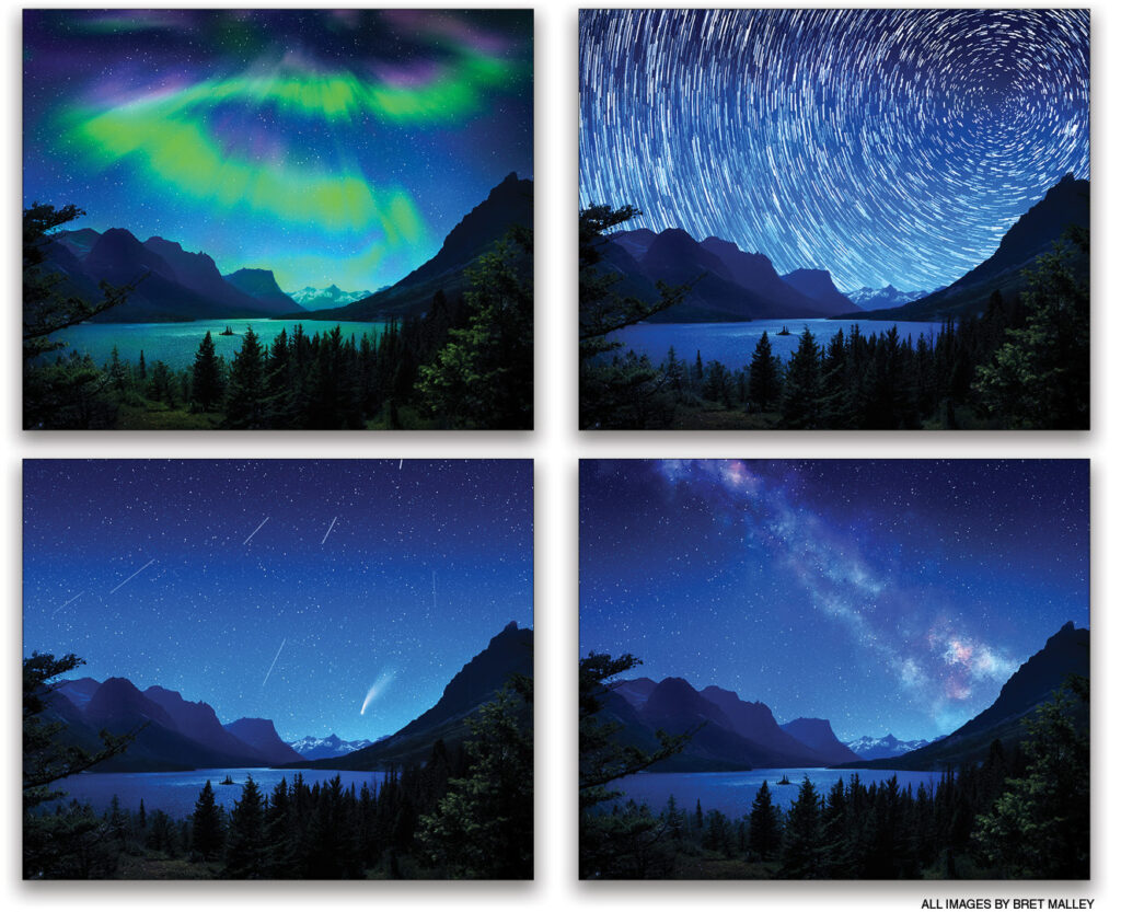
In the meantime, while you may be waiting for your perfect night-photography expedition, why not create some of your own night skies from scratch in Photoshop? This way, you don’t have to worry about bears, mountain lions, or moose during your perfect image creation. And, while this article focuses specifically on creating an aurora borealis night scene from a plain midday shot, I highly encourage you to attempt creating your own Milky Way, star trails, comets, and shooting star images. Let your night imagination run wild and add some fresh character to even your most banal landscapes!
Day to Night
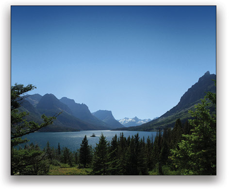
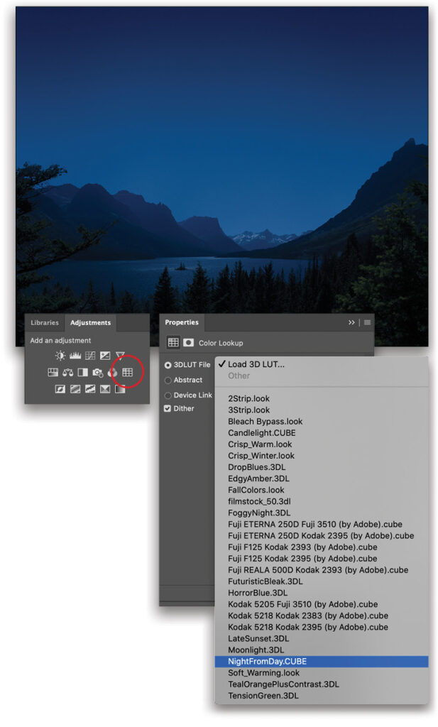
Regardless of your final skyward creative direction, here’s a great effect I use all the time for turning daytime scenes into nightscapes. In short, three things need to happen: the scene needs to be darker; there needs to be a more limited color palette; and there needs to be more blue in general. Fortunately, there’s a LUT adjustment layer preset that gets us in the ballpark of all three, so let’s start there!
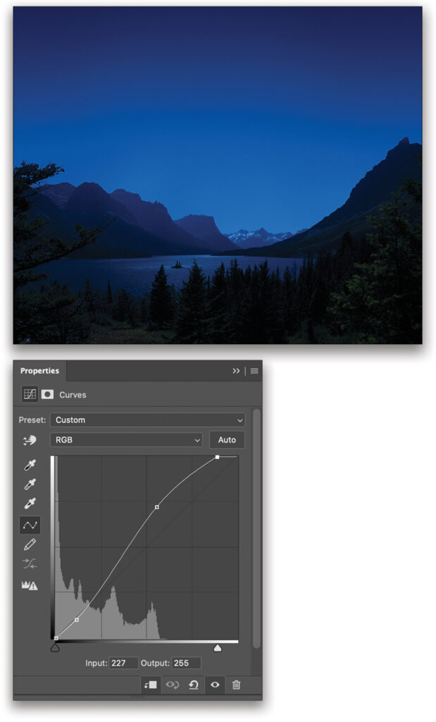
Step One: With your chosen daytime scene (with a plain sky) open in Photoshop, go to the Adjustments Layer panel (Window>Adjustments), and select the Color Lookup adjustment (it’s the grid icon at the end of the second row). In the Properties panel (Window>Properties) of this new adjustment layer, click on the top 3DLUT File pull-down menu and choose NightFromDay.CUBE. Bam! Just like that the night has arrived. So let’s refine this to taste.
Step Two: The color lookup table often makes things a bit too dark and a bit too blue, so let’s add another adjustment layer to compensate. Create a new Curves adjustment layer (the middle icon in the top row of the Adjustments panel) above the Color Lookup layer to fine-tune the lights, darks, and general contrast. Definitely check out my KelbyOne class, Advanced Photoshop: Pro Curves Techniques, if you need a refresher on this feature.
In short, keep the shadows crushed and mysterious, while letting those highest brights come through a bit more, as our eyes pick up these more easily in low-light situations (at least compared to the animals likely lurking in the shadows!). Make sure not to overdo the effect at this point; keep the adjustment more of a nudge in the right direction for now.
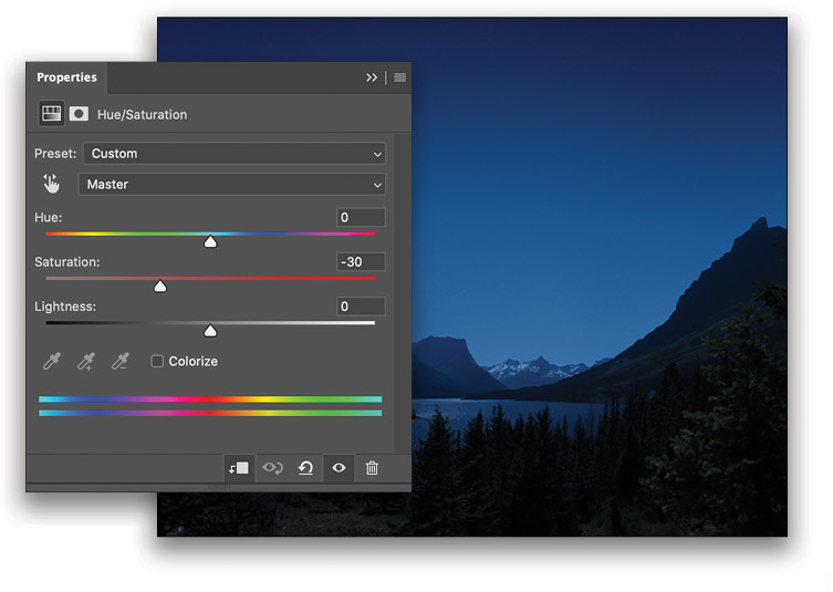
Step Three: Change the saturation of the blue with a Hue/Saturation adjustment layer (first icon in the second row of the Adjustments panel) placed above the Curves adjustment layer. This will allow you to fine-tune your color and saturation. In this example, a Saturation of –30 will do the trick in getting things a bit more natural. You can always add coloring effects and intensity in the global edits at the end. For now, get things looking like an un-edited night shot from your camera: fairly flat with loads of potential. If you start off too stylized, it doesn’t give you much to work with in the final adjustments.
Add Stars
Whether you have an empty night sky you already shot, or you applied the above effect to a daytime image with a plain sky, here’s how you can make some stars from scratch, or in this case, from noise!
Step Four: There are many ways to make sure your stars stay in the sky and not cover the entire image so, for this example, we’ll assume you have a good grasp of separating out your sky with selections tools and Select and Mask. If you need a refresher on separating landscapes and skies, take a gander at my class on Creating Landscape Composites, as it’s an addicting subject in itself.
A simple method for now is to click on your image layer in the Layers panel to make it active, and then select the sky with the Quick Selection tool (nested below the Object Selection tool [W] in the Toolbar). Click Select and Mask in the Options Bar to refine the selection, and make sure the Output To drop-down menu in the Properties panel is set to Selection before clicking OK.
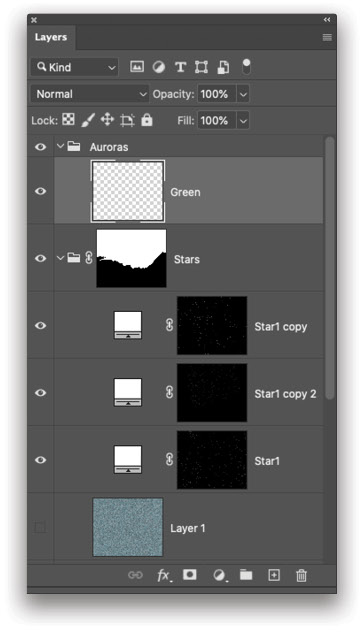
Click the Create a New Group folder icon at the bottom of the Layers panel, move the layer group to the top of the layer stack, and rename it “Stars.” Turn the sky selection into a mask for the Stars group folder by clicking the Add Layer Mask icon (circle in a square) at the bottom of the Layers panel. Now all future stars will at least stay contained to the sky area as long as those layers don’t escape the Stars group.
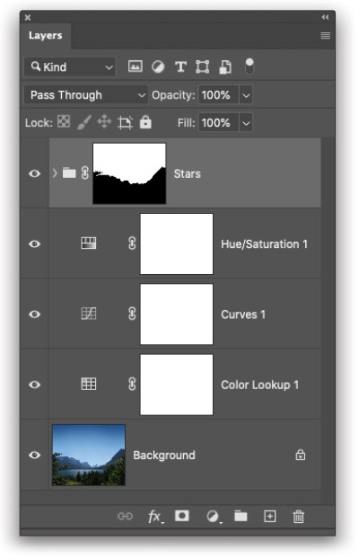
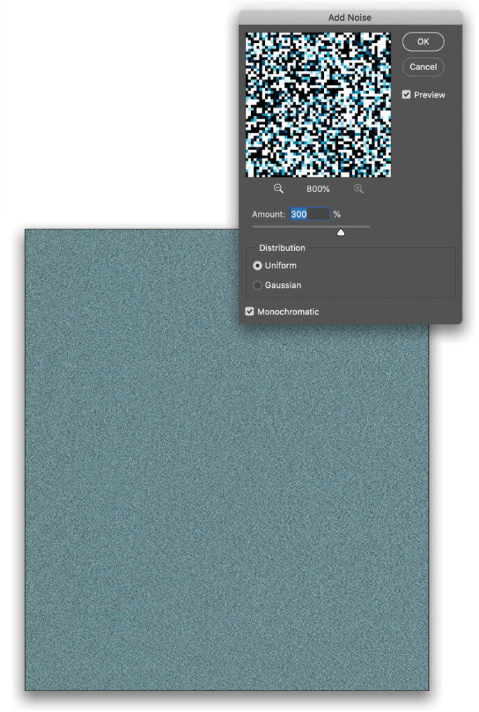
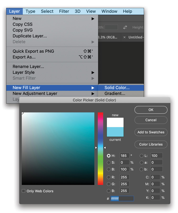
Step Five: Okay, it’s time to make some noise! Create a new layer, and drag it into the Stars group. Pick up the Paint Bucket tool (nested below the Gradient tool [G] in the Toolbar), click on the Foreground color swatch in the Toolbar, select a medium-value color (such as a blue) in the Color Picker, and click OK. Now click on the image to spill this color on the new layer.
Go to Filter>Noise>Add Noise to add noise to this layer; an Amount of 300% will give you a good amount of noise variation with which to work. Starting with a mid-value color allows you a little bit of nuance to work with, as well, which will translate to star density in the next step. Set the Distribution to Uniform, turn on Monochromatic, and click OK.
Step Six: This is where we use the generated noise to make a star scatter of a selection. Grab the Magic Wand tool (nested below the Object Selection too [W] in the Toolbar), and up in Options Bar, set the Tolerance to 1 and turn off Anti-alias. Also uncheck Contiguous so Photoshop doesn’t only select touching pixels that are exactly alike in value/color.
Now zoom all the way into the noise until it looks like a strange QR code and click on a medium- to lighter-color pixel, as the example shown here. This should create a selection of pixels throughout the noise. If you end up getting too dense a number of selection spots (future stars), press Command-Z (PC: Ctrl-Z) to undo, and select another pixel that selects fewer pixels before moving on to the next step.
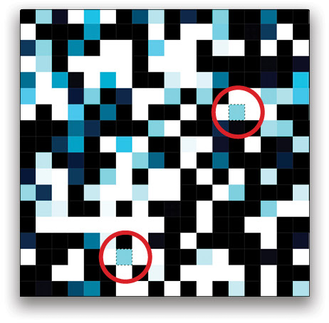
Step Seven: Let’s turn this sporadic noise selection into a masked layer with white star-like dots. Go to Layer>New Fill Layer>Solid Color. Name this layer “Star1,” and click OK. Choose white in the Color Picker for the proper star effect, click OK, and then click the Eye icon next to the noise layer in the Layers panel to hide it. This creates white dots by using the noise selection as your mask. Cool, right? But we’re not finished with these stars quite yet because they’re still a little hard to see when zoomed out.
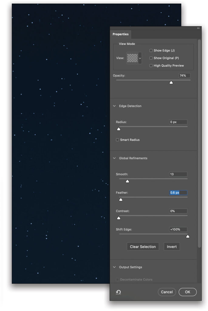
Step Eight: Once you disable the visibility of the noise layer, the white dots may look sporadic and somewhat similar to stars, but they’re jagged and don’t yet have the variation in size and intensity, so let’s fix that by going into Select and Mask. Do this by clicking the layer mask thumbnail in the Layers panel to make it active, and clicking the Select and Mask button within the mask Properties panel.
Once in Select and Mask, set the View drop-down menu to On Black (A), and the Opacity to around 75%. Make the stars rounder by setting Smooth to 13, soften their edges with a Feather of 0.6 px, and make their radius larger by setting Shift Edge to +100%. Click OK to keep the new mask. You should be able to see the stars much better now. Again, if you have too many stars at this point, go back to Step Six and select a different noise layer pixel that grabs fewer pixels, and try these steps again. Now we’re getting somewhere!
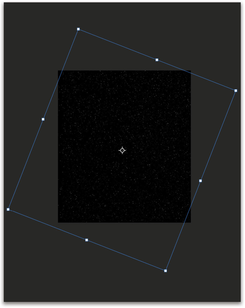
Step Nine: Now let’s add more variety of stars. Switch to the Move tool (V), and toggle on Show Transform Controls up in the Options Bar. Hold the Option (PC: Alt) key and click-and-drag this Star1 layer slightly to make a copy. It will automatically go into Free Transform. Drag out corner points to expand this layer and rotate it until you get the effect of those larger galaxies, brightest stars, and closest planets. Press Enter to commit the transformation.
Step 10: Repeat Step Nine to create another copy of the Star1 layer, but this time use Free Transform to make the new copy smaller and with another unique rotation. Now Change the Opacity of each star layer in the Layers panel, with the largest stars being the brightest for a more believable sky. The two smaller star layer copies can be dimmed to preference.
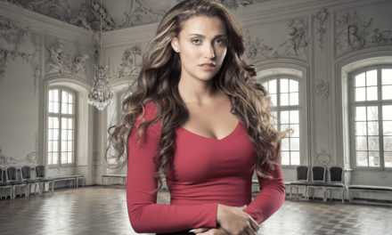
Step 11: For this last step in the star creation, we can do a bit of fine-tuning before moving on. For example, if there are too many large stars (or any others), paint out some of these with the Brush tool (B) set to black on your Star1 copy layer mask (the larger stars). Also, if you create another blank layer above the stars, you could give a few stars a bit of a colored glow if you felt inclined. Do this by painting with the desired color with a soft round brush at 90 px and a lowered Opacity in the Options Bar. Just dab (with a single click) on a star or two before switching colors. Add more variety by changing the size and Opacity of your brush before each click (see image above).
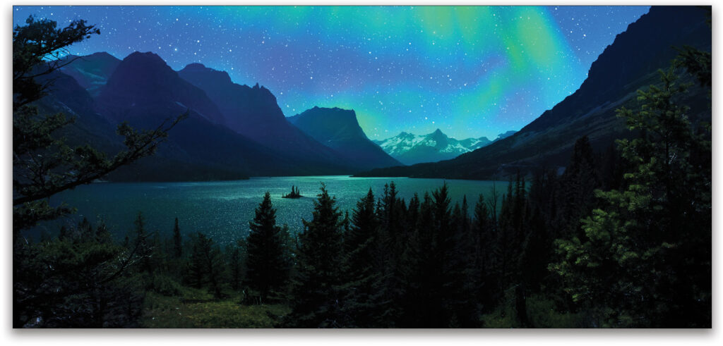
Aurora Borealis
Since my own sabbatical plans to travel up into Canada were laughed at by the pandemic this past spring (like most plans), the closest to the aurora borealis I could travel was escaping into Photoshop, which actually led to some fun creative adventures, to say the least. Here’s how you can join me in escapism and making your own northern lights.
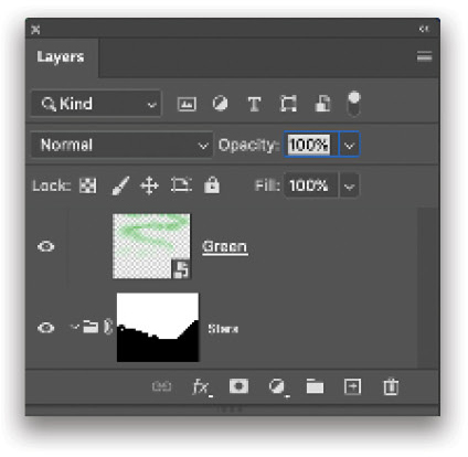
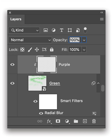
Step 12: Create a new layer group called “Auroras,” and a new blank layer inside this group called “Green.” Place this group folder above the Stars group folder in the Layers panel of your main document.
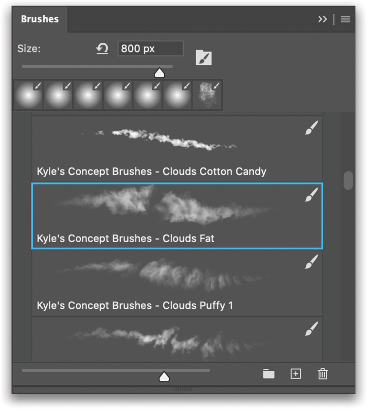
Step 13: Switch to the Brush tool, and open the Brushes panel (Window>Brushes). Click on the flyout menu at the top right of the panel, and select Get More Brushes. In the Adobe web page that opens, sign in with your Adobe ID, and download the Concept set of brushes. After the .abr file downloads, double-click it to install it in Photoshop.
Expand the Concept set in the Brushes panel, and grab a Kyle’s Concept brush such as the Clouds Fat brush to begin painting in the main colors. Most brushes with variation (even a spatter brush) will do the trick here. Just make sure that the brush doesn’t have any identifiable pattern to it. Definitely experiment here.
Step 14: Select a neon-greenish for the Foreground color. For those with tablets, use pen pressure for dynamics, and those without fancy-pancy hardware, lower the Flow in the Options Bar once you have a brush selected.
For this part, look up some actual northern lights example images for ideas for where you might add the auroras before you apply the blur effect in the following steps. The general strategy is to start small for the ones in the distance, and to make your brush larger and more encompassing with the Right Bracket key (]) as it gets closer to being directly overhead. Also, paint with variation of Opacity in the Options Bar.

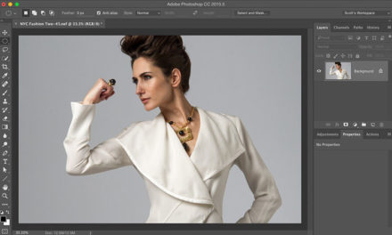
Step 15: Once you have the general shape of where the green will be, it’s time to add the crucial effect, but first, turn this layer into a smart object so you can nondestructively play with this effect after you apply it to the layer. Right-click near the layer’s name in the Layers panel and select Convert to Smart Object. Now you’re working like a nondestructive pro!
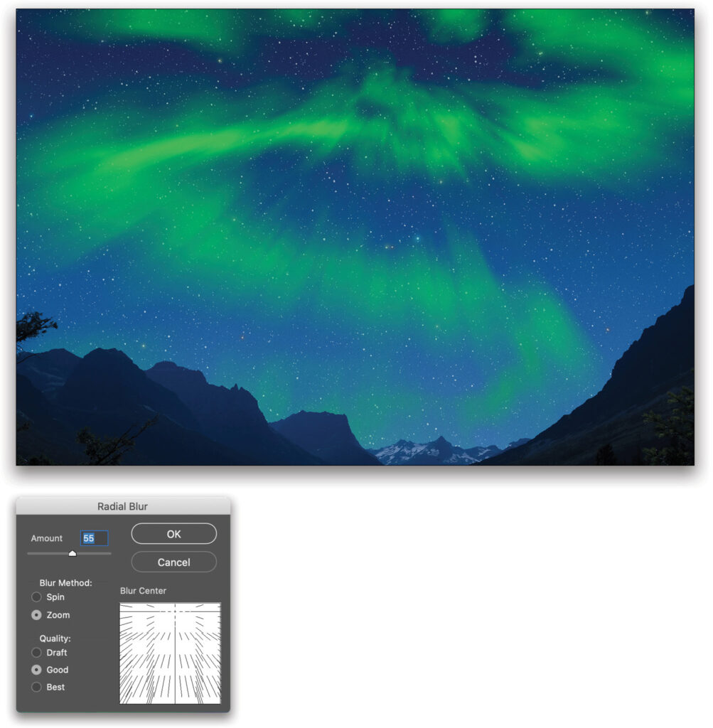
Step 16: Next, go to the Filter menu and choose Blur>Radial Blur. In the dialog, start with these settings: Change the Blur Method from Spin to Zoom and set the Amount to 55. Since we want the effect to blur upward into the sky rather than boldly engaging in warp speed dead ahead, click-and-drag within the Blur Center box until the center is near the top of the box. Click OK to engage aurora borealis!
Tip: Try different blurs for a more custom effect such as Path Blur within the Blur Gallery, or even a simple vertical Motion Blur. The possibilities are as endless as the actual auroras, so have fun experimenting with this part. Also, for better depth, try separating out this effect on two layers, one for closer auroras and one for more distanced ones. Apply a smaller blur Amount on auroras further in the distance, and a higher blur Amount for auroras that are closer to our vantage.
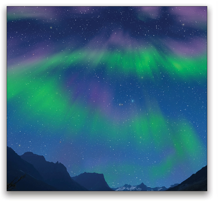
Step 17: Bring in some custom coloring by painting with purples. Specifically, we want to paint onto the current aurora blur effect, changing some of the greens to purples, nondestructively. Do this by first creating a new blank layer named “Purple,” and place it directly above the Green layer. With the Purple layer active, clip it to the Green layer with Command-Option-G (PC: Ctrl-Alt-G).
Step 18: Select a bright purple color and switch your Brush tool over to a basic soft round brush with a 30% Flow in the Options Bar. This will allow you to make multiple passes for more color application and control (if you don’t have a tablet). Paint sparingly on the top edges of the blurred green at first, and thicken the color once you see the effect for which you’re going.
Again, take a look at some inspirational examples of real aurora coloring to help guide where you’d like to see more purple in your own image. Go wild and try a few variations; you can always take down the intensity using the Purple layer’s Opacity setting.
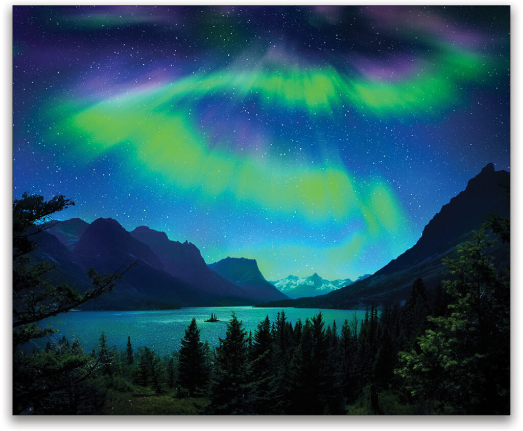
Final Global Adjustments
Once you have an aurora effect you’re enjoying, you can now apply some final effects for coloring, saturation, and other global adjustments to really make things pop and sync with the rest of the image. We deliberately kept the image a bit flat up to this point to resemble an image straight from the camera, so we’re going to need some contrast to start. And if you added a decent amount of greens or purples in the sky, you’ll definitely need to have some of that coloring across the landscape features, so let’s do this!
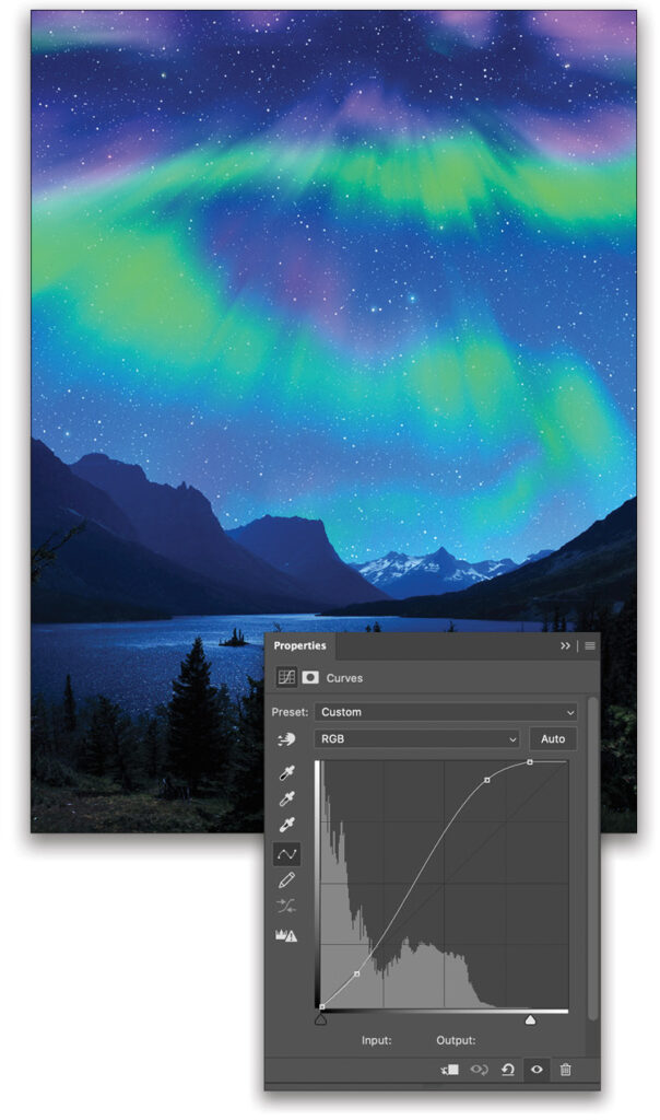
Step 19: Begin with a new Curves adjustment layer inside a layer group above everything else in the layer stack. Name this group “FX” or something helpful for your own reference. Within the Curves adjustment, click to add two control points, one for keeping the darks dark (as it is nighttime after all), and the other for boosting the highlights, as the nighttime effect left things dynamically lacking in general. Each image is different, so do this to your own preference. Also, feel free to create several Curves adjustment layers, and paint in the effect where it’s needed around the image by using their accompanying masks. Just be careful to keep it looking like night and not day again!
Step 20: Now it’s time to paint in some green and purples on the land or water, depending on what you created in your own sky masterpiece. Do this by creating a new layer above the Curves adjustment layer(s) and change its blending mode. While the Color blending mode will literally change the color of everything to the new color you paint, sometimes it’s preferable to change the color and brighten things up a bit with nondestructive dodging, which means changing the blending mode to Overlay in this case. Again, each image is different, so try a few blending modes here for the right look. Paint with a soft brush set to green at a low Opacity here.
Step 21: After playing around with Curves and coloring, it’s a good idea to go in with one last dodge-and-burn pass to make sure you have the right eye-flow and general balance. Create a new layer and change its blending mode to Overlay once again. This time paint with a low Opacity (below 10%) large (1000 px or more) soft round brush using black for darkening and white for lightening. Less is definitely more at this stage; just add that final gentle touch that helps it all come together with better balance and an intentional eye-flow. And with that, you should be done and ready for your next experiment!
Only the Beginning
Remember, this is all just the beginning of what you can do when creating fantastic skies from scratch, so put on your experiment hat (tinfoil is making a comeback, right?) and see what you can come create. For more on compositing landscapes or more on fun lighting effects, definitely explore some of my classes on KelbyOne to gain greater depth into these subjects. In the meantime, have fun playing in the sky!
This article originally published in the October, 2020 issue of Photoshop User magazine.
About Photoshop User and KelbyOne
Photoshop User magazine comes out digitally 12 times a year and is part of KelbyOne, the leading educational resource for Photoshop, Lightroom, and photography. Pro members have access to more than 900 video courses and 100 back issues of Photoshop User. To learn more about KelbyOne, click here.