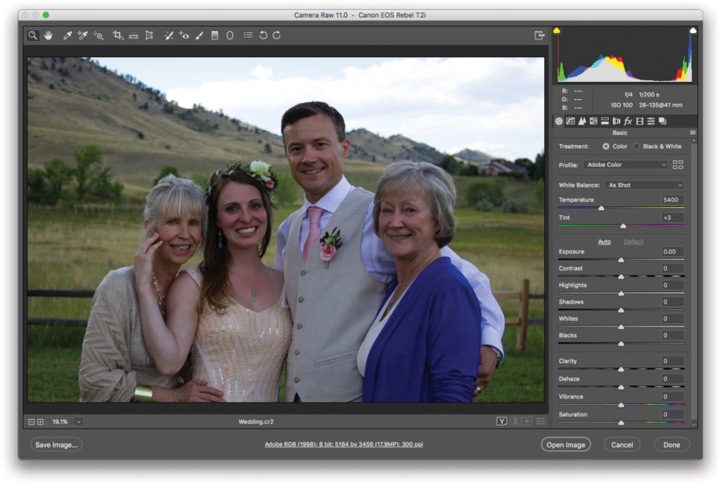
An easy way to correct tone and color in your photos is to use the Adobe Camera Raw (ACR) plug-in that comes with Photoshop. Its powerful, yet easy-to-use sliders make adjusting photos a breeze. ACR is a nondestructive editor, too, so you won’t harm your original. The following steps work with RAW files, JPEGs, and TIFFs. Tip: As an added bonus, you can use much of this workflow in Adobe Lightroom, too.
Step One: If the photo is in RAW format—the unprocessed information the camera recorded—summon ACR by double-clicking the file’s icon on your hard drive. Alternatively, locate the image thumbnail in Adobe Bridge—an excellent image browser and organizational tool—and choose File>Open in Camera Raw, or press Command-R (PC: Ctrl-R). You could also Right-click the thumbnail and choose Open in Camera Raw from the resulting menu.
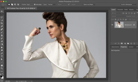
Note: You can open ACR as a filter in Photoshop, too. To do that, activate the image layer in your Layers panel and choose Filter>Convert for Smart Filters, followed by Filter>Camera Raw Filter. The caveat is that you lose the ability to apply adjustments to more than one photo, as described later in this column.
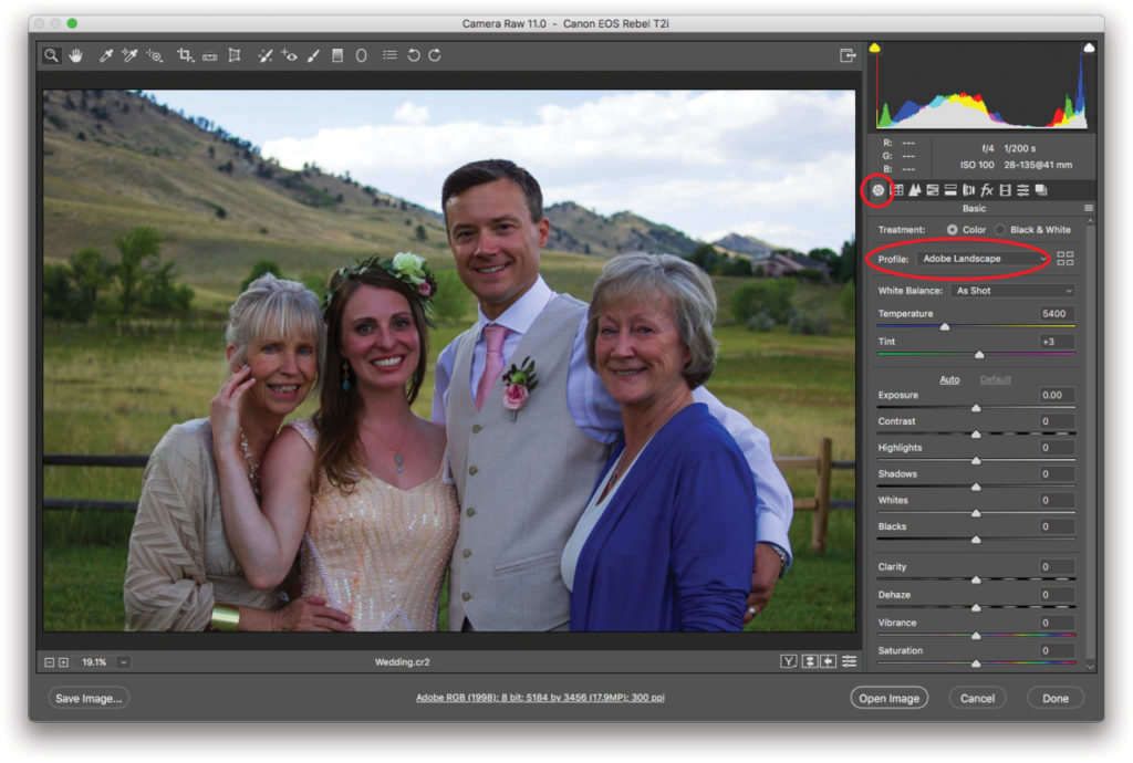
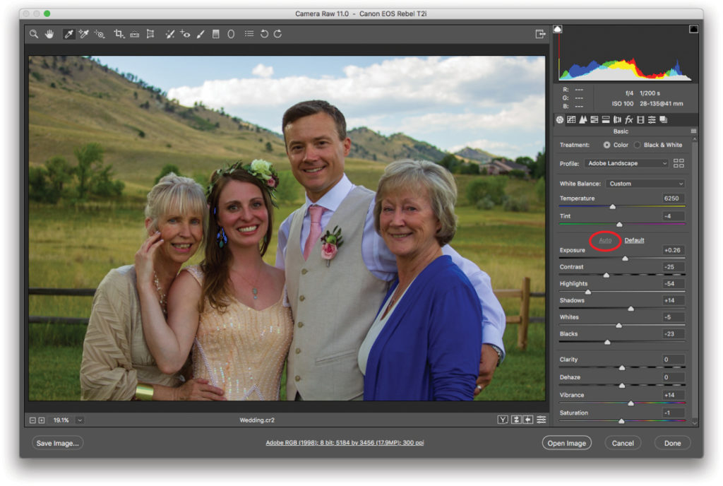
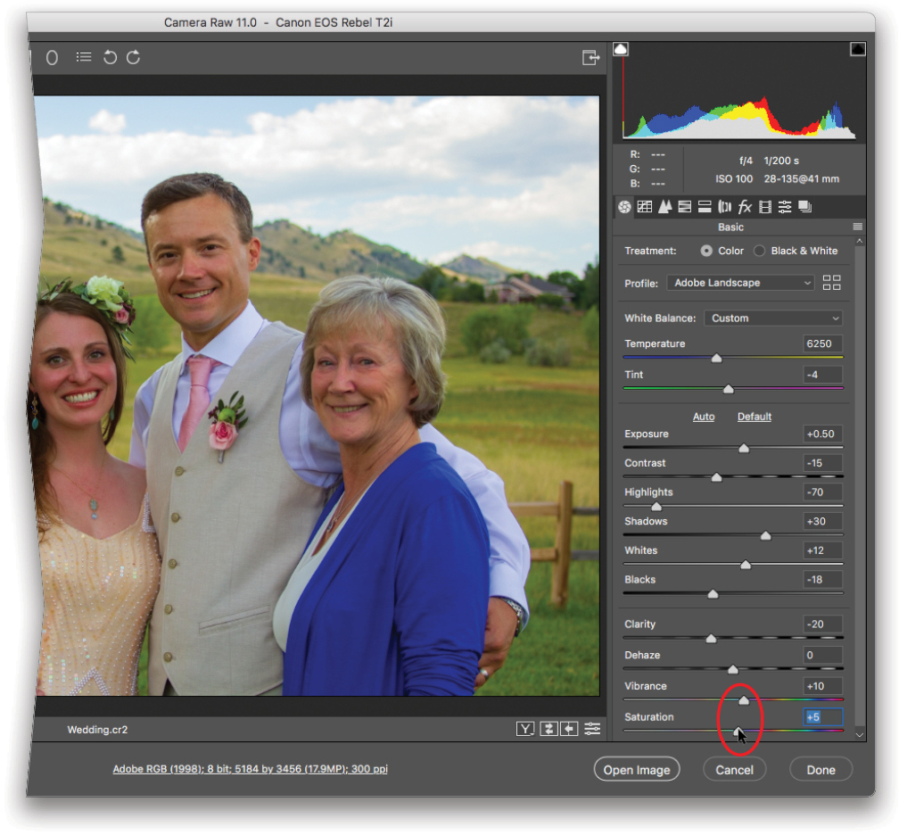
Step Two: In the Basic panel (circled), locate the Profile drop-down menu (also circled) and take a spin through the presets to see which one looks the best (Adobe Landscape was used here). Each preset produces a subtle shift in color and contrast. They’re worth trying on a few of your own photos to see which one works best for your camera and the type of photos you take.
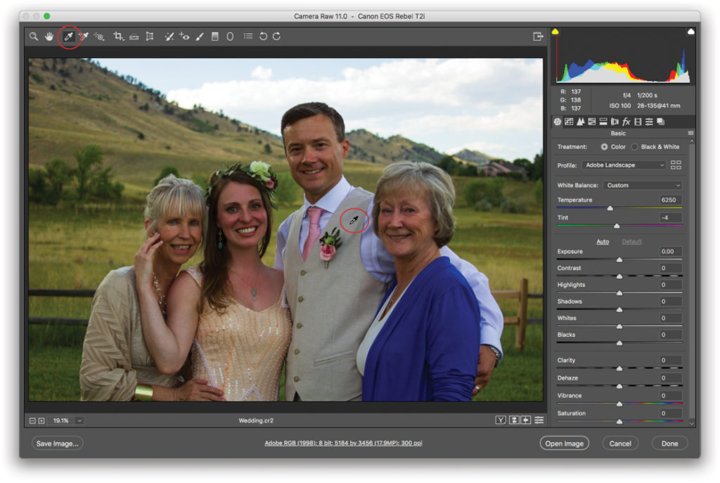
Step Three: White balance refers to the color of light in your photo. Different kinds of light—fluorescent or tungsten lighting, overcast skies, and so on—lend a different color cast to the photo. To correct it, press I to grab the White Balance tool (circled here). In the photo, click an area that should be neutral in color, such as a light or medium gray. Keep clicking until it looks good to you. If you’d like, fine-tune the color of light using the Temperature and Tint sliders.
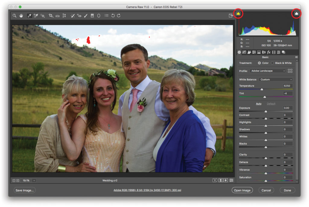
Step Four: In the Histogram panel at the upper right, turn on the shadow and highlight clipping warnings by clicking the triangle at the histogram’s upper left and right (both circled here). When you do, both buttons sport a white border. Clipping refers to shadows and highlights that have been pushed to the point where they’re pure black and pure white and thus stripped of all detail (pure black and pure white are also outside of what’s reproducible in print). Detail loss is a bigger problem in highlights because our eyes aren’t used to seeing much detail in shadow areas. By turning on the clipping warnings before you adjust tone, ACR shows you clipped areas in the image preview: Clipped shadows appear bright blue, and clipped highlights are red. In this image, there’s some highlight clipping in the clouds.
Step Five: To adjust tone, click the Auto button (circled). When you do, ACR sets the sliders for you, which you can then tweak to your liking. The Auto button often does a good job adjusting your image, and you may just need to fine-tune the sliders (explained next). If the auto adjustment is too far off, however, undo it by pressing Command-Z (PC: Ctrl-Z), and then manually adjust Exposure and Contrast. Alternatively, click the word Default to reset the sliders to 0.
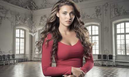
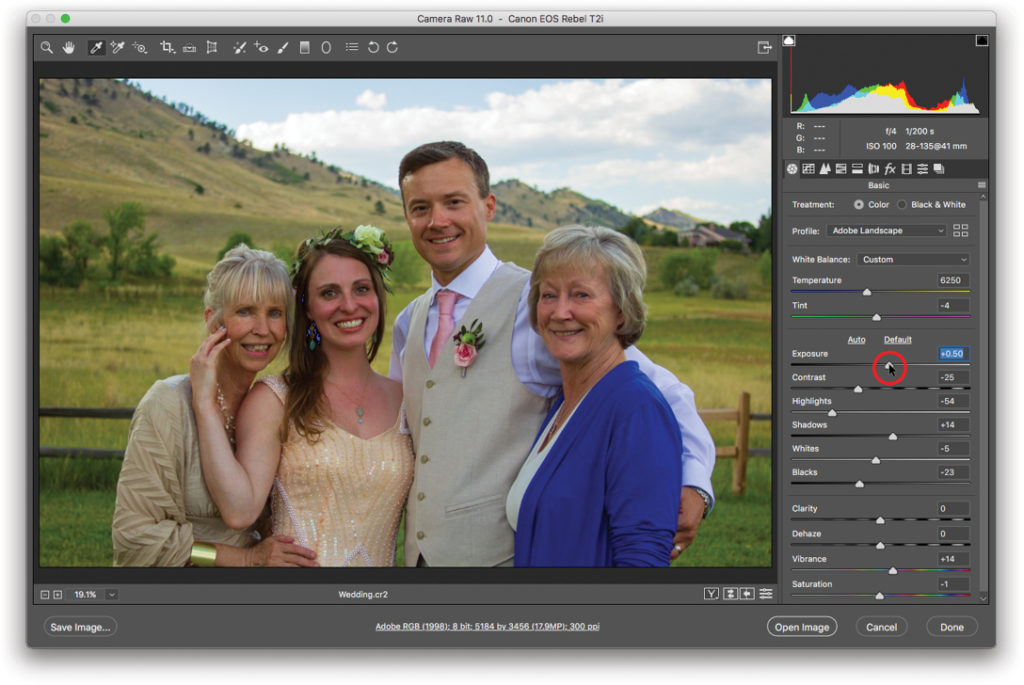
Step Six: Exposure is determined by how much light your camera’s sensor captured and is measured in f-stops (which indicate how much light your camera’s lens lets in). In fact, the slider values simulate stops on a camera—setting it to +1.00 is like exposing one stop over the metered exposure in-camera. In ACR, the Exposure slider affects midtone brightness (in portraits, that’s skin tones). Drag it to the right to increase brightness, or drag it leftward to decrease it. In this example, Exposure was dragged rightward to +0.50.
Tip: If you point your cursor at the middle of the histogram, ACR highlights the tones affected by the Exposure slider in light gray and your cursor turns into a double-sided arrow that you can drag left or right. You’ll see the Exposure slider change as you drag.

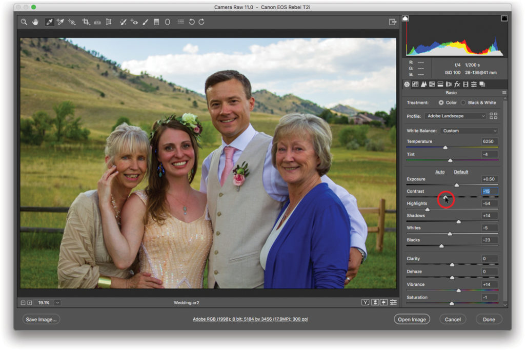
Step Seven: Contrast controls the difference in brightness between the darkest and lightest tones in your picture. When you drag this slider to the right (increasing contrast), you stretch out the histogram’s data, creating darker blacks and brighter whites. If you drag this slider to the left (decrease contrast), you scrunch the histogram’s data inward, shortening the distance between the darkest (pure black) and lightest (pure white) endpoints, making the photo’s tones look flat or muddy. Here contrast was changed to –15.
Step Eight: Skip ahead to Clarity to adjust edge contrast. If you’re working on a landscape image, drag the Clarity slider rightward to increase edge contrast and add depth to your photo. If you’re working on a portrait, drag the slider leftward to roughly –20 for a subtle softening of skin details.
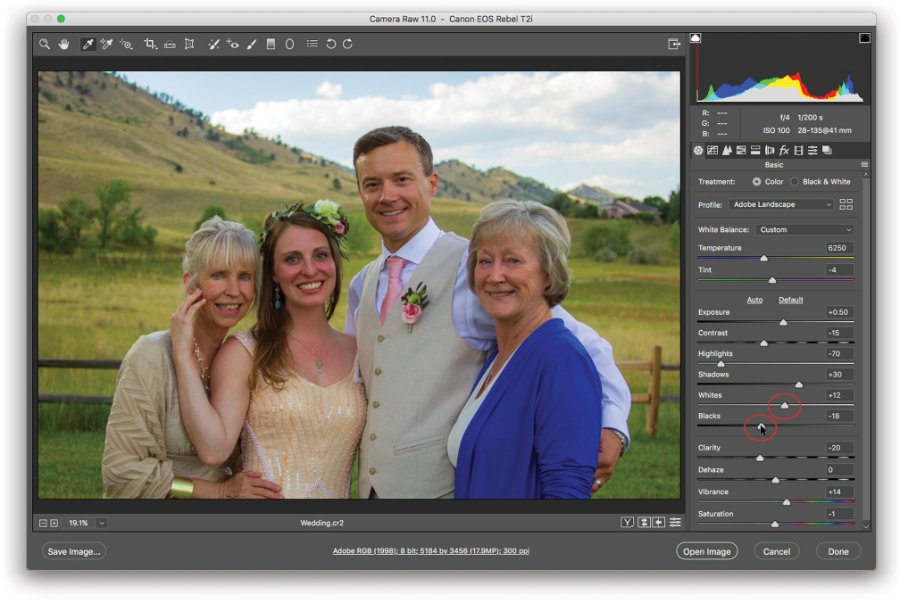
Step Nine: If necessary, adjust Highlights and Shadows to recover details in areas that look too light or too dark, respectively. The Highlights and Shadows sliders affect your 3⁄4 and 1⁄4 tones, or rather, the tones midway between the midtones and the whites, and the tones midway between the blacks and the midtones. Drag the Highlights slider left to darken only the highlights, or drag it right to lighten them; the shadows and darker midtones remain unchanged. The Shadows slider works the same way: Drag it left to darken only the shadows, or drag it right to lighten them; the highlights and lighter midtones don’t change. Highlights here are set to –70 and Shadows to +30.

Step 10: If necessary, adjust the Whites and Blacks sliders to control how dark your blacks are and how light your whites are, to fix clipping warnings, or both. The Whites and Blacks sliders let you ensure that you actually have some pixels that are white and black in your photo, meaning you’re using the full dynamic range of tones possible. They’re especially handy to use if you end up with a flat, muddy image because you were aggressive with the Highlights and Shadows sliders in order to recover lost detail. Of course, you can also use these sliders to eliminate clipping warnings and to ensure your tones are within the realm of what can be printed. In this example, Whites is set to +12 and Blacks is set to –18 to eliminate some shadow clipping in the bride’s hair.
Tip: To see which tones the Whites and Blacks sliders affect, point your cursor at the far right and left sides of the histogram, respectively.
Step 11: To boost color, adjust Vibrance, Saturation, or both. Think of the Vibrance slider as an intelligent Saturation slider. When you drag it rightward, ACR boosts less saturated colors to match those that are already saturated. By contrast, the Saturation slider saturates all tones. Here Vibrance is set to +10 and Saturation is set to +5.
Tip: Vibrance is aggressive with blues and greens (skies and foliage), yet it’s cautious with oranges because they’re commonly found in skin tones. So if you’re trying to boost the colors in a photo of a sunset, you may end up adjusting both the Vibrance and Saturation sliders.
Step 12: Now let’s reduce noise in the image. Open the Detail panel (circled) and locate the Noise Reduction section. From the Zoom percentage drop-down menu at the bottom left of the window (also circled), choose 100%. Press H to grab the Hand tool (circled) and drag atop the photo to reposition it and bring a noisy area into view. Here the Luminance slider is set to 20. The Luminance and Color sliders can remove both luminance and color noise, though they do so by blurring your picture, so use the minimum amount necessary.
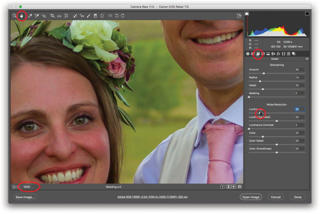
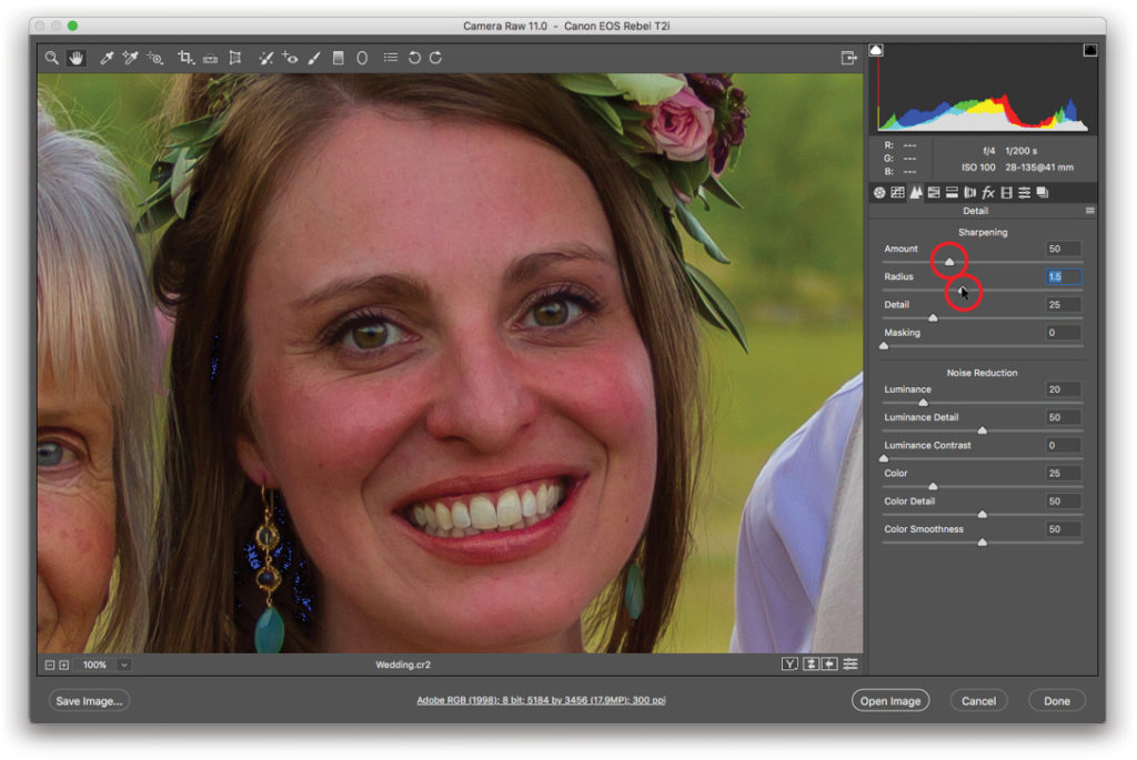
Step 13: It’s time to sharpen. While you’re still viewing the image at 1:1 (100%), drag the image to bring an important area into view, such as the face in a portrait. By default, ACR applies an amount of 40, which was increased to 50 here. Much like sharpening a knife in your kitchen accentuates its edge, sharpening an image in ACR accentuates the edges it contains (that is, places where light and dark pixels meet). This adjustment works by lightening light pixels and darkening dark pixels wherever they appear next to each other. Radius determines sharpening width by telling ACR how many pixels on either side of the edge pixels it should analyze and therefore lighten or darken. Use a higher value for portraits (say, 1.5) than for photos that have a lot of detail (say, 0.8).
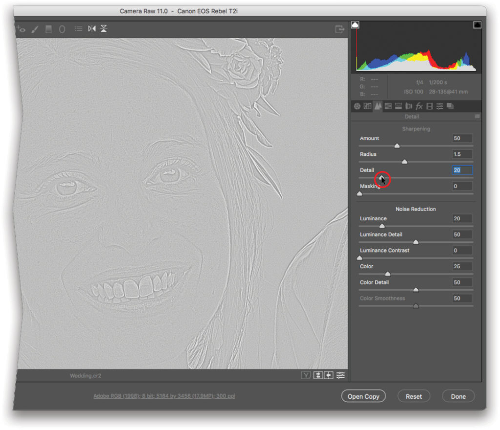
The Detail slider lets you control which of the more detailed edges ACR sharpens. It’s impossible to see any difference in your photo as you adjust the Detail slider; however, if you Option-drag (PC: Alt-drag) it, your photo turns gray and the sharpened areas appear in light gray. A setting of 20 was used here.
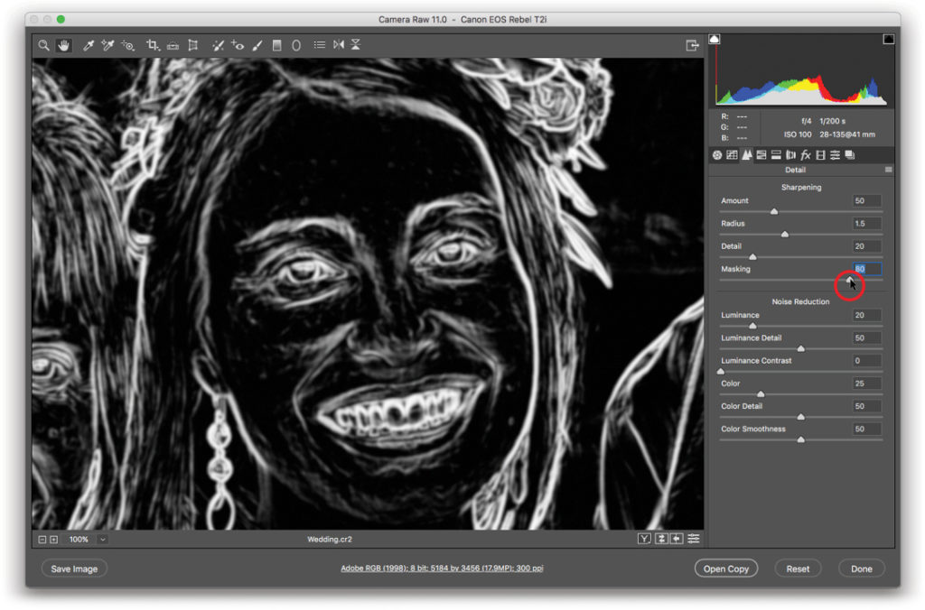
The Masking slider lets you restrict sharpening to only the higher-contrast edges. To use it, Option-drag (PC: Alt-click) the Masking slider, and ACR displays sharpened areas in white and non-sharpened areas in black. As you drag the slider rightward, ACR sharpens fewer areas. A setting of 80 was used here.
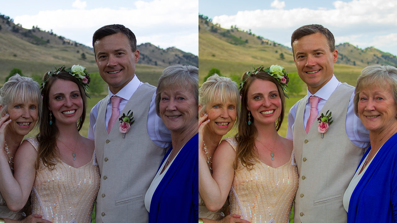
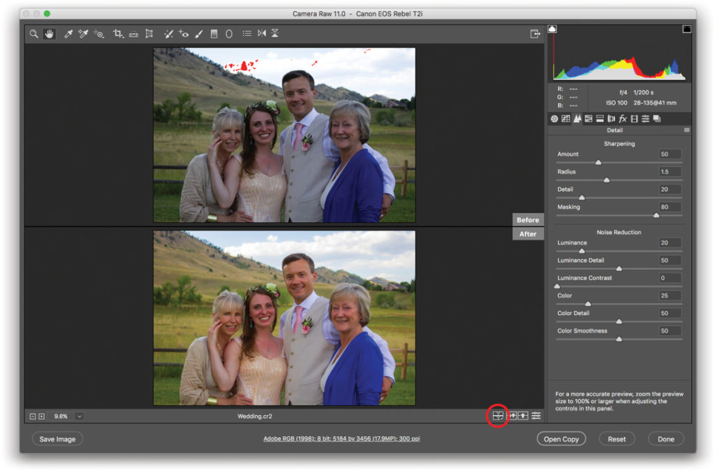
Step 14: From the Zoom menu, choose Fit in View. Press the Q key on your keyboard to cycle through various before and after versions of your photo or click the icon circled here. As you can see, this image has come a long way, baby!
Step 15: When you’re finished, click Done. To open the image in Photoshop, click Open Image.
If you have several photos to correct that were captured under the same lighting conditions, you can save time by opening multiple photos in ACR and then selecting them in the Filmstrip on the right and correcting them all at once. Alternatively, launch Adobe Bridge and Right-click the thumbnail of an image you’ve corrected in ACR. Choose Develop Settings>Copy Settings. Select other thumbnails, Right-click one of them, and choose Develop Settings>Paste Settings. Select the settings you want to paste and click OK.
Big thanks to Photoshop Hall of Famer, Jack Davis, who originally taught me this workflow. Until next time, may the creative force be with you all! n
This article originally published in the February 2019 issue of Photoshop User magazine.