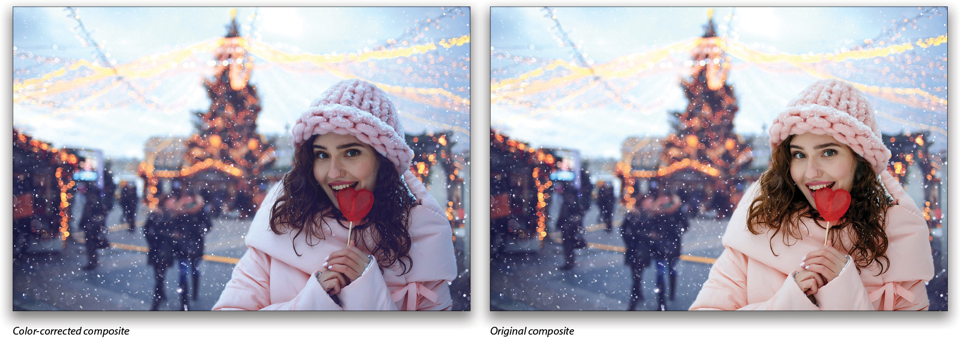
One of the trickier tasks in compositing is matching colors from images shot under different lighting conditions. This is compounded if you have less-than-perfect working conditions for your monitor or workspace (and even worse if you’re just a teensy bit color blind, like me). Fortunately, we can make use of some really simple techniques to help out our eyes.
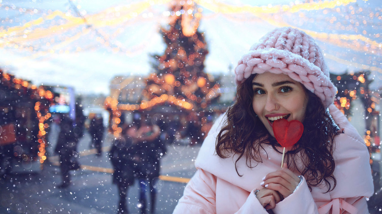
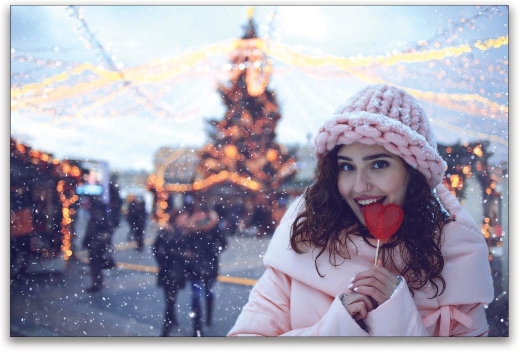
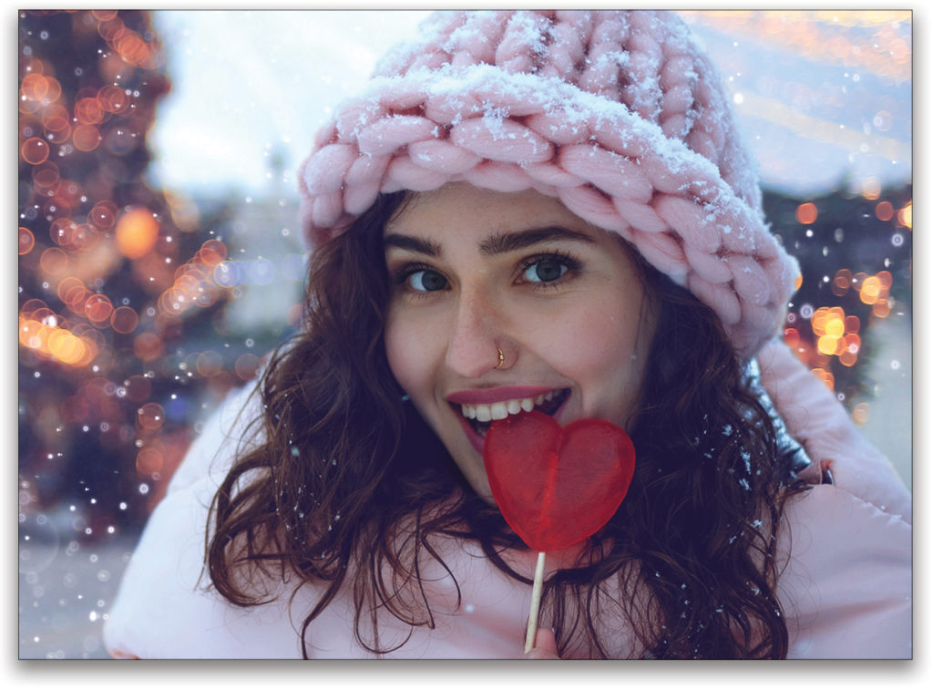
I’ve replaced the background behind this model, which has a roughly similar dynamic range and quality of light; however, her shadows and colors are far enough off that I need to do some manual tweaking in both areas. There are a few ways to tackle this problem, but I want to show you a nifty trick that falls into the category of “helper layers,” which are meant to assist you in focusing on specific elements of your image.
If you’d like to download the low-res watermarked versions of these images to follow along, click this link for the portrait of the woman, log in with your Adobe ID, and click the Save to Library button. Double-click the image in the Libraries panel (Window>Libraries) to open it in Photoshop. And then click here to download and open the background image. Using the Move tool (V), drag the portrait image into the background image, and then use your favorite selection technique to select the woman (you can try Select>Subject for a quick selection). Once the woman is selected, click the Add Layer Mask icon (circle in a square) at the bottom of the Layers panel to mask out the portrait’s original background, revealing the background on the layer below. Reposition the portrait in the image as needed, double-click its name in the Layers panel, and rename it “Model.”
Step One: In this example, I’m going to start by using Curves to help match the overall value, without regard to color. That means I want to see just the luminosity of both images so I’m not distracted trying to do too much at once.
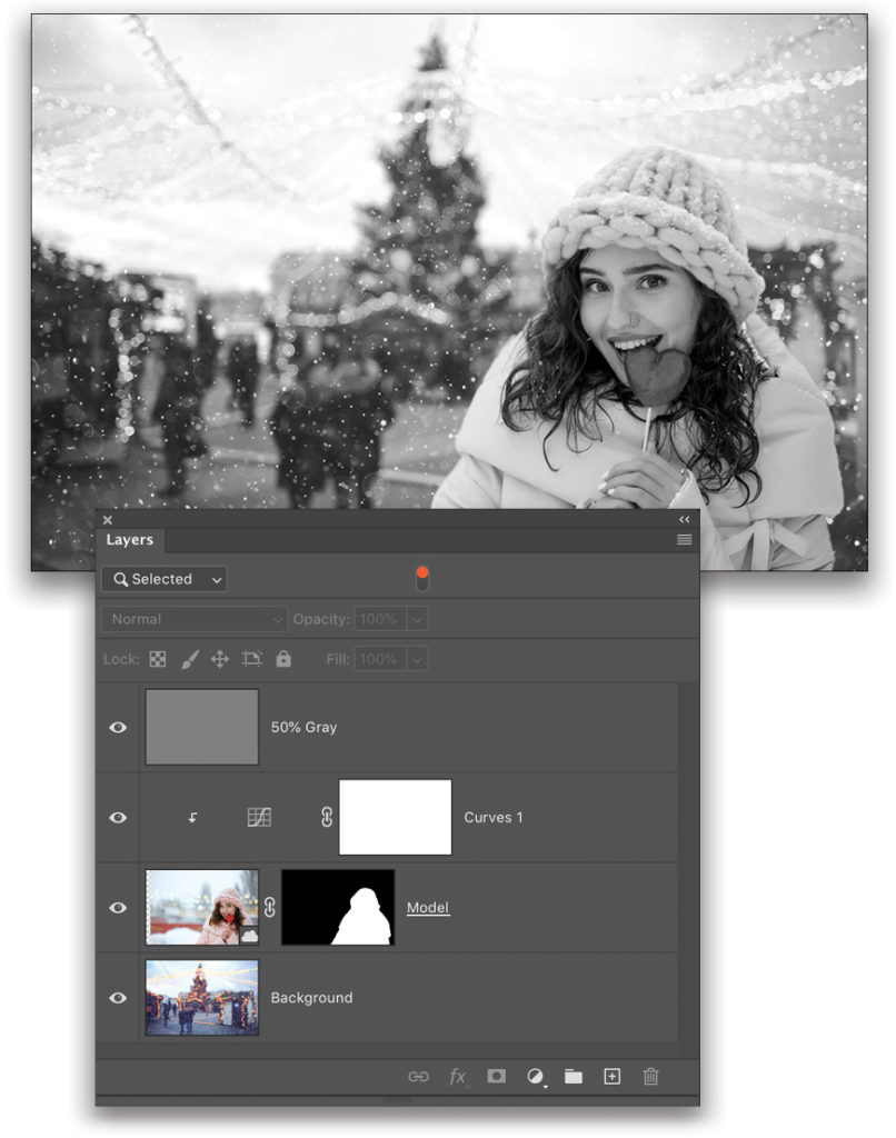
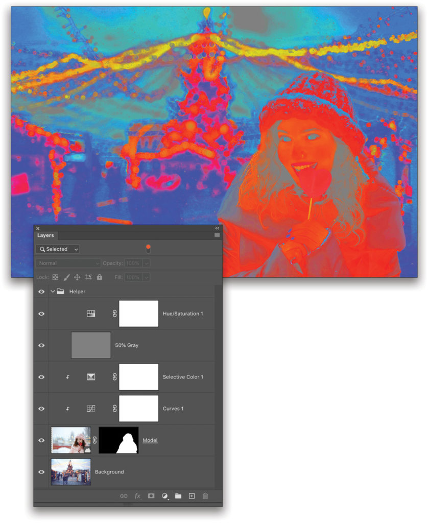
Add a Curves adjustment layer (Layer>New Adjustment Layer>Curves) above the two image layers, and clip it to the Model image layer (Option-Command-G [PC: Alt-Ctrl-G]). Now, create a new layer above the Curves adjustment, press Shift-Delete (Shift-Backspace) to open the Fill dialog, select 50% Gray in the Contents drop-down menu, and click OK to fill the new layer with 50% gray. Set the gray layer’s blending mode to Color, and rename it “50% Gray.”
The Color blending mode takes the color of the blend layer (the one on top) and mixes it with the saturation and brightness of the base layer underneath. Since 50% gray is neutral, there’s nothing to blend, so you’re left with a straight grayscale version of your photo.
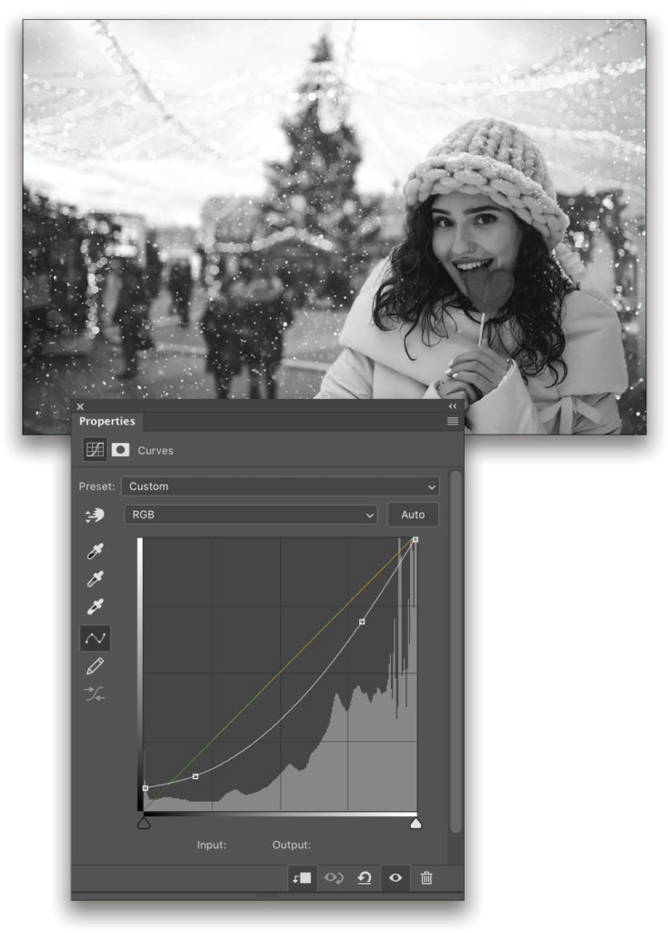
Step Two: Now you can go back to the Curves layer and start making adjustments in the Properties panel (Window>Properties). Notice that the background doesn’t have any solid black, but the model does. We need to increase the left control point of the curve just a little at a time to lighten the deepest areas under the model’s hair. Add another control point along the curve near the left and drag it down to bring down the overall brightness. We also want to reduce her peak brightness below that of the sky, so add a control point on the right side, and lower that point as well. The curve for this image is shown here.
For a plain black-and-white conversion, the match is pretty good. This means the colors we adjust next are going to have a similar level of saturation and brightness. It’s worth taking some time here to get as close as possible to a match, so in some cases you may need to add a dodge-and-burn layer for spot corrections.
Step Three: To deal with the color, let’s reuse the gray layer, but this time set its blending mode to Luminosity. Just like Color replaced the base layers with gray values, the Luminosity blend takes the colors from below and blends them with neutral gray. That leaves us looking at a color map with no brightness information. (If you used a dodge-and-burn layer, put it beneath the gray helper layer.)
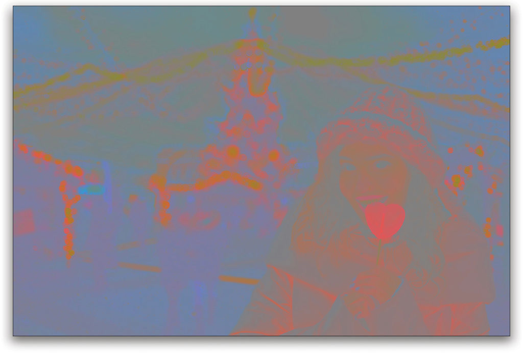
Step Four: This can be difficult to see well, especially in images that have low saturation to begin with. We need to boost it by adding a Hue/Saturation adjustment layer (Layer>New Adjustment Layer>Hue/Saturation) at the top of the stack, and moving the Saturation slider in the Properties panel nearly all the way to the right (around 85%). Your goal isn’t to max everything out, just to boost the colors so you can see them easily. With the Hue/Saturation layer active, Shift-click the 50% Gray layer so they’re both selected, and press Command-G (PC: Ctrl-G) to place them in a layer group. Rename the group “Helper.”
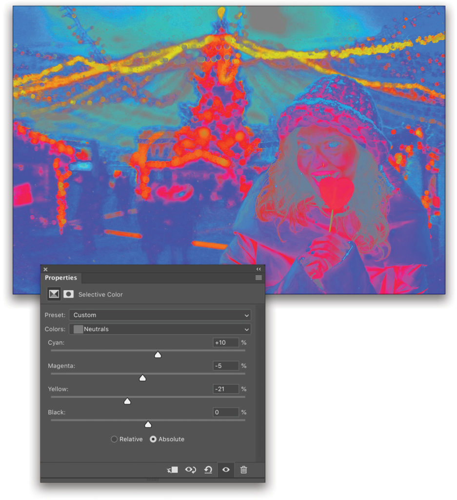
You can see that the model’s overall colors are very different from the background. Let’s add a Selective Color adjustment (Layer>New Adjustment Layer>Selective Color) above the Curves adjustment and clip it as well.
Step Five: To deal with the color, we have to pay attention to areas of similar value, and try to get those areas close. The usual advice is to start with the neutral areas. With the Selective Color layer active, use the Colors drop-down menu in the Properties panel to choose the Neutrals color sliders, and begin working the sliders to get a feel for what ranges are being affected most dramatically. The model’s jacket is a good point of reference, but there’s no exact match in the scene for comparison.
The people to the left of the model are fairly dark, but there’s a definite blue cast in that area. Here’s where a little color theory is helpful, because the Selective Color sliders are all in CMY colors. To add blue, we need to remove yellow by dragging the Yellow slider to the left. That leaves some Magenta and Cyan to manage.
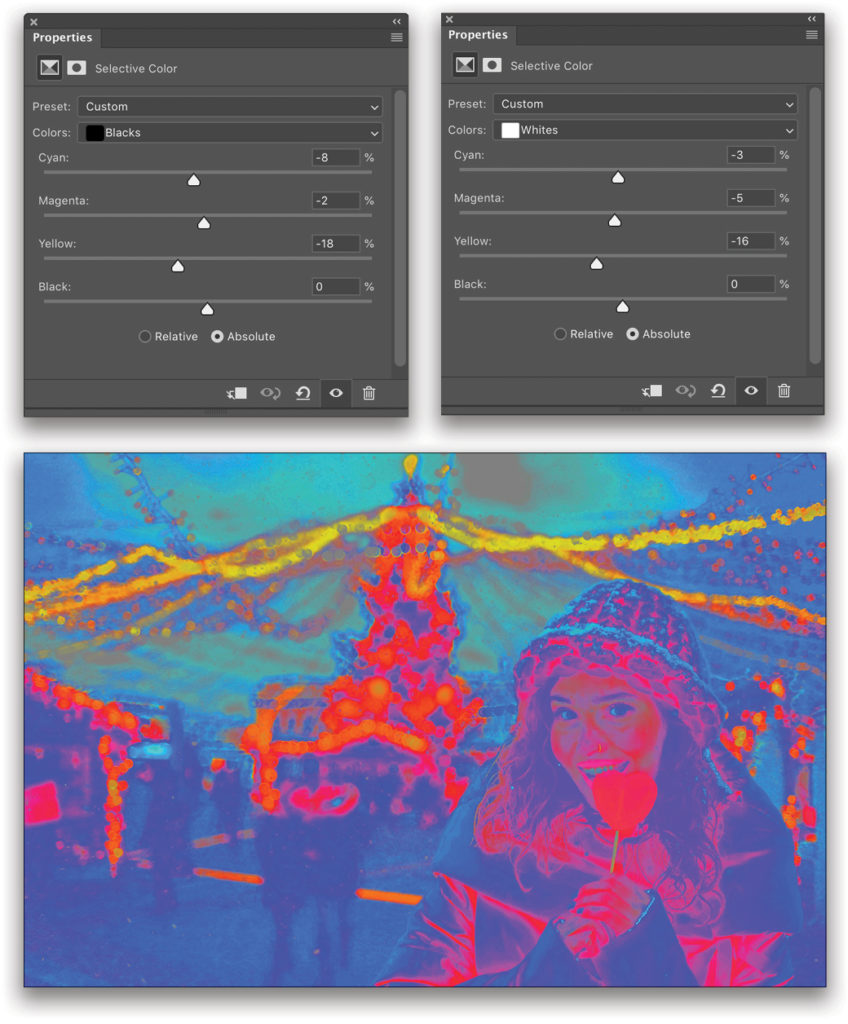
Step Six: The result in this area is acceptable, so it’s time to move on to the shadows and highlights. Start with the Blacks in the Colors drop-down menu in the Properties panel, and take a look at the shadow areas. Black tones are mostly in her hair; dropping the Yellow a bit gets us close, and a slight decrease in Magenta and Cyan finishes off the dark areas.
Meanwhile, the whites on the edges of her jacket and hat seem to be more neutral than having any specific color. They’re similar to the highlight areas of the sky in the background, but I want to give them just a little of the overall cast by selecting Whites in the Colors drop-down menu and adjusting the sliders.
The final color map should appear to blend in reasonably well with the surroundings, though not necessarily match exactly. This differs from image to image, and frequently depends on where the overall tone in an image comes from. If it’s a natural result of available light, then it’s likely the highlights and shadows will vary somewhat and depend on reflections, etc. If the result is from processing, then the cast tends to be more uniform across the dynamic range (though not always!), and you’ll have to be a little more careful in distinguishing highlights from shadows. In the end, you need to use your best judgment!
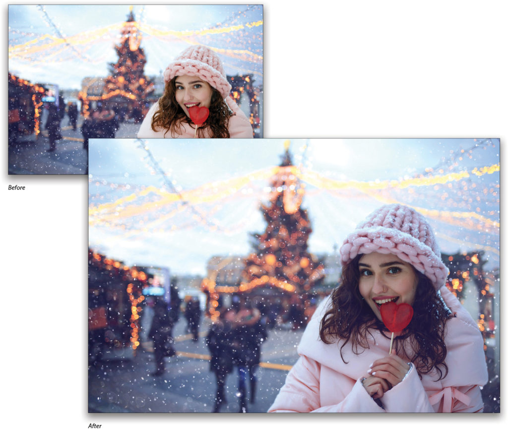
Step Seven: So far, the images are much closer in color values than when we started. I’ve intentionally ignored the skin tone up to this point because, as viewers, we’re more forgiving of “correct” skin tones regardless of surrounding colors, so we can deal with her skin last. Turn off the Helper group by clicking its Eye icon in the Layers panel to see the results. Here’s what we have so far.
Step Eight: The model certainly looks more like she belongs in the photo, but that skin really is kind of a distraction, no matter how realistic it might be under these lighting conditions. Switch to the Brush tool (B), grab a large, soft, round brush, set the Opacity and Flow to 30% in the Options Bar, and press X until the Foreground color is black. Then, just lightly dab her face and hands on the Selective Color adjustment layer’s mask. This lets some of the original color back in, giving a more natural feel.
This technique is very sensitive to the starting images, so unless you’re using the exact same images, there’s no recipe to follow. It also matters which image you’re using as your baseline for adjustments. Had I tried to match the background to the model, the values would have been extremely different.
The big things to take away here are using the 50% gray layer as a visual moderator for contrast, range, and color, and remembering a bit of color theory. Of course, you can also use Color Balance or other adjustment layers to help with matching, but I do find that Selective Color’s Whites, Neutrals, and Blacks regions give me a reasonable amount of control. And naturally, you don’t have to use the helper layers every time you make a tweak. You may find that once you’ve completed the matching, you want something a little different—go back and fiddle to your heart’s content.
If you want more precision and control, use the Color Sampler tool (nested below the Eyedropper tool [I] in the Toolbar) and drop a few control points around the image. I like to limit myself to two at a time, one in the base area and one in the target adjustment area, and then drag them around the image as needed. Color samples aren’t tied to a specific layer, so the readings you get in the Info panel (Window>Info) are based on the visible canvas. In this technique, I tend to deploy them at the end after I’ve turned off the helper layers, which helps me with the perceptual finish. If you’re using the Selective Color adjustments, you can set the color sample readouts in the Info dialog to give you CMYK instead of RGB. To change the readout of a color sample, click on the Eyedropper icon below the sample point you want to change (#1, #2, etc.) in the Info panel, and select the color space in the drop-down menu.
Finally, one more helper layer can be added: the Invert adjustment (Layer>New Adjustment Layer>Invert). Toggling this off and on now and then can really help alleviate eyestrain, and highlight trouble areas that may otherwise be hidden. I like using Invert because some of the darker, super-saturated colors can be tough to see otherwise, so I sometimes work with Invert turned on while fine-tuning.
This article originally published in the November/December 2019 issue of Photoshop User magazine.


Jessica, I tried to do this and did not get very far. I clicked on Save to Library and never saw in the image in PS. I have desktop PS but don’t subscribe to the cloud. Would that explain why the image didn’t come to me?
Thanks.
Hi, Hal! If you’re not connected to the cloud, you’ll want to download the watermarked image by using Adobe Stock’s “Download Preview” button and following any prompts (like logging in if you have not already), rather than adding the image to your library. Then, just open the image in Photoshop from wherever you download the file to on your computer. The downloaded image should show up wherever you have your browser set to store downloaded files. This may be your Downloads folder, desktop, or another folder you have pre-selected. Hope this helps!