Ansel Adams said, “A photograph is usually looked at—seldom looked into.” I agree 100 percent! In this article, we’ll look into a few of my favorite photographs, analyzing them as to what I feel makes them good photographs. The colors correspond to the analysis you’ll see throughout this article.
Of course, this analysis is subjective, like everything else in life. I’m sharing this stuff with you so perhaps you’ll take a closer look at your own photographs and think more deeply as to what makes a good photograph.
Girl with a Pearl Earring
Some of you have seen (looked at) my photo rendition of Vermeer’s Girl with a Pearl Earring.
Now, let’s take a look into the photograph. Here’s my analysis (right).
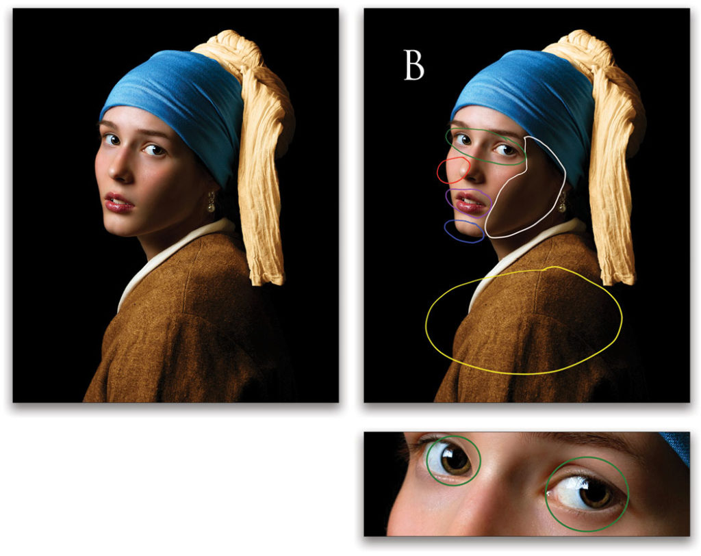
White: The shadow on the model’s face adds a sense of depth to the picture. Tip: If you want an interesting portrait, don’t light the subject’s entire face.
Blue: The model’s strong chin is totally separated from the background, making her face stand out from the black background.
Red: Her right cheek is acting as a background for her nose. If I’d photographed the model from a position more to my right, or if she’d been turned more to her right, the tip of her nose might have been “sticking off” her face in the photograph, which would have looked unflattering.
Purple: Her lips are slightly parted, adding to her all-important gesture, and sense of interacting with the camera/viewer.
Yellow: The model’s left shoulder is facing the camera. A side view, or slightly side view, of a subject is usually more interesting than a straight-on view.
B stands for the black background. This makes the model stand out in the frame, because she’s well lit, with one Canon speedlite in a Westcott Apollo softbox.
Green: Even though the eyes are the most important element in this photograph, I saved this analysis for last to see if you noticed two very important things: (1) The catchlights in the subject’s eyes make her eyes sparkle. And, (2) check out the size of her pupils. They’re very large and “inviting,” as opposed to small pupils that are not as inviting. I used a speedlite in my dark studio, so the pupils didn’t have time to close down during the exposure. The study of how the size of the pupils affects the impression of the subject on the viewer is called “pupillometrics.” As an FYI, Cleopatra used a mixture of water and belladonna to enlarge her pupils to create what some refer to as “bedroom eyes.”
Llanrwst
I made this HDR image early one morning in Llanrwst, a small town in the Conwy Valley in North Wales.
Learning how to pronounce Llanrwst, and all the names with double Ls, was harder than making the image.☺ Here’s my analysis:
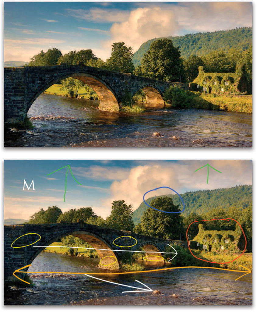
White: Both the bridge and the river are photographed at an angle, adding a sense of depth to a two-dimensional image.
Yellow: We have detail in both the shadow and highlight areas on the bridge, but not too much detail in the shadow areas, which would have made the photograph look flat (contrast-wise).
Red: The main subject, the small cottage, is placed off-center, and the bridge, photographed at an angle, draws the viewer toward the cottage.
Blue: The top of the tree is almost aligned with the top of the hill in the background. I positioned my camera so both elements were almost lined up. It’s kind of like using the cheek as a background for the nose in the previous example.
Green: “Breathing room” at the top of the frame.
Orange: The entire scene is in focus, so the photo looks as it looked to my eyes.
Tip: For maximum depth of field, use a wide-angle lens, small aperture, and focus 1/3 into the scene.
M stands for the mood of the scene, created by the early morning light. In most photographs, mood matters most.
Pregnant Giraffe
I photographed this pregnant giraffe on one of my African photo safaris. The photo was taken with my Canon 24–105mm IS lens set at 55mm.
I share this info with you to illustrate the point that wide-angle safari shots often tell more of a story than close-up safari shots, some of which look as though they could have been taken in a zoo or wildlife park. Here’s my analysis:
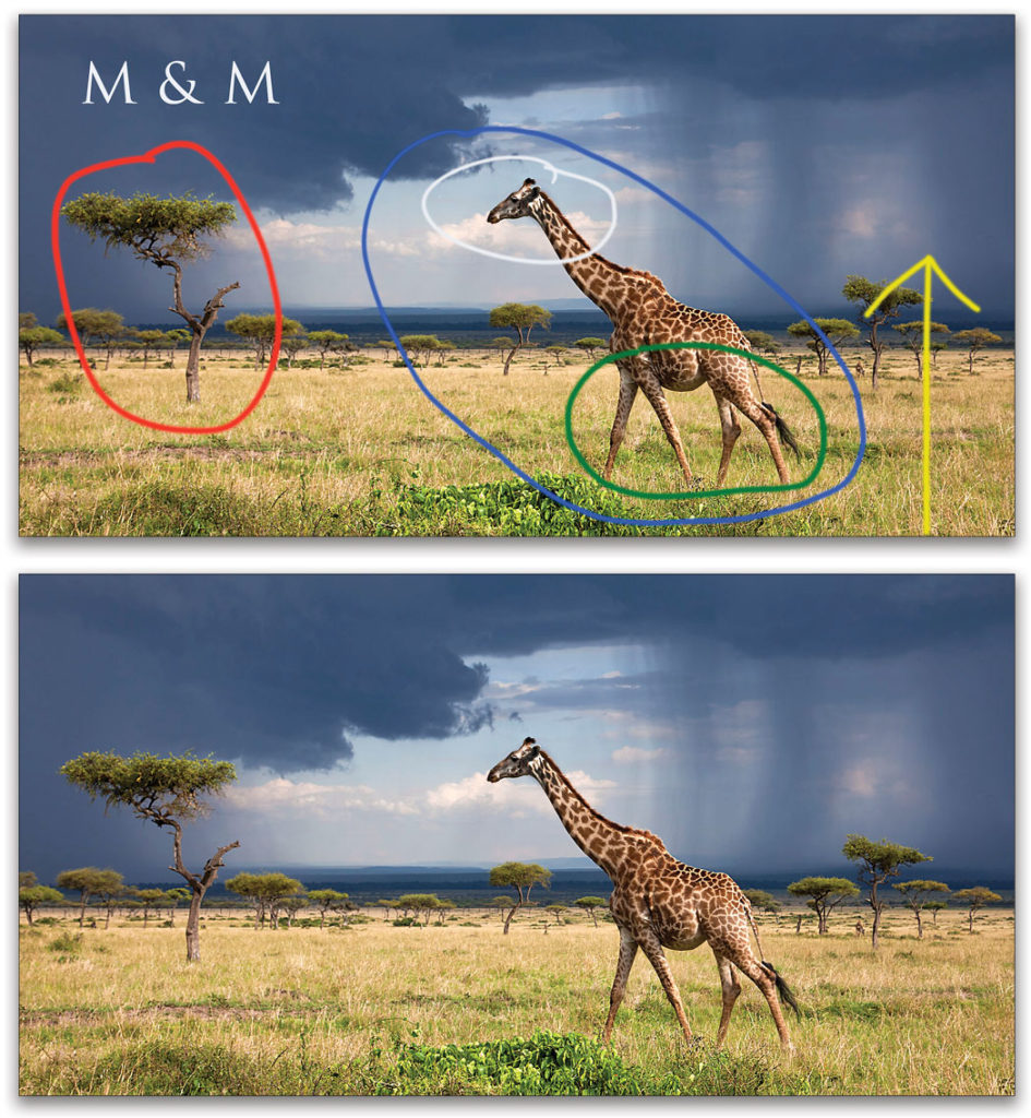
White: The most important part of the scene is separated/isolated between the two storms, so your eye goes right to the giraffe’s head.
Blue: The main subject is off-center. When a subject is off-center in a photograph, one’s eyes look around the image to see what’s going on, as opposed to getting stuck on a subject placed dead center.
Green: The position of the giraffe’s legs adds a sense of movement to the still photograph. Again, gesture is important.
Red: The tree helps to balance the image.
Yellow: Because I shot at a small aperture, the entire scene is in focus. Here, again, the scene looks as it looked to my eyes.
M & M stands for the mood of the scene, created by the two storms, and making the picture. I directed my guide to get me into exactly the right position for the photograph, which took about 20 minutes.
Model in Abandoned House
I photographed this model in my living room, shortly after I made my son’s last college tuition payment. Just kidding! The model is actually standing in the living room of an abandoned house I found in Westchester, New York. Here’s my analysis:
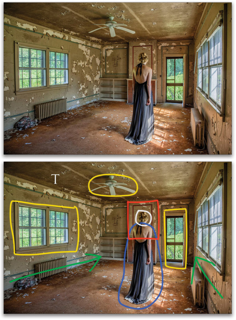
White: Because we can’t see the model’s face, the photograph has a sense of mystery. There’s a photo adage that applies here: When you destroy the mystery of the photograph, you destroy the photograph. Hey! I don’t always agree with that adage, but it’s a good one to keep in mind.
Blue: The formal dress that the model is wearing in an abandoned and decaying building also adds a sense of mystery to the photograph. Had she been wearing jeans and a T-shirt, the photograph would have a totally different feeling.
Red: The most important part of the image, the model’s upper body, is framed by the red frame on the rear wall.
Yellow: Thanks to HDR, we can see both inside and outside the scene.
Green: Because I used a wide-angle lens (a Canon 17–35mm at 17mm) and positioned myself very close to the right wall, the walls lead the viewer into the scene.
T stands for the texture in the image, which I brought out using the Texture slider in Lightroom.
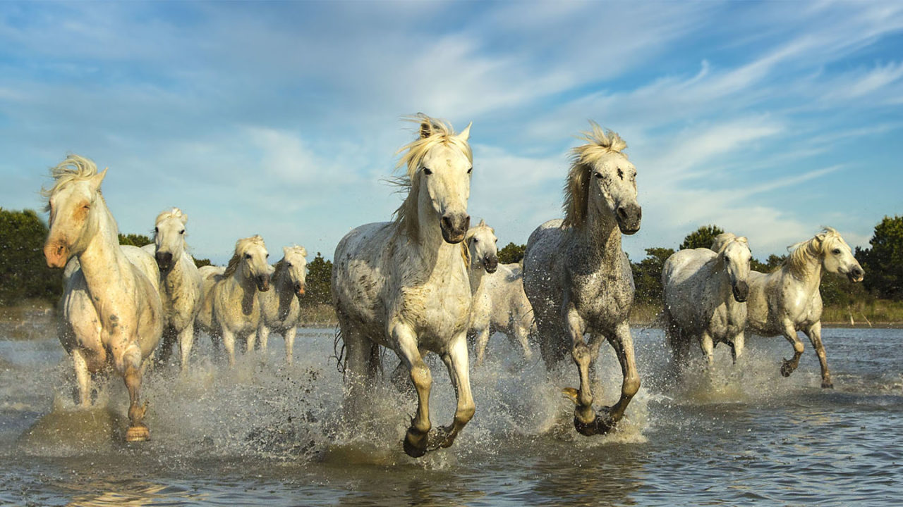
Camargue Horses
These Camargue horses were running at me at top speed when I took this photo during one of my Provence, France, workshops. Here’s my analysis:
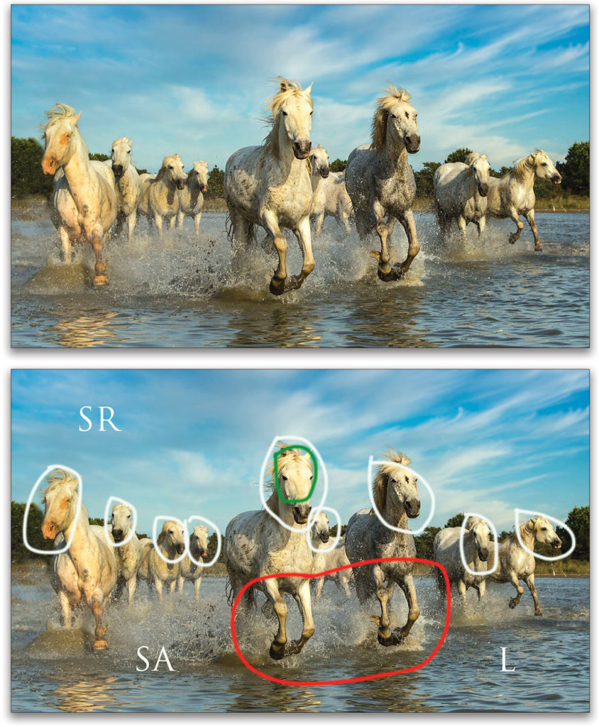
White: Each of the horses’ heads is separated. Again, separating elements in our photographs is important.
Green: The brightest part of the scene isn’t overexposed. I always expose for the highlights to ensure detail in bright areas. I do that by checking my histogram and highlight alert.
Red: You probably guessed it: great gesture of the two horses’ legs upfront.
L stands for shooting at a low angle to add a sense of power to the horses.
SA stands for stop action. I used a shutter speed of 1/2500th second to freeze the action.
SR stands for sky replacement. The sky in the original photo was a dull blue, so I replaced it using Luminar 4 from Skylum Software.
Model in the Westcott Warehouse
This photograph was actually taken in the Westcott warehouse, while I was at Westcott headquarters shooting some videos. Here’s my analysis:
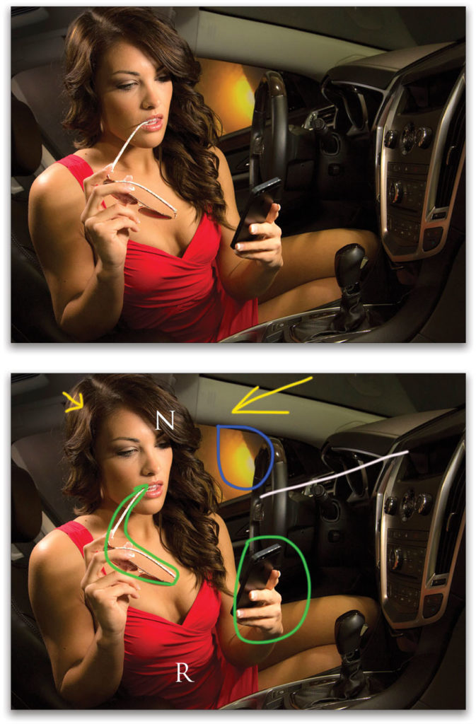
White: I used a technique called “disequilibrium,” in which you tilt your camera down to the left or right to create an off-balanced image, which can be effective in people photography. This technique doesn’t work for landscape photography.
Yellow: The larger yellow arrow shows the direction of one Westcott Ice Light (the main light) shining through the front windshield of the car. Here, too, I had the model turn her face away from the light to create a shadow on her face. Remember that, in portraiture, shadows are your friend. The smaller yellow arrow indicates nice hair light created by a second Ice Light. That hair light helps to separate the model from the background.
Blue: We used a hand-painted sunset background to create a sense of depth in the image, as well as to separate the subject from the dark background.
Green: Props add to the interest of the photograph.
R indicates that if you want a subject to stand out in a photograph, have them wear red. I first learned this from National Geographic photographer Al Moldvay in 1976.
N indicates something very important: Never underestimate the importance of a good subject. I promise you, the photo of me sitting in the car to test the lighting is not as interesting!
Sunrise at Mesquite Flat Sand Dunes
On the next page is one of my favorite shots, sunrise at the Mesquite Flat Sand Dunes, which are far from flat! Here’s my analysis:
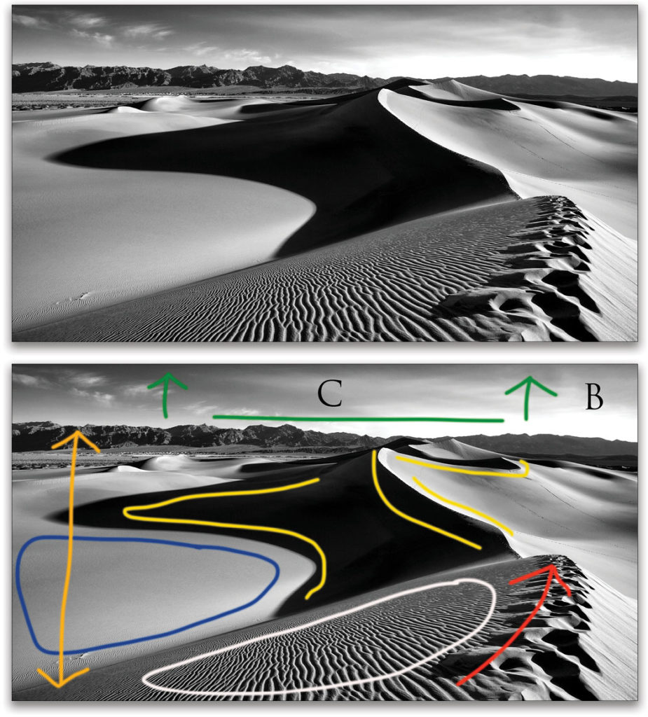
Yellow: All those curved lines, created by dramatic shadows, add interest and appeal to the image.
Red: The imprints of footsteps on the top of the dune draw the viewer into the scene; especially because they’re so close to the camera.
Tip: Foreground elements help to place the viewer in the scene.
Blue: The negative space, where “nothing is going on,” actually makes the areas of the image where something is “going on” look more interesting.
Green: The horizon line is positioned at the top of the frame, which forces the eye to view the dramatic scene below the horizon line.
Orange: Everything in the scene is in focus, as the scene would look to your eyes if you were standing there next to me. That’s accomplished by shooting with a wide-angle lens and small aperture.
White: The texture, created by the sun’s low angle in the sky and the ripples in the dunes, adds to the impact of this image.
B stands for black-and-white. When you remove the color from a scene, you remove some of the reality. When you remove some of the reality, a picture can, but not always, look more creative and more artistic.
C stands for contrast. In black-and-white photography, contrast is king!
Okay, enough about analyzing my images. Now it’s your turn to analyze yours. Have fun while you’re learning!
This article originally published in Issue 62 of Lightroom Magazine.


