There’s nothing more frustrating than looking at an image you took in Photoshop that looks amazing, only to upload it to your website and see completely strange color changes appear. You think to yourself, “It didn’t look like that when I was editing it in Photoshop; why are the colors so wonky now that I’ve uploaded it to the Web?”
Your website is priority one, two, and three when you’re a photographer. It’s your trademark and brand to anyone looking to hire you, and it’s essential that the images that represent your business on your website look perfect. Here are my top three tips to make your images appear in a league of their own once they’re uploaded to your website.
1. Sharpening
It’s quite a wild time in the world of computer screen resolution. Since the debut of the Apple Retina Display and the more recent 4K monitors and the adoption of UHD (ultra-high definition), the race to more pixels is well under way. That’s why it’s important for you as a photographer to be well-educated on your website provider’s default image settings. This information is hugely important when uploading your images to your website. You’ll want to make sure that you’re manually sizing and cropping your images to your website’s specifications and not checking the box, which resizes your images automatically upon upload.
After sizing your images in Adobe Photoshop or Lightroom to the correct dimensions and dpi (dots per inch), it’s time to sharpen. Here’s your dinner-party factoid: The Unsharp Mask tool in Photoshop hasn’t been updated since Photoshop version 1! Needless to say, while I do use Photoshop to selectively sharpen certain areas of my images, for your overall Web image sharpening, I’d rely on the much newer algorithm behind Adobe Camera Raw’s (ACR) or Lightroom’s Sharpening sliders in the Detail panel.
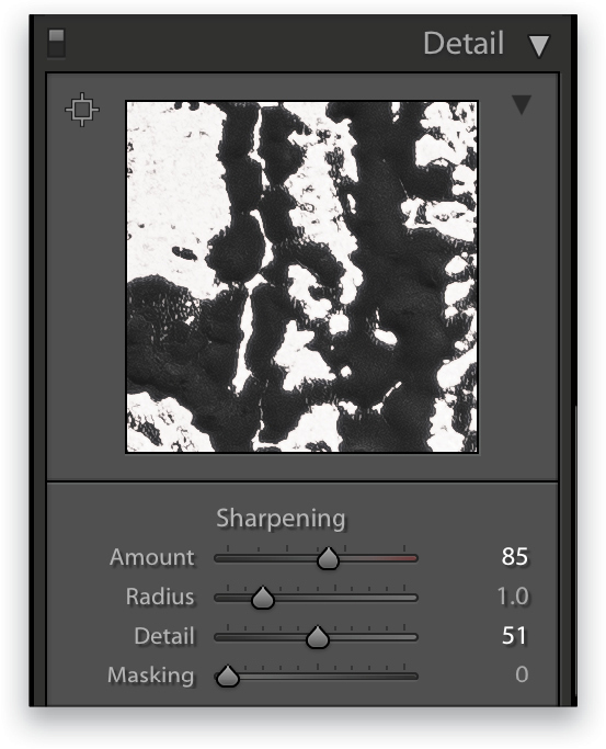
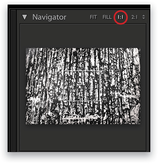
Since your images have already been resized to Web dimensions, in Lightroom tap your Z key to zoom your entire image to 100%, rather than using your detail preview box located in the Detail side panel. Make sure your zoom setting is set to 1:1 to ensure that you’re looking at a true 100% zoom. In ACR, press Option-Command-0 (PC: Alt-Ctrl-0) to zoom in to 100%.
The first slider in the Detail panel is the Amount slider, which is responsible for overall sharpening. Use this to find a point of sharpening that looks best for your image. The Radius slider determines how far away Lightroom or ACR should look for a contrasting pixel to decide whether or not to add more sharpening to that area. My suggestion would be to leave the slider at 1.0 for the majority of your images.
Think of the Detail slider as the protection slider, protecting you from over-sharpening. As you increase the Amount slider, you should also increase the Detail slider to protect your image against sharpening artifacts and the dreaded halo effect.
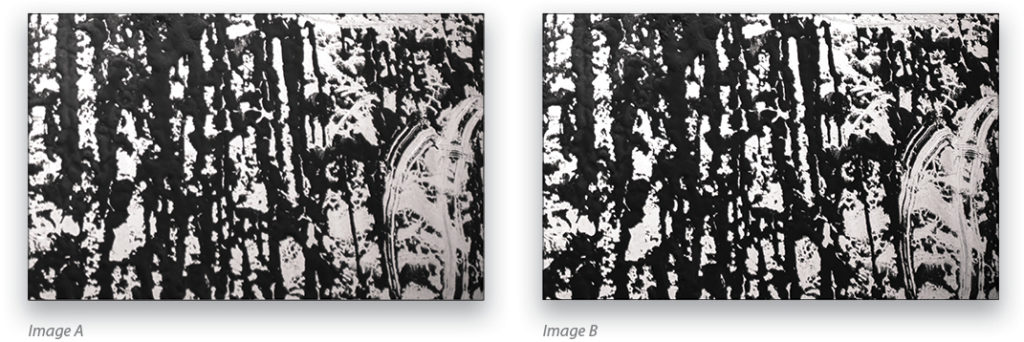
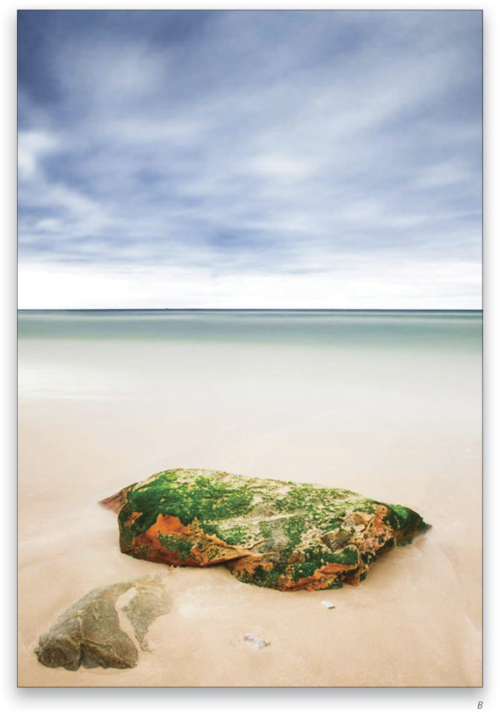
Here are two images side by side. Image A is unsharpened, and image B is sharpened. These images definitely show you how sharpening, when done right, can really make your image look crisper than it originally was!
2. Selective Toning
This next tip is applied to every darn image on my site. Think of your website viewer as a child with ADD. And they have a right to be a little ADD—try putting yourself in their shoes for a moment; they’re frantically looking for a photographer to hire, while trying to juggle everything else real life throws at them: kids, groceries, projects, deadlines, etc. The moment your website viewer looks at an image on your site, their eye should instantly take them to the section that you’ve chosen as the most important place. If you don’t lock in their curiosity, you’ll immediately lose their interest. In order to protect myself against this phenomenon, I selectively tone my images. Another term for this is dodge and burn. (This skill has so many uses and isn’t just for skin retouching!)
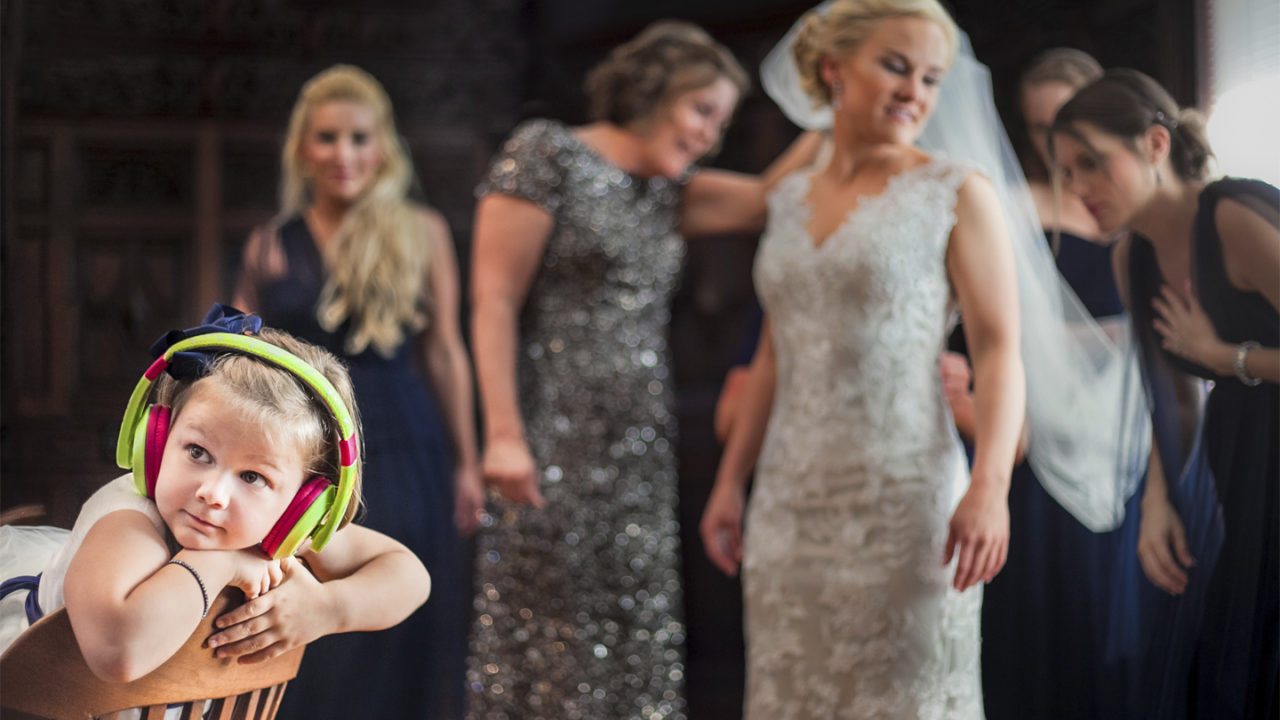
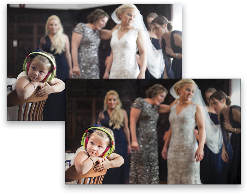
Take a look at this next image. The first version of the image is un-toned and un-retouched. It’s straight out of camera, and even though the little girl is actually in focus, your eyes pass over her because the lightness of the bride’s dress distracts you. In the second version, I brightened the girl, and toned down the white dress, which immediately leads the viewer’s eye to the intended subject of the image!
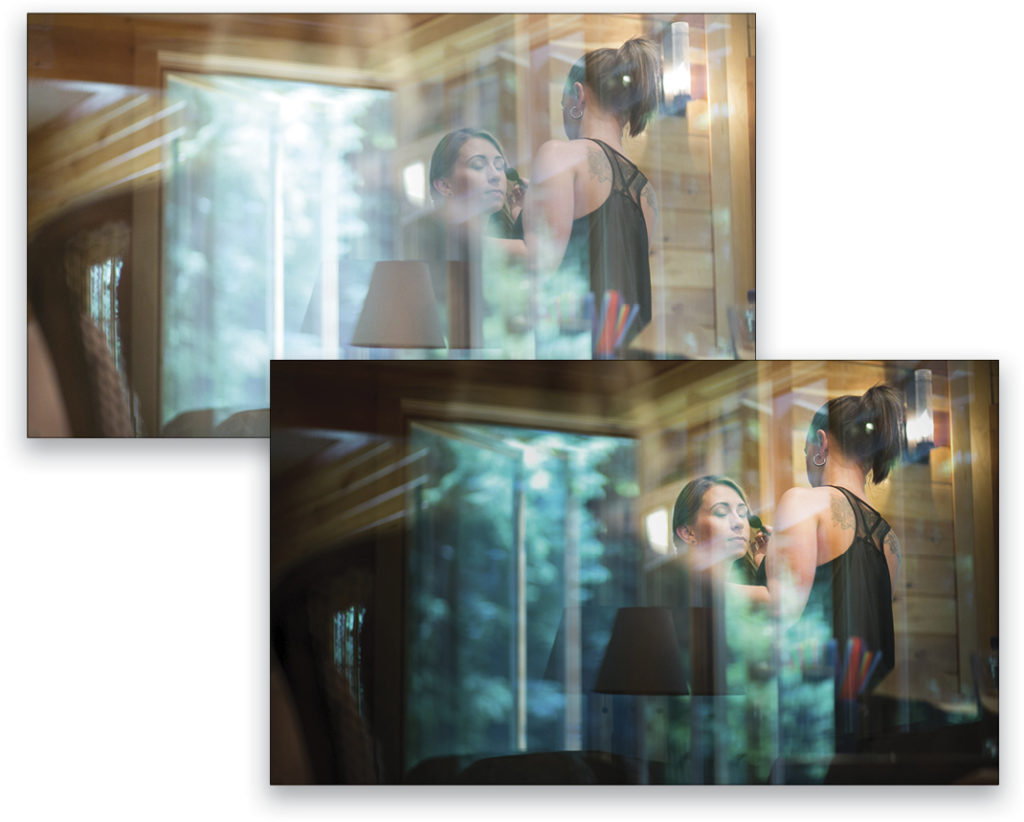
Here’s one more example. In the un-toned image, your eye bounces around from the light reflections on the glass to the sconce on the wall behind the bride, and then finally sees the sharp, in-focus face in the middle. Well, by toning down those other things in the image, and brightening and adding contrast to the bride’s face, I’ve created a stunning image where the viewer’s eye goes immediately to the place intended!
3. Gamma and Color Profiles
The last tip is not only the most important but also the hardest to understand. I’m going to divide it into two segments since it’s so stinking complicated! Here we go…
Part A: Gamma and White Point
You can think of gamma as your computer screen’s black and white clipping points, similar to an image’s black and white points in the image’s histogram. The two most broadly adopted gamma settings are 1.8 (less “contrasty” and what Macs used prior to 2009) and 2.2 (more “contrasty” and what PCs use). In 2009, Mac computers switched their default gamma from 1.8 to 2.2 in order for all images to look similar whether viewing images on Macs or PCs. Translation for you, my photographer friends: This is good news because it means your website viewers will see a closer representation to what you want them to see whether they’re using a Mac or a PC to view your site. So when you’re calibrating your own screen, it’s best to use a gamma of 2.2 so that the images you retouch and put on your website will look similar to what your viewers are seeing on their screens.
If you don’t calibrate your screen and want to know how to make your images look more appealing to the public who are viewing your website through their crappy, un-calibrated computer screens, consider making your Web images a tad more “contrasty” than you usually might. This will compensate for the less “contrasty” gamma setting to which most computer screens are set.
White point is a little bit easier to understand, thank goodness. If you’ve ever used Kelvin as your camera white balance, you’re already slightly aware that different light sources have different color temperatures. Computer screens have two different color temperatures too:
D50: Also known as a Kelvin color temperature of 5000. This white balance has a yellowish tint and is used by people who primarily do print photography.
D65: Also known as a Kelvin color temperature of 6500. This white balance has a bluish tint, and most computer screens are set to this color balance.
Check out this graphic that I found in a really wonderful article in Scientific American called “Gamma and White Point Explained” by Jim Perkins. Just scroll down until you see the side-by-side comparison of Gamma 2.2 vs. Gamma 1.8. In the example he uses, you can see the difference between the two gamma points as well as the difference between the two color balance values! He’s a medical illustration professor at RIT and uses understandable English and terms that help anyone understand these exceptionally advanced concepts. I highly recommend reading the article if you calibrate your monitor (which I know all of you do, regularly—wink, wink!)
So what does all this mean to the professional photographer? If some of this went over your head, that’s completely normal, but just remember these two points: Make the images that you put on your site slightly more “contrasty” and also slightly warmer than you normally would. These two tips will help your images look really nice on the mass-market computer screens that most people own!
Okay, so does your brain hurt yet? Sorry! I know this stuff isn’t the most exhilarating, but it’s incredibly important that you understand these things to make sure your images shine on your website!
Part B: Understanding Color Profiles
There are three general color profiles used in photography. The one with the most colors is ProPhoto, the second largest is AdobeRGB (1998), and the smallest, with the least amount of colors is sRGB. When showing your images on a screen, you want your image to have the color profile that’s specifically created to protect the validity of the colors in your photo. In other words, you want to apply a color profile that keeps the colors in your shot as close to what you see in Photoshop as possible. Thus, for any images being viewed on a screen, you need to apply an sRGB color profile to the image.
Here’s where our original scenario comes in: Have you ever retouched an image in Photoshop that looks absolutely stunning, the colors are spot on, and the shot just sings, but the moment you upload it to your website, it looks muddy and the colors look muted and wacky? That’s probably because the color profile applied to the image isn’t meant to be viewed on a computer screen. It’s probably made for printing or something else.
As an example, I’ve uploaded the same image to a Facebook photo gallery with three different color profiles attached. Which one do you think matches the colors seen in the Photoshop window I have open?
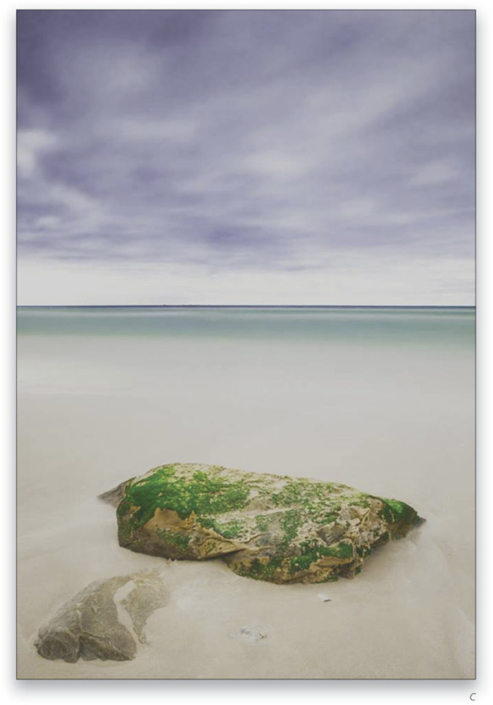
I hope you chose option B, and if you did, then great! The exact same image with three different color profiles applied to it looks like three completely different images once uploaded to any website! Crazy, right?
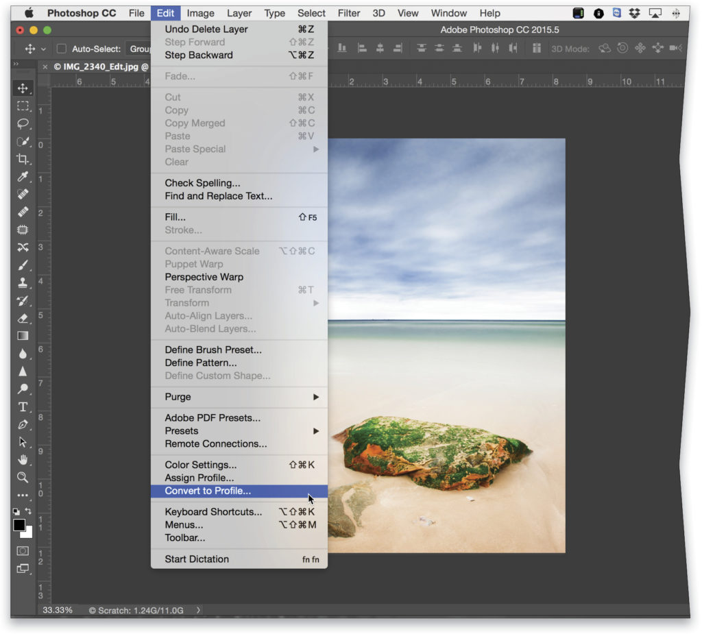
To find the Photoshop color profiles go to Photoshop>Edit menu, and then choose the Convert to Profile option.
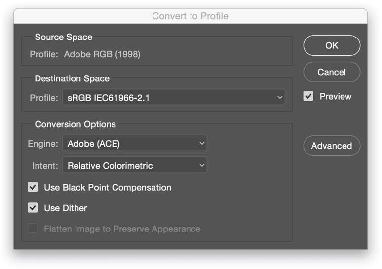
Once you have your Convert to Profile dialog open, make sure to change the Profile drop-down menu to sRGB.
While I know this topic isn’t the most fascinating, this information is vital in presenting yourself as a professional photographer. If the images on your website are the strongest, most beautifully color-treated and -toned images you have, and they look stunning on your clients’ monitors, you’re bound to get an uptick in new client inquiries!


