This month, let’s take a little trip into the “Hey, that’s neat!” category of image adjustments in Photoshop. If you don’t already know, you can change the blend mode of an adjustment layer to double up on its utility and power. Classic examples use Multiply, Screen, Overlay, or Soft Light to enhance contrast or brighten a dull photo. Normally, you’d use these with a Curves adjustment layer and fiddle with Opacity values to dial in your results. This technique ought to be in your bag of tricks, and it’s often used for advanced dodge-and-burn methods.
GO WITH THE FILL
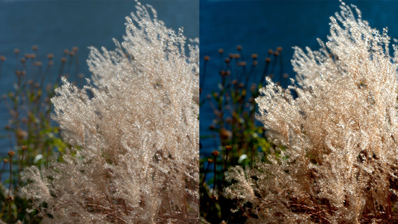
But there’s definitely more to be had from this basic idea of contrast enhancement, in particular when taking advantage of some of the so-called “Special 8” blending modes that behave differently when using the Fill slider instead of the Opacity slider. One of my favorite things to show off is how this works with the Hard Mix blending mode, because the immediate result is harsh and often just plain ugly. Check out this rather dull image of grasses along a local pond, and then take a look at the version where I added a Curves adjustment layer above the Background and set its blend mode to Hard Mix.
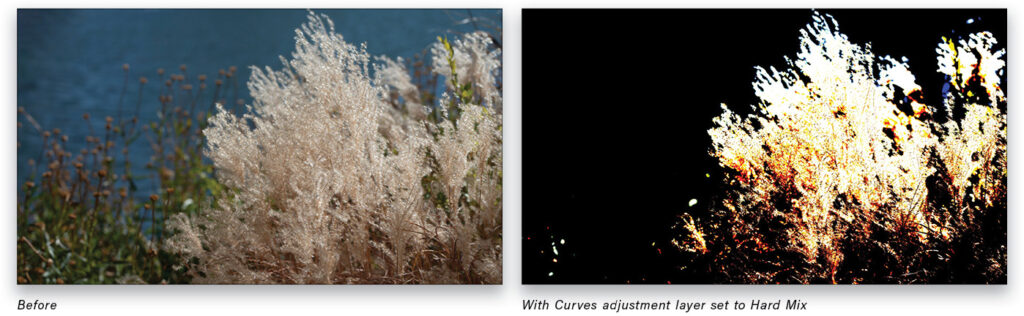
“Eww! This is an abomination! Why, Scott? Oh, why?” Okay, it’s horrible, I admit. Reducing the Opacity to 20% isn’t much better. Highlight details are all smushed, and some of the colors are just awful. Now let’s put Opacity back to 100% and instead set Fill to 20%.
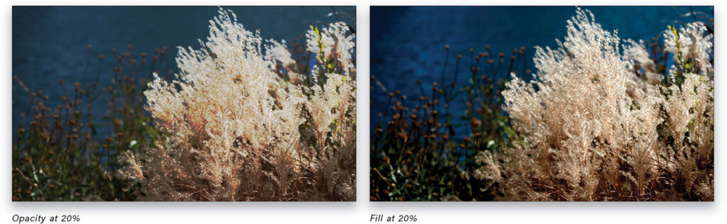
That’s more like it! Contrast is much better, and there are no funky, clipped colors or muddy spots. The difference between Opacity and Fill is quite dramatic here, and it’s likely that you’d never have considered even trying Hard Mix in this way. The other two contrast modes in the Special 8 are Linear Light and Vivid Light. Both behave in similar ways, and offer stronger results than Overlay and the rest, though less total contrast than Hard Mix.
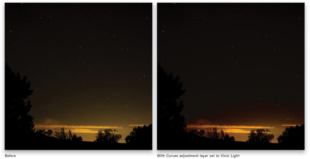
Using blend modes in this way increases the flexibility of Curves, and sometimes saves several steps or helps you achieve something that may otherwise require careful masking or other tricks. This shot of a night sky has a little too much glow for my taste. Adding a Curves adjustment with Vivid Light lets me reduce the sky glow but retain detail in the clouds.
Since Vivid Light is increasing contrast, I’m able to manipulate the middle values more easily without creating a complex curve or using a luminosity mask.
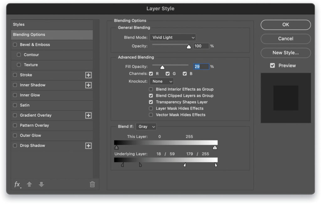
I’ve used 29% Fill, and also adjusted the Blend If sliders for the Underlying Layer in the Layer Style dialog to keep a hint of the tree outline on the left. (To open the Blending Options, double-click to the right of the Curve layer’s name in the Layers panel, and to split the sliders, hold the Option [PC: Alt] key and click on them.)
BLENDING PORTRAITS
The same technique applies to portraits, though there are some caveats around hue and saturation. In this image, using Linear Burn at 20% Fill gave me the tonality I wanted in the model’s skin, but increased saturation too much. The simple fix in this case is to add a Hue/Saturation adjustment layer on top of the Curves adjustment, reducing Saturation by –15. I’ve also used the Brush tool (B) set to black to paint on the masks of the two adjustment layers to show the color of her eyes.
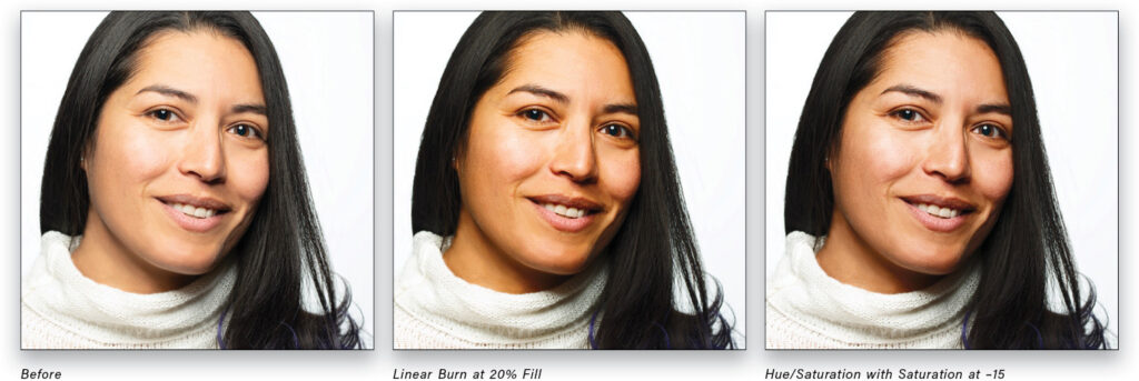
Linear Burn is one of the Darken blend modes, similar to Multiply but with a much stronger effect. Going in the opposite direction, we can use Linear Dodge (Add) from the Lighten collection of blend modes to recover a slight underexposure.
In this case, no other adjustments were needed, not even a reduction in the Fill value. Linear Dodge (Add) is stronger than Screen, allowing for much more dramatic corrections. Notice that I could have obtained a similar result simply by using Curves alone, but the blend mode did the heavy lifting, leaving me to use Curves for more delicate refinements.
MIXING THINGS UP
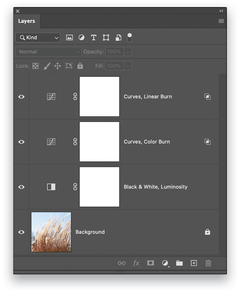
Using blend modes in this way provides a lot of flexibility when you need more extreme adjustments and, while I’ve focused on a handful that respond differently to Fill and Opacity, there’s no real need to stick with only those, nor do you need to limit yourself to one blended Curves layer. Here’s another picture of pond grass that was overexposed, then treated to a custom stack of adjustment layers.
I ended up using a Black & White adjustment layer set to Luminosity blending, then two Curves adjustments on top of that. The first Curves adjustment is set to Color Burn blending and about 10% Fill, then the white Blend If slider for Underlying Layer is split all the way from 0 to 255. That split provides a smooth transition for the blend, which darkens the base of the grasses and increases saturation. To bring down the highlights, the top Curves adjustment uses Linear Burn at 100% Fill, and Blend If adjusted to avoid affecting the shadow areas.
Nearly all the work is done by the blend modes, and I still have the ability to use the Curves layers for contrast refinement and color adjustment.
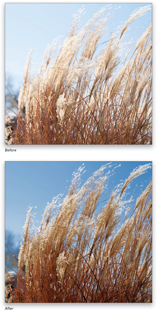
Note: The Black & White adjustment layer is used to help bring down the blue and cyan brightness in the sky and the yellow in the blades of grass. Luminosity blend mode causes the Black & White layer to behave like a color brightness control panel: the color sliders in the Properties panel (Window>Properties) affect the brightness of each of six colors without shifting their hues.
KNOW YOUR BLEND MODES
Now, I’m not going to argue that this approach is inherently better than other methods you’re used to. In some cases, blend modes allow you to target colors or brightness directly without having to create masks. And in the examples above, there was no real need for detailed work to get reasonable results in just a few seconds. You do need some familiarity, however, with how blend modes work for there to be any speed gains. Unlike creative effects where you’re exploring different looks, corrections are often something you can see right away, and trying out all 27 blend modes in the list isn’t exactly a fast approach.
When you need to increase contrast in an image where the dominant tones are in the midrange, try Linear Light or Vivid Light (or Hard Mix if everything hovers around middle gray). For images that are too bright, try Color Burn and Linear Burn in the Darken set. And to lighten things up, head for Color Dodge and Linear Dodge (Add) in the Lighten collection. Each of these listed modes should be used with Fill before Opacity because of the different behaviors, which I’ll discuss in detail in a future column.
This article originally published in the August, 2021 issue of Photoshop User magazine.
About Photoshop User and KelbyOne
Photoshop User magazine comes out digitally 12 times a year and is part of KelbyOne, the leading educational resource for Photoshop, Lightroom, and photography. Pro members have access to more than 900 video courses and 100 back issues of Photoshop User. To learn more about KelbyOne, click here.

This article originally published in the August, 2021 issue of Photoshop User magazine.