No matter what you’re doing in Photoshop, there’s always a use for smart objects as a means of nondestructive editing, but what about nondestructive design? In this exercise, you’ll learn how to create an eye-catching design with just one photo and a few smart object layers, plus a few other interesting tricks along the way. Of course, the beauty of this technique is that you can easily swap out the main subject image with all the effects intact.
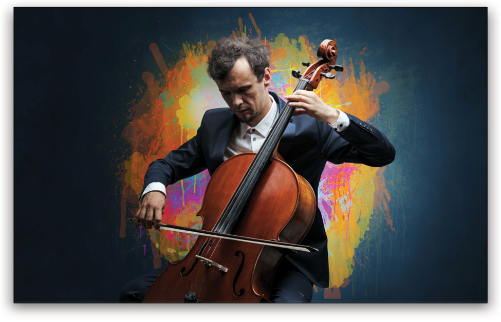
Step One: We need to start with an image, so here’s a nice stock shot of a cellist that would make for a modern poster design. (Note: The image dimensions I’m working with here are 2000x1200px. Filter settings will vary on higher- or lower-res images.) If you’d like to download the low-res watermarked version of this image to follow along, click this link, log in with your Adobe ID, and click the Save to Library button. Double-click the image in the Libraries panel (Window>Libraries) to open it in Photoshop. To make it easier to work with the image, increase the resolution of the practice file. (We normally don’t recommend enlarging images, but this is only for practice purposes.) Go to Image>Image Size, turn on the Resample checkbox, and set the Width to 2,000 pixels. The Height should automatically change to around 1,252 pixels. Click OK.
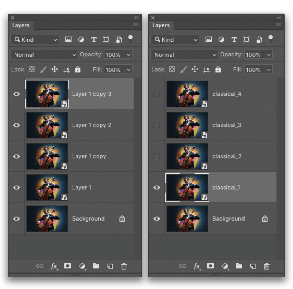
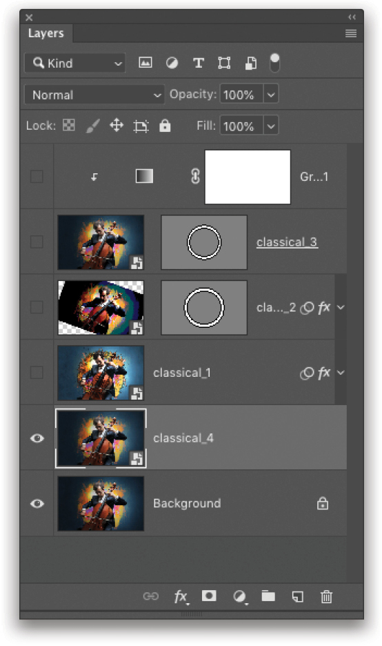
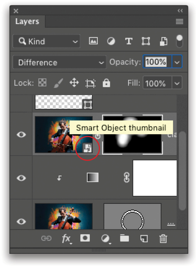
Step Two: Create a duplicate of this layer by pressing Command-J (PC: Ctrl-J). Then Right-click on the duplicate layer in the Layers panel and choose Convert to Smart Object. You’ll see the smart object icon appear on the layer thumbnail. Press Command-J (PC: Ctrl-J) three more times to create a total of four duplicate smart objects. Now we can run different effects on each layer while the core image stays linked through all layers.
Step Three: To make it a little easier to identify the layers throughout this exercise, rename them classcial_1–4, ascending from the bottom. To rename a layer, double-click its name in the Layers panel. When done, click the Eye icon next to layers 2, 3, and 4 to turn them off, and click on classical_1 to make it the active layer.
Step Four: Any filter effects we apply to a smart object will become smart filters, which means that we can edit them even after they’ve been applied. For this first layer, we need to smooth the image a little without losing edge sharpness, so go under the Filter menu, to Blur, and choose Surface Blur. Set both the Radius and Threshold to 10 pixels. Remember, these settings may be different based on the resolution of your file. Click OK when done.

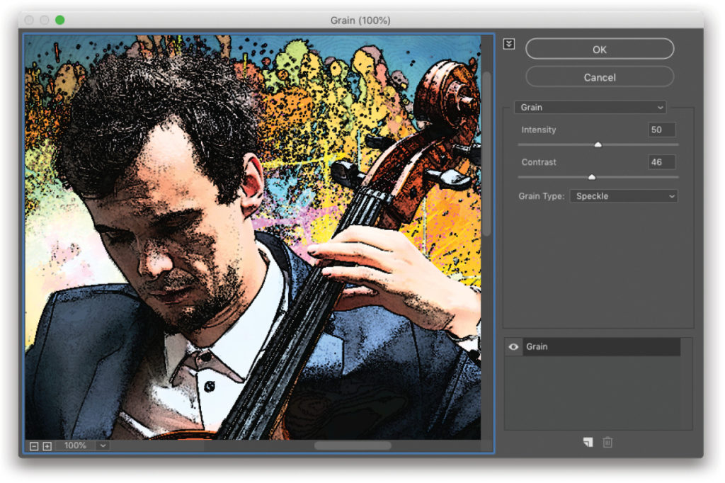
Step Five: Next, go under the Filter menu, to Texture, and choose Grain. (Note: If you don’t see Texture in the Filter menu, you have two options. The first is to go to Photoshop CC [PC: Edit]>Preferences>Plug-Ins, turn on Show All Filter Gallery Groups and Names, and click OK. Now you’ll see Texture in the Filter menu. The second option is to go to Filter>Filter Gallery, expand the Texture folder on the right, and choose the Grain filter.) First, go into the Grain Type drop-down menu and choose Speckle. Then, set the Intensity to 50 and the Contrast to 46. Feel free to experiment with different settings, depending on the image.
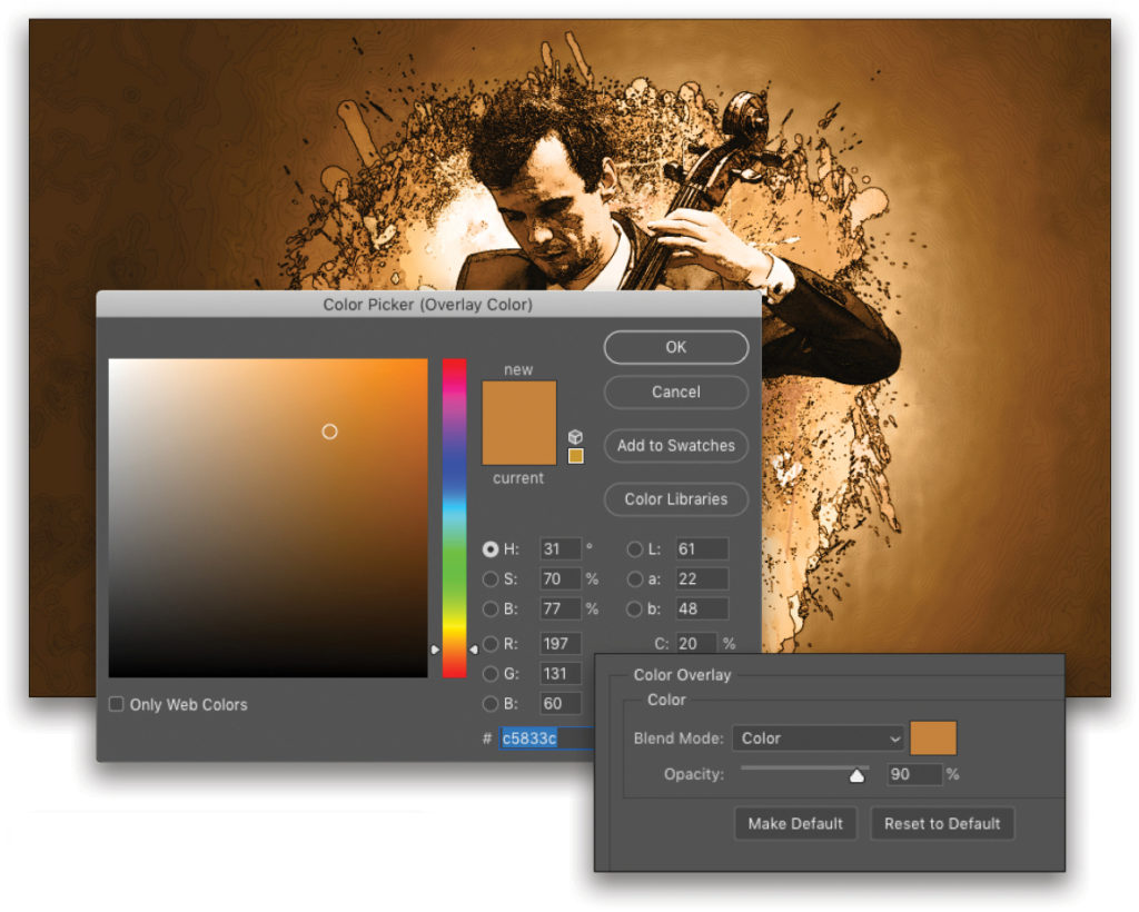
Step Six: With this layer still active, click on the Add a Layer Style icon (fx) at bottom of the Layer’s panel, and choose Color Overlay. Set the Blend Mode to Color, and click on the color swatch. Here, we’re using a sepia color. If the effect seems strong, you can lower the Opacity to tone it down a bit. The result is an interesting combination of filters and layer styles. This is worth experimenting with, but save that for later. For now, click OK and let’s move on.
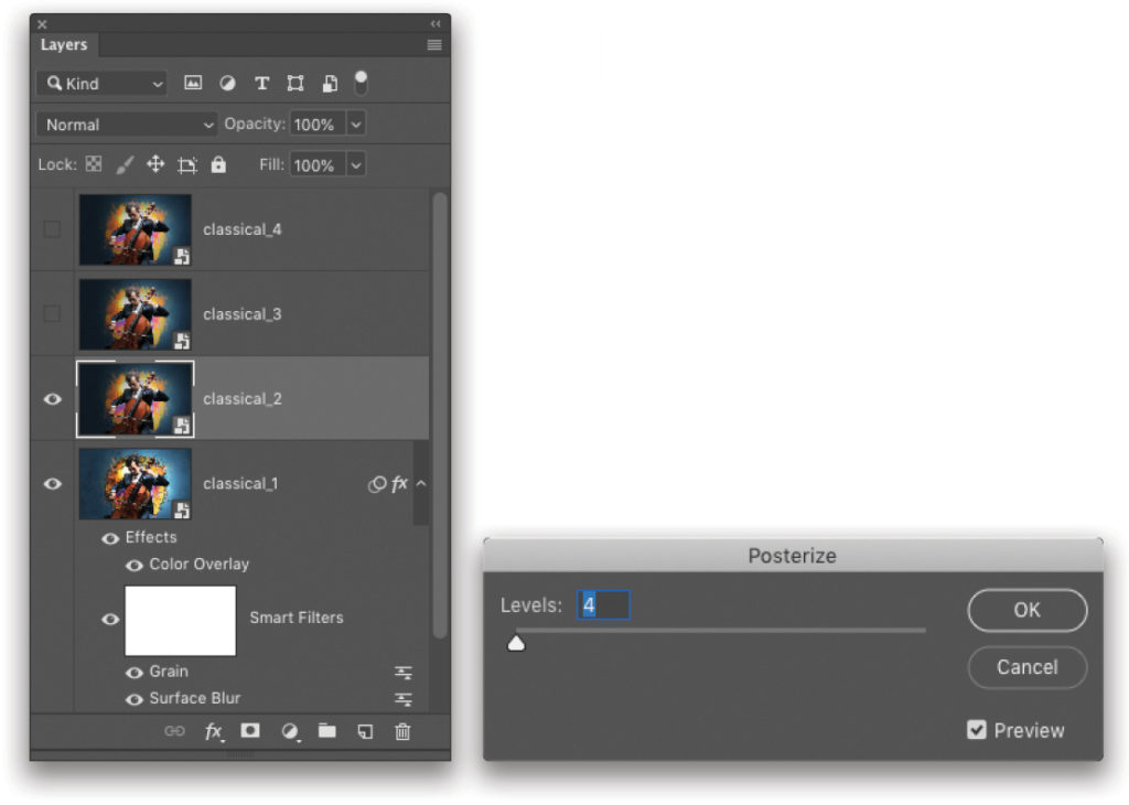
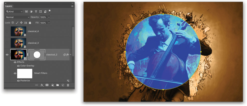
Step Seven: Click the next layer in the Layers panel labeled classical_2, and click where its Eye icon used to be to make it visible again. Go under the Image menu, to Adjustments, and choose Posterize. Set the Levels to 4 and click OK.
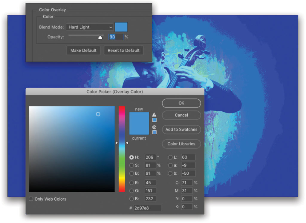
Step Eight: Add a Color Overlay layer style to this layer but give it a different color. We’re using a blue color to contrast the sepia-colored background image. Notice here that we also lowered the Opacity to 90% and changed the Blend Mode to Hard Light. Again, by itself it’s an interesting result, but we want to blend it with the rest of the image, so we’ll be using a vector mask. Click OK.
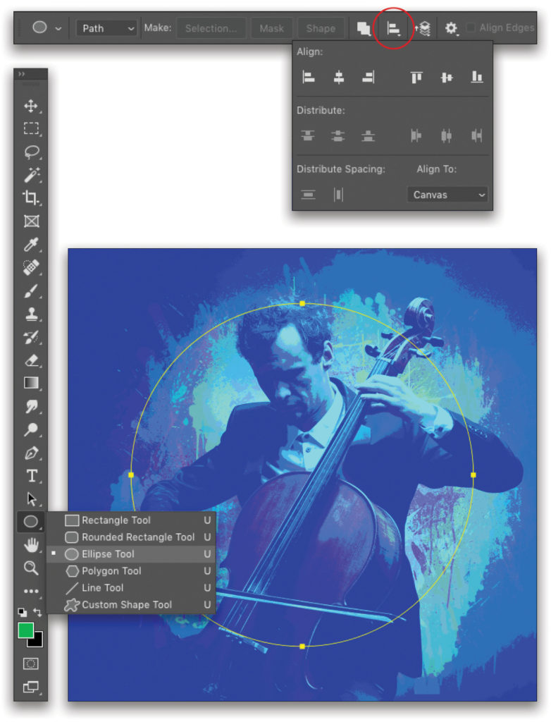
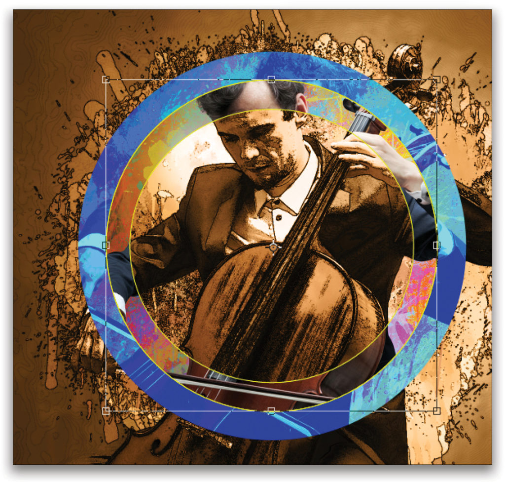
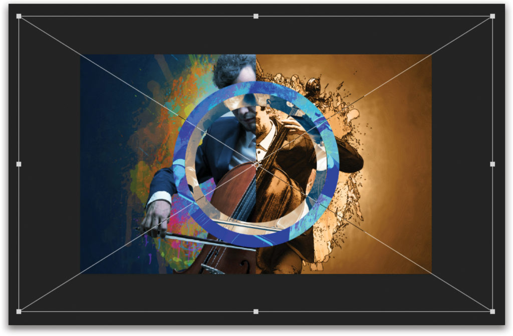
Step Nine: Click-and-hold on the Rectangle tool (U) in the Toolbar to access the Shape tools, and then choose the Ellipse tool in the menu. Make sure the Tool Mode is set to Path in the Options Bar. In the canvas, hold down the Shift key as you drag out a circle over the main subject. Tip: If paths are hard to see in your document, go to Guides, Grids, & Slices in the Preferences and change the Path color in the Path Options drop-down menu.
In the Options Bar, click on the Path Alignment icon (a vertical line with two bars) to open the panel, and make sure the Align To drop-down menu at the bottom right is set to Canvas. Then, click the Align Vertical Centers and Align Horizontal Centers icons to center the circle path in the canvas.
Step 10: With this circle path still selected, go under the Layer menu, to Vector Mask, and choose Current Path. This will mask the blue image inside the circle, and you’ll see the vector mask icon in the Layers panel.
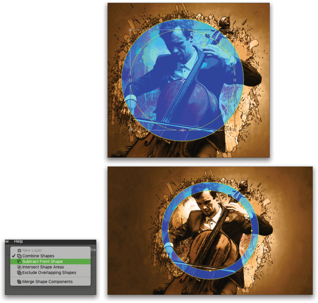
Step 11: With the path still active, press Command-C (PC: Ctrl-C) then Command-V (PC: Ctrl-V) to duplicate the circle path. It automatically places it in the same position as the original path. Press Command-T (PC: Ctrl-T) for Free Transform, hold down the Option (PC: Alt) key so the shape will resize from the center, and click-and-drag a corner point inward to scale it down proportionally and create a ring. Press Enter when done.
Next, click on the Pathfinder Options icon (overlapping squares) in the Options Bar, and choose Subtract Front Shape. This will knock out that center shape, confining the effect to just the ring area.
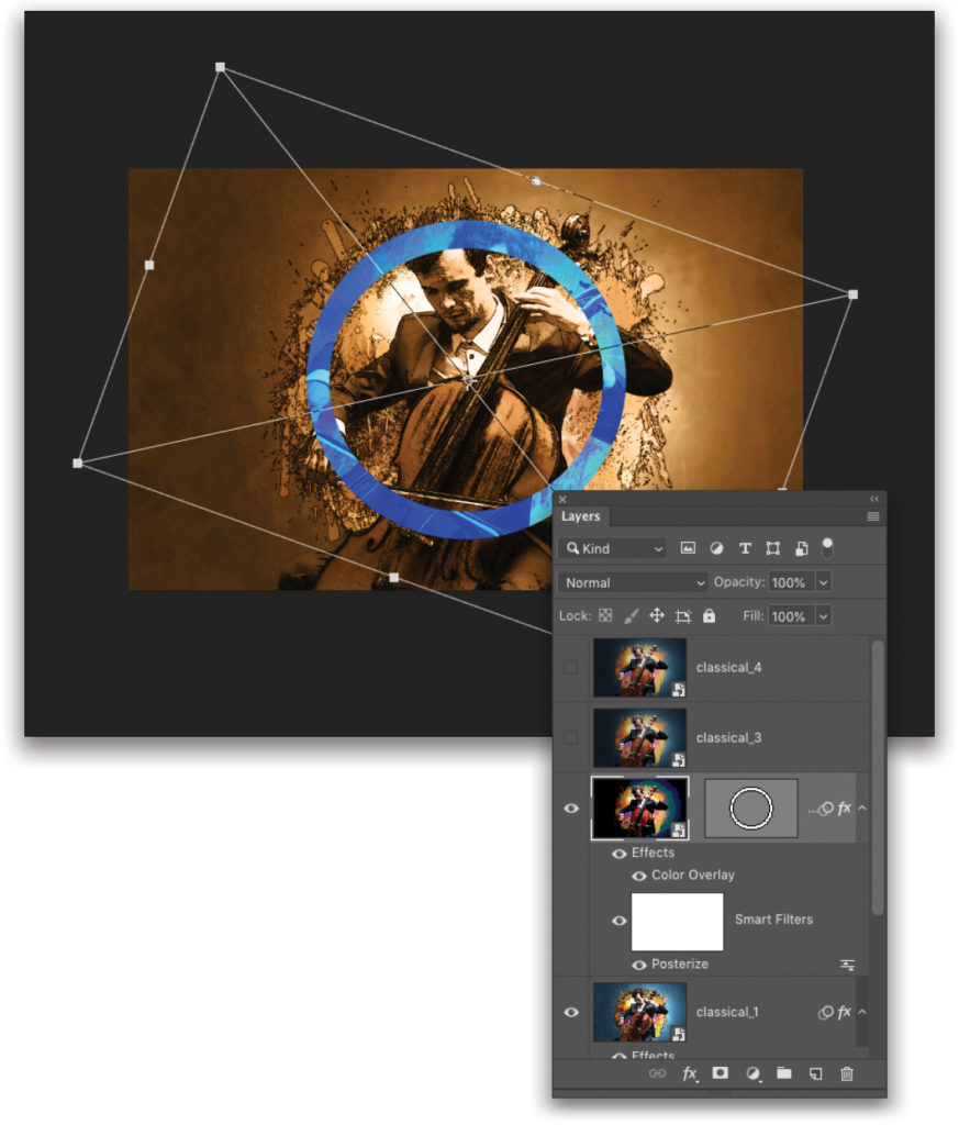
Step 12: To add a little more interest, you can rotate the image in the shape. Just go to the Layers panel and click the chain icon between the layer thumbnail and vector mask icon to unlink them. Then make sure the layer thumbnail is active. Press Command-T (PC: Ctrl-T) to activate Free Transform again, and click OK in the warning dialog. Click-and-drag outside the bounding box to rotate the image and offset the alignment a little. Press Enter when done.
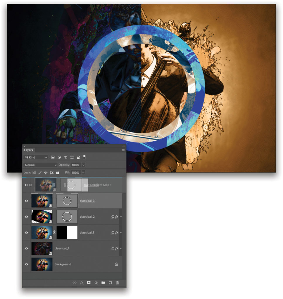
Step 13: Now turn on the classical_3 layer. We want to use the same ring vector mask we created in the layer below. To save time, we’ll just copy it. In the Layers panel, hold down the Option (PC: Alt) key as you click-and-drag the vector mask thumbnail from layer 2 to the target layer 3 above. When you release the mouse button, it will copy-and-paste the vector mask in one step.
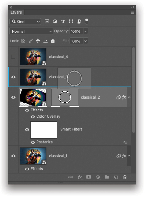
Step 14: Obviously, we don’t want both rings the same size, so we need to scale the whole ring shape on layer 3. With layer 3 active, and using the Path Selection tool (A), marquee around both the outer and inner circle paths contained in the vector mask so they’re both selected. Then, use Free Transform again and scale the ring down so it fits inside the existing ring. Be sure to hold down the Option (PC: Alt) key to scale it from the center. Press Enter when done.
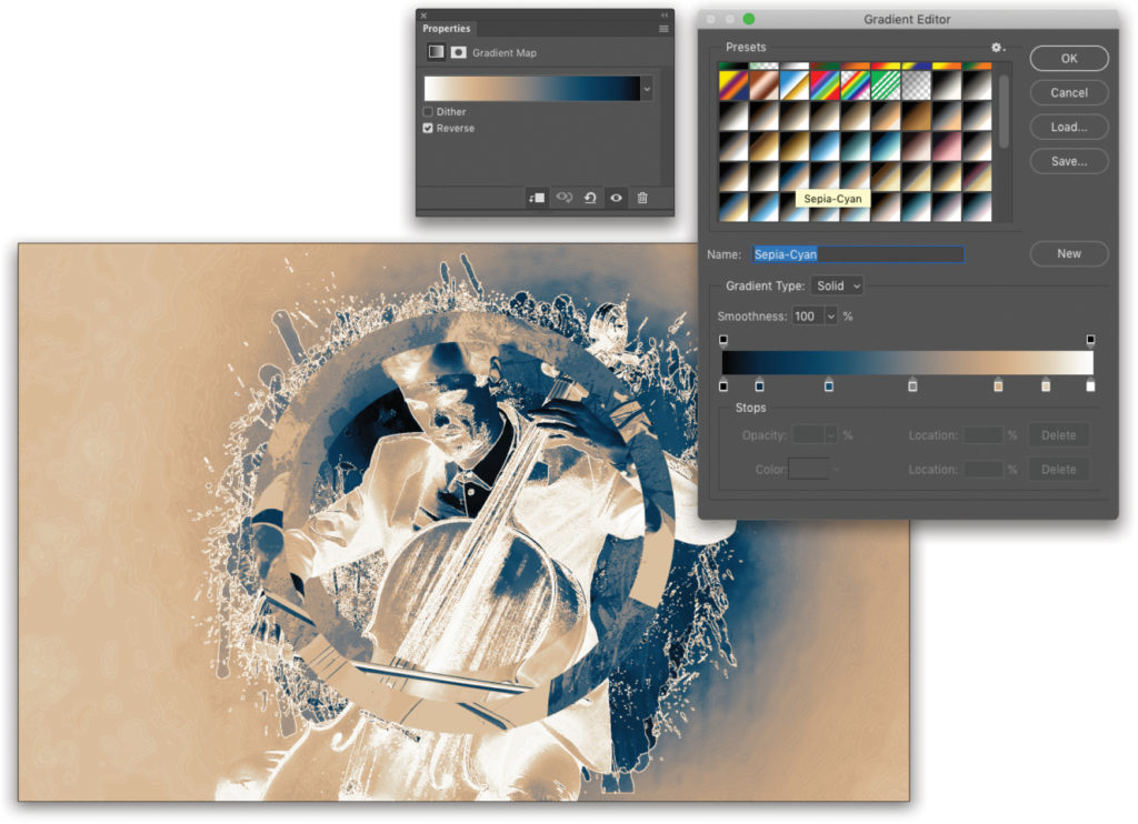
Step 15: You’ll see the image inside this ring is the original image; however, instead of a filter, this time we’ll use a layer style. Click on the Create New Adjustment Layer icon (half-black, half-white circle) at the bottom of the Layers panel and choose Gradient Map.In the Properties panel (Window>Properties), click on the preview strip to open the Gradient Editor. Click on the settings icon (gear) in the upper-right corner, and load the Photographic Toning set of gradient maps. When prompted, click Append to add the set to the existing list. These are worth experimenting with but for our purposes, choose the Sepia-Cyan swatch. Click OK when done. Finally, back in the Properties panel, click on Reverse to create a negative effect with this color scheme.
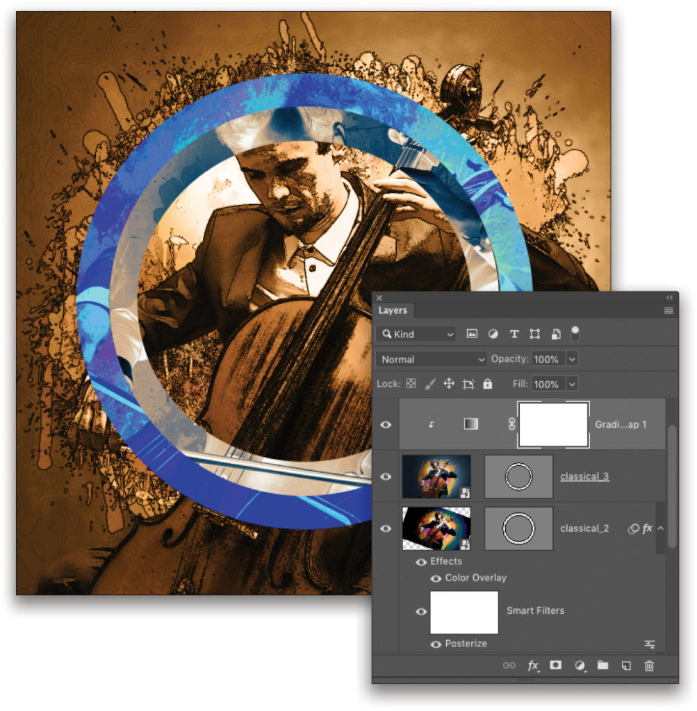
Step 16: The only problem now is that the gradient map covers the whole image. Select the Gradient Map adjustment layer in the Layers panel and press Option-Command-G (PC: Alt-Ctrl-G) to create a clipping group, isolating the effect to the masked area of the layer below.
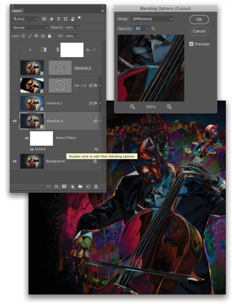
Step 17: In the Layers panel, click-and-drag the classical_4 layer from the top of the layer stack and place it just below the classical_1 layer. Turn this layer back on and make it active. Turn off all the layers above it so you can see the effect as we build it for this layer.
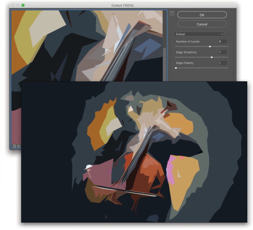
Step 18: Go under the Filter menu again but this time go to Artistic and choose Cutout. (Again, if you don’t see the Artistic option in the Filter menu, see the note in Step Five above, except expand the Artistic folder in the Filter Gallery.) Your settings may need to be tweaked depending on your image but here we’ve set the Number of Levels to 6, the Edge Simplicity to 7, and the Edge Fidelity to 1. This will create a wild graphic effect from the photo. Click OK when done.
Step 19: It doesn’t look like much but what comes next is pretty cool. In the Layers panel, you’ll see the Cutout Smart Filter as a line item under the layer (if you used the Filter Gallery it will say “Filter Gallery” instead). To the right is a small settings icon that looks like two sliders. Double-click on the icon to open the filter Blending Options. This only affects the filter and not the original layer. Set the blend Mode to Difference and lower the Opacity to 90%. Click OK. (When I first did this effect, this part was a happy accident.)
Step 20 (Optional): I added a simple Color Overlay layer style to this layer to cool down the image a little and provide better contrast with the sepia elements.
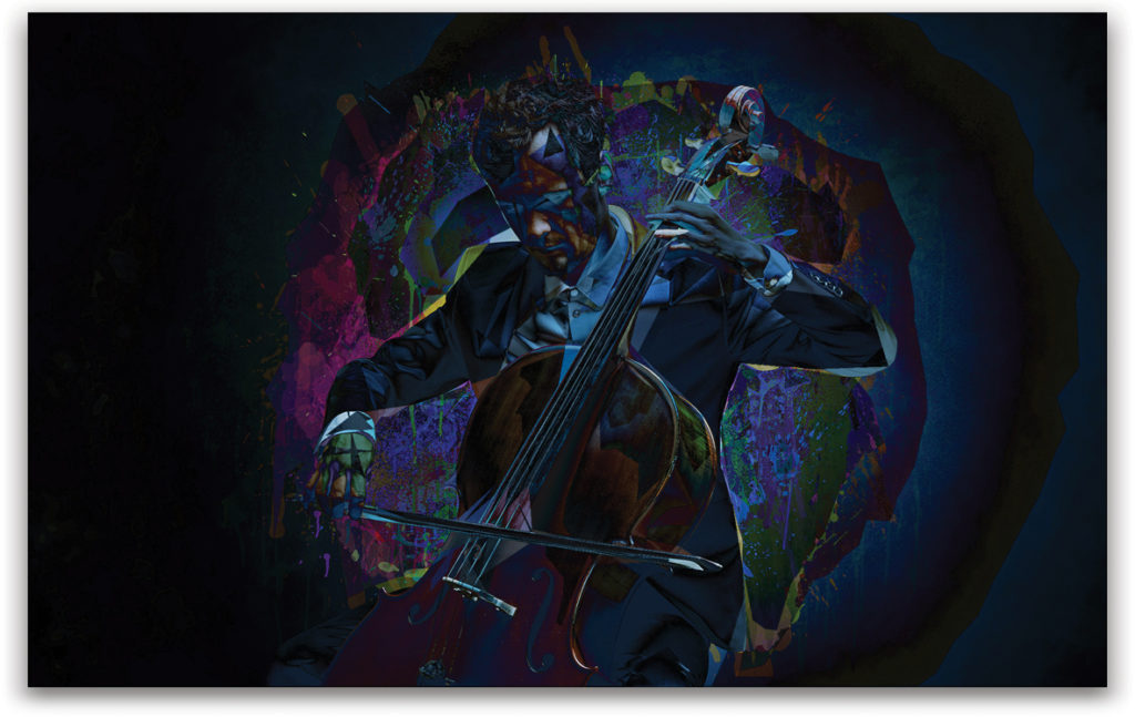
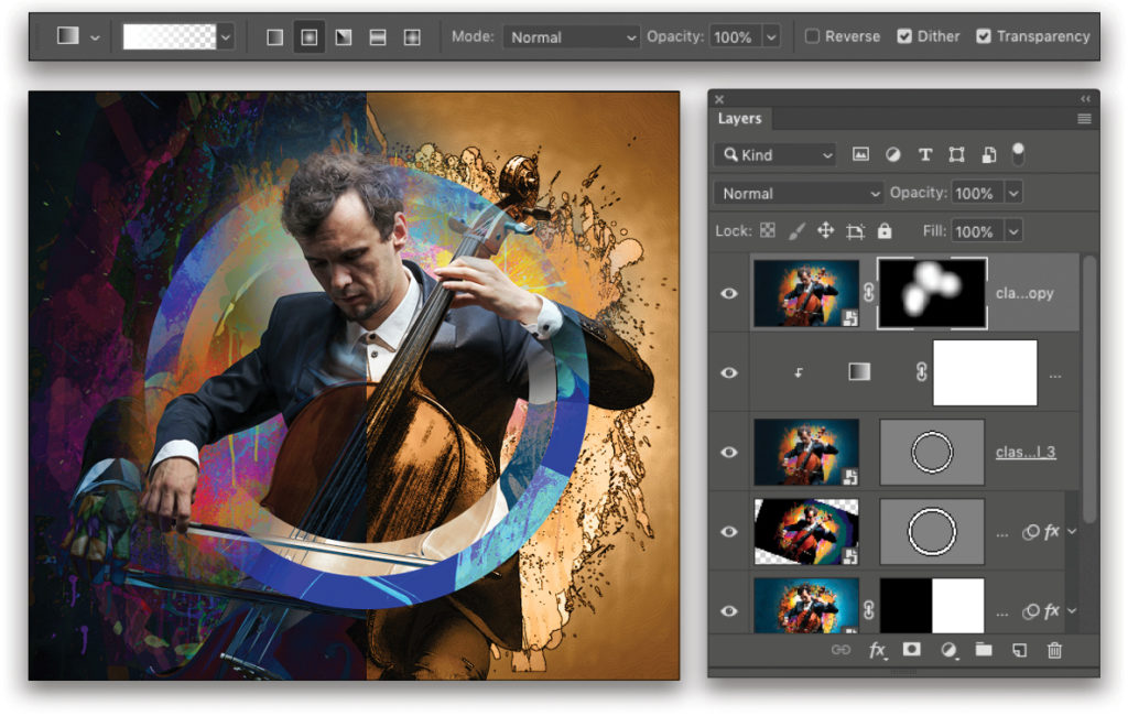
Step 21: Turn all the layers back on, and click on the classical_1 layer to make it active. Using the Rectangular Marquee tool (M), draw a selection over the right half of the image. Click on the Add Layer Mask icon (circle in a square) at the bottom of the Layers panel to convert the selection to a layer mask, hiding the unselected area. This creates a split effect that reveals the two layers below.
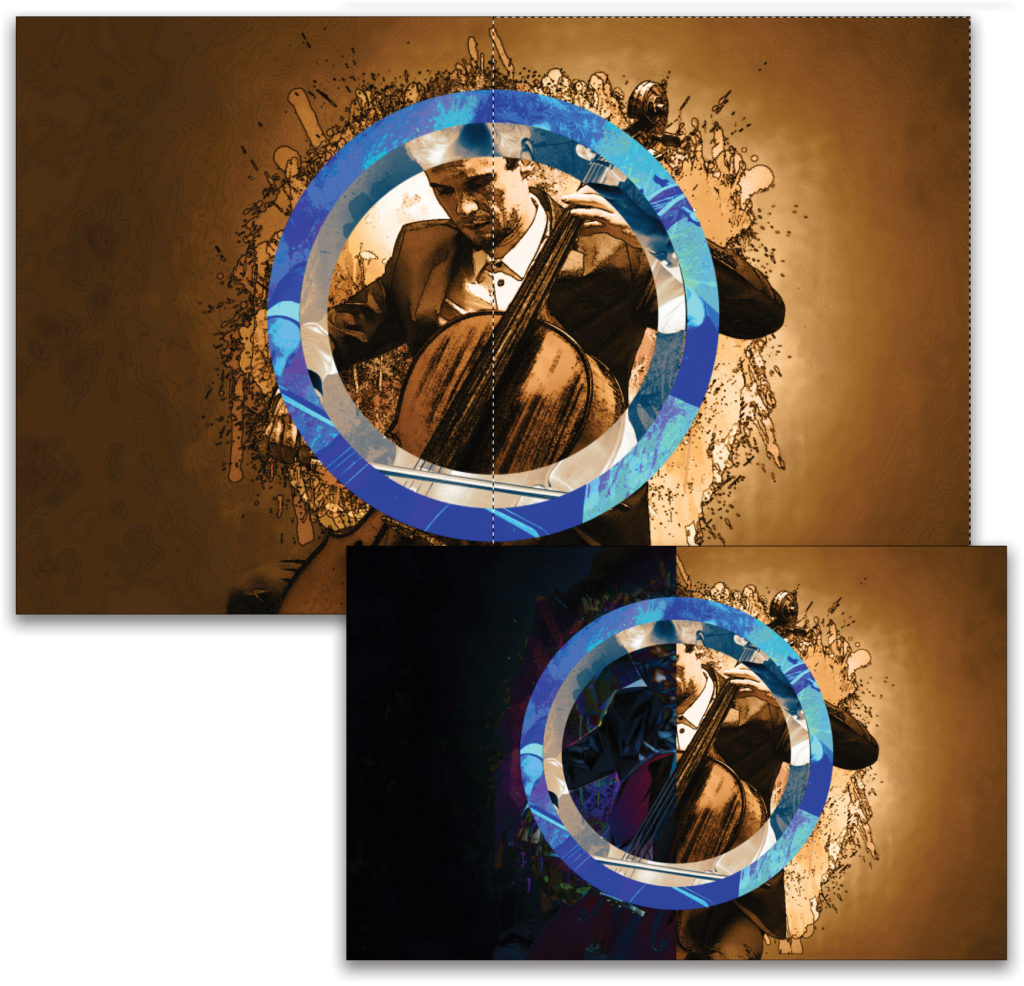
Step 22: Just like before when we rotated the classical_2 layer to offset the image, we’ll scale up the classical_4 layer with Free Transform to get more variation. Hold the Option (PC: Alt) key to scale it from the center outward. Press Enter when done.
Step 23: Hold the Option (PC: Alt) key, click-and-drag the layer thumbnail of the classical_3 layer to the top of the layer stack, and release the mouse button when you see a thin blue line appear. This will create a copy of the layer at the top of the stack. Grab the vector mask and drag it to the Delete Layer icon (trash can) at the bottom of the Layers panel to delete it.
Step 24: Now add a Hide All layer mask by holding down the Option (PC: Alt) key as you click on the Add Layer Mask icon at the bottom of the Layers panel.
Press D to set the Foreground color to white, and choose the Gradient tool (G) in the Toolbar. Up in the Options bar, click on the gradient preview thumbnail, choose the Foreground to Transparent preset in the Gradient Editor, and click OK. Also choose the Radial Gradient type in the Options Bar.
Drag out gradients on the layer mask in areas you want to reveal the main subject. Here we want to show the head and hands a bit more and give the illusion of the rings fading around him. You can draw multiple gradients as needed to reveal more of the subject.
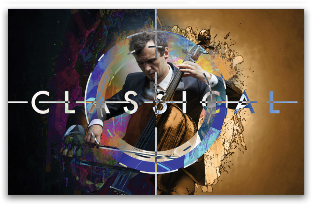
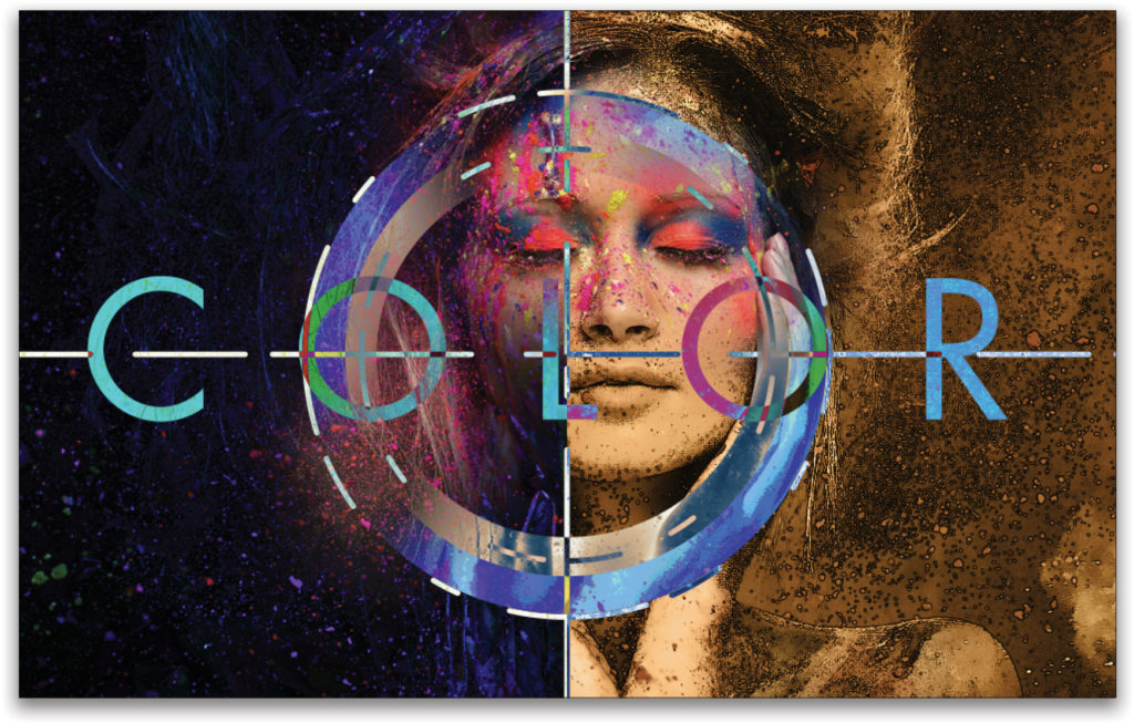
Step 25: To finish the image, I added some text and other graphic elements. Check out this video to learn how I added those elements.
Bonus: Changing the Entire Design in One Step
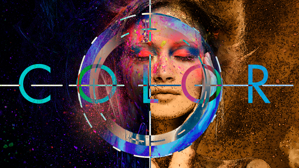
As I mentioned at the beginning of this article, the big advantage of using smart objects in this way is that you can easily change the subject image while keeping all the effects intact. All you need to do is swap out the image in one of the smart objects and it will instantly change all the others.
Step One: Double-click on any one of the smart object thumbnails in the Layers panel to open the smart object in a temporary file, which is the original photo of the cellist.
Step Two: Here we have another cool model shot with a mess of colors—perfect for this project! All you need to do is place, copy, or drag the image into this smart object image. You’ll see in the Layers panel it retains the original image layer, so you could keep a whole library of designs in one file.
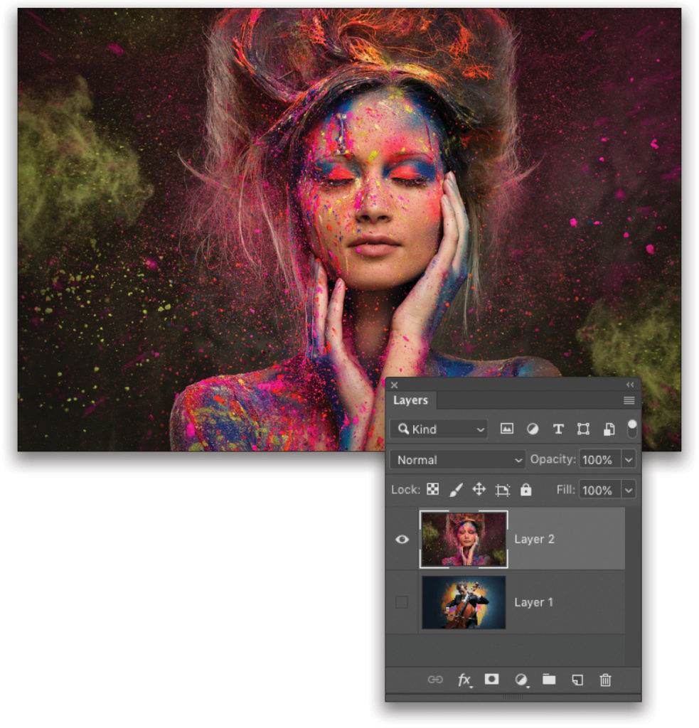
Step Three: Once the image is placed, just close it and save the changes. You’ll see the entire design magically change. All I did here was modify the color in the Color Overlay layer styles on a couple of the layers and changed the text. You could have multiple text layers for various designs.
Reach out to me in the KelbyOne Community page for this issue if you have any further questions or wish to share your creations. Until next time, keep experimenting!
This article originally published in the October, 2019 issue of Photoshop User magazine.


