This issue, we’re going to look at one of my favorite styles of graphic effects, retro type! Anyone who knows me as a designer can see that my work is influenced by retro design. But what is retro design? There’s so much great design that was created in the pre-computer days, including many familiar logos and font styles that make you think of the “classics,” and many brands seem to be going back to these styles.
Design is heavily affected by its time, which we categorize into decades. Growing up, I was influenced by the artwork and design of the 80s—a world filled with neon and color, film and TV, and recognizable brands. Even now in 2018, we’re still drawn back to a decade like the 80s for retro design. You only have to look at the recent logo for Thor:Ragnarok and the opening title sequence for Netflix favorite Stranger Things (which I’ll cover in this tutorial). And the new Ready Player One movie is full of 80s pop culture that has inspired a whole series of posters based on classic movies.
Many of the big movies still resort to that familiar hand-painted poster look that we remember from the 80s by artists such as Drew Struzan and John Alvin. These days, artists such as Paul Shipper and Kyle Lambert (who did all the Stranger Things artwork) continue to replicate this style. I recently picked up a great book called VHS Video Cover Art: 1980s to Early 1990s,you know, those straight-to-video action movies with cheesy covers and even cheesier titles. You should check out the above artists and books if you love the 80s style.
Stranger Things Text Effect
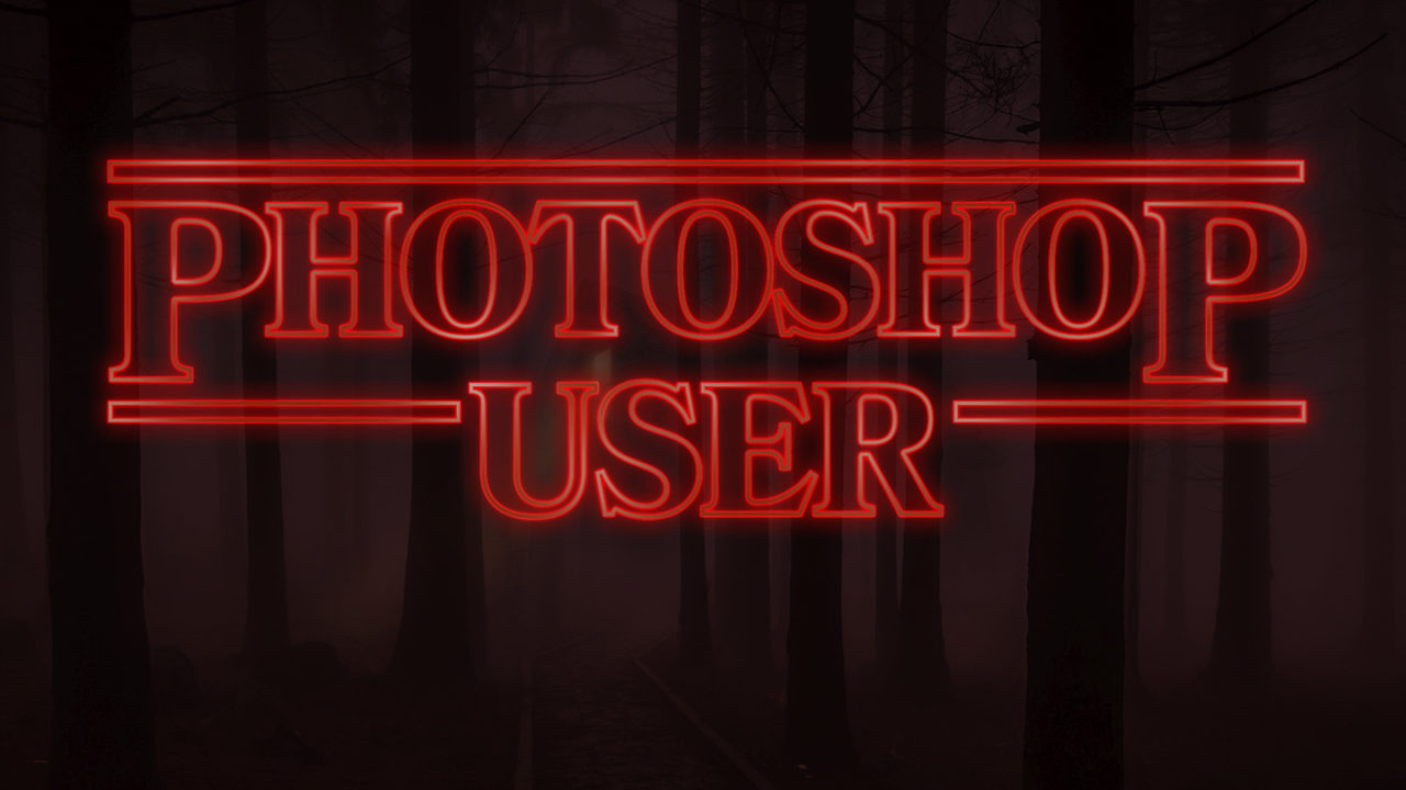
We’re going to replicate the Stranger Things title, one of my favorite retro type effects from last year. The original title used a font called ITC Benguiat, created in 1978 by Ed Benguiat, and used in everything from Stephen King novels to the main titles of the Star Trek films. As this is a licensed font, we’ll use something more readily available but similar. The tutorial is how to replicate the glowing red style, so let’s get started in Photoshop and re-create this iconic title.
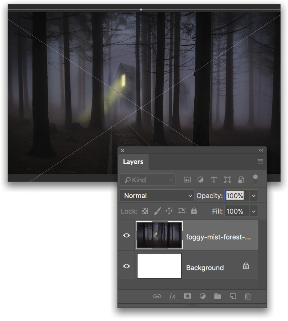
Step One: First, we need a spooky background image to give our title some impact. I found a free one at Pexels.com. Download the image and save it to your desktop for now.
Step Two: Next, fire up Photoshop. For this tutorial, we’re using the most up-to-date version, Photoshop CC 2018. The document size isn’t that important for now; we’ll just make a new file (File>New) and select a web size as though we’re making a desktop image for our computer. Mine is a 27″ iMac, so I’ll go with 2560×1440 px at 200 ppi.
Step Three: Go to File>Place Embedded, navigate to the spooky image that you downloaded, and click Place. Use the bounding box to resize the image to fill the frame. To do this easily, just Option (PC: Alt)-Shift-click-and-drag a corner point and it will resize from the center. Click-and-drag it up or down to position the image as desired. Press Enter to commit the image.
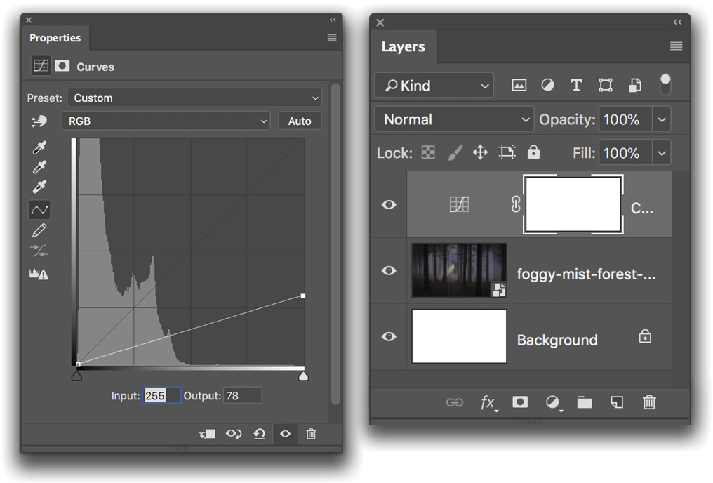
Step Four: Now we’ll add a Curves adjustment layer to darken the image so that our text will stand out more. Go to Layer>New Adjustment Layer>Curves, and click OK. In the Properties panel, drag the right-hand side of the graph down to an Output of 78, or lower if you prefer it to be even darker.
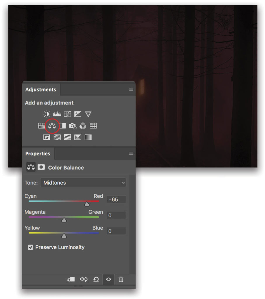
Step Five: To give the background image some mood, we’ll add a second layer adjustment. This time, click on the Color Balance icon (the small set of scales) in the Adjustments panel (Window>Adjustments). Let’s go for a reddish tone here by dragging the Cyan/Red Midtones toward Red to about 65. Always play around with these settings to find your own preference.
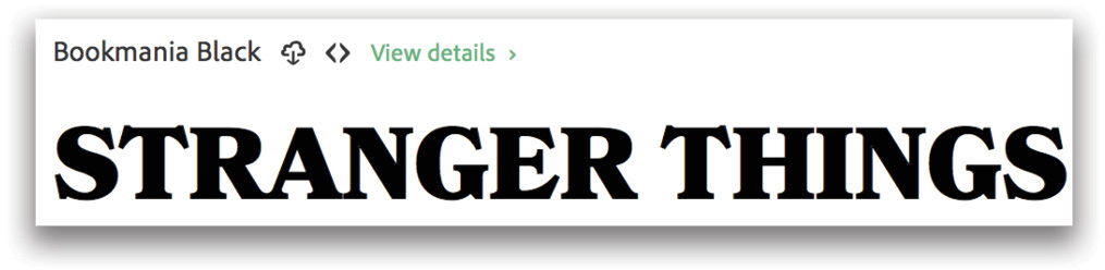
Step Six: For our title, we need a font similar to the old Stephen King novels. As I mentioned before, the original font is ITC Benguiat Bold. If you have a Monotype Library Subscription through MyFonts.com then you can use the original font, but there’s a similar style font available through Typekit called Bookmania Black, or a free font on DaFont called Indira K. Because Typekit is available through the Adobe Creative Cloud, we’ll go ahead and use that.
In Photoshop, switch to the Type tool (T), and click on the down-facing arrow to the right of the current font’s name in the Options Bar to open the font menu. At the top right of the menu, click on the Tk icon just to the right of the words “Add Fonts from Typekit” to go to the Typekit web page. In the search field at the top, type in “Bookmania,” and press Enter. Click on the results to see all the fonts in the Bookmania family. Scroll down to Bookmania Black, and click the green Sync button on the right.
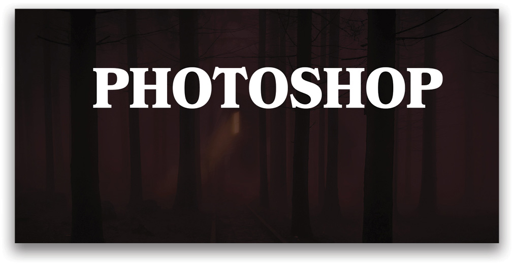
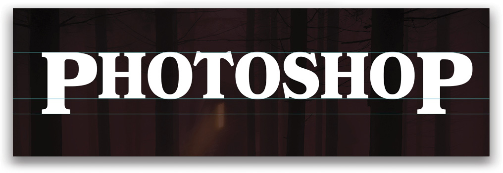
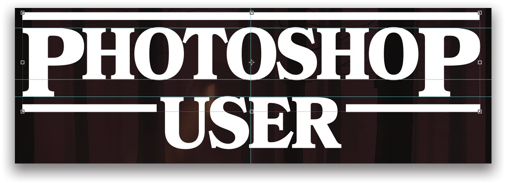
Step Seven: We’ll create our title using the words “PHOTOSHOP USER.” Why not? Using the Type tool, select Bookmania Black in the font menu in the Options Bar, and set it to about 100 pt. Press D, and then press X until your Foreground color is white. Click in the top section of your image, and type “PHOTOSHOP.” To center-align the text, just Command-click (PC: Ctrl-click) the image layer so that both the image layer and type layer are selected in the Layers panel. Then, go to Layer>Align>Horizontal Centers.
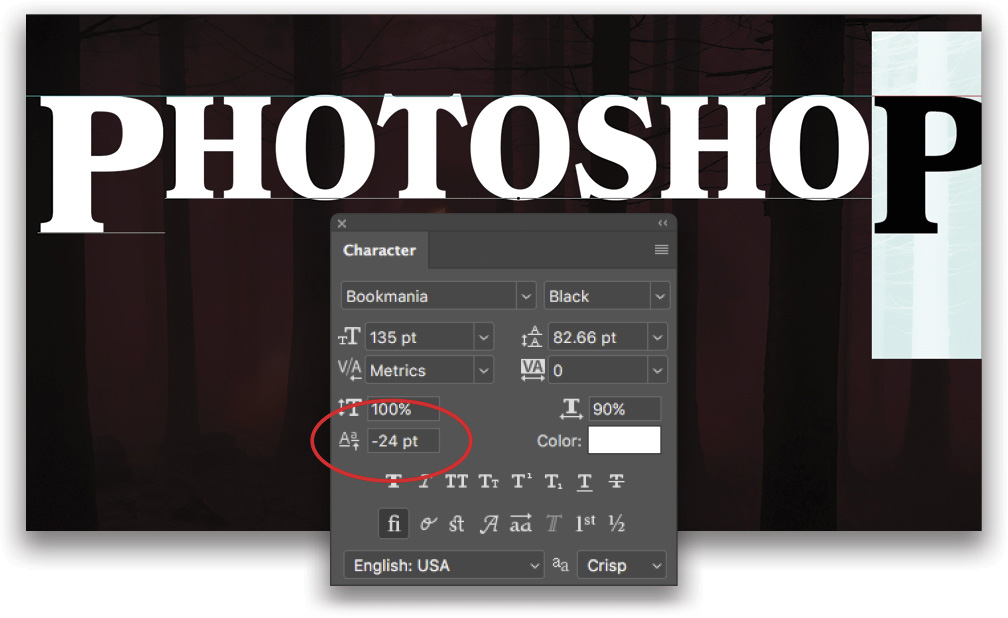
Step Eight: Now we need to increase the size of the Ps at each end of the word to about 35% larger. So highlight the first P with the Type tool and change the font size to 135 pt in the Options Bar. Do the same for the last P.
Next, we need to adjust the baseline shift of both the P characters. To do this, select one of the Ps, and in the Character panel (Window>Character), click-and-drag on the Baseline Shift icon (uppercase and lowercase A) to about –24. To help you eyeball this, you can turn on your rulers (Command-R [PC: Ctrl-R]), and drag a guide down to the top of the word “PHOTOSHOP.” Repeat for the other P.
Step Nine: Now we have our PHOTOSHOP word set up, let’s add a couple more guides. Drag a guide down to the bottom of the “HOTOSHO” section of the type and another one down to the bottom of the Ps.
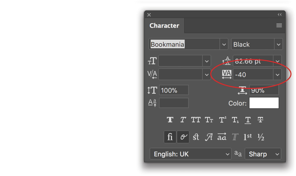
Step 10: We also want to bring the characters a little closer together, so select all the type with the Type tool, go to the Character panel, and change the tracking (the VA icon) to about –40. Press Enter.
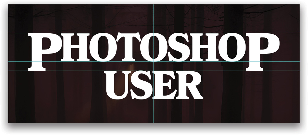
Step 11: Now we need our next line of text, so click with the Type tool to add a new type layer, type out “USER” in the same 100 pt font, and press Enter to commit the text. Switch to the Move tool (V), and drag it underneath the word “PHOTOSHOP” so the top of the word is level with the guide at the bottom of the two Ps. Now select both type layers in the Layers panel, and go to Layer>Align>Horizontal Centers.
Step 12: We need to convert all the text to shapes, so select both layers in the Layers panel, Right-click on one of the selected layers, and select Convert to Shape to convert both layers. Right-click again and select Merge Shapes. This creates one shape layer so we can start applying some changes.
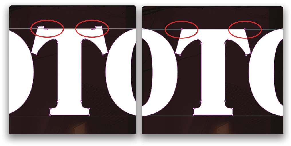
Step 13: We just need to tidy up the T a bit, so use the Zoom tool (Z) to zoom into the letter and switch to the Direct Selection tool (nested with the Path selection tool [A] in the Toolbar). Click on the letter and you’ll see some points appear. We need to work on the ones along the top of the T’s crossbar. Click on one of the inner points, then Shift-click the opposite inner point so they’re both selected. Press Delete (PC: Backspace) to remove them. You should now have a straight line across the top of the T. Click anywhere inside the T to deselect any points. Follow the same process to remove the next two inner points. Then select the remaining two points at the far ends of the crossbar and press the Down Arrow key a few times until the top of the T is level with the guide.
Step 14: Now we need to add a rectangle shape above the word “PHOTOSHOP” and to each side of “USER.” To do this, just select the Rectangle tool (U) from the Toolbar, set it to Shape on the left side of the Options Bar, and set the Fill to white. Click-and-drag out your rectangles using the smart guides to help place them, as shown in the image. While you’re dragging out a shape, you can press-and-hold the Spacebar to reposition it as needed.
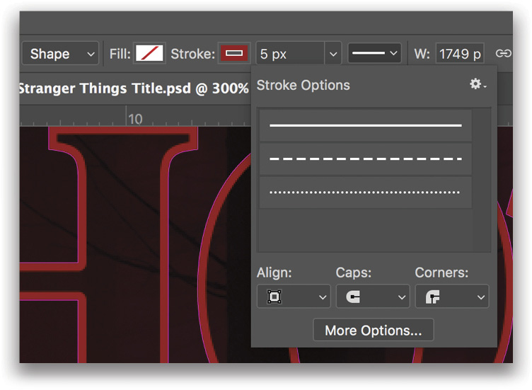
Step 15: Everything now needs a stroke, so select all the shape layers in the Layers panel, and then press the U key to make sure the Rectangle tool is still active so you can see the Fill and Stroke settings in the Options Bar. Click on the Stroke swatch to open a panel of color swatches, and select an orange/red color. We clicked on the Color Picker icon in the top right of the panel, entered a color of #A22002, and clicked OK to close the Color Picker. Change the Fill to No Color, and set the size to 5 px. (If your stroke looks odd, you’re just seeing the outline of the shape layers in addition to the red stroke.)
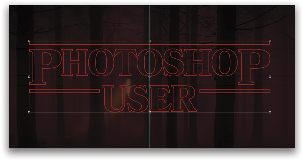
Step 16: To tidy up the stroke, select just the type shape layer in the Layers panel, click on the stroke thumbnail in the Options Bar to open the Stroke Options, and change the Caps and Corners to rounded.
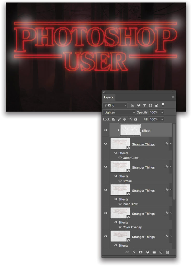
Step 17: Now select all the shape layers again, Right-click one of the layers, and select Convert to a Smart Object. This will package all the shape layers into a single smart object. Double-click the name of the smart object, and rename it “Stranger Things.” Then press Command-J (PC: Ctrl-J) twice to make two more copies above the original layer.
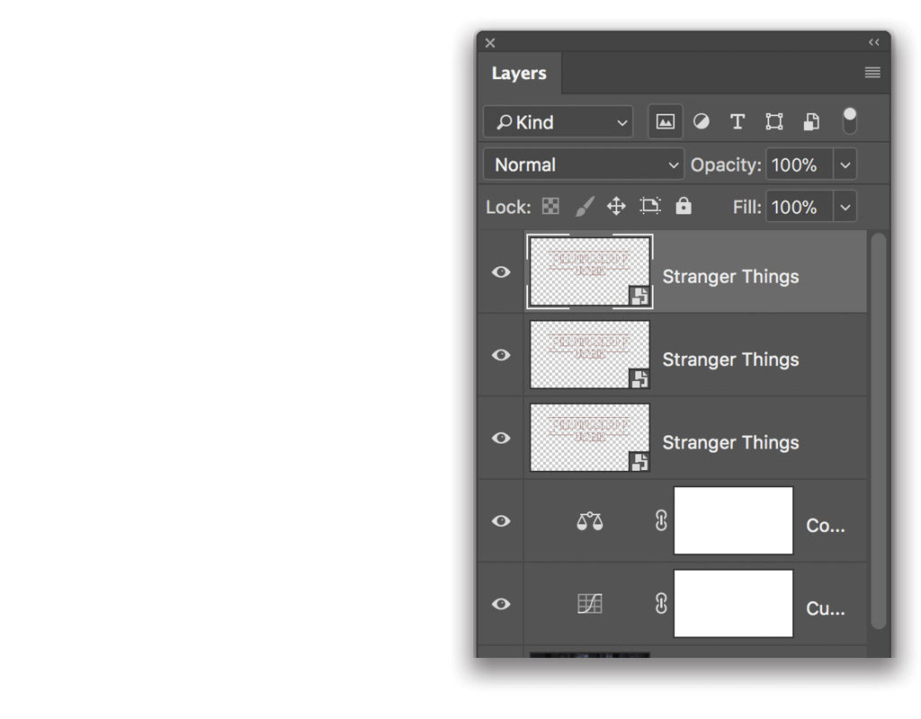
Step 18: Click on the bottom Stranger Things layer, and set its Fill to 0% in the Layers panel.
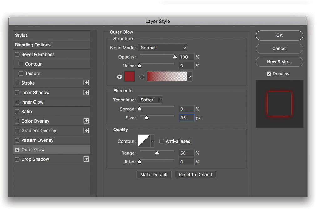
Step 19: We’ll add an outer glow to the middle of the three layers, so click the fx icon at the bottom of the Layers panel, and select Outer Glow. Change the settings to Blend Mode: Normal; Opacity: 100%; Noise: 0%; Technique: Softer; Spread: 0%; Size: 35 px; Range: 50%; and Jitter: 0%. Click on the color swatch, and choose #a80000 as the color for the glow. Click OK to close the Color Picker, and then again to close the Layer Style dialog.
Step 20: Select the bottom Stranger Things layer again, and repeat the Outer Glow, but this time use these settings: Blend Mode: Normal; Opacity: 50%; Noise: 0%; Technique: Softer; Spread: 5%; Size: 40 px; Range: 50%; and Jitter: 0%. Choose #d20000 as the color for the glow.
Step 21: We’re almost there but we need to add some more glow effect on the title. Click on the topmost layer in the stack to make it active, and press Command-J (PC: Ctrl-J) three times to duplicate it three times. Turn the layer visibility off for these three duplicate layers for now by clicking their Eye icons in the Layers panel.
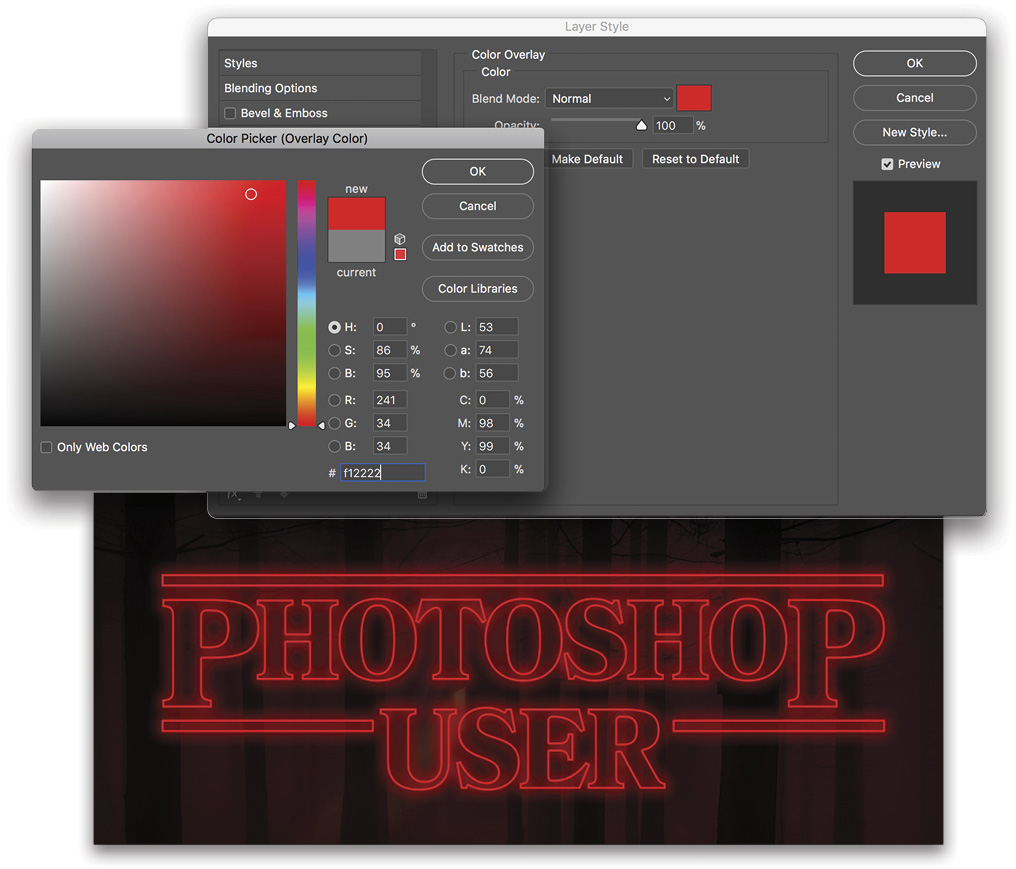
Step 22: Select the fourth layer down (the one we just duplicated three times in the previous step) in the layers stack, click the fx icon, choose Color Overlay, and set the color to #f12222.
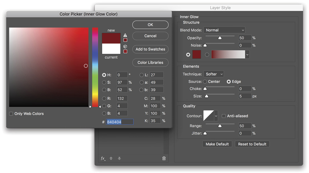
Step 23: Now select the third layer from the top and make it visible; we’re going to add an Inner Glow to it by clicking the fx icon and using the following settings: Blend Mode: Normal; Opacity: 50%; Color: #840404; Size: 5 px; and Range: 50%.
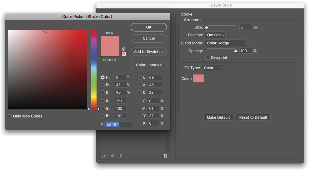
Step 24: Then make the second layer from the top visible and active, and using the fx icon, add a Stroke layer style using these settings: Size: 2 px; Blend Mode: Color Dodge; and Color: #fb8484.
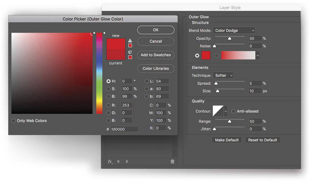
Step 25: Make the top layer visible and active, and add another Outer Glow with the following settings: Blend Mode: Color Dodge; Opacity: 50%; Spread: 5%; Size: 10 px; Color: #fd0000; and Range: 50%.
Step 26: We’re done with the type; now it’s time to add some random highlights around the text to give it that extra touch. Create a new layer at the top of the layer stack, and name it “Effect.”
Step 27: Select the Brush tool (B), press D then X to set the Foreground color to white, and in the Options Bar, select a soft brush that’s around 280 px in size at 50% Opacity. Now dab bursts of white around the letters and rectangles to highlight some of the areas. Change the blend mode of the Effect layer to Lighten, and then hold the Option (PC: Alt) key and click between the Effect layer and the layer below to clip the highlight brush effect to the shapes. If you want, you can add more dabs with a smaller brush size to highlight a few more areas.
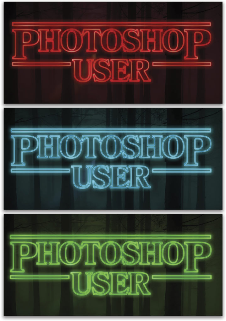
And there you have it. You can go back and adjust any of the effects to suit your taste; you can even add a Hue/Saturation adjustment layer and play with the colors to get a different look! There are all sorts of stranger things you can create! Be sure to check out the books I recommended at the beginning of this article to get more inspiration.