How do you write a big story? By writing it in small parts and putting it all together! In my regular “Photoshop Proving Ground” column for Photoshop User magazine, I spend a lot of time getting you familiar with Photoshop’s tools so you can use them to build big things from small. In this tutorial, I’ll show how to combine a few tools I’ve written about in the past to take on bigger challenges by tackling the smaller ones first. In this way, you get to tell bigger and bigger stories.
Step One: Get the Shots
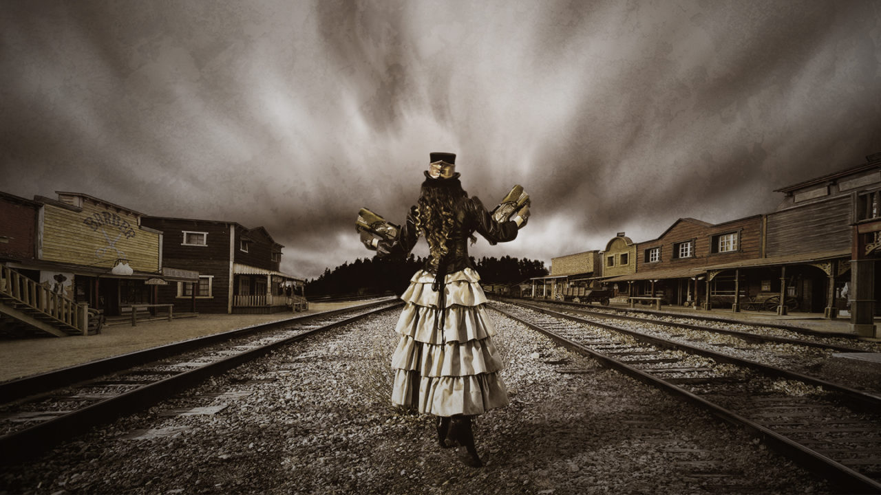
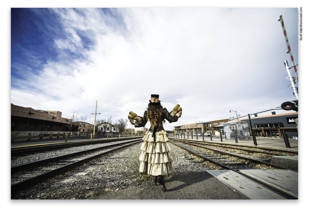
“New in Town” is built from a mix of photos from Adobe Stock and my personal collection. When I got the chance to shoot this amazing costume by Nicole Fullerton of Mad Girl Clothing, I knew I had to tell a story with it. My model, Annette, and I headed out to the Railyard district in Santa Fe, New Mexico, to get a Western Steampunk feel. I gave her a couple of NERF guns and set up behind her with a 14mm NIKKOR rectilinear lens on my Nikon D800.
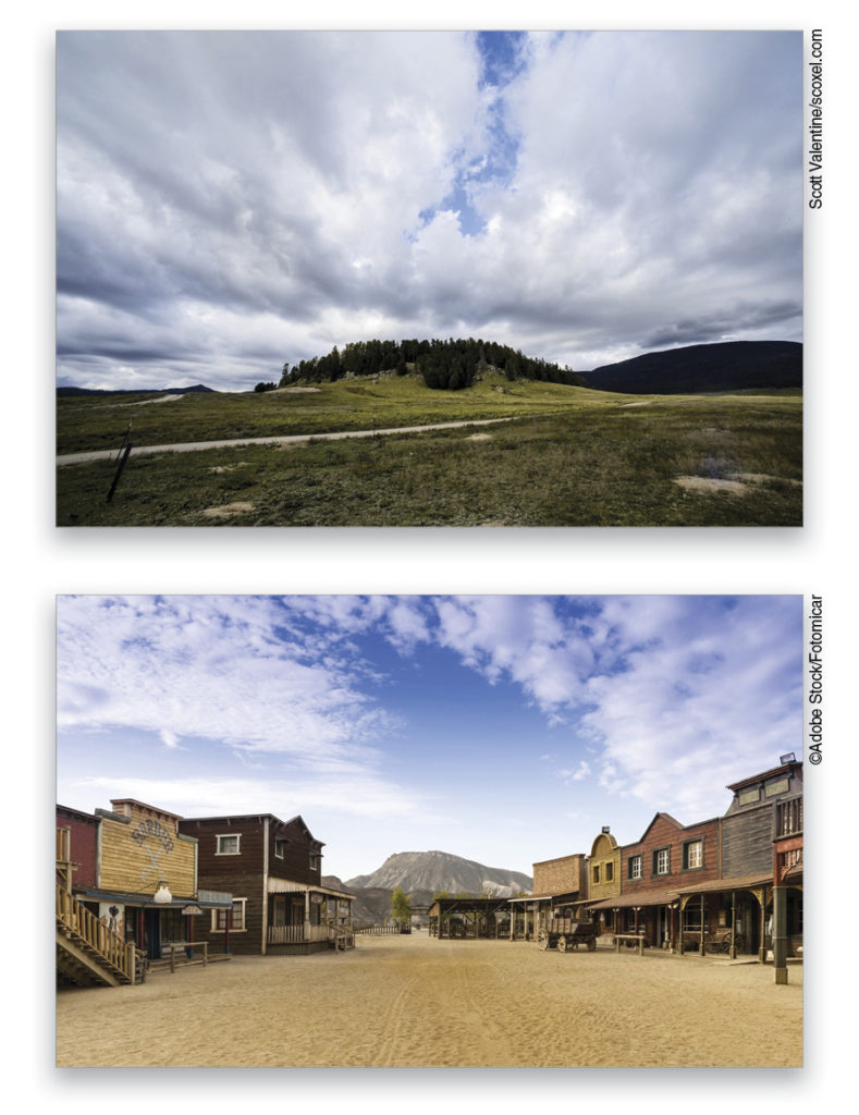
Once I had an angle I liked, I went back to my image library in Bridge and searched for other shots I’d taken with the same lens. Out came a shot of this little hill from the Valles Caldera, also in New Mexico.
Then it was off to find the right stock images to set up an Old-West theme. I found an old movie-set town that was nearly perfect, except it appears to have been shot a little higher up, and with a longer lens—probably a 50mm. That will have to be dealt with to get the same vanishing point as my 14mm lens.
As I hunted for the right pictures, I paid attention to the quality of light, shadows, and approximate point of view. Color wasn’t important to me because I’d planned this image to be heavily toned for a vintage look. While many characteristics of an image can be modified with enough work, things like shadow angle and quality are extremely difficult to change. In my original costume photo, the sunlight is direct and somewhat hard; but using a reflector during the shoot kept the contrast down. From there, I could easily cheat on the model’s ground shadow by simply cloning over it. The rest of her costume has enough texture that there are very few hard edges in the shadows, and since she’s somewhat isolated, the viewer’s eye is not likely to compare shadows on her outfit with those of the much larger buildings that will be around her.
(Note: Due to space constraints, I will stick to showing how I aligned the buildings, and what effects were applied to the sky. Watch this video to see how I painted the toy blasters!)
Step Two: Gather Up the Pieces
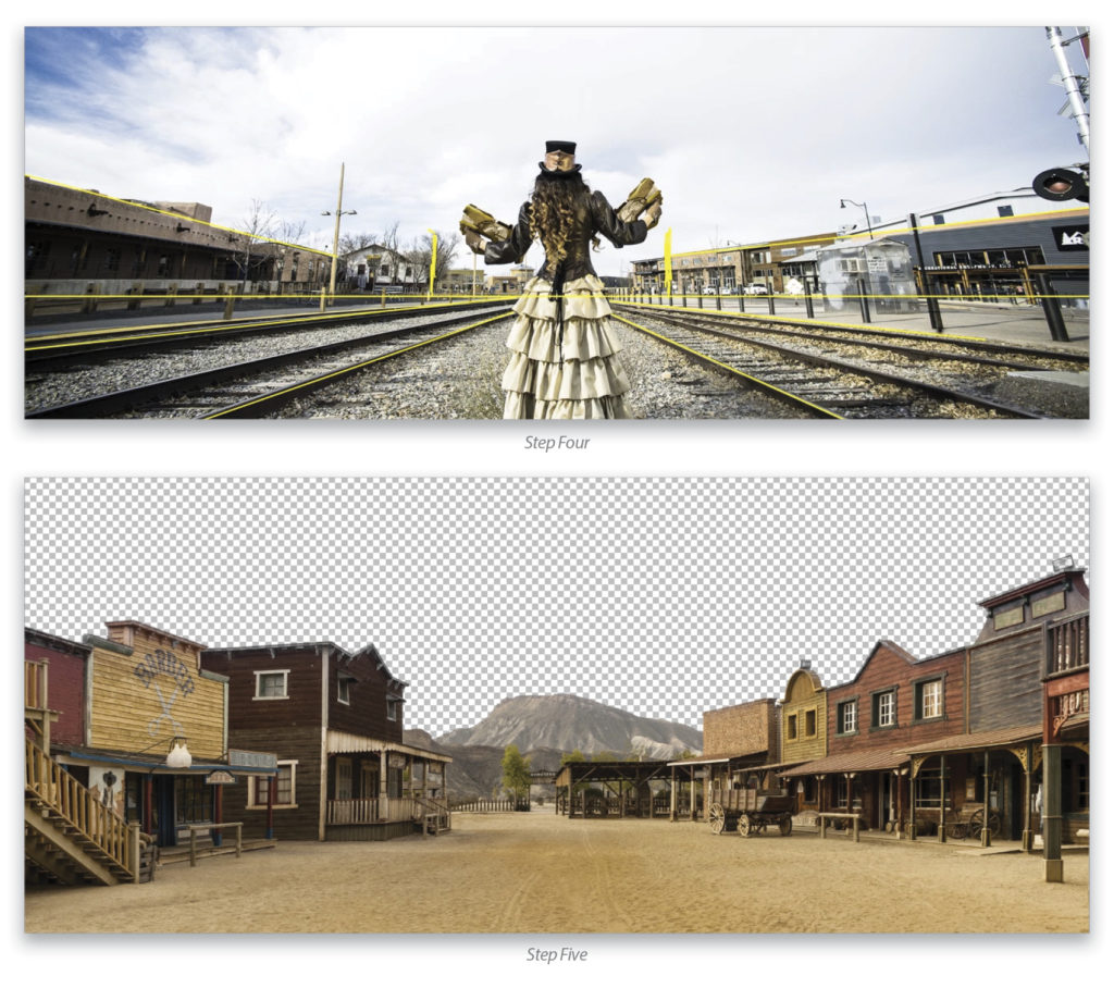
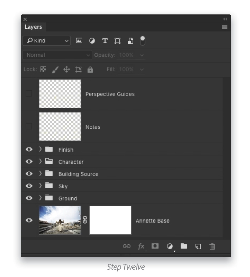
Let’s get everything into the same document on its own layer. I don’t generally have a strategy for layer order when I start out—I just put things in as I think of them for the final image. I do, however, try to keep things organized with names and groups. In this case, I opened my model’s photo as the base layer because I wanted to ensure that she was centered in this composition. Next, I added (File>Place Embedded) the sky and far background (the Valles Caldera image), temporarily lowering its Opacity in the Layers panel for easier alignment. Finally, the buildings were placed and oriented. Each time an element is placed, I keep it as a smart object, at least until I’m done transforming (in Photoshop’s Preferences, on the General panel, select Always Create Smart Objects when Placing).
Step Three: Make a Rough Mask for the Model
Now it’s time for strategic thinking—what’s going to make things easier to work with? In this case, since the model will be on top of everything, click the Eye icons next to the other layers in the Layers panel to hide them, and then use the Rectangular Marquee (M) to make a selection around her on the Background layer. Press Command-J (PC: Ctrl-J) to copy her to a new layer and drag that layer to the top of the stack. Using the Quick Selection tool (W), make a rough selection of the model and then click the Add Layer Mask icon (circle in a square) at the bottom of the Layers panel. This is just a rough mask for placement; you can refine the mask around her later on, once you know how detailed she’ll have to be. Later, we’ll also use the Clone Stamp to hide the asphalt and concrete on the ground where she’s standing. Now, let’s work on the setting.

Step Four: Draw Some Perspective Guides
The buildings need some serious work to make the scene blend together. This calls for Perspective Warp! While you’ve probably seen this tool used mostly for correcting perspective in single images, it’s great for situations like matching focal lengths. Fortunately, I have some scene elements from the background image to help guide me. Click the Create a New Layer icon to create a new layer at the top of your layer stack and grab a brightly colored sketching brush (press B for the Brush tool, click on the Foreground color swatch near the bottom of the Toolbox to pick you color, click on the brush preview thumbnail in the Options Bar, and set the Size to 3 px and the Hardness to 100%). With only the Background layer (the layer you’re trying to match) and the new layer visible, start drawing some perspective guides on the blank layer. A strong horizon is critical, and in this case we can get away with single-point perspective—draw radial lines along the building’s lines, giving hints about building height and distance from the center of the composition. (Tip: To create a straight line with the Brush tool, click once where you want the line to start, and then Shift-click where you want the line to end.)
Step Five: Mask Out the Sky in the Buildings Smart Object
I prefer to mask in advance when I’m going to be matching up elements. In this case, I first made sure the Buildings layer was a smart object, and then used Topaz ReMask 5 to isolate the sky to mask it out. Some of the mask edges are left semi-transparent, which will help blend the sky and building elements together in the final image (I’ve hidden the other layers in the image shown here).
Note: To quickly mask out the sky in Photoshop, make the Buildings layer visible and active, double-click the smart object thumbnail to enter the smart object, use whatever tool you want to select the sky, press Shift-Command-I (PC: Shift-Ctrl-I) to inverse the selection so it’s around the buildings, click the Add a Mask icon, and then close and save the smart object file. The reason we want to add the mask inside the smart object is because when we use Perspective Warp in the next step, we want it to affect both the buildings and the mask at the same time; otherwise, it will reveal part of the sky above the buildings.
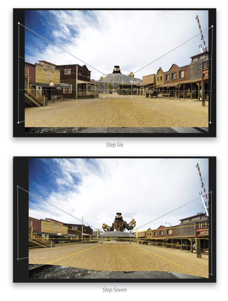
Step Six: Define Planes of the Architecture
Once the mask is applied, it’s time to add the Perspective Warp (Edit>Perspective Warp). First, draw out three connected quad shapes as shown here. I drew the boxes to the building perspectives, going outside the canvas bounds to minimize distortions in those areas. These buildings weren’t completely square, so I got as close as possible. (Tip: Once the Perspective Warp tool is active, you can no longer toggle visibility of other layers—turn on your perspective guides layer before warping! I left them off here for clarity.)
Step Seven: Warp the Architecture
Next, click on Warp in the Options Bar, and start dragging the corner pins to change the perspective. Making the perspective changes requires some guess work and old-fashioned eyeballing. The guides we drew were for hints on the image elements themselves, not the Perspective Warp guides. In this scene, I needed not only to adjust perspective, but also to scale down vertically. Once you have the buildings lined up against the guides, click the checkmark in the Options Bar to commit the changes. Don’t be afraid to finish up with a little extra transform (Command-T [PC: Ctrl-T]), scale, or even another pass at Perspective Warp. (A great reason to use smart objects is that you don’t have to start over to make small changes.) Notice that you can still see some of the original background elements peeking up over the western town. That will be taken care of when the sky is added to the mix. You can now turn off the perspective guides layer.
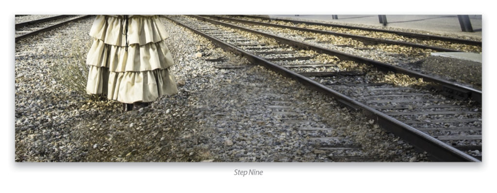
Step Eight: Mask to Reveal Train Tracks and Gravel
Next up is a little mask work on the Buildings layer to reveal the railroad tracks in the Background image below. This is straightforward painting and selecting to get the details right. Remember that you don’t want hard edges on your masks! Leave a little softness to sell the pieces all being in the same place at the same time. I only included one set of tracks to the models left in the final image. (Note: I’m not showing the masking process in this article; look for an upcoming “Photoshop Proving Ground” that deals with specialized masking techniques.)
Step Nine: Clone Out Asphalt and Concrete
To clean up the asphalt and concrete, create a new layer directly above the Background layer, and use the Clone Stamp (S) tool with the Sample drop-down menu in the Options Bar set to Current & Below. Also in the Options Bar, deselect the Aligned checkbox (a.k.a. Use Same Offset for Each Stroke) so that every time you pick up the mouse or pen, you’ll start over with the same sampled area. In this way, you can use the same patch of rock for different areas, like a collage. The point of this is to lay down copies of little pieces over a larger area to be filled. In the Clone Source panel (Window>Clone Source), I also changed rotation and scale as I worked, which broke up any patterns. For highly textured areas where direction of shadow is difficult to discern, this works really well.
It took several passes, always sampling new areas and painting only small pieces at a time, but the result is worth the effort to avoid patterns.
Step Ten: Finish Model’s Mask and Paint Shadow
Once that’s done, finish the model’s mask on the top layer and then add a basic shadow, since the original was covered up when you cleaned up the ground. The shadow is just a blank layer set to Multiply, and painted with a soft, low-flow black brush. Nothing fancy, and again, I’m just eyeballing the placement.
Step Eleven: Mask out the Foreground in the Sky Layer
The last major piece to work on is the sky. The original sky in the base image had some really nice texture on one side, but not much detail elsewhere. Something I liked was the breezy, directional look on the left side, so let’s replicate that in our new sky.
In the Layers panel, Option-click (PC: Alt-click) where the Eye icon used to be for the Sky layer to turn it on and to turn off all the other layers at the same time, and then click on it to make it active. Add a layer mask; switch to the Gradient tool (G); click on the gradient thumbnail preview in the Options Bar to open the Gradient Editor; select the Black, White preset; choose the Linear Gradient; and click OK. Now, hold the Shift key and click-and-drag upward a very short distance just below the hill to draw a gradient that will hide the foreground. Press Command-J (PC: Ctrl-J) to copy the sky layer. Right-click on the copied layer’s name and choose Rasterize Layer, and then Right-click on the layer mask thumbnail and select Apply Layer Mask. That’s a destructive move, but there are two great reasons for it: (1) The Path Blur tool (see next step) can be a little intensive on the graphics card, so giving it less to work with is preferable whenever possible; and (2), when you use a blur, all the surrounding pixels can get mixed in. Since there were elements on the horizon I didn’t want blended with the sky, I left them out so they wouldn’t contaminate the edges when I added everything together.
(Note: You want to turn off other layer elements so you don’t get confused with all the other things going on, because when you enter the Blur Gallery, you’ll see everything that’s currently visible on the canvas, but only the active layer gets the effect. It can be disconcerting to see that some things don’t react to your changes!)
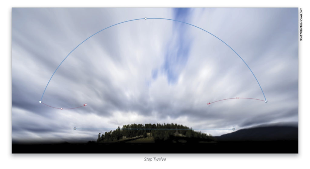
Step Twelve: Blur the Sky
Go to Filter>Blur Gallery>Path Blur. I’ve added two blur paths. The top is curved, and set to a Speed of about 80% in the Blur Tools panel. The end shapes are selected, and I curved them (turn on Edit Blur Shapes in the Blur Tools panel to see the end shapes). Using end shapes in this way allows for more texture and complexity; otherwise, blurs can end up looking like you simply ran a comb over them. A little extra texture from the shape may not be completely natural, but it certainly looks more interesting!
To keep the horizon from being blurred, the second path is a straight line with the End Point Speed set to 0 px at both ends of the line. This little trick is important to know; each Blur Path can have its own speed setting, and that’s what gives this tool its amazing power.
After selecting OK in the Blur Gallery, the result is rendered back to the layer stack. I then flipped the Sky copy layer horizontally (Edit>Transform>Flip Horizontal).
Placing the Sky copy layer between the ground and the Buildings layer (and turning all the layers back on) lets me take advantage of the western town’s cutout, and hides the original background, including some elements that might stick out around the edges and rooftops. To get more contrast in the sky layer, I clipped a Curves adjustment layer to it and lowered the shadows a bit.
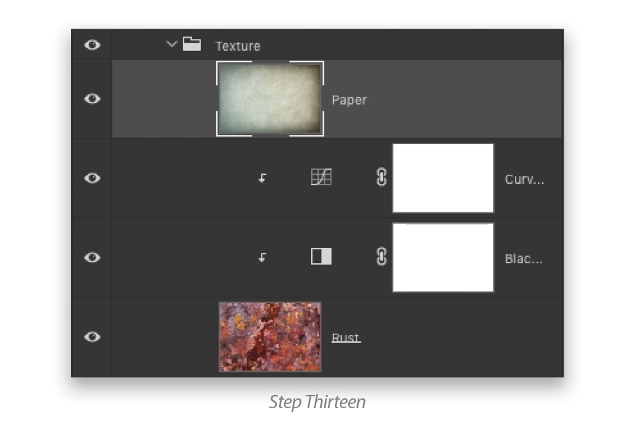
Step Thirteen: Drama, Please!
The finishing touches here are pretty simple, but really add some pizazz. The main tone comes from a Color Lookup (CLUT) adjustment layer (Layer>New Adjustment Layer>Color Lookup), using the Gold-Crimson preset found under Abstract in the Properties panel. I wanted a tintype feel, without losing all of the color.
Just above the CLUT adjustment is a Gradient fill layer (Layer>New Fill Layer>Gradient) for the vignette. It’s a simple radial gradient from transparent to black at the corners. Vignettes help draw the eye in to the center of the image while providing some depth. I’ve set the blend mode of the Gradient fill to Multiply and lowered the Opacity to 68%.
Finally, it’s time for the texture! I used a combination of some really grungy rust and some old parchment paper, both from Adobe Stock. The rust layer was treated with a clipped Black & White adjustment and some Curves to smooth it out, then set to Overlay blend mode and 41% Opacity. At the top of that is the paper texture also set to Overlay, with 36% Opacity. All of the texture elements are grouped (select all of the layers in the Layers panel and press Command-G [PC: Ctrl-G]), then the group’s Opacity is lowered to 15%. The reason for this is to maintain the relationship between the texture elements, so as to have them both be raised or lowered by the same amount with the group Opacity.
Something I love about building composite images is that they exercise nearly everything you know about photography and working in Photoshop. You need to understand composition and what to look for in a scene. You also need some engineering skills to disassemble the various images, look for important common elements, and identify what needs to be changed. And in Photoshop, you’ll get a serious workout with lots of techniques and tools all mashed together in a single project.
There’s no single path to success here, so trust yourself and keep your story in mind. Organization and a little planning will also help a great deal. What you’re really doing is performing your art of visualization, giving your perspective, choosing the emotion and narrative you want to tell that didn’t exist until you opened Photoshop. Go tell your story!
This article originally published in the April, 2016 issue of Photoshop User magazine.


