When you think of useful blending modes, I’m going to bet that Hard Mix doesn’t show up at the top of your list. At first glance, it looks like a one-trick wonder, useful mostly for creating quirky pop art. Of course, there’s more to it than meets the eye, so let’s see what there is to discover about this underappreciated Photoshop tool.
How Hard Mix Works
Hard Mix is actually a pretty simple blend mode in operation. For any given set of base and blend layers, the individual channel values are added together (that is, reds are added to reds, greens to greens, etc.). If the layer pixel values of the channel add up to 255 (for 8-bit images) or greater, then the result is 255 (white) on that channel. If the value is less than 255, then the result is zero (black) on that channel. Since this happens for each channel, the results give up to eight total combinations: Red (255, 0, 0), Green (0, 255, 0), Blue (0, 0, 255), Yellow (255, 255, 0), Magenta (255, 0, 255), Cyan (0, 255, 255), Black (0, 0, 0), and White (255, 255, 255).
Tip: You can apply a blending mode to an adjustment layer that’s clipped to a regular layer, which behaves exactly like duplicating a layer and changing the blending mode, but gains you the advantage of being able to use the adjustments, too.
Of course a visual is helpful, so check out the gradient demo below. There are three gradients, which I split in half horizontally. The top half of each pair is the result of blending, the bottom half is the original. You can see how the black-to-white versions get turned all black to the 50% point (that is, 127 on each channel), then turn all white. The color gradient divides up into six unevenly sized solid blocks. The size difference has to do with how Photoshop interprets brightness (see the November 2015 issue of Photoshop User).
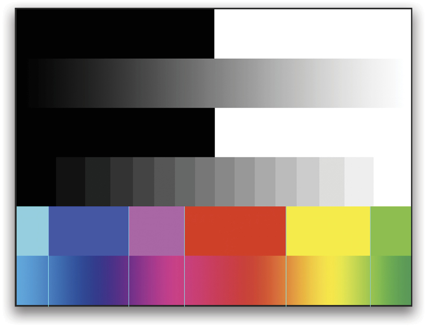
Looking at the channels in the Channels panel (Window>Channels), you can see how the combinations are formed.
For each of the channels, I’ve added guides as markers to make it easier to compare the overlapping regions.
Opacity and Fill
It turns out that Hard Mix is one of the “magic” blending modes that behaves differently between Fill and Opacity. In the following example, the first image shows Opacity at 33%, and the second shows Fill at 33%. As you can see, lowering Opacity does exactly what you’d expect—you still see the hard edges caused by the Hard Mix blending, they’re just becoming transparent. But lowering the Fill actually blends the effect in a surprising way.
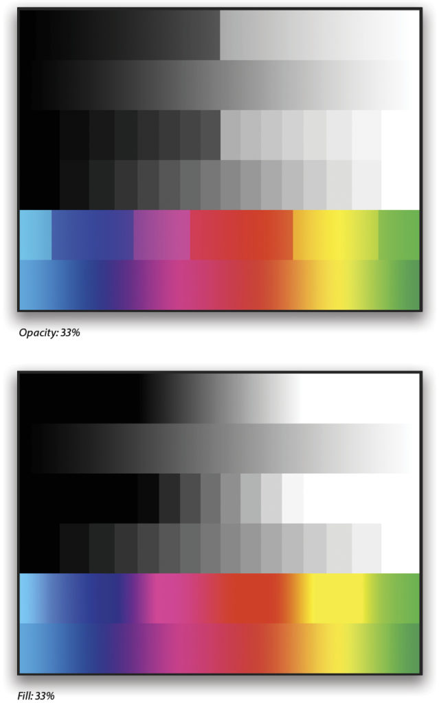
One way to think about it is as if Hard Mix were a contrast tool cranked to absurd levels. As soon as the Fill slider is nudged below 100%, it begins to show a soft transition between the areas of solid color. You can use this to add contrast to hazy photos. For this image from San Diego,
I added two Curves adjustment layers above the background (Layer>New Adjustment Layer>Curves), both set to Hard Mix. The first one is meant to adjust only the buildings, so I lowered the Fill to 33%, modified the curve a little, then used the Blend If sliders to target the dark regions and avoid affecting the sky. (To access the Blend If sliders, double-click to the right of the layer’s name in the Layers panel to open the Blending Options in the Layer Style dialog.) The second adjustment layer is set to 21% Fill, and again I used Blend If, but this time to target the sky and highlight areas.
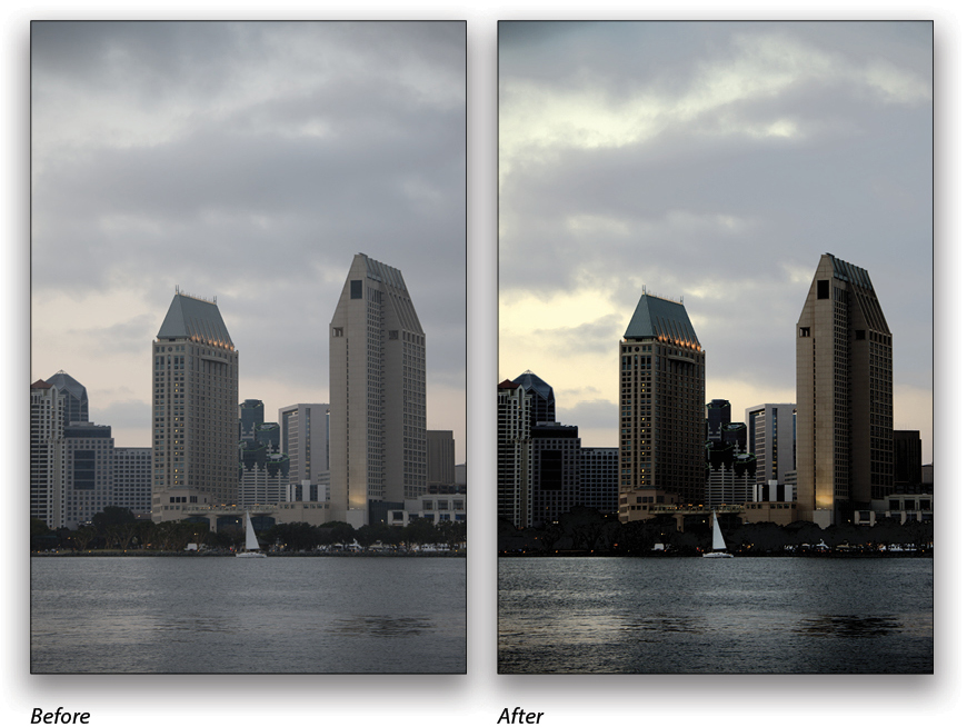
Pairing up a Curves adjustment with Hard Mix is a fast way to jam on the contrast for quick fixes. Don’t forget that Curves also lets you target channels individually in the Properties panel, so you get some control over colors as well.
Creating Pop Art
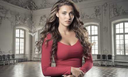
Now let’s do something a bit more creative and use the results of the Hard Mix filter as input for a painted effect. I’m using a portrait from Adobe Stock and, just like the building above, I’ve added a Curves adjustment layer set to Hard Mix. This time, however, I’m leaving both Fill and Opacity at 100% to get this gnarly pop poster look.
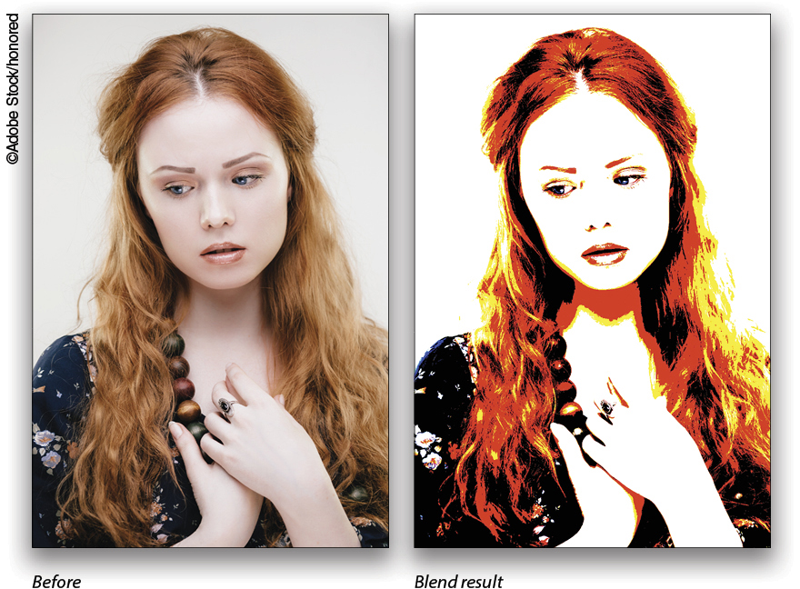
You could start from here; but what if you want to tweak the output a bit to change up the color boundaries? An easy way to do this is to add a Black & White adjustment layer between the photo and the Curves adjustment. In order to retain the colors, you need to change the blending mode of the B&W layer to Luminosity. From here, you can adjust the various color sliders in the Properties panel to change the balance a bit. I wanted more detail in her hair, so I moved the Yellows and Reds sliders until I got the result I wanted.
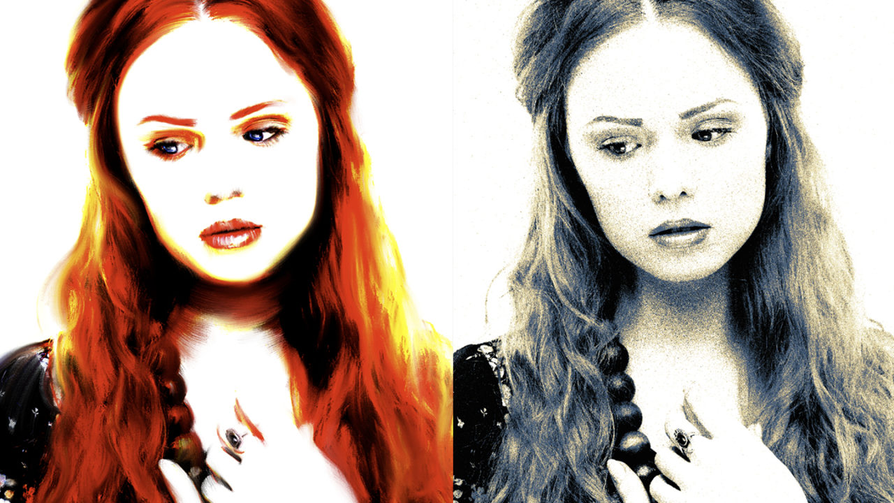
Create a flat copy of the results by clicking on the top layer in the Layers panel and pressing Command-Shift-Option-E (PC: Ctrl-Shift-Alt-E) to stamp a copy to a new layer. Here’s the fun part: grab the Mixer Brush tool (nested under the Brush tool [B] in the Toolbar) and choose the Fan – Flat Blender from the Tool Presets panel (Window>Tool Presets). (Note: If you don’t see any tool presets for the Mixer Brush, open the Brushes panel, select Converted Legacy Tool Presets from the flyout menu at the top right, and click OK in the resulting dialog. In the Brushes panel, expand the Converted Legacy Tool Presets folder, and then expand the Default Tool Presets folder to find the Fan – Flat Bender preset.)
On the stamped layer, start brushing! This particular preset has a texture built in, so it gives the impression of painting on a canvas. For best results, use a digitizing tablet like a Wacom Intuos Pro or Cintiq—that opens up the expressive capabilities by letting you use pressure and rotation.
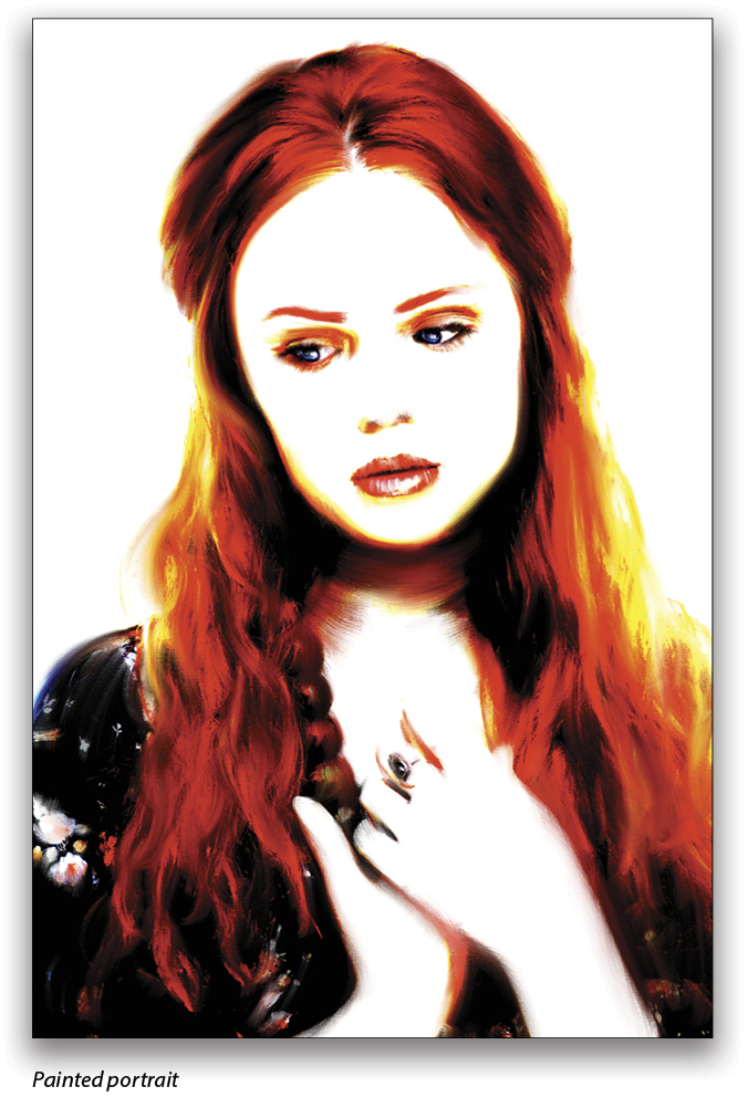
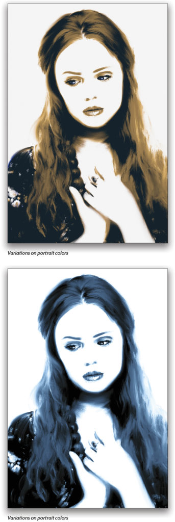
While you’ll be painting with the eight basic colors we discovered above, the Mixer Brush lets you blend, blur, and mix (hence the name!) the various colors to get softer transitions. If you want the same effect with different colors, you can always add a Gradient Map or Color Lookup adjustment layer before stamping, or even after you’re done painting.
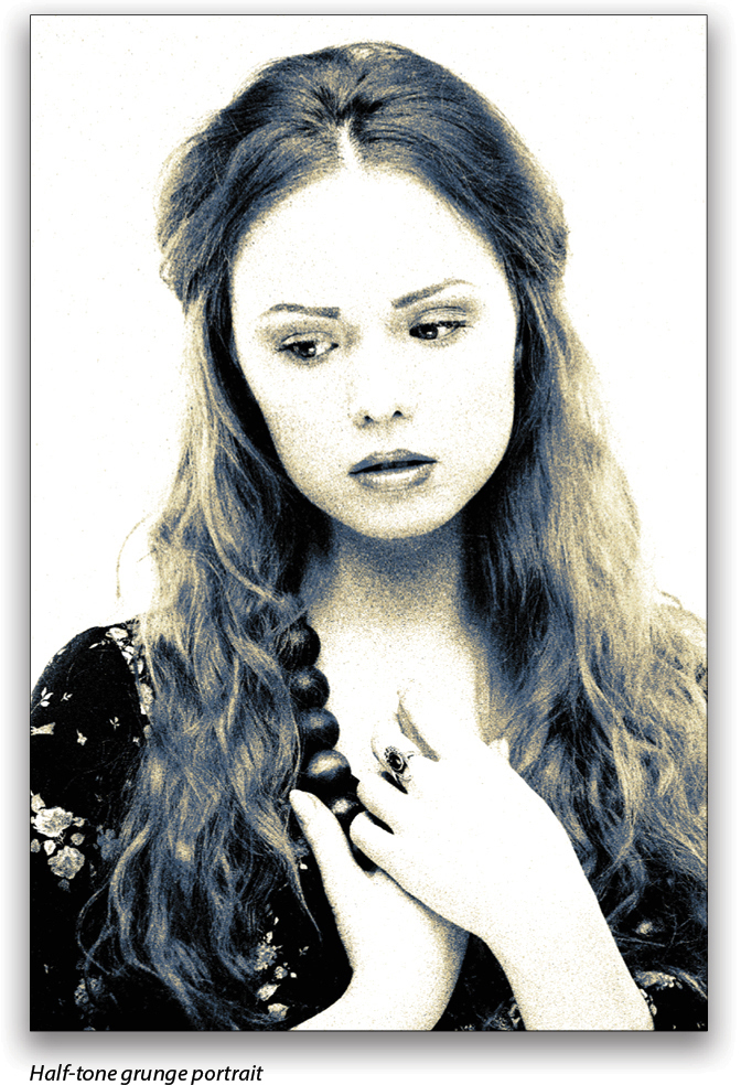
Oh, one last effect you can do is add a 50% gray layer above your photo, and add some noise to the gray (Filter>Noise>Add Noise). Choose Gaussian, Monochromatic, set the slider anywhere from 20% to 50%, and click OK. Change the blending mode of the gray layer to Hard Mix and
lower the Fill to about 70%. This starts you out with a kind of colorized half-tone effect. To make it more interesting, experiment with some blur, pixelization, and artistic filters on the gray noise layer to change the characteristic patterns. Crosshatch is a good one! (You can find Crosshatch by going to Filter>Filter Gallery, and expanding the Brush Strokes folder.)
I love this trick for creating stylized, lo-fi images.
Remember that these effects don’t have to be the final result—use them as starting points for deeper techniques and looks, and push the boundaries wherever you can, which frequently sparks new ideas and approaches.
As always, please share what you discover! The KelbyOne Community forum is eager to see your work, and remember to tag #kelbyone and #pspg in your social media posts. n
This article originally published in the March, 2018 issue of Photoshop User magazine.