Sometimes we become so familiar with a place that we forget there are little corners we’ve ignored for a long time. We walk by something and barely give it any notice, perhaps thinking that we’ll check it out later. That becomes especially easy in big areas, where we get so used to our routines that we just don’t even think about exploring.
That happens with our tools, too. Photoshop has been around a long time, and most of us tend to head straight for the familiar paths, rarely looking around to see what we’ve missed. Let’s take some time to wander through these digital halls and open a few doors we may have noticed, but tend to pass by.
Stack Modes in Smart Objects & Statistics
Stack modes in smart objects (Layer>Smart Objects>Stack Mode) and Statistics (File>Scripts>Statistics) are typically used for technical image processing, where the brightness, color, size, and relative motion of elements in an image are important to understand and visualize. When using stack modes with a smart object, each layer’s content inside the smart object is compared with every other layer and combined in some way. With Statistics, you choose the files that you want Photoshop to open in an image stack, as well as the stack mode you want applied to those layers.
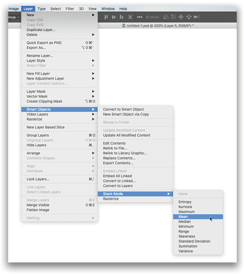
Stack modes are similar to blend modes, but they work equally across all elements in the stack. These modes also ignore opacity gradients, and only work on actual non-transparent pixel content. That means masking is only an on or off proposal for certain areas: Any content below 50% opacity isn’t included in the operations, and layer opacity doesn’t mean anything until it gets below the halfway mark.
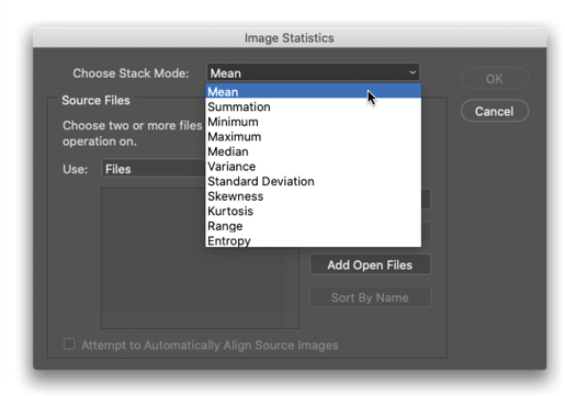
You may have seen stack modes used for noise reduction, object removal, and star trails. In this month’s “Photoshop Proving Ground” (in this issue), I put together a synthetic galaxy using a star trails technique in which you choose Maximum from the Layer>Smart Object>Stack Mode menu. For noise reduction, the two popular mode choices are Mean and Median. Since noise is considered random, if you take several frames of the same stationary subject (say, a night sky), the noise should be different on each frame.
Mean mode averages the channel values of each pixel on each layer, so if the noise is relatively dark compared to the subject areas, it will become a dark, neutral color and become easier to remove with contrast enhancement. If you remember the old-school method of looking at each channel to choose the least noisy, and then using Channel Mixer to blend the others back in, you’re familiar with the basics of this mode.
Median, on the other hand, takes the middle value of the range of pixel colors and brightness from each layer. This is also good for noise removal, but is often used to remove unwanted, transitory objects from an image. Let’s say you’re taking photos of a public place and there are always a couple of people in your frame. So long as you can get the same areas unobstructed a few times, the Median mode will use the information common to those areas and reject the “differences” introduced by people, cars, or other stuff. For a fantastic example of this, check out David Williams’s “Photo Effects” article from August 2019 where he uses the Median stack mode in Statistics.
In each of the stack modes, the layers represent information that’s best understood in the context of the entire stack. Such tools are used to compare changes over time or other variable values (or to look to see if changes exist). An example might be examining the change in color of a bacterial sample as some chemical is added, or reflectance (as seen through changes in brightness) of a plastic surface as temperature is varied.
Zoomify
Zoomify is a third-party plug-in included with Photoshop that allows very large images to be effectively tiled so that they can be displayed quickly on a webpage and then zoomed/panned once loaded. Your main image is saved in progressively smaller sizes, and then those sizes are split into tiles that are loaded in the background. This trick allows extremely large images to be displayed much more quickly as smaller versions, then zoomed in and panned for more detailed viewing. NASA uses this technique to display its huge photographs stitched from hundreds of smaller images.
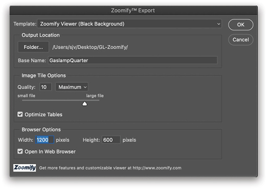
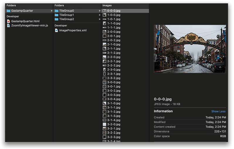
It’s pretty easy to use, too. Simply choose File>Export>Zoomify and fill out the options. Select a Template and Folder, set the Base Name, Quality, etc., then click OK. When the files are created, you can open them up in a browser to preview the results. The output is HTML 5 for broad compatibility with modern browsers. Upload to your website and you’re good to go! Check out some examples on the Zoomify site.
Notes
Notes are somewhat enigmatic in Photoshop. Using the Note tool (nested under the Eyedropper tool [I] or with the extra tools found by clicking on the three dots near the bottom of the Toolbar), it’s easy to mark up areas of an image for later work, especially for collaboration and review. To see the notes, just open the Notes panel (Window>Notes). While more traditional approaches include using the Brush tool or Type tool on a layer to describe changes or edits, the Notes tool allows easier and less obtrusive comments to be written out more thoroughly.
There’s also an import option for bringing notes in from a flattened PDF file, allowing anyone without Photo-shop to make notes on an image and send them back to the artist. For this to work, you’d send reviewers a flat version of your image in PDF format, and they add their notes in Acrobat. When they send the PDF back, you can simply import the notes to your layered working document (File>Import>Notes) and have them appear in the correct place. Note: Be sure to send a full-size flattened version so everything lines up.
You can show or hide notes using View>Show>Notes. I’d better not hear stories of people hiding jokes in their PSD files….
Package
One of the great uses for smart objects is to distribute work to team members, or to help organize stock image assets without duplicating files everywhere. This is especially handy for developing branding or media collateral that may change from time to time; however, if you need to gather those resources into a single folder, it could be challenging to track them all down. Photoshop’s Package command (File>Package) goes out to look for those linked assets in your file and bring them all together into the main document folder.
Photoshop will preserve absolute links to resources, and when you use Package it will start looking in the last-known place. When you use the command, Photoshop creates a folder called “Links” in the same place you saved your main document. Try this out with shared Libraries!
Apply Image AND Calculations
Apply Image and Calculations are two things you’ve probably heard of, even if you haven’t used them. Apply Image is kind of a shortcut for blending the current layer with any other layer, including individual channels or masks from other layers. It then returns the result as a replacement for the current layer.
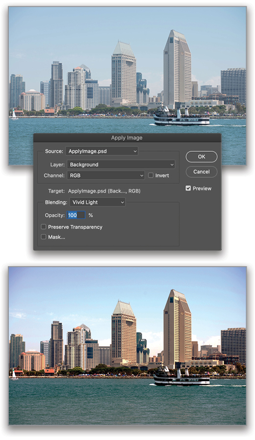
Most people who are familiar with Apply Image use it in the context of frequency separation, where it’s used to…you know…separate frequencies. The trick is in setting up layers for specific results, which takes some practice. To remove the hazy color cast from this scene, I duplicated the Background layer and ran Filter>Blur>Average to get a solid-filled layer of the average color, and then inverted the color (Command-I [PC: Ctrl-I]). Finally, I went to Image>Apply Image and applied the Background layer to the image, with the blending mode set to Vivid Light. It’s a little crunchy, but some Blend If goodness (in the Layer Style’s Blending Options) will clear that right up.
The Calculations tool is similar, but operates on any channel from any layer in any open (compatible) document. The output is either a selection, a new alpha channel, or a new document. Calculations is aimed at creating masks and selections and doesn’t return a blended layer to your document. Those familiar with making luminosity selections directly from channels should see a lot of benefit from this dialog, because it gives you a preview of the operations before committing them to an alpha channel. Calculations are also far more flexible than Boolean channel operations, but not an exact replacement; both techniques are important to know.
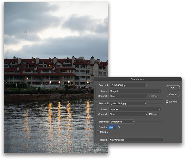
To lighten the apartments in this image, I duplicated the Background layer and set the duplicate layer to Exclusion blend mode, then used Calculations (Image>Calculations) to take the difference between the Blue channel of the Merged result (that is, what’s visible on the canvas) and the inverted Blue channel of the Background layer.
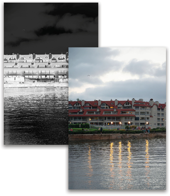
The Blue channels had the least amount of spill from the various light sources, giving me the best chance at not introducing halos in the mask. The result was returned as a new Alpha 1 channel. I loaded that channel as a selection and added a Curves adjustment layer to turn it into a Curves mask. Then, I turned off the Exclusion layer and adjusted the Curves settings. [For more on Calculations, see “The Perfect Selection in this issue.—Ed.]
There are untold riches to be had in both of these features, but they do require a little planning and patience. With experience, you can develop recipes that will quickly get you some amazing results and effects.
Share & Share on Behance
Want to share your latest piece or work in progress? Go to File>Share. This handy feature generates a quick snapshot of your document and lets you send it off to other applications such as Evernote (a photo gallery), Lightroom, an email client, and some social media services. What shows up varies by operating system and configuration, so if you want more options, you’ll have to investigate your own computing environment. When you choose where you want to share, you are given the option of adding a description before sending it off.
There’s also an option for Share on Behance, but this service has been deprecated and now simply opens Behance.net in your default browser.
Variables
Here’s something for all of you production-minded folks: using data to drive graphics in Photoshop! While normally in the domain of InDesign, this handy feature (Image>Variables) allows you to use an external data source (a tab-delimited or comma-separated text file) to build collections of similar graphics. Within Photoshop, you can assign different kinds of variables to the layers so those layers are replaced with text or images, or simply toggled on and off. If you’ve ever needed to generate a stack of customized images for business cards, catalogs, marketing collateral, sports cards, or any other templated series, this is your tool.
Using Variables is fairly easy. You start by editing your Photoshop file to assign variables to the necessary layers, create the data file containing the image names and text you want to use, and choose where to store the output files.
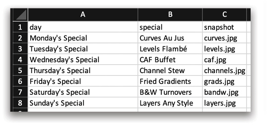
In practice, it’s easiest to create your data file in a spreadsheet application, and then export it to a tab-delimited text format. You also have to ensure that your variables are all named exactly the same as your data columns. The data file can contain an option for layer visibility, as well, giving you even more flexibility for showing or hiding other layer content, such as logos or other special indicators.
You can get fairly complicated with the replacement information, and not all of your source images need to be in the same location; relative paths are supported, too. [For more on Variables, check out Dave Clayton’s “Designing in Photoshop” column from August 2018.—Ed.]
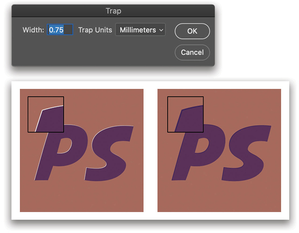
Trap
Trap (Image>Trap) refers to overlap in printing that avoids tiny alignment gaps due to what is called misregistration. This is used in commercial systems where a special color, ink, or coating is applied to a substrate, or when printing with color plates. Trapping is a kind of safety mechanism to prevent the substrate from showing through if printing elements aren’t perfectly aligned. Misregistration typically looks like a thin border of the substrate next to a spot or special ink, or when you see a sliver of one color that doesn’t look like it belongs.
Setting up a file for trapping varies from process to process, so it’s best to contact your print team to get specific details on what they need you to do with your file. Some may handle it internally, others will need you to do a little extra work.
Analysis and Measurement Log
Analysis (Image>Analysis) lets you take 2D measurements from your image directly, and doesn’t otherwise alter the visuals in your file. This feature works with the Measurement Log panel (Window>Measurement Log), and shows you the results of measurements you’ve taken.
Typically, Analysis starts with the Ruler tool, but you can take measurements from any selection. The values recorded refer to everything visible on the canvas, including transparent and blended areas—important to know in case you’re attempting to do analysis on a layered image.
There are a few ways to use this feature. With the Ruler tool (under the Eyedropper tool [I], or check under the extra tools in the Toolbar), click a starting point and then click an end point, and then, with the Measurement Log panel open, click Record Measurements at the top of the panel. You’ll get a readout of the length (in pixels) of your line, as well as the angle (which also shows in the Options Bar, along with the actual X and Y position, and a width/height readout, as if your line were on opposite corners of a rectangle).
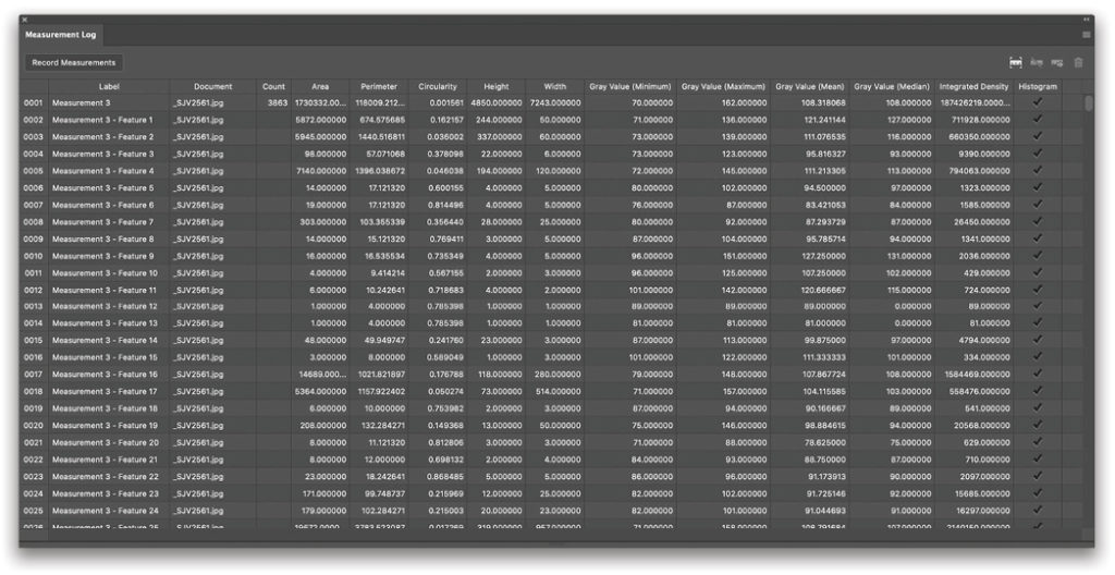
Using the new Object Selection tool (W), and holding down the Shift key, you can add multiple objects to your selection. When you’ve made your selections and clicked Record Measurements, you’ll get a count of how many objects you selected, as well as the area of each selection, the perimeter, dimensions of a bounding box, gray values (roughly equivalent to luminosity), and more. When you’re done measuring, you can export the data to a spreadsheet-ready file, including the Histogram of whatever was contained in the selection areas.
Running Record Measurements on a complex selection can yield hundreds to thousands of individual measurements, because each selection area is unique. For example, using the Magic Wand tool (under the Object Selection tool in the Toolbar), with Contiguous deselected in the Options Bar, will make selection regions that aren’t connected; each region is counted individually.
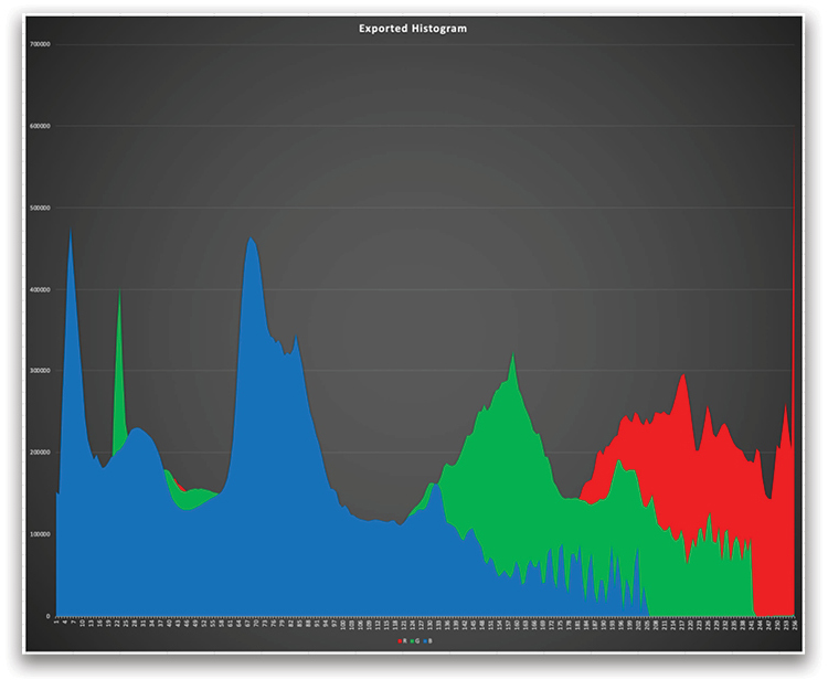
If you want to see a really great histogram of your entire image, here’s a trick: Make a flat version of your photograph, press Command-A (PC: Ctrl-A) to select everything, open the Measurement Log panel, and then click Record Measurements. Export the file to your desktop and open up the folder it creates, then load the CSV file into a spreadsheet or data-viewing application. Choose a histogram data display and set up the chart with appropriate colors and tags. The raw histogram won’t have any labels, so you’ll have to add the Red/Green/Blue (top to bottom) on your own.
Layer Content Options
Layer Content Options (Layer>Layer Content Options) is just the menu access version of double-clicking on a fill layer, such as Solid, Gradient, or Pattern. It’s handy for building actions that rely on menu access. This feature used to be more valuable before the Properties panel was enhanced, and now only becomes active with fill layers. Between you and me, I’d like to see the Fill options moved to the Properties panel, too!
Reveal All
Have you ever moved something off to the side of your canvas and lost track of it? This is your magic recovery ticket. Using Image>Reveal All expands the visible area beyond the canvas so you can see not only bits that are hanging over that might get trimmed, but also those bits and pieces you may have inadvertently slid into oblivion. Once you have either moved everything back where you can see it, or are confident you know what will be trimmed, use the Trim or Crop command to remove the excess viewing area.
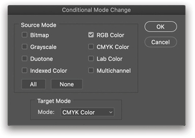
Conditional Mode Change
File>Automate>Conditional Mode Change is used with actions and automation to change the color mode of a set of files. A great application of this feature is when converting screenshots from sRGB to CMYK for print output. The dialog lets you choose which color spaces are to be included to help prevent duplicating conversions, which will return an error if the source file is the same as the target space. Using this feature on a single file isn’t really useful, so save it for when you need to batch-convert or run a suite of actions at the end of editing.
File Info
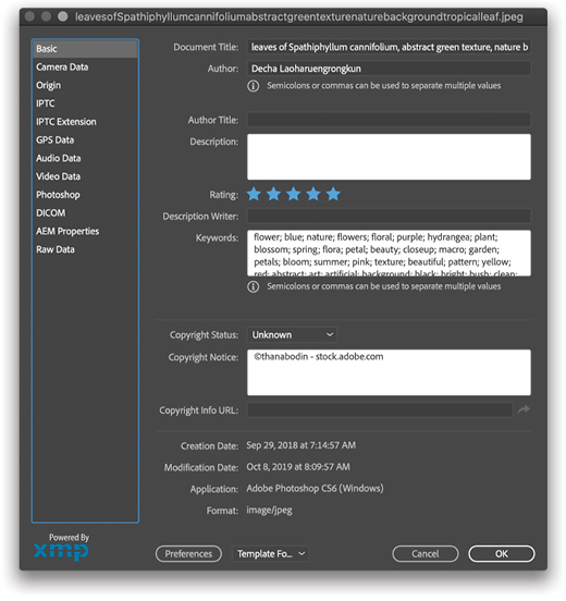
You say you have metadata for your image, but it’s not attached. Well, here’s your solution! File>File Info (Command-Option-Shift-I [PC: Ctrl-Alt-Shift-I]) is where you can put everything related to your image. If you work with agencies or teams, it’s likely this information is being used in some way, whether it’s automatically populated by another application such as Lightroom or from a camera. Many images found on stock agency sites, including Adobe Stock, have this metadata available.
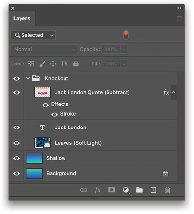
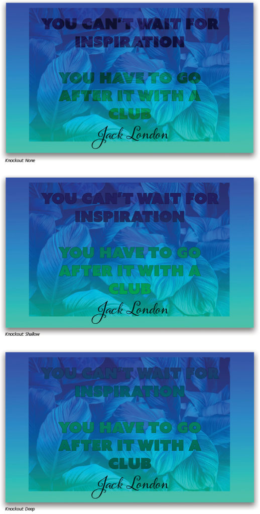
Knockout (Advanced Blending)
Found in the Advanced Blending Options in the Layer Style dialog (Layer>Layer Style>Blending Options, or double-click to the right of the layer’s name), Knockout behaves like a clipping mask, but in the opposite direction. A knockout layer exists at the top of a stack or group of layers and acts to cut out (knock out) a hole through to reveal content from lower layers or the Background layer. There are three options under the Knockout menu and they are: None, Shallow, and Deep.
Let’s say you have a shape layer at the top of a stack of layers. Once you change the Fill Opacity or Blending Mode, setting the shape layer to Knockout: Deep will “punch through” all of the layers to your Background layer (you must have a Background layer for this to work properly). In this way, you can stack up lots of layer content and still have your background show through nice and clean.
Shallow is used with grouped layers. If your shape layer is now at the top of a group, Deep will still punch all the way through, but Shallow stops at the first layer below the group. Interestingly, that first layer can be an adjustment or fill layer, so you can modify the Background layer for the Knockout. You can also use multiple knockout layers for various effects.
In both cases, your knockout layer will need to have Fill Opacity reduced or the Blending Mode set to something other than Normal. Opacity will reduce the knockout effect, and believe it or not, you can use layer styles on the knockout layer.
This example shows the quote layer set to Subtract blending mode, with a Leaves stock photo set to Soft Light. The Shallow layer is the same gradient as the Background layer, but rotated 180°.
Here’s the image showing: no knockout, Shallow, and Deep.
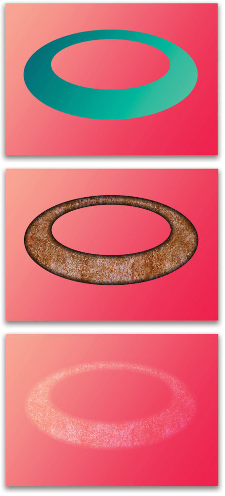
Blend Interior Effects as Group
This option affects order of operations for what are called “interior” effects: Inner Glow, Satin, and the three Overlay effects (Color, Gradient, and Pattern). Recall how the Fill slider affects layer content while the Opacity slider affects the entire layer, well, if you lower the Fill percentage of a layer with a layer style applied, the content disappears, but the style remains visible. Lowering the Opacity causes the styles to become transparent, also. Blend Interior Effects as Group (in the Advanced Blending Options of the Layer Style dialog), however, causes the interior effects to be blended and then become part of the layer content, rather than blended separately. When blended with the layer content (i.e., the box is checked), the Fill slider no longer ignores these styles.
An interesting side effect of this option is that it makes these three styles subject to the layer blending mode, just like regular content. When unchecked, these styles ignore layer blending modes, except as set in their specific options. In this example, we’ve used Inner Glow set to Subtract blending mode and a rust Pattern Overlay set to Multiply. The main layer content is set to Normal in the first image (it’s simply the inverse of the bottom gradient), then to Color Dodge for the next two, showing how the effects blend with the layer pixels and then the lower gradient.
Blend Clipped Layers as Group
Similar to blending the interior effects above, Blend Clipped Layers as Group (Layer>Layer Style>Blending Options: Advanced Blending) affects the order of operations. By default, the box is checked, meaning the clipped layer blends with the contents of its base layer before the result is blended with the rest of the canvas. If the box is unchecked, the clipped layer’s blending mode behaves as if it were not clipped, and interacts with the entire layer stack.
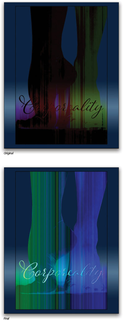
This option only applies to the bottom layer in a clipping group. In the example image, there are four layers: a background gradient fill, a photo of dancer’s feet, and a pair of layers clipped by the photo: one text, and one noise gradient. The photo layer’s blending mode is Subtract, the text layer is set to Exclusion (filled with white), and the noise gradient uses Linear Light.
Here, the first image shows the result of the layer blending with default Blend Clipped Layers as Group checked. It’s turned off in the second image. Notice that the various layers all now blend as if they were not clipped, but are still bound by the clipped layer’s mask. This is most useful when dealing with graphic elements that need to be clipped while retaining some continuity of blending modes.
Of course, this isn’t an exhaustive list of features that you may not have used. No doubt a few of these tools are someone’s bread and butter, while others probably leave even the Photoshop engineers wondering if anyone uses them. Being a nerd, one of my favorites is the ability to export a histogram to a graphing package. From this list, perhaps the most underrated are Apply Image and Calculations, and they’re certainly worth your time to investigate further.
I really enjoyed wandering Photoshop’s halls with a mix of memory and discovery. Hopefully, you’ve found some dusty corner that becomes your new favorite, too!
This article originally published in the April, 2020 issue of Photoshop User magazine.