A few years ago, I was looking for high-resolution versions of very specific kinds of paint cracks to simulate Renaissance paintings of the Dutch Masters. I found some great stock images, but the scale was all wrong, so I had to shrink the original photo to get the right effect. Of course, that meant the fill region was far too small for the entire canvas, and I ended up manually pasting, filling, stamping, and healing an entire canvas. That was neither easy nor really satisfying because there were lots of repeated patterns.
When I got my hands on the new Content-Aware Fill (CAF) workspace in Photoshop CC 2019, one of the first things I tried was synthesizing textures just to see what happened. The left half shown below right is the original texture, and the right is a single pass from CAF, with no Color Adaptation or Rotation, and only Scale checked.
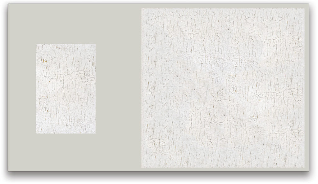
Original cracked paint and CAF result
Is it perfect? Nah. But it’s a fantastic starting point, and may be just fine when used for a very subtle overlay. In my case, this would have saved me a couple of hours and a lot of frustration. The basic process is incredibly simple, but the results can vary wildly depending on the starting textures. Here’s how to get started:
- Find the source texture and isolate it. I find it’s easiest to work in a new document.
- Create a canvas size that gives you plenty of room to have both the source and the generated texture. The above example is about 2500×1400 px.
- Drag out a selection region that you want to fill.
- Run Edit>Content-Aware Fill.
- Take a deep breath while the tool does its thing!
From here, you’ll have to try the various options and change up the selection source mask (the green overlay) to refine the results (I had a professor that called this “fiddling with the knobs.” So, go fiddle!). When you get something you like, click OK. I like to set Output To: New Layer. This way, you can generate multiple versions of the texture for even more flexibility.
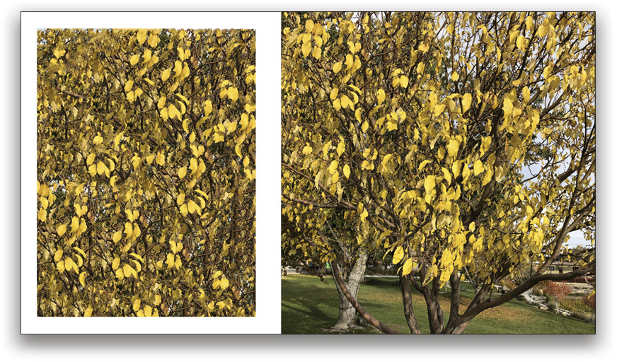
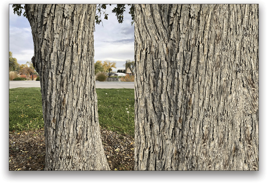
This approach works on fairly “clean” textures, especially when the image has some larger features mixed with some fine features. By clean, I mean to say that the textures are obvious and have good contrast. Even better is when there’s a range of frequencies available and an organic, non-repeating pattern. Fine details, such as human hair, do not make for good texture fills with the CAF workspace, but bark works amazingly well.
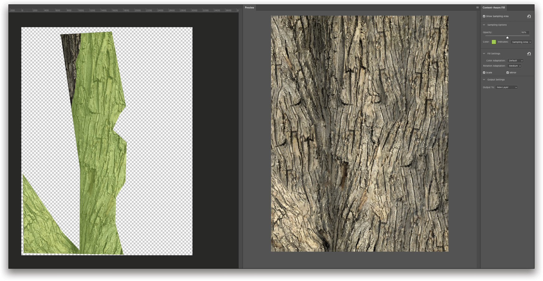
I spent a few minutes outside getting some shots of tree trunks and trying out the various settings. The so-called “Patch match” technology looks more at chunks in an image than fine structures to develop new pieces to blend together.
Abstract Patterns & Transparency
If you’re not worried about replicating a specific texture, then just about anything goes, and it’s worth experimenting with a variety of textures. I tried quite a few times to get really good textures to fill in human hair, but that didn’t go very well. Then I tried creating a few abstract patterns with some custom brushes, and that wasn’t only useful, but interesting.
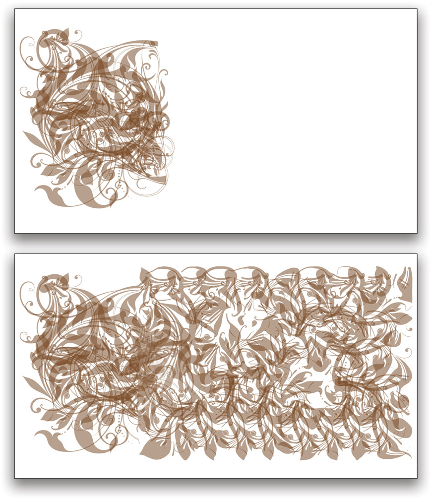
The pattern above was built up by using 50% Opacity stamps on a blank layer. When working with patterns like this, there are two important things to know: First, CAF doesn’t like too much transparency in the source material; second, it helps to overlap the original pattern a little to create more of a transition from the original to the synthesized textures.
To deal with the transparency issue, simply stamp a merged visible copy (Command-Option-Shift-E [PC: Ctrl-Alt-Shift-E]) that includes some kind of background. A solid color works well and lets you isolate the result with a simple Blend If adjustment to remove the solid color.
Happy Accidents
The CAF can also give up some really impressive results, though they’re sometimes very random. Check out the result above right when sampling from a piece of blue embroidered fabric and creating a filled circular patch.
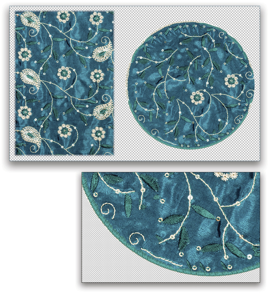
See the border? I have no idea how CAF interpreted those little leaves into a believable border, but it looks amazingly real along the bottom. While it’s not consistent all the way around, it wouldn’t be difficult to simply copy-and-paste those sections further around the patch. You shouldn’t expect this kind of result, however; this is what Bob Ross would have called a “happy accident.” I tried many times to force a similar border using slightly different selections, and it never was replicated.
The lesson from the cloth is this: If you get something cool, save it! You can always repeat the selection for new results, but you may never get the same happy accident again.
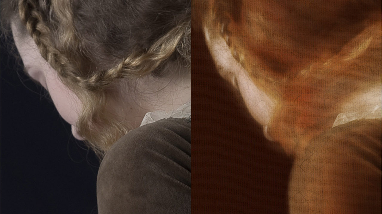
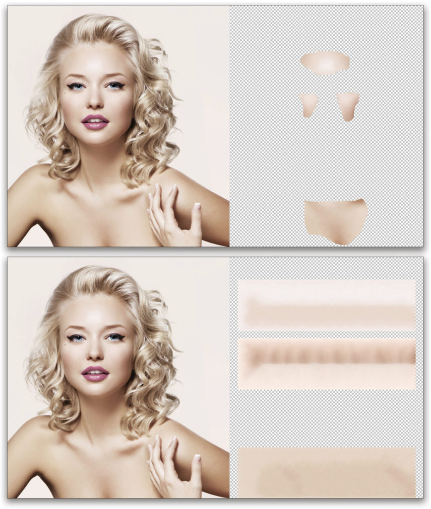
Skin Textures
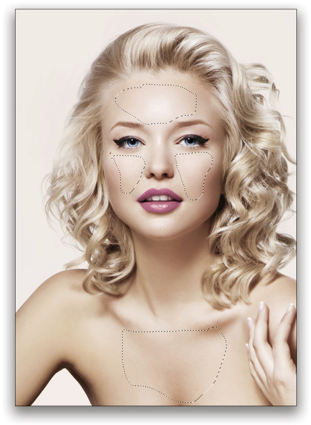
For fine textures such as skin, it helps to leave the source “patch” under the CAF result area if you need to use Color Adaptation. In the portrait example here, I wanted to create a set of swatches to use for texture in other images so I chose a finished stock portrait. Note the selection regions have been chosen with the Lasso tool (L), then moved to one side. Each patch was included in the rectangular selection made prior to starting CAF. Once inside the workspace, most of the green overlay was erased except for the regions of interest on the model’s skin. In this particular example, all three patches were filled using the Scale option selected, but Color and Rotation were set to None.
Workflow Tips
When you’re creating textures, either for a library you’ll use later or to work on a current image, there are a few workflow tips that will help keep you moving forward:
- Leave the Output To option set to New Layer. This gives you maximum flexibility for later work, and also isolates the filled result for easier archiving.
- Work on textures in their own document whenever possible, to minimize source cleanup (the green overlay). CAF generally ignores transparent pixels, but erasing the green overlay forces the algorithm to re-compute, which takes time.
- Filling a transparent selection tends to give the most “pure” texture results, and uses only the selected source area for synthesis. Using a selection that has material in it causes the algorithm to try and blend with the surrounding region, and so may be more useful for matching a specific image. This includes using solid color or other generated textures, such as the Filter>Render>Clouds filter, in which case you’ll want to use Color Adaptation at Default or higher to get a good blend.
- Sometimes it helps to build up large textures in pieces. If the result is too messy, has a lot of repeated patterning, or is taking too long, start with a smaller section and render it back to the normal workspace. Then make a new selection that slightly overlaps the previous result and run CAF again. You’ll get slightly different results, because the source region will be a little different every time you run the workspace. Repeat until you get the right size.
- Occasionally, CAF will give some smeared, blurry results on some patterns. If these areas are small enough, simply correct them with the Clone Stamp and Healing tools.
Build Texture Libraries
Using these techniques with the Content-Aware Fill workspace can help you build quite a collection of textures for all kinds of purposes very easily. Portrait retouchers especially can benefit from creating a large library of skin textures that can be used to repair or replace blemishes and problem areas, and the collection only gets more useful as more samples are added. The same approach can be used to help remove wrinkles from fabric or even to build new skies for landscape images.
How you use the textures matters, of course. In some cases, you may be able to import a texture to an image and use it as a clone or healing source, or to generate yet another content-aware filled region. For skin, it may be more useful to convert the sample to grayscale and blend using Luminosity or even patching into frequency separation results. And as I noted earlier, the textures may be used for blended overlays to give your projects a little something extra.
Special thanks to Sohrab Amirghodsi, who is the engineering brain behind the new Content-Aware Fill experience!
This article was originally published in the November/December 2018 issue of Photoshop User magazine.


