Lightroom has a myriad of ways to edit and change colors in your images. In this article, we’ll explore the different tools available for working with color in both Lightroom Classic and the cloud-based Lightroom. This includes everything from basic white balance adjustments and creative profiles to global color adjustments, the local color adjustment tools, and the Color Grading panel. There might even be some ways to adjust color that may surprise you. And the cool thing about the Lightroom ecosystem is that nearly every feature covered in this article also works in Lightroom for mobile.
In the Beginning: Applying Presets at Import
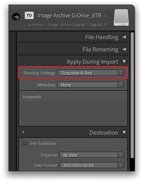
In the Lightroom Classic Import dialog, there’s an option in the Apply During Import panel to apply Develop Settings to all of the photos in a particular import session. The settings listed are all the presets you have in your version of Lightroom Classic: the default presets, presets you’ve created, or ones that you’ve purchased and installed on your system. Presets aren’t specifically for color adjustments, of course; they’re simply a collection of different Develop settings designed to add a certain correction or look to an image. If you have a preset that creates a color treatment that you like to use on a lot of your photos, this is a convenient way to apply that look to all the photos you’re importing from a given shoot.
White Balance
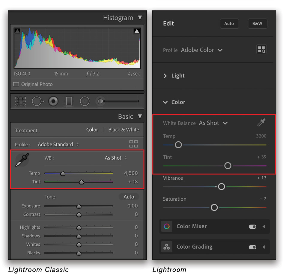
There are definitely more exciting color adjustments than white balance in both versions of Lightroom (and we’ll be getting to those soon), but white balance is often an important first step in working with the color in your photos, especially if an image has problems caused by a specific type of ambient lighting. In Lightroom Classic, the white balance sliders and White Balance Selector tool (eyedropper) are near the top of the Basic panel in the right-hand panels in the Develop module. In Lightroom, they’re found in the Color panel, just below the Light controls.
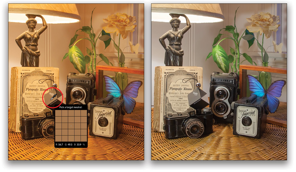
The white balance sliders are simple enough: Temp shifts the color between blue and yellow, and you can fine-tune this with the Tint slider, which offers tinting capabilities between green and magenta. The real power of the white balance adjustments comes from the White Balance Selector tool (W), which allows you to click on a part of the photo that should be neutral. These are areas that should not have a color cast or color tint (e.g., the shaded area on a white item of clothing, a white wall, gray metal, etc.). In an image with an obvious color cast you want to correct, clicking with this tool on such an area will adjust it to become a neutral tone (equal amounts of red, green, and blue), which can often fix the offending color cast in the entire photo. In the example shown here, I’m using this tool to click on the neutral gray side of a Spyder CUBE.
Some photos may not require any white balance adjustments, of course, but if there’s an objectionable color cast in a photo, my advice would be to address that first and get the overall color looking good, before you try out different interpretations via some of the other color controls.
Interpret a Photo with Profiles
After adjusting the white balance for a photo, one possible next stop for exploring a new color look would be to take one of the profiles for a spin. You can think of profiles as a starting-point interpretation for an image that’s independent of any of the adjustment sliders. Profiles are most commonly associated with RAW files, though they’ll also work with other file formats. All images that are imported into either Lightroom Classic or Lightroom are interpreted by a profile. The default for RAW files is Adobe Color and just Color for other types of files.
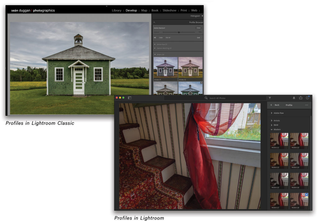
Adobe Raw, Camera Matching, and Creative Profiles: Click on the small grid of four squares near the top of the Basic panel in Lightroom Classic (near the top of the Edit controls in Lightroom) to display the available profiles. There are three types of profiles in both Lightroom and Lightroom Classic that ship with the program. The Adobe Raw group includes seven profiles: Adobe Color (the default), Adobe Monochrome, Adobe Landscape, Adobe Neutral, Adobe Portrait, Adobe Standard, and Adobe Vivid. The Camera Matching profiles will show profiles based on the camera that created the RAW file you’re viewing. Then, there are additional groups for more creative interpretations: Artistic, B&W, Modern, and Vintage. You can also purchase profiles from third-party vendors and install them for your version of Lightroom or Lightroom Classic.
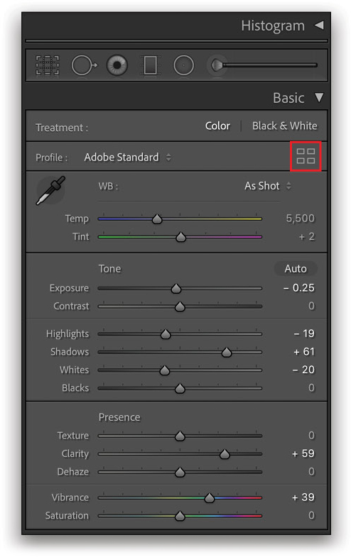
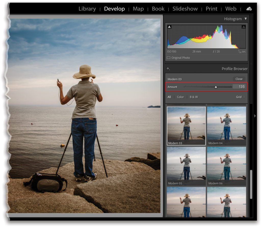
Fine-tune the Look of a Profile with Additional Edits: As you move the cursor over the different profile thumbnails, you’ll see a live preview applied to the image. Click on a profile to apply it. As with all edits in either version of Lightroom, this is nondestructive and can be removed or changed at any time. For some profiles, you can use the Amount slider to decrease or increase the intensity of the effect. The Amount slider isn’t enabled when using the Adobe Raw or the Camera Matching profiles.
Profile Results: The visual result from applying a profile will vary depending on how the color lookup table (LUT) at the heart of a profile has been edited. Some will offer an increase or decrease in contrast or saturation, while others will create a noticeable color bias that shifts the color in a specific direction. Once a profile has been applied, you can still edit the image using any of the Develop or Edit sliders in either version of Lightroom. This provides the opportunity to start with an initial interpretation or color look for the photo, and then customize it. Any profile that’s applied to an image will also be included as part of a preset that you create from the adjustment settings that have been applied.
Vibrance and Saturation
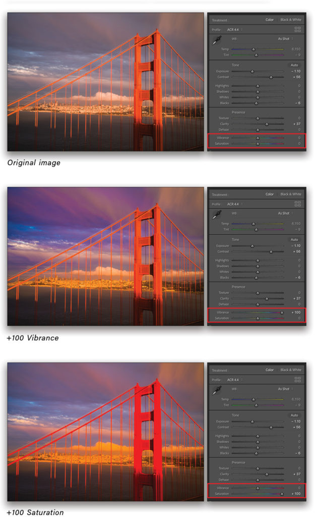
Two of the most commonly used color adjustments are the sliders for Vibrance and Saturation. In Lightroom Classic, these are found in the Presence section of the Basic panel, and in Lightroom, they’re located in the Color panel. It’s important to understand the difference in how each of these affects the colors in a photo.
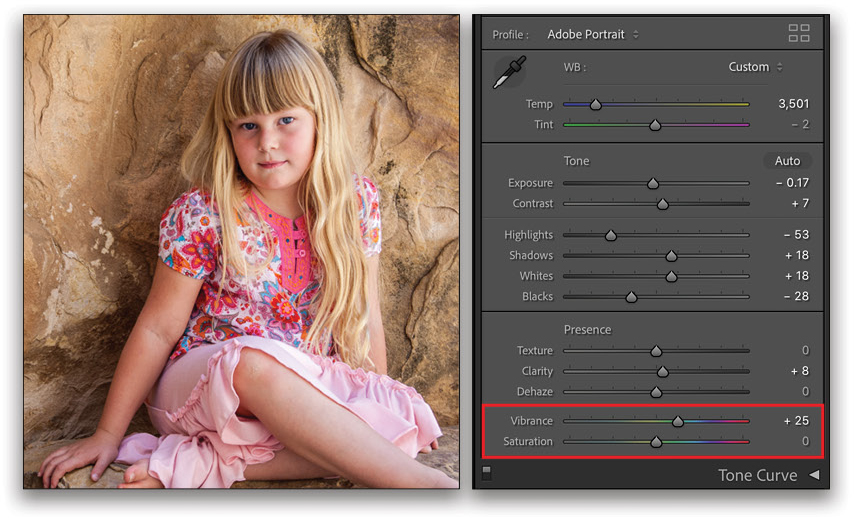
Vibrance: Vibrance is placed first and for good reason. If you feel that the colors in an image need a boost, then you should probably try this slider first. Vibrance increases (or decreases) the intensity of colors, but it does so in a more subtle way than the Saturation slider. Vibrance gives priority to colors that have a lower saturation value and doesn’t affect colors that already have a higher level of saturation. I like to think of it as a “kinder, gentler” version of the Saturation adjustment. Vibrance is usually a much better choice than Saturation with portraits, where the latter adjustment can often oversaturate the skin tones in an unnatural way.
Saturation: Saturation will affect all colors in the photo, regardless of whether they’re already highly saturated or not. You can easily see this in action for yourself by alternately applying a high Vibrance value, double-clicking on the slider to reset it, and then applying a similarly high value to the Saturation. In this photo of the Golden Gate Bridge, the bridge is already highly saturated, yet a Vibrance setting of +100 doesn’t increase the saturation much in that part of the photo. When the same value is used with Saturation, however, the bridge becomes so oversaturated that detail is compromised.
The HSL/Color Panel
So far, we’ve explored fairly simple and modest color controls, but now is where things start to get interesting! In Lightroom Classic, the HSL/Color panel offers controls for affecting the three primary characteristics of color: Hue, Saturation, and Luminance. If you think of words that we use to describe colors, they often directly or indirectly reference the properties of hue, saturation, and luminance. Describing a race car as being a “bright intense red” is a good example: The hue is “red,” saturation is referenced by “intense,” and “bright” describes the luminance.
Lightroom Classic offers two different interfaces for these controls. In the HSL part of the panel, you can choose Hue, Saturation, or Luminance at the top and then use the sliders to adjust specific colors below. If you click All, you’ll see separate groups of sliders for each property, which results in a much longer panel.
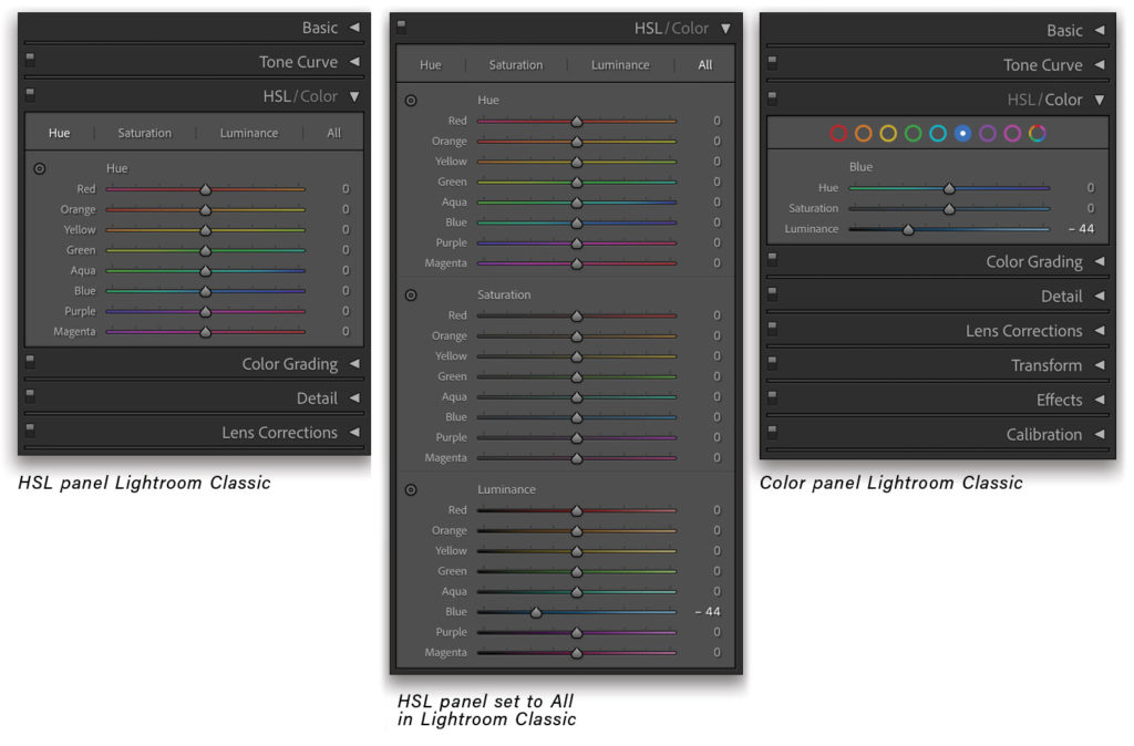
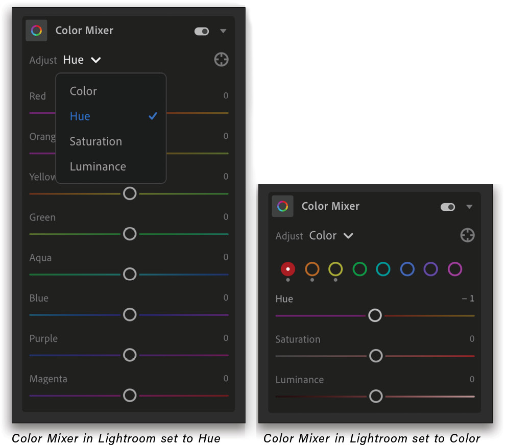
When you click on the Color part of the panel, you can use the color circles to work with the three properties for a specific color, or you can select the multicolored circle at the far right to display the controls for all colors in a single-panel view. The Color Mixer in the cloud-based Lightroom has the same options for adjusting color in a slightly different interface.
The adjustments you apply with these controls will affect colors on a global scale, i.e., colors that appear in the entire image, as opposed to a local adjustment where you can affect a color in a specific part of the photo. If the color blue is present in different areas of an image, adjusting the Blue slider will affect all instances of that blue color.
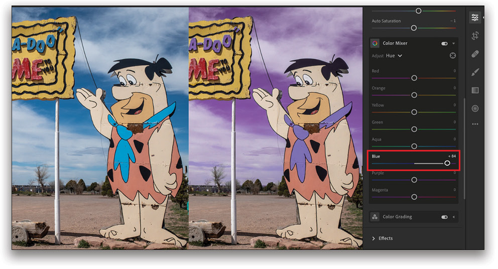
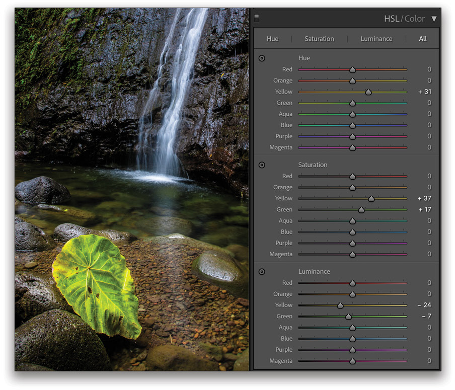
Hue: Adjusting a Hue slider will shift a color between its two component colors within a limit of about 30° from the starting color. You can see this displayed in the way the slider tracks are colored in the interface. Adjusting the Hue for the Red, for instance, will adjust that color between magenta and yellow, which, when combined, create red. Changing the Hue slider for Blue will move that color between cyan and purple.
You can learn a lot about which colors contribute to another color by playing with the Hue sliders. For example, if you want to make the leaves or grass greener in an image, the first impulse might be to adjust the Green slider, but in many cases, it may be Yellow that has the most effect because yellow is a component color of green and often a major color in foliage, as can be seen in this photo of a leaf by a waterfall.
Saturation and Luminance: Hue describes a color in general terms (red, yellow, green, blue, purple, etc.). Saturation and Luminance let you fine-tune the color. To adjust a color so it has more “pop,” increase both its saturation and brightness. For a more muted and pastel version, lower the saturation.
Beyond purely interpretive adjustments for changing the character of a color, these controls can sometimes be very useful from a practical perspective, as well. In some digital photos, certain bright colors, such as red, can often appear more saturated than they were in reality, and a slight desaturation can bring them back from the edge and create a more realistic expression of that color.
The Target Adjustment Tool: In addition to choosing a color slider to adjust, you can also use the Target Adjustment Tool (TAT) and drag directly on a color in the photo to modify that color (in Lightroom Classic, this is only available in the HSL part of the panel). For making changes to color, it can sometimes be very useful if you’re not sure which color sliders to use.
Click on the tool’s icon to activate it and then click-and-drag on a color in the image to shift the active property between positive and negative values. In Lightroom Classic, dragging vertically will apply more noticeable changes that shift the active value across the entire range of the slider, while dragging horizontally will apply a fine adjustment that results in more subtle changes to the color. The only indicator that you have this tool selected in Lightroom Classic is that the icon in the HSL panel changes from a small circle to a circle with small arrows above and below it.
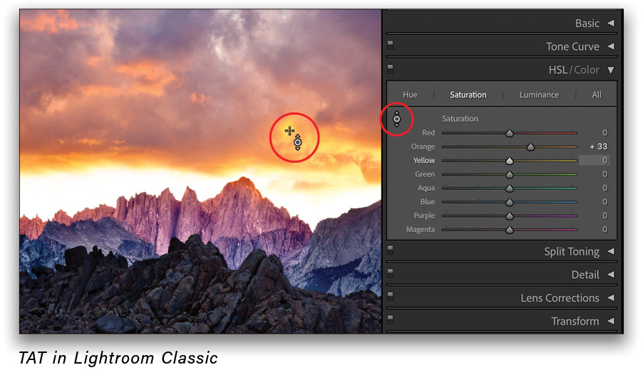
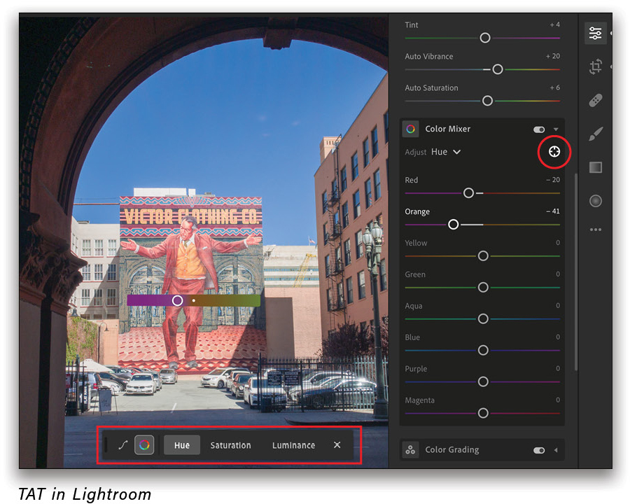
In Lightroom there’s a floating toolbar that appears on the image allowing you to switch between Hue, Saturation, or Luminance, as well as change to the Tone Curve adjustment.
Tip: To reset an individual slider, double-click on it. To reset all of the sliders, press Option (PC: Alt) and the section title for a group of controls will change to Reset. Click on this to reset that property in Lightroom Classic (e.g., just the Hue sliders), or to reset all the sliders in a panel in Lightroom.
Localized Color Adjustments
As mentioned earlier, the controls in the HSL/Color panel in Lightroom Classic, or the Color Mixer in Lightroom, will affect colors in the entire image. To apply an adjustment to a color in a specific area of the image, you need to use one of the local adjustment tools, such as the Adjustment Brush or the Graduated or Radial Filters. In the cloud-based Lightroom, these same tools are called the Brush and the Linear and Radial Gradients. For the most accuracy in defining the color you want to affect, the Adjustment Brush will give the best results.
Tip: In Lightroom Classic, click the checkbox for Auto Mask at the bottom of the Adjustment Brush panel to restrict the brush mask so that it only affects a specific area as you paint.
The 9.3 update to Lightroom Classic and the 3.3 update to Lightroom in June 2020 added a significant new capability to the local adjustment tools with the addition of localized Hue adjustments. This tool allows you to shift the hue of a color a full 360° without affecting its saturation or brightness. Once you’ve defined the area you want to change with one of the local adjustment tools, drag on the Hue slider.
The spectrum gradient slider interface is divided with the bottom showing you the original color and the top showing what it has shifted to. The controls in Lightroom show this a bit better than in Lightroom Classic, which has much thinner color bars.
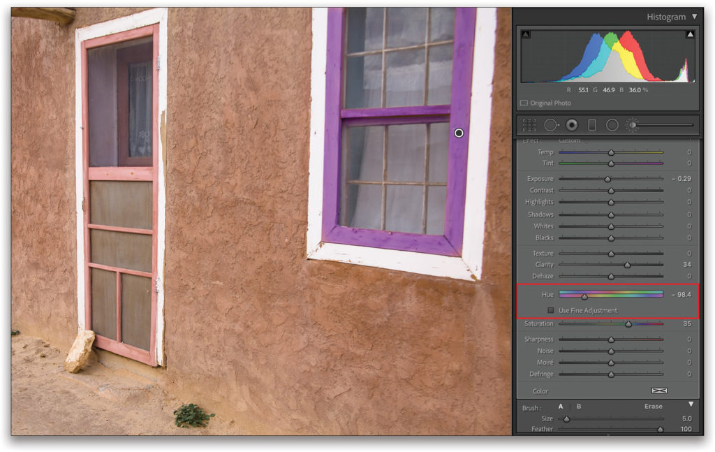
In the image shown here, I used the Adjustment Brush (K) to define the rose-colored window frame on the right and shifted this color to purple without affecting the door and the other window. I also increased the Saturation of this area and slightly darkened it with the Exposure slider. For more subtle changes to a color, click the checkbox for Use Fine Adjustment.
Tip: If you don’t see the Hue adjustment in Lightroom Classic when using the local adjustment tools, make sure that the image is updated to the current process version. You can do this by clicking the lightning bolt icon under the histogram, or by choosing Settings>Process Version.
Color Grading
The Color Grading feature is the (relatively) new kid on the block in terms of color adjustments. It was introduced in the fall of 2020 in Lightroom Classic 10.0 and Lightroom 4.0, and it replaced the Split Toning panel. If you were a fan of the Split Toning controls, fear not: Color Grading can do everything that Split Toning could do, and much more.
Like Split Toning before it, Color Grading allows you to apply a color tint to the image based on the different tonal brightness values. Split Toning only allowed you to apply different color tints to the shadows and highlights. The Color Grading feature offers those and adds controls for the midtones, as well as an interface that offers more control and flexibility, which is more in line with how color grading is implemented in other programs.
Note: Color Grading is compatible with the earlier Split Toning controls. Existing images with Split Toning settings will look exactly the same as they did in previous versions of Lightroom Classic or Lightroom, and any Split Toning presets you may have will also look the same when you apply them.
Working with the Color Grading Interface: At the top of the Color Grading panel, you can click on the circle icons to display the color wheels for all three tonal regions at once or view each one separately (this is a good way to work with the feature if you’re new to it). There’s also an option for a Global wheel, which will apply a tint to the entire image. This latter control is what you’d use if you wanted to apply a color tinting effect, such as a sepia tone, to a grayscale image.
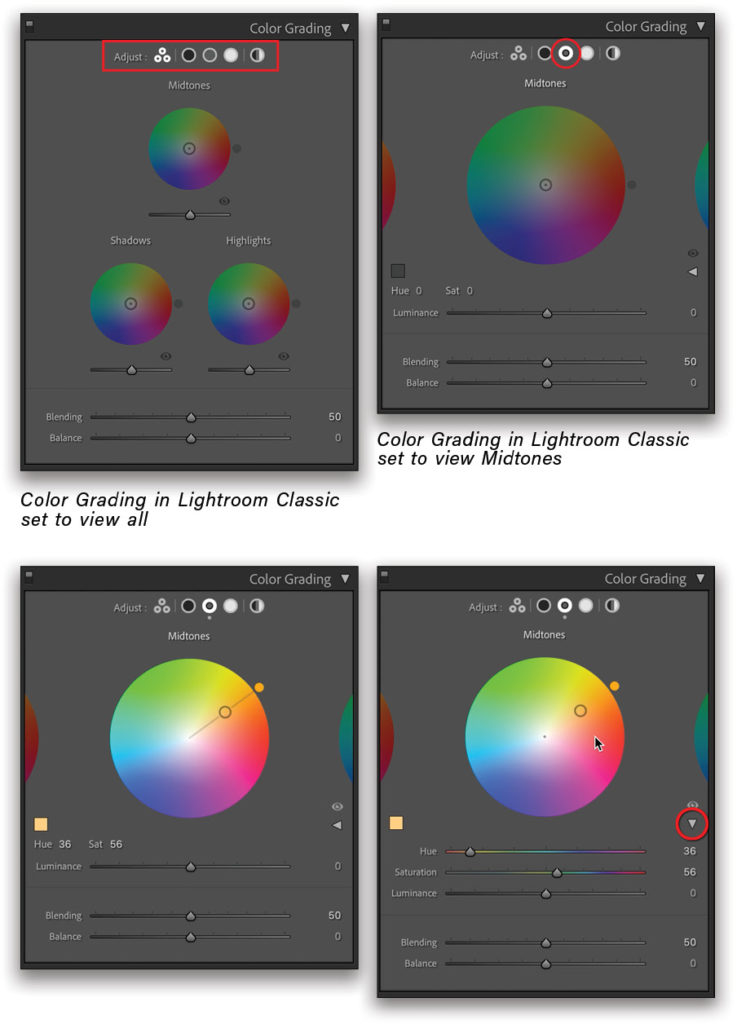
In the color wheel interface, move the circle just outside the wheel to change the hue (see images on previous page). Click-and-drag on the circle at the center of the wheel to adjust the saturation. The center of the wheel is 0% saturation, and the outer edge of the wheel is 100% saturation. Dragging on the saturation circle will move both it and the hue, whereas moving the hue circle will only adjust the hue and leave the saturation alone.
You can interact with the values for Hue and Saturation immediately above the Luminance slider by dragging on the numbers to change them. If you click the small disclosure triangle on the right side of the panel, you can display these as sliders.
The Luminance slider below a color wheel will allow you to make minor adjustments to the brightness of a given tonal region, but you shouldn’t think of it as equal to other controls in the Tone section of the Basic panel in Lightroom Classic, or the Light section in Lightroom. Adjusting Luminance here won’t change any other settings you may have applied, such as Exposure, Highlights, or Shadows. It’s intended for making adjustments to these tonal areas to modify how they’re affected by the applied color tint. For instance, if you wanted to try and recover tonal detail in a washed-out highlight, it’s much better to use the Highlights slider in those areas. The Luminance slider in Color Grading would be used to ensure that the color tint is visible in an area of washed-out highlights (a color tint won’t be visible in a tone that’s total black or white).
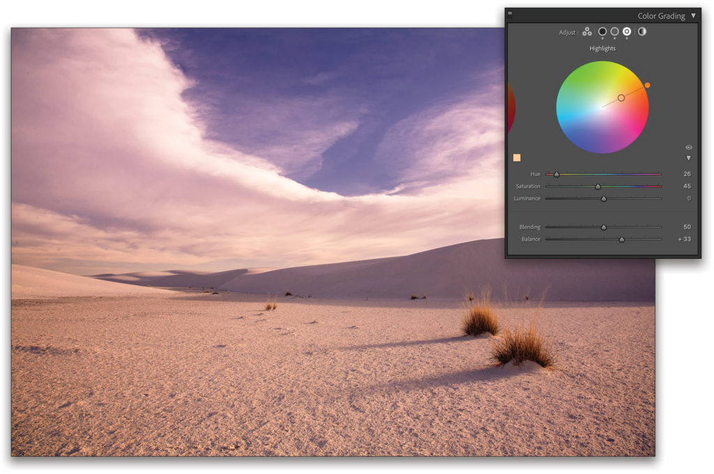
The Blending and Balance sliders affect the entire Color Grading adjustment. Whatever settings you make to these sliders will be the same no matter which color wheel you’re viewing. Blending controls how much the different tonal ranges, and the color tints applied to them, overlap. A value of zero results in less overlap and more obvious separation between the tonal regions; a value of 100 creates a blend where the colors overlap and blend together more. Balance is the same as it was with the Split Toning control and biases the tinting effect more toward a specific part of the tonal range.
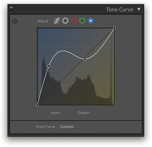
Color Adjustments with the Tone Curve
You can also apply color effects, both subtle and extreme, using the Tone Curve panel. For more subtle effects, I’d advise using the Color Grading panel simply because it gives you much more control with a more intuitive interface. But if your intent is extreme color adjustments that fall more into the category of special effects, you can certainly do some interesting things by adjusting the individual red, green, and blue curves.
As you can see from the scenic color tour we’ve just taken, Lightroom Classic, the cloud-based Lightroom, and even Lightroom for mobile have an excellent set of tools for adjusting the color in your images and getting them to look just right. They offer features that are both practical and inspirational for fine-tuning every aspect of hue, saturation, and luminance.
This article originally published in the March, 2021 issue of Photoshop User magazine.


