There’s an adage passed around by Photoshop users that there’s always more than one way to do anything in Photoshop. That’s especially true when it comes to color manipulation. In this article, we’re going to repurpose the trusty Curves adjustment and get it to do some heavy, but fast, lifting for applying a color theme based on another image or color palette. The nifty thing about this approach is that you can easily get in the ballpark of matching reference images without breaking a sweat. Hollywood poster guru Lisa Carney loves this trick for fast production and comping work.
The process is really simple, which is great for experimenting. There is a catch, however, that requires a little workaround, which I’ll describe shortly.
Start by finding a reference image—something with a similar range of values (brightness and darkness) as your target image. This is moderately important, because the Curves adjustment will attempt to match the target hues by remapping the values in each channel individually. Ideally, if both the reference image and the target image were simply desaturated, they would each have the same levels of gray for the same important features. Skin, for example, would have similar values in each image. While this is not strictly required, it makes for more predictable results.
Note: I’m using the word “target” in two ways here, but ultimately they mean the same thing. Target hues are the colors you want to end up with for each value range of highlights, midtones, and shadows. Target image is the image to which you want to apply the changes. The target hues are applied to the target image, but there’s no other relationship between them.
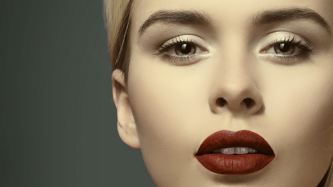
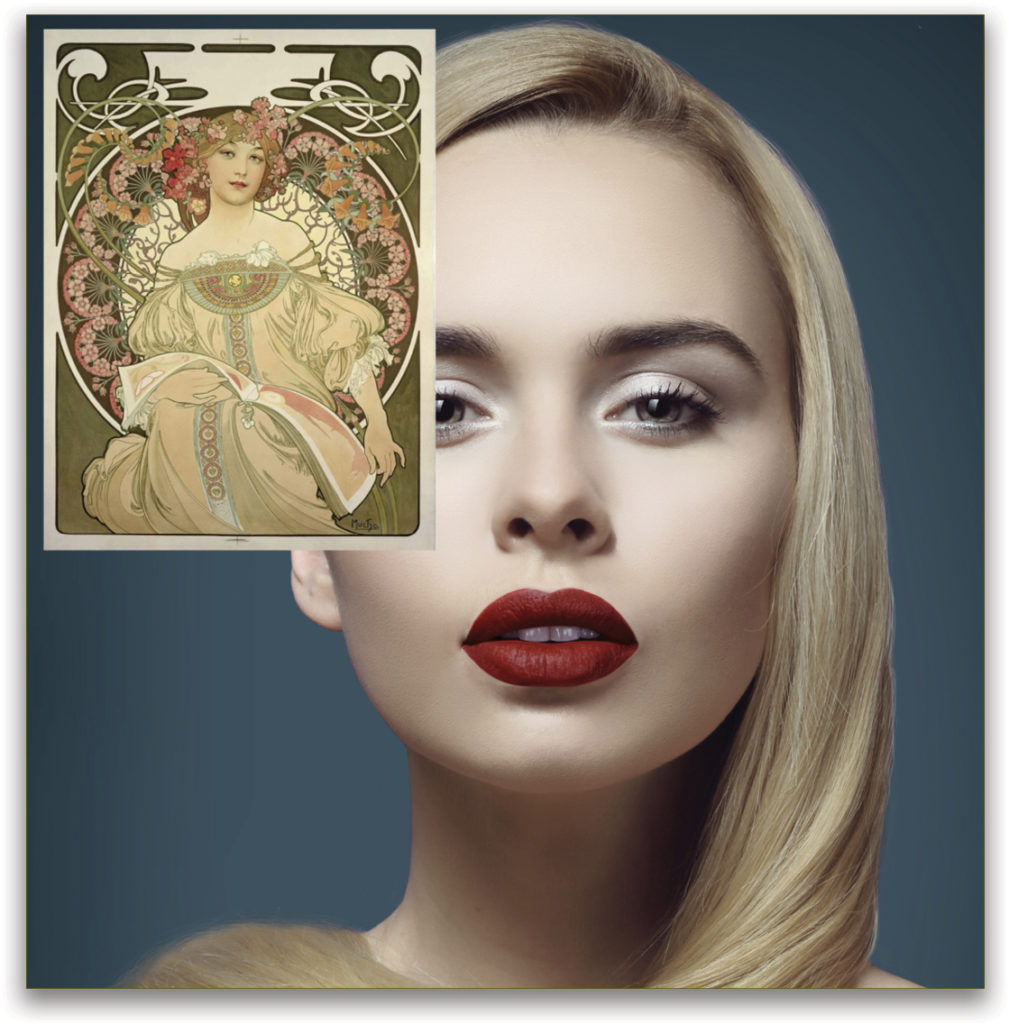
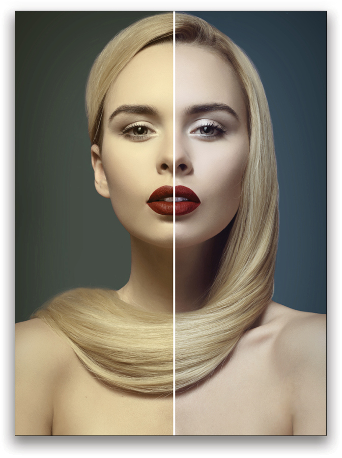
Step One: Open both your target and reference images. I’m using a public domain image by Alphonse Mucha called Reverie (1897) and will be applying it to this portrait from Adobe Stock. If you’d like to download the low-res watermarked version of the Adobe Stock image to follow along, click this link, log in with your Adobe ID, and click the Save Preview to My Library icon to download it to your Libraries panel (Window>Libraries). Double-click the image in the Libraries panel to open it in Photoshop.
Use the Move tool (V) to drag-and-drop the reference image onto your target image. If necessary, use Free Transform (Command-T [PC: Ctrl-T]) to resize the reference image or crop it so the important areas of the target image are visible—the reference picture only needs to be big enough for you to easily sample the highlights, midtones, and shadows.
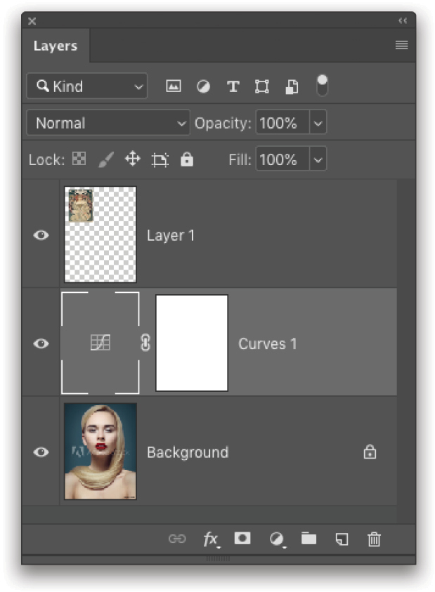
Step Two: Click on the Background layer, then click on the Create New Adjustment Layer icon (half-black/half-white circle) at the bottom of the Layers panel and choose Curves to add a Curves adjustment layer between the reference and target layers. This avoids causing confusion because as you sample from the reference, the target will change. If you’re working with several layers in a project, with the Curves adjustment layer selected, press Command-Option-G (PC: Ctrl-Alt-G) to clip it to the target layer.
Now, here’s a gotcha: for this trick to work properly, you have to click on the Curves adjustment’s thumbnail in the Layers panel to make it active (you’ll see a white frame around it, as shown here). By default, the adjustment layer’s mask is selected, which will cause every attempt at selecting a color to turn out white.
Step Three: After making certain the thumbnail is selected and the Properties panel (Window>Properties) with the Curves’ options is visible, hold down the Option (PC: Alt) key and click the Auto button at the top right of the curve. This opens the Auto Color Correction Options dialog. Click the Find Dark & Light Colors radio button and enable Snap Neutral Midtones. If that checkbox is not enabled, your midtones selection won’t have any effect—you may wish to experiment with this if you’re after more of a duotone effect.
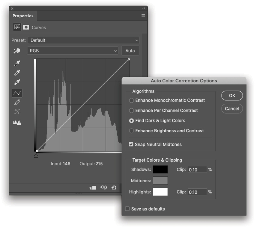
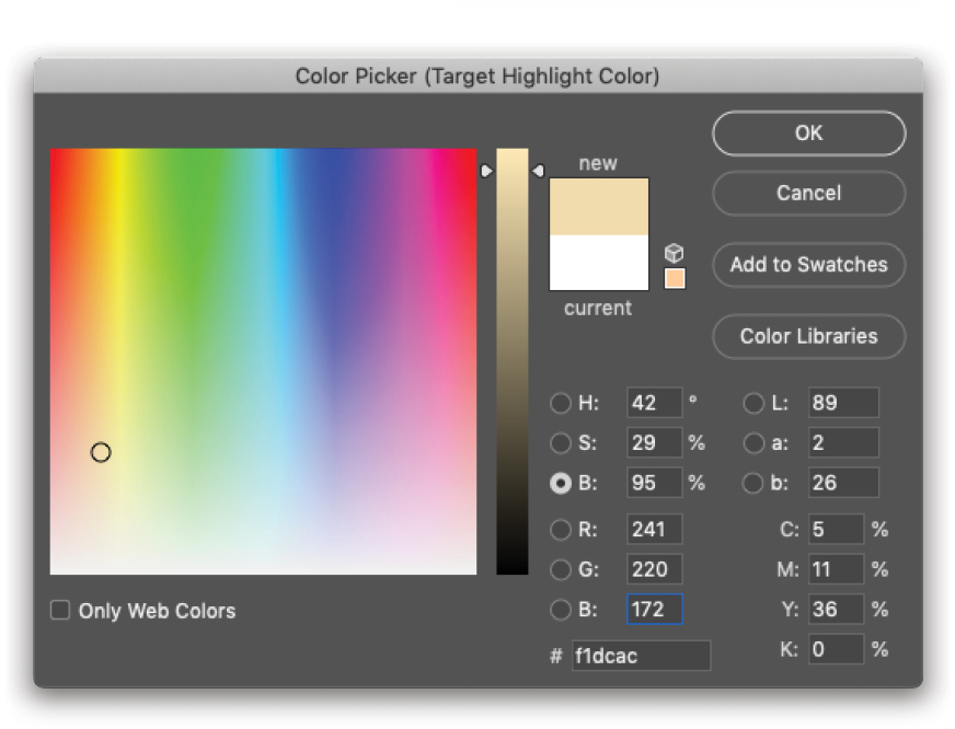
Step Four: Now, down in the Target Colors & Clipping section, first click the Highlights swatch to activate the Color Picker. Click in the reference image’s highlights, or the color you want to use as a highlight. It doesn’t have to be perfect, just reasonably close (you can hunt around and watch the effect on your target image). Don’t panic if it looks weird at first! Click OK in the Color Picker to accept the Highlights color.
Tip: For general grading or color overlay work, you want to achieve a natural-looking result, where the final image takes on the tones of the color theme without drifting too far. While you make your selections, check the Brightness (“B” in the HSB group) value in the Color Picker, and adjust the vertical slider so that it’s close to the intended value range—Highlights should be between 100% and about 85%, Midtones between 40% and 60%, and Shadows between 0% and 20%. This is a general guide, but will help with more traditional-looking images. If your goal is special effects, then rock out!
Step Five: Repeat Step Four for the Midtones and Shadows swatches. Leave the Clip settings alone. When you’re happy—and only when you’re happy—click OK to close the Auto Color Correction Options dialog and click No when it asks you if you want to save the new target colors as the default.
Remember the catch I mentioned above? Here it is: This is a one-way ticket. Once you close the dialog, if you reopen it, the values will be reset. We’ll solve that problem shortly!
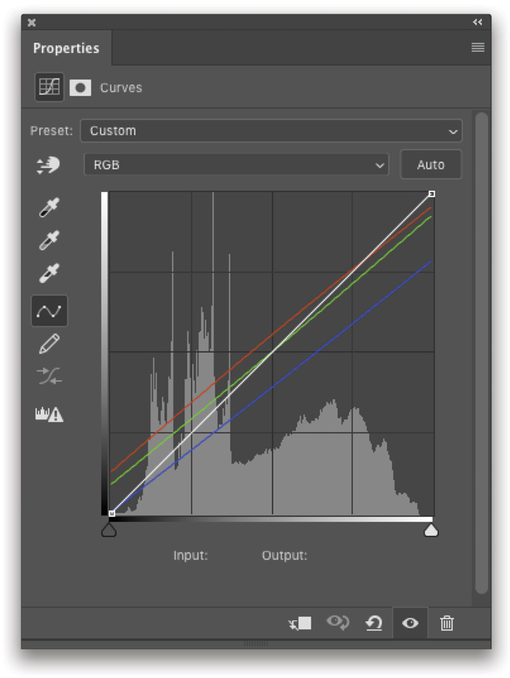
Since this is an adjustment layer, you can fiddle with the results to dial everything in. Remember that you can choose individual channels to adjust from the drop-down menu in the Properties panel, as well as the main curve itself. For the moment, let’s stick with these results and save the settings in a more reasonable way rather than making them the default.
Step Six: Okay, so how do we save the results for other images? We need to create an asset to store in the Libraries panel, or some kind of preset. If you know you’re going to use the same settings on several more images, go ahead and create a preset by going to the flyout menu (it’s the three-line icon) in the upper right of the Properties panel, and choose Save Curves Preset. Give it a name (don’t forget to use good naming conventions) and click Save. You can now access that preset near the bottom of the Preset drop-down menu in the Properties panel.
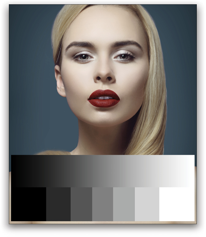
Step Seven: I like to use the Libraries panel (Window>Libraries) to save such things—it’s easier to organize, it’s more visual, and it’s easier to share with others if you happen to be working with a team. Start by temporarily turning off the Curves adjustment and reference layers (click on their Eye icons in the Layers panel), and create a blank layer between the Curves layer and your target or base image.
In an unobtrusive area, use the Rectangular Marquee tool (M) to make a rectangular selection across the width of the image. Get the Gradient tool (G); Right-click in the image; choose the Black, White gradient in the Gradient Picker (the third from the left in the top row); and click the Linear Gradient icon in the Options Bar. Holding the Shift key, click-and-drag from the left edge of the selection to the right edge to fill it with your gradient.
You have the option at this point of keeping the continuous gradient or breaking it out into a number of bars using Image>Adjustments>Posterize. In my example, I reselected the lower half of the gradient before applying the Posterize command with a setting of 7 Levels. The benefit of using the Posterize command is that it’s easier to use exactly the same colors every time, and the odd number allows for a “dead center” value.
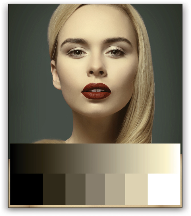
Step Eight: Press Command-D (PC: Ctrl-D) to deselect the gradient, then turn the Curves adjustment layer back on. You should see the effect immediately on the gradient—it will have a full representation of the color theme you just created. Again, you can modify it if you need to for whatever reason.
To save this, turn off everything except the Curves and gradient layers, and create a new layer of the visible layers by pressing Command-Option-Shift-E (PC: Ctrl-Alt-Shift-E). The flattened copy saves the mapping that you can drag to your Libraries panel, which you can then use as a reference in other images—just drag it from your library to an open document, and repeat the sampling above using the Auto Color Correction Options dialog.
There are some variations worth exploring here. First, if you’re looking for a monotone conversion, don’t enable the Snap Neutral Midtones option, and skip the Midtones sampling step. This will map only the shadows and highlights. Use this for more traditional, intense monotone color effects, like you’d get with a simple gradient map.
If you find that the values don’t map very well, try setting the Curves adjustment layer’s blending mode to Color. This can be a more subtle effect, but will tend to preserve the extreme value ranges much better. Alternatively, add some serious punch by using Soft Light or even Overlay.
This article originally published in the June/July 2019 issue of Photoshop User magazine.


