By Dave Clayton & Glyn Dewis
As photographers and graphic designers we all face various challenges, the biggest issue being effective collaboration. Being able to work with other creatives on a project was always fraught with danger— ridiculously named files being sent back and forth and nobody really knowing who had the most recent version. But that all changed with the introduction of the Adobe Creative Cloud.
Now we can work seamlessly and collaboratively via the Creative Cloud, using the suite of creative and mobile apps, CC Libraries, and Creative Sync to enable work to be shared and projects completed more quickly and efficiently—a workflow we’d all have envied just a few years ago.
Speaking as a graphic designer, working with photographers on projects has become so much easier. In this article, we’ll look at the workflow that photographer Glyn Dewis and I used to work collaboratively on an end-to-end design project.
Glyn will start with the photo shoot and take the image through Lightroom and Photoshop before handing it over to me using Creative Sync for file sharing. I’ll add the design elements using Illustrator and InDesign to build our project, and I’ll also use Adobe Stock and Typekit for the logos, colors, and fonts.
Our aim is to give you an idea of how you can create your own productive workflow using all the awesome tools available with a Creative Cloud subscription. We’ll start with Glyn and his section of the project.
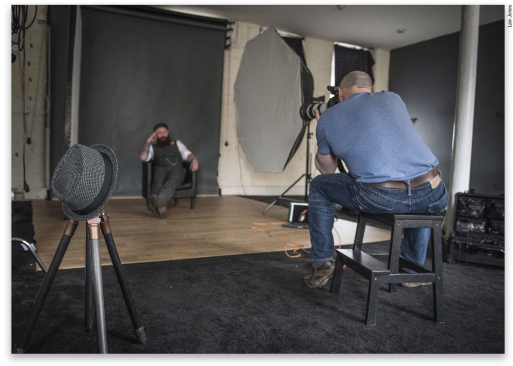
To kick things off let’s start right at the beginning with the photo shoot to give you a quick look behind the scenes at how the picture was set up.
THE PHOTO SHOOT • by Glyn Dewis
Lighting
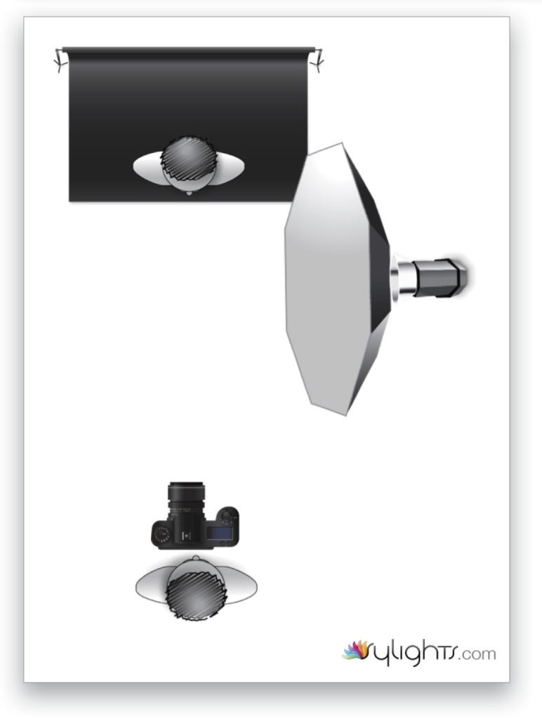
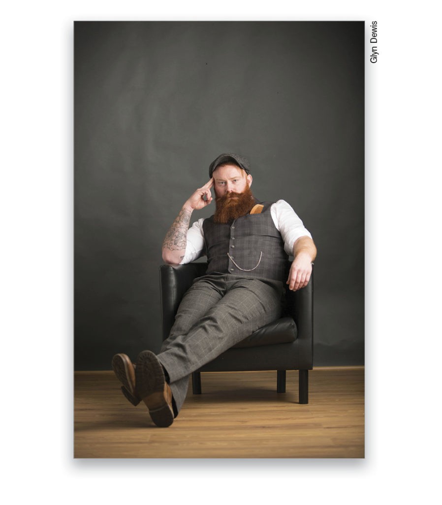
For this shoot I was using a Canon EOS 5D Mark III and an EF 70–200mm f/2.8 IS II lens. Just one light was used: an Elinchrom ELC Pro HD 1000 into the Elinchrom Rotalux Softbox Octa 135cm. It was positioned to create a cross-lighting pattern. For the background, we used a seamless roll of gray paper, as this is great for adding texture during post to give it a completely unique and much more interesting look.
Collaborating
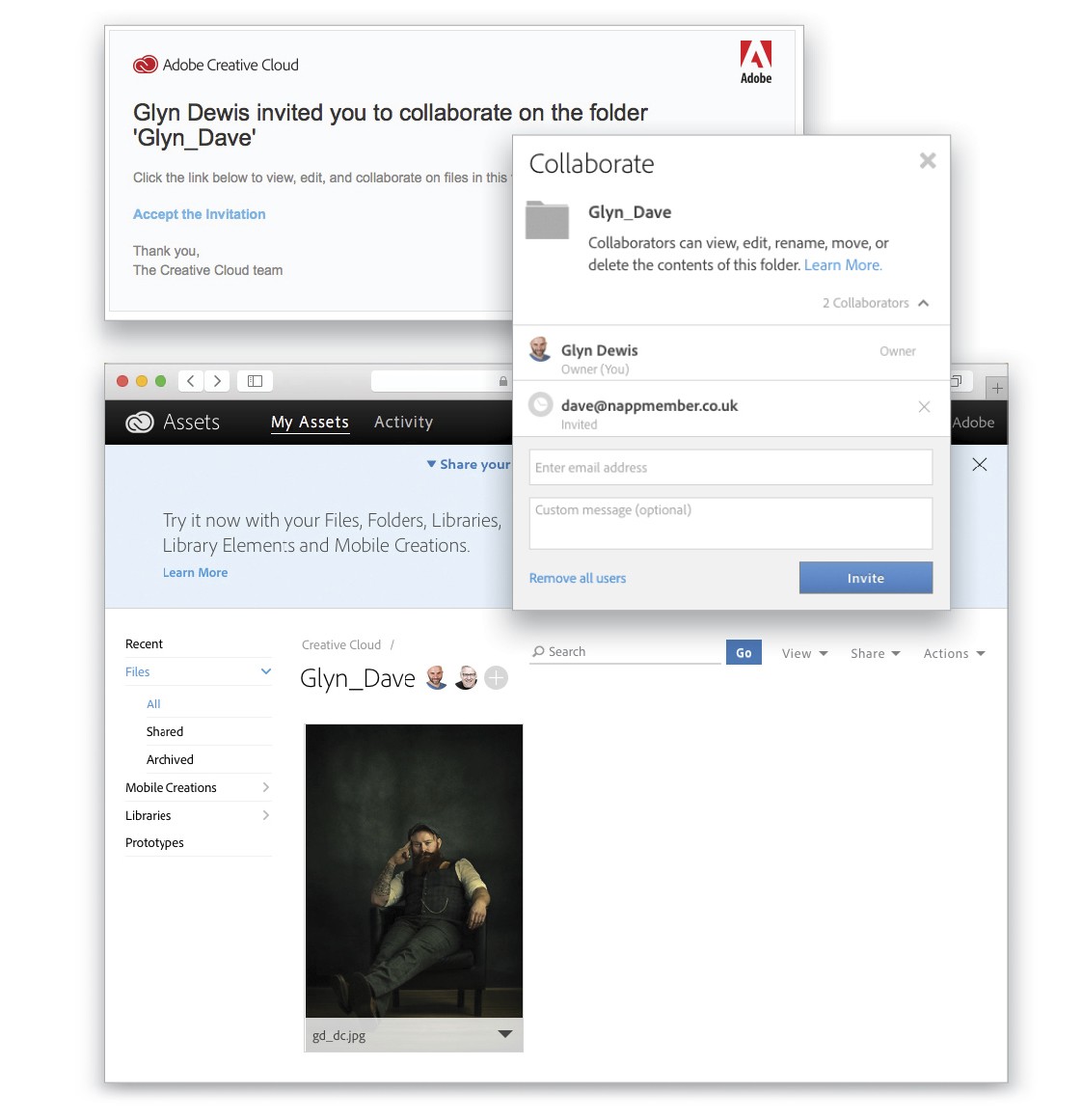
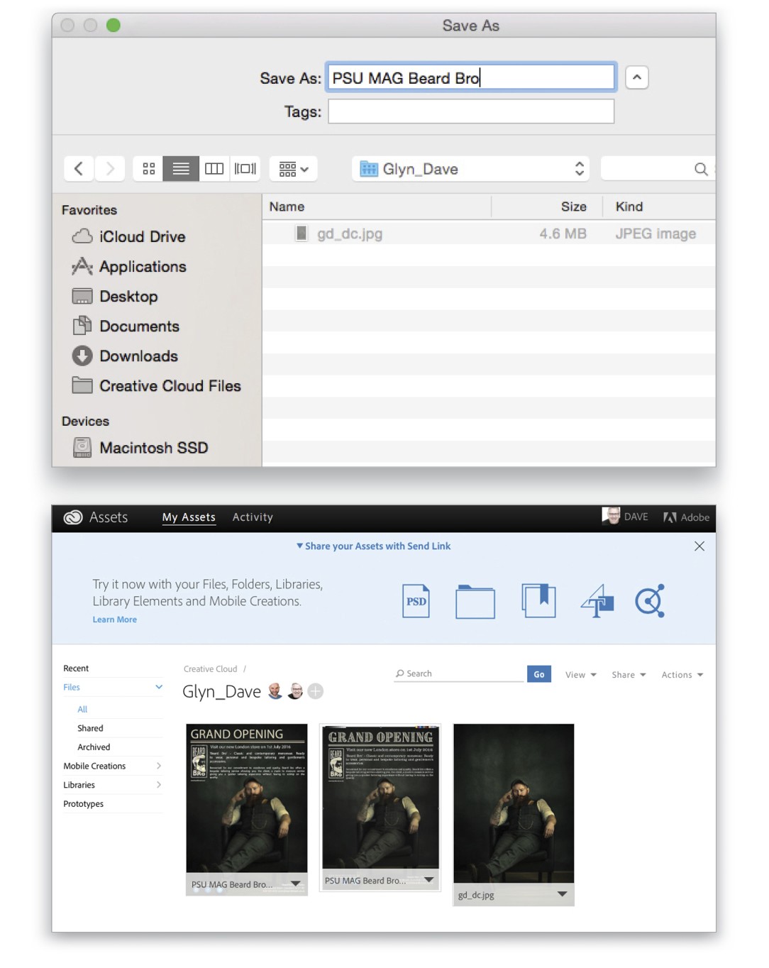
As this image, once retouched, is going to be worked on by Dave to add his design elements, an easy way for us to collaborate is to set up a folder to which we have shared access. To do this, I’ll simply create a new folder within my Creative Cloud Files folder on my local drive and rename it “Glyn_Dave.” (To find your local Creative Cloud Files folder, open the Creative Cloud app, click on the gear icon at the top right, and select Creative Cloud Files.) Then, I Right-click on the Glyn_Dave folder to bring up a menu of options, one of which is Collaborate. Clicking on this takes me to my Creative Cloud account on the Web where I can invite Dave to collaborate so he can have access to the Glyn_Dave folder and its contents.

Postprocessing
Now that we have the out-of-camera RAW file, we’ll get to work on the postprocessing. We’ll start in Lightroom, and then we’ll dive into Photoshop to add elements such as a textured background, fake shadows, and toning. We’ll then save our image back into Lightroom before exporting it to the collaboration folder that we just set up.
[KelbyOne members may download the files used in this tutorial at http://kelbyone.com/magazine. All files are for personal use only.]
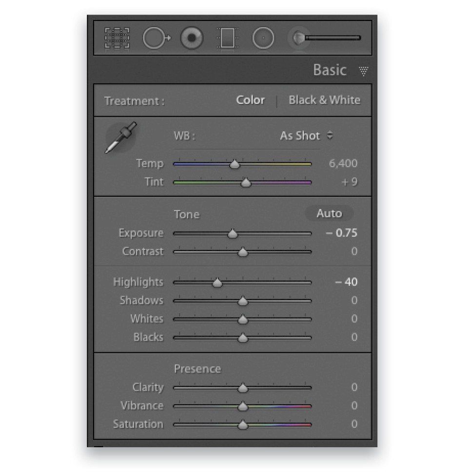
Step One: The Lightroom Basic Panel
Although a light meter was used to ensure a perfect exposure, looking at it onscreen, it appears just a touch too bright for the feel we’re after with this image. So in the Basic panel of the Develop module in Lightroom, we’ll begin by adjusting the Highlights to around –40, and bring the Exposure down to –0.75.
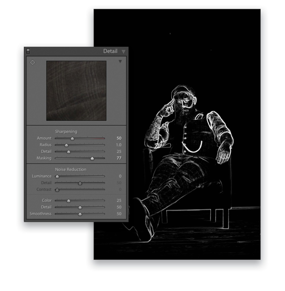
Step Two: Sharpening
Next, we’ll move down to the Detail panel to add a little bit of sharpening. We’ll take the Amount slider to around 50, which obviously now means that the entire image has been sharpened. To restrict the sharpening to only the areas we want, hold down the Option (PC: Alt) key and drag the Masking slider to the right. Initially, the image will turn completely white, which indicates that everything is being sharpened. As you drag to the right, you’ll see areas appear in black. Anything in black isn’t sharpened anymore. The white that you see in the image here means that it’s now only our model that’s being sharpened as opposed to the entire image.
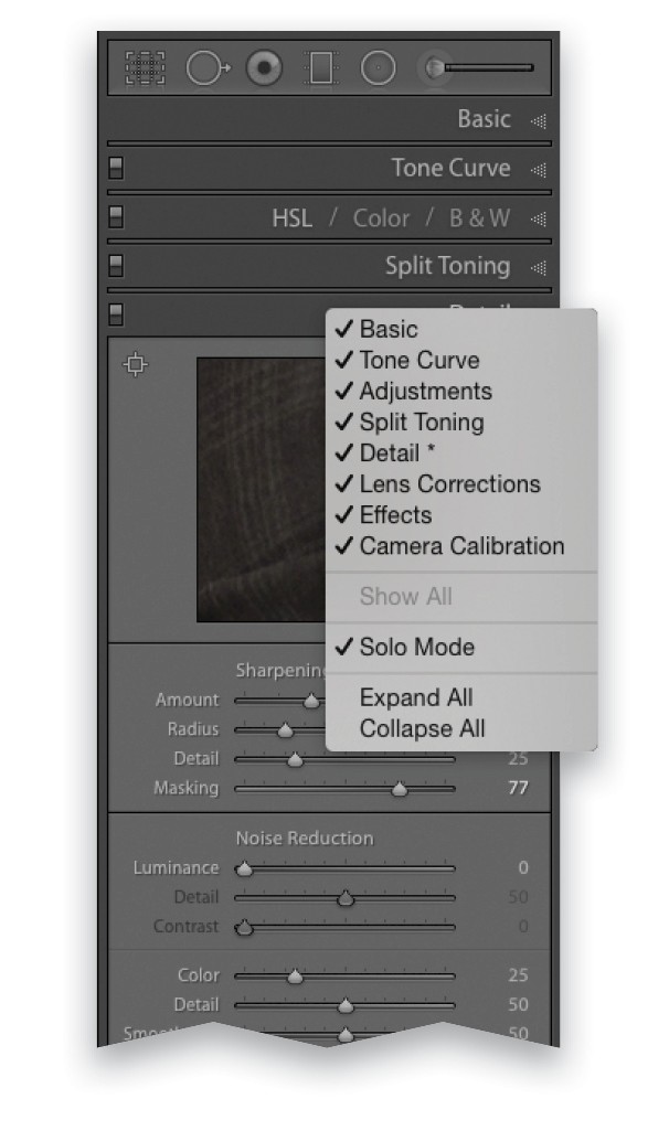
Tip: Solo Mode
With so many adjustments available in Lightroom in a number of different panels, if you have a lot of panels open you can end up scrolling quite a ways up and down to get to the adjustment you’re after. To help with this, there’s Solo Mode, which automatically collapses all the other panels except the one in which you’re currently working. To access this, simply Right-click on the title bar of any of the panels, and in the contextual menu that appears, click on Solo Mode to turn it on.
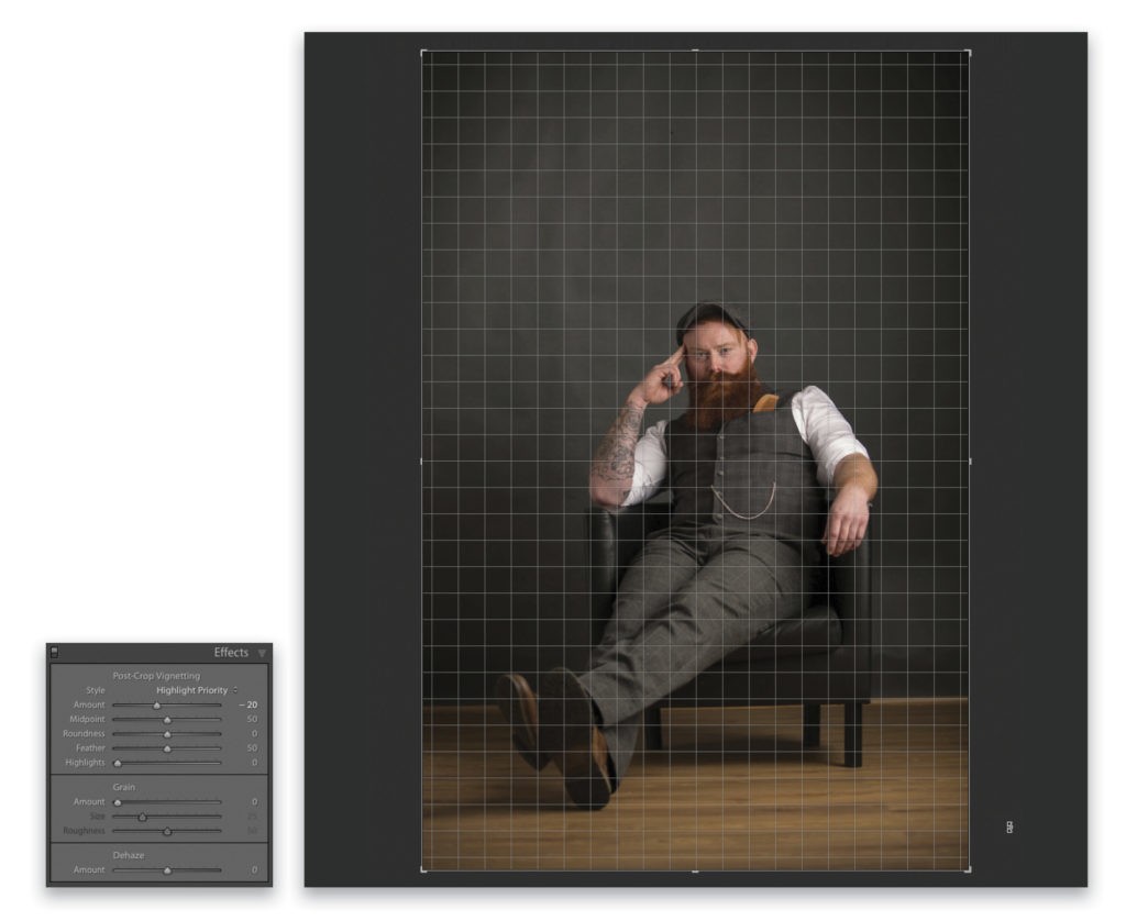
Step Three: Straighten & Vignette
The last couple of things we’ll do in Lightroom before heading into Photoshop is to straighten the image and add a small amount of vignetting. To straighten the image, press the R key to activate Crop Overlay, and then with you cursor outside the image area, click-and-drag up or down to rotate the image; once the image is straight, release the mouse button and press Enter to commit the crop. Finally, to add a small amount of vignetting, move the Amount slider in the Effects panel to the left to around –20.
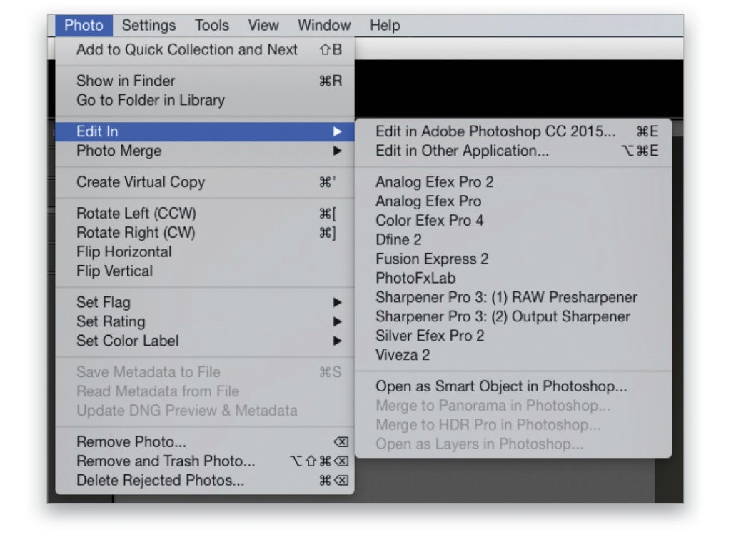
Step Four: Open in Photoshop as Smart Object
Now that we’re done in Lightroom, we need to head over to Photoshop. We’ll do this nondestructively by using smart objects so we can make any adjustments to what we’ve just done at a later stage if we need to. To do this, go to Photo>Edit In>Open As Smart Object In Photoshop.
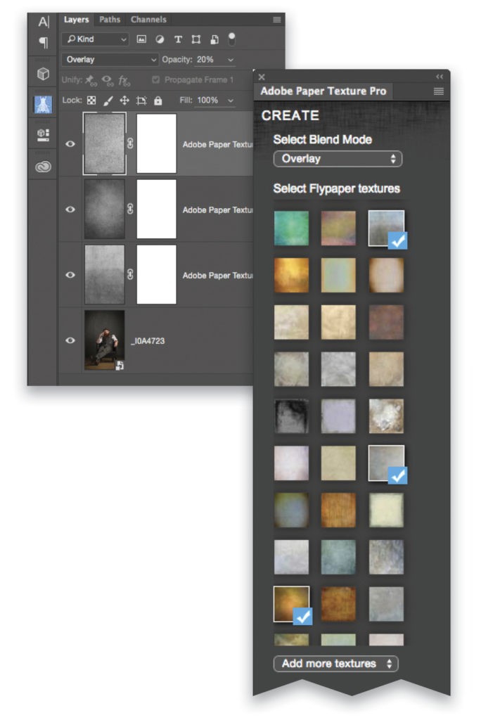
Step Five: Add Texture to Backdrop
The first thing we’ll do in Photoshop is add texture to the gray backdrop. The textures I used here are from Adobe Paper Textures Pro by Russell Brown, a free add-on to Photoshop available at Adobe Add-Ons, where you’ll find plug-ins, extensions, and more for Adobe products. Using this particular add-on, you can easily select and place textures into your images. (Once you’ve installed the add-on, you’ll need to restart Photoshop, and then you can find it under Window>Extensions.) For this image, I’ve added three different textures, which are automatically added in the Overlay blend mode. I’ve also desaturated each (Shift-Command-U [PC: Shift-Ctrl-U]) and varied the Opacity of each in the Layers panel until I achieved the look I was after.
Step Six: Blur and Mask Texture
In order for the placed textures to match the depth of field already in the image, we need to blur them slightly. We’ll do this by first clicking on the uppermost texture in the Layers panel, holding down the Shift key, and clicking on the bottom texture so that they’re all highlighted in the Layers panel. Next, go to Filter>Convert for Smart Filters, then Filter>Blur>Gaussian Blur. Add a Radius amount of 5 Pixels, and click OK. Change the blend mode of this smart object layer to Overlay (near the top left of the Layers panel).
Finally, click the Add Layer Mask icon (circle in a square) at the bottom of the Layers panel, switch to the Brush tool (B), press X until the Foreground color is black, and with a soft-edged brush, paint to remove the texture from our model, the chair, and the floor. Tip: Use the Bracket keys on your keyboard to quickly change the size of your brush as you paint.
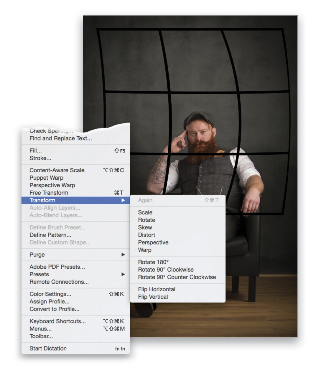
Step Seven: Create Fake Window Frame Shadow
To give the picture more interest, we’ll add a fake shadow coming from a window frame onto the back wall. To do this, add a new blank layer to the top of the layer stack, double-click its name, and rename it “shadow.” Press D to set the Foreground color to black, and select the Custom Shape tool (nested under the Rectangle tool [U] in the Toolbox). Click on the thumbnail preview to the right of the word “Shape” in the Options Bar to open the Custom Shape Picker, and choose the Grid shape (it’s a 3×3 grid). In the drop-down menu on the left of the Options Bar, select Pixels. Drag out the grid onto the image, then go to Edit>Transform>Warp. Click-and-drag to the right just a touch in each of the three squares in the center row and then press Enter to commit the transformation. Go to Filter> Convert for Smart Filters followed by Filter>Blur>Gaussian Blur. Dial in a blur Radius amount of 90 pixels, click OK, and lower the Opacity of this layer to 75%. At this point it’s your choice whether or not to remove the shadow off the male subject by adding a layer mask and painting with black.
Step Eight: Add Contrast
Create a merged layer at the top of the layer stack by pressing Shift-Option-Command-E (PC: Shift-Alt-Ctrl-E). We’ll now add in some contrast. There’s an endless number of ways to do this in Photoshop; however, purely because of personal taste, I’m going to use a plug-in from Topaz called Clarity and add a very small amount of Micro Contrast (0.19) and Low Contrast (0.9).
Step Nine: Use Graduated Filter in Camera Raw to Darken Floor
Next, convert the layer to a smart object by going to Filter>Convert for Smart Filters, then go to Filter>Camera Raw Filter. I feel the ground needs darkening a touch, and to do this, take the Graduated Filter (G) and drag up from the bottom of the image to just above the point where the back wall and the floor meet. Reduce the Exposure slider to around –1.30.
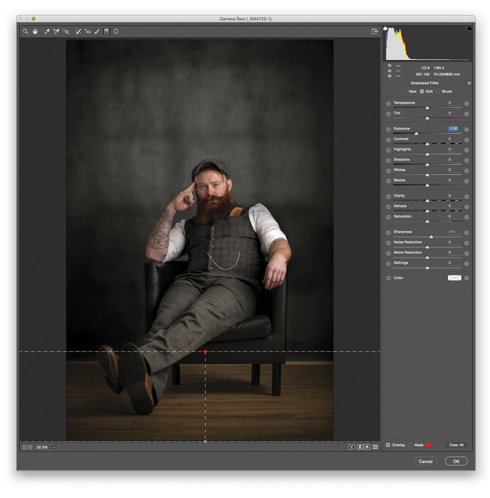
Step 10: Use Adjustment Brush to Darken Sleeves and Brighten Face
Choose the Adjustment Brush (K), reduce the Highlights slider to –16, and then with the Mask option active at the very bottom of the Adjustment Brush panel, as well as Auto Mask, paint over the model’s white shirtsleeves. Click the New radio button to add a new Adjustment Brush, reset the Highlights slider to 0, increase the Exposure to +0.20, and paint over the model’s face. Click OK.
Step 11: Toning
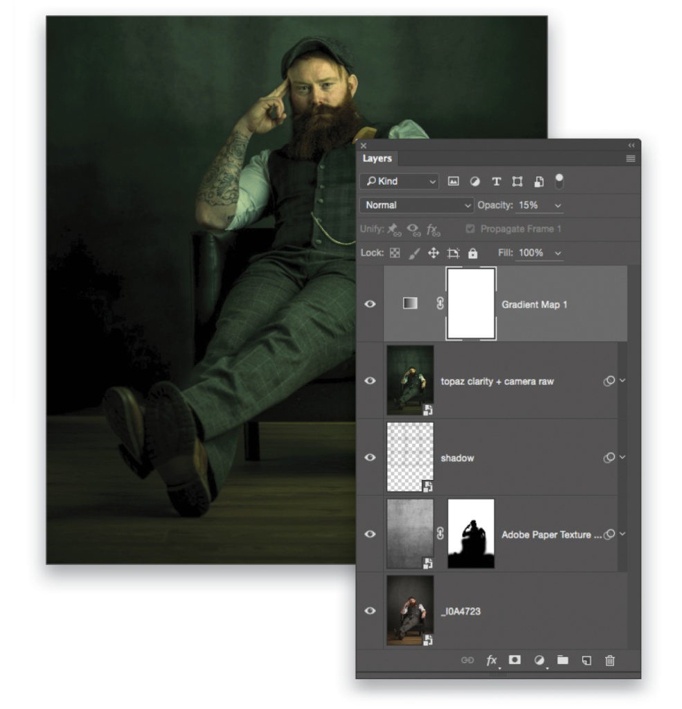
To tone the image and give it the final look, I’m going to use the now free Nik Color Efex Pro 4 from Google (after you install it and restart Photoshop, go to Filter>Nik Collection>Color Efex Pro 4). I start by using the Cross Balance filter—choose Tungsten to Daylight (2) and a Strength of 30%. Click Add Filter, then go to the Cross Processing filter, choose YO2, use a Strength of 70%, and click OK.
Back in Photoshop, press D on the keyboard to set the Foreground and Background to their default colors of black and white, respectively. Then, add a Gradient Map adjustment layer (Layer>New Adjustment Layer>Gradient Map), and without making any alterations to the gradient, simply lower the Opacity of the adjustment layer to 15%.
Tip: Filter Blending Options
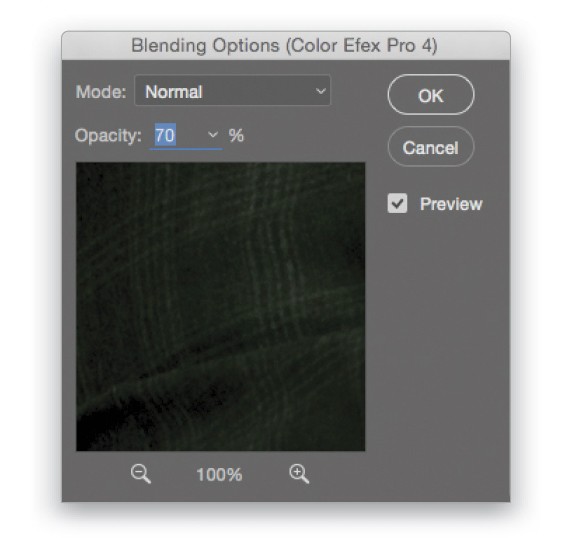
To reduce the toning effect used in Color Efex Pro 4, double-click on the filter Blending Options (the icon that looks like two sliders) to the right of the filter’s name in the Layers panel and then in the Blending Options dialog, lower the Opacity slider, and click OK. In this example, I reduced it to 70%.
Step 12: Save Back to Lightroom
Now that we’ve finished retouching this image, all we need to do is save it and then add it to the collaboration folder so that Dave can begin his design work. So go to File>Save and then jump back into Lightroom to see the final retouched image update in the catalog. From here, I simply export (File>Export) the image as a JPEG into the collaboration folder that we set up earlier, where Dave can then pick it up once synced. Dave, over to you….
THE DESIGN PHASE • by Dave Clayton
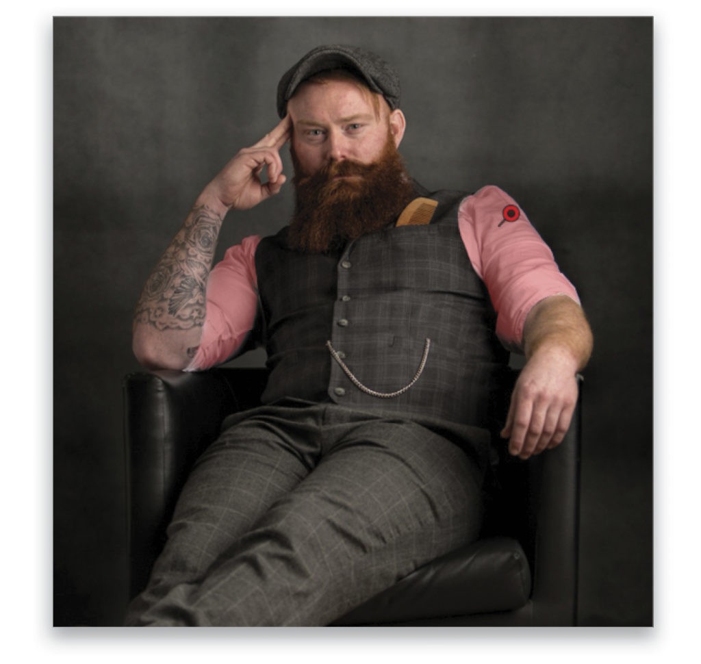
Okay, now that I’ve received my invitation to collaborate with Glyn using our shared folder, I can see the final image I’ll be working with for our poster. I’ll download this image to my desktop to work with for now.
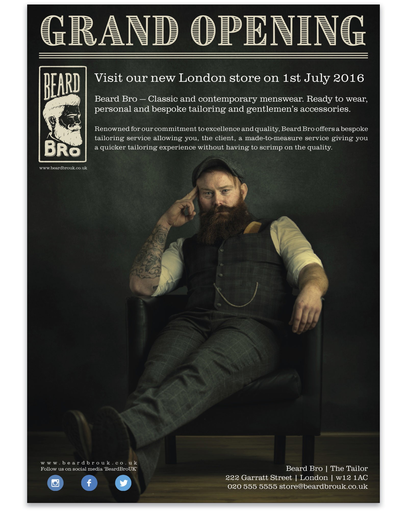
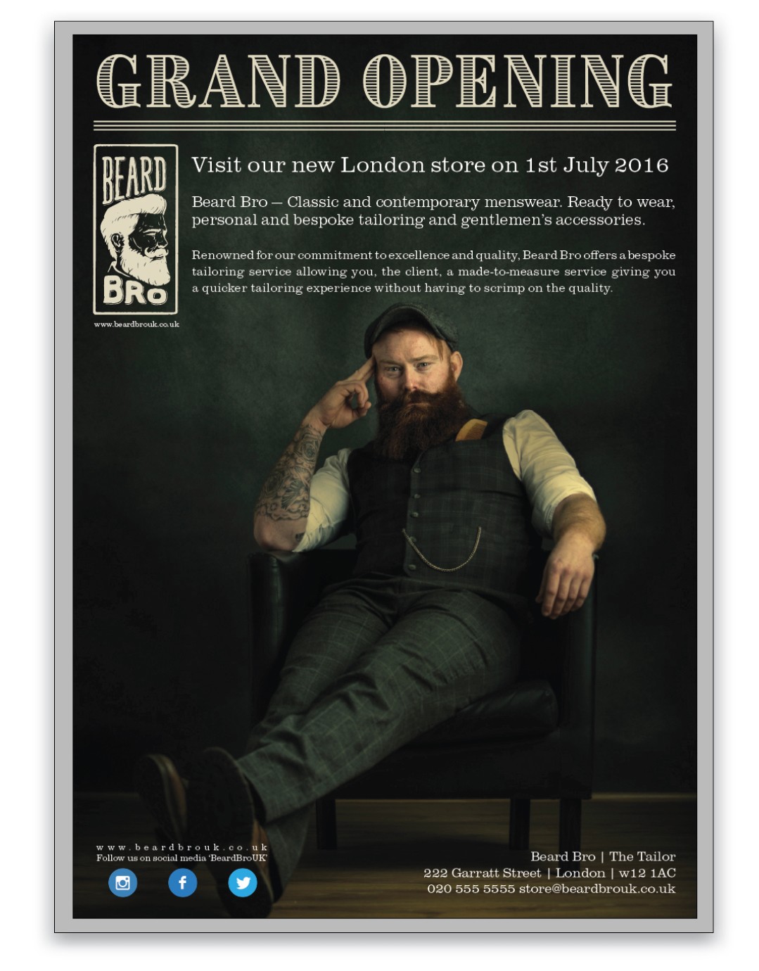
The shoot and design is for a (fictitious) gentleman’s tailor shop called Beard Bro Tailors, and I think you’ll agree that the source image is perfect for our poster! As well as using the CC Libraries for my assets, I always create a folder on my desktop for every project to save my assets locally as well, just in case my Internet connection fails. When I’m done, I’ll save everything into the shared folder in the Creative Cloud Files folder.
Step 13: Create New Document
We’re going to open InDesign to create our layout for this project. The reason we’re using InDesign and not Photoshop or Illustrator to build our poster is because not only do we have more creative control over the assets and layout but we can also package up the file for print more easily than if we use the other two apps. We’ll come to that at the end of this tutorial.
The first thing to do is select File>New>Document. We’re making a poster, so in the New Document dialog, choose A3 for Page Size, 10 for Number of Columns, 2mm for Gutter, 10mm for each of the Margins, and 5mm for the Bleed settings—all personal preference. Click OK.
Step 14: Place Image
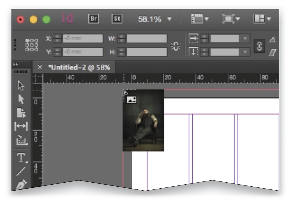
Choose File>Place, navigate to the location of the image, click Open, and the image place gun will appear. Click-and-drag from the top corner of the red bleed lines over the whole document. It won’t fit perfectly (it will extend below the document), but for now, fill the entire document up to the top and side bleed lines.
Step 15: Position Image
Now we need to adjust the position of the image. To do this, ensure that the image borders are touching the top and side red bleed lines. Don’t worry about cropping the image; we’ll just adjust its position to place the subject where we want him. Switch to the Selection tool (V), click-and-hold on the circle in the center of the image for a couple of seconds, and then drag the subject into position. (The reason you click-and-hold for a few seconds is so you can get a preview of the actual image being moved on the page; otherwise, you’ll only see the frame around the picture move.) Now we have the image positioned and ready to add our logo, headline, and copy. Let’s save this into our desktop folder.
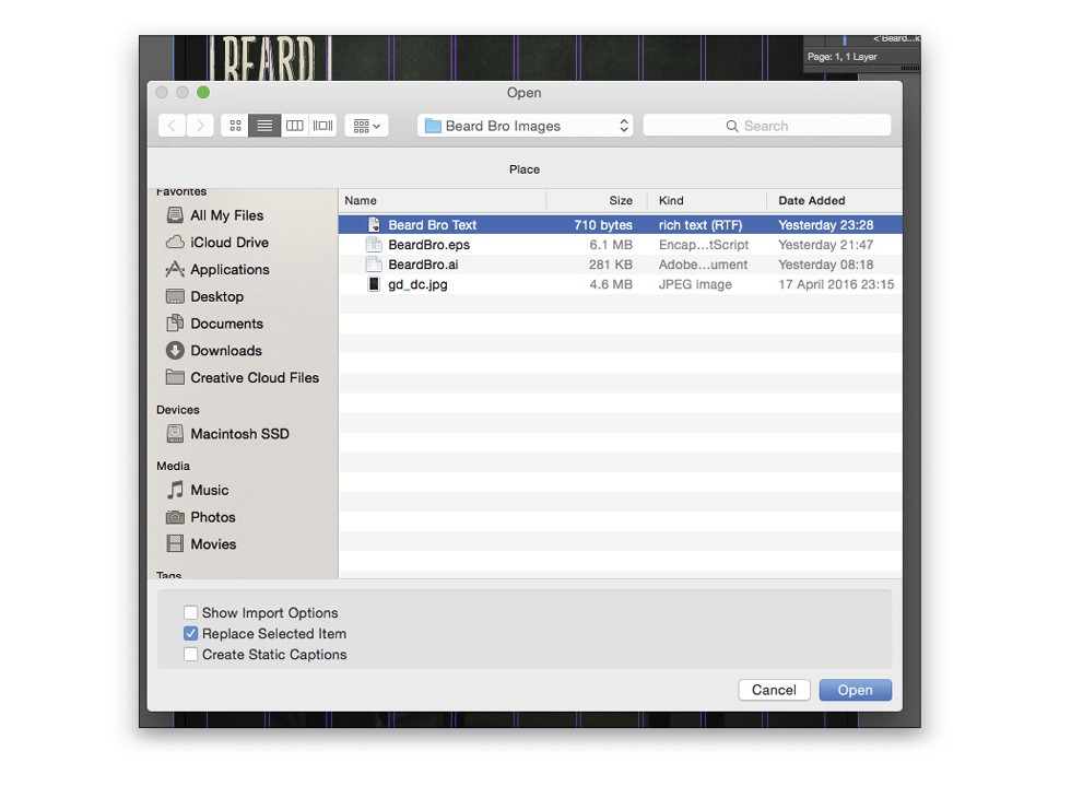
Step 16: Find and License Vector Graphic
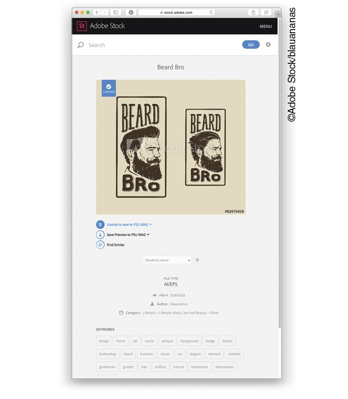
For the sake of this tutorial and to demonstrate the benefit of having an Adobe Stock subscription, we’ll select a vector image for our tailor business and manipulate it in Illustrator to suit our poster design. You can search for Adobe Stock images right inside the CC Libraries panel (Window>CC Libraries). After a couple of searches for “tailor,” “man,” and “beard,” I found this great image called “Beard Bro,” and this is what led us to call our shop “Beard Bro Tailors” for this tutorial. In your case, you should have the appropriate vector logo from your client or for yourself. [KelbyOne members can find the Beard Bro logo in the downloads folder. All practice files are for personal use only.—Ed.]
I’ll license the image so that I can use it in this commercial project and add it to my CC Library—for this project, I have a Library called “PSU Mag,” but you can create a Library and call it whatever you wish, even “Beard Bro,” and it will appear in all of your Adobe apps. (To create a Library, click on the drop-down menu at the top of the CC Libraries panel and choose Create New Library.)
Step 17: Open Image in Illustrator
Now we’ve licensed our vector image, let’s launch Illustrator so we can play with some colors. If the file you want to use is already in your CC Libraries as described in the previous step, when Illustrator opens, click on Libraries, select the Library where your vector graphic lives, and then double-click the graphic in the Libraries panel to open it.
[Note: If you’re using the download file, after you launch Illustrator, click Open, and navigate to the file. If you see a dialog about slicing, click No. Once the logo is open, switch to the Selection tool (V), press Command-A (PC: Ctrl-A) to Select All, and then drag it into your Library in the CC Libraries panel so you can have access to this file in other Adobe apps.—Ed.]
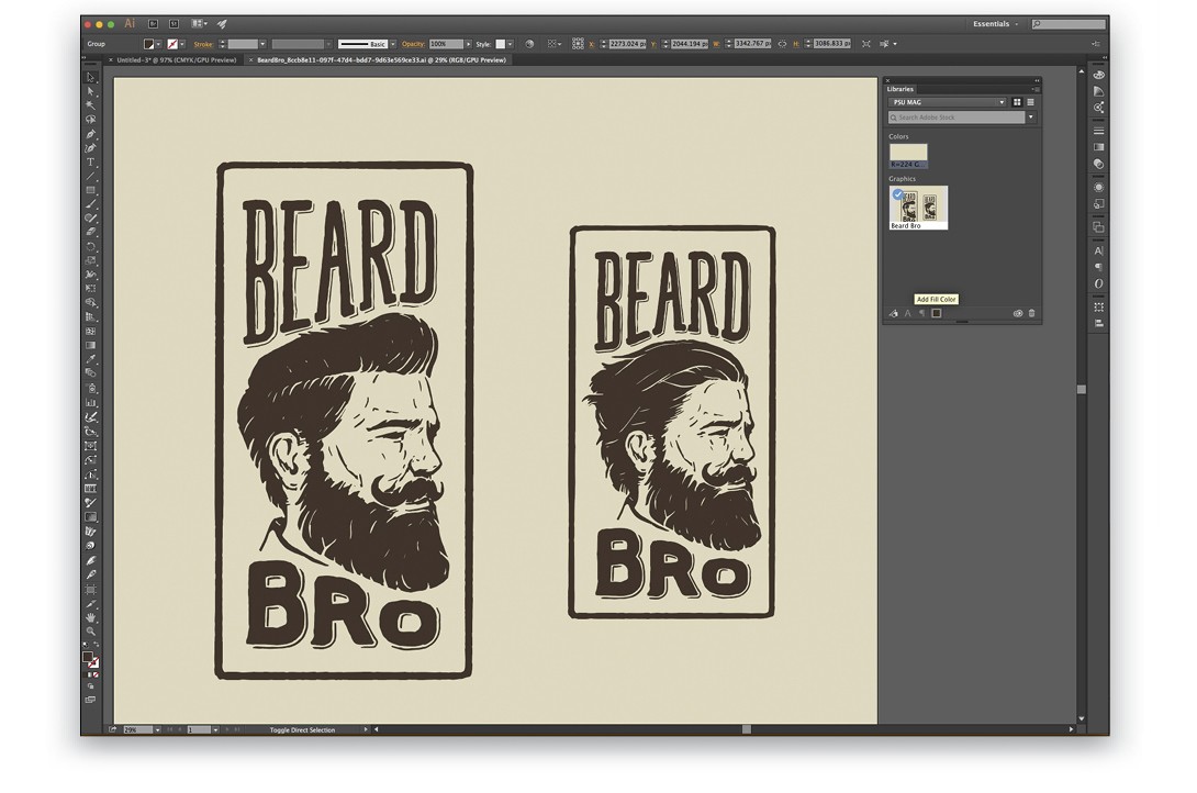
Step 18: Delete Background and Graphic on the Right
With our vector image open, switch to the Direct Selection tool (A), click on the background, and press Delete (PC: Backspace) to delete it. As we just want to work with the logo on the left for now, marquee around the entire graphic on the right and delete it.
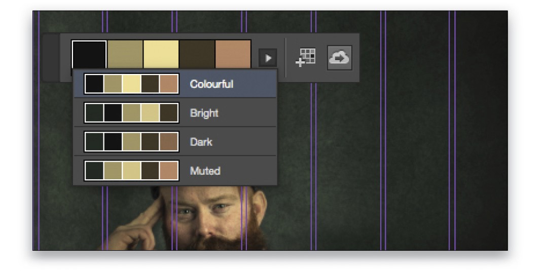
Step 19: Sample Colors from Image in InDesign
We have a perfect space at the top of the image for our header, copy, and logo, but because our main image for the poster is quite dark, we need to recolor the logo to a lighter shade. There are some lighter colors in the main image we can use, so we’ll quickly jump over to InDesign, create a color theme, and add it to our PSU Mag library. To do that, switch to the Color Theme tool (Shift-I) in InDesign, and click on the image. This will create a set of five swatches based on the colors in the image. To the right of those swatches, you’ll see an icon of a cloud with an arrow. Click on that icon to add this color theme to your CC Library.
Step 20: Apply New Color in Illustrator
When we jump back into Illustrator and look in the CC Libraries panel, we’ll see our new color swatches. Select the logo image by clicking-and-dragging around the entire image with the Direct Selection tool, and then click on the light-cream color swatch. This changes the color of the whole logo.
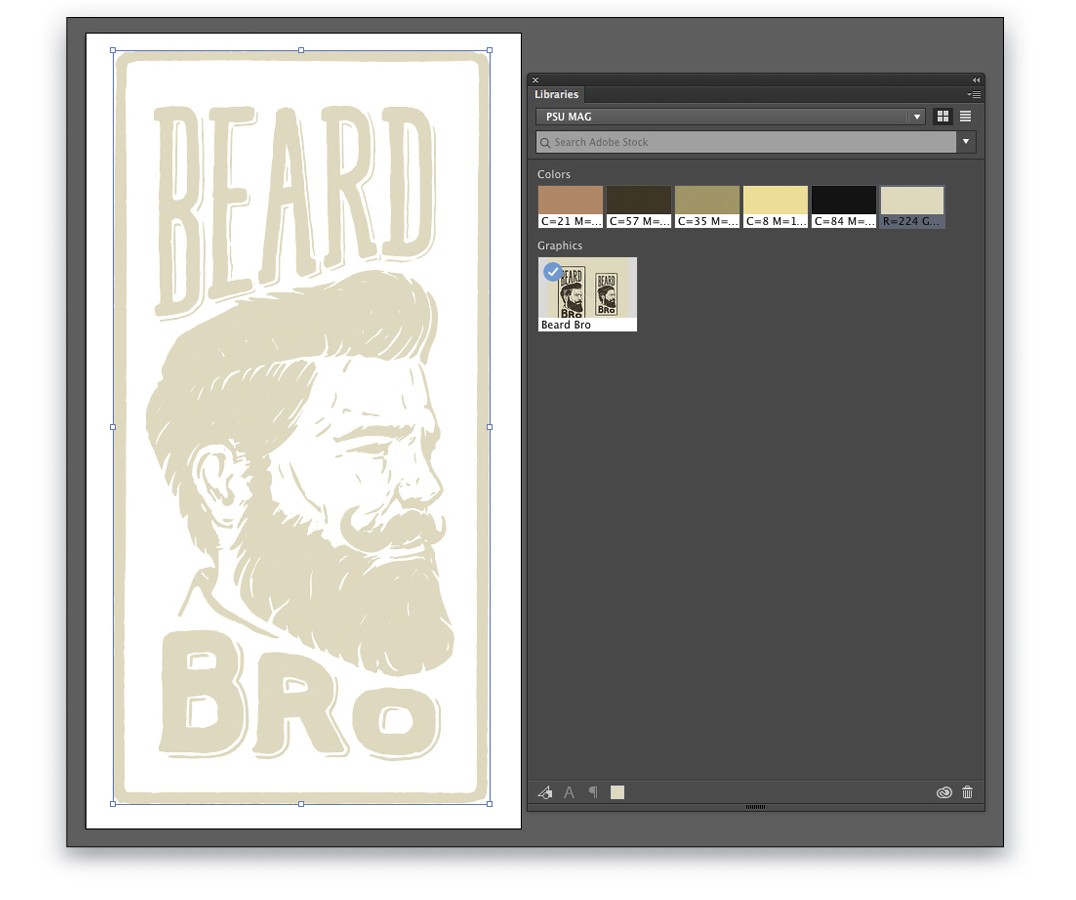
Step 21: Save Updated Logo
When finished, we’ll save it out as “Beard Bro Logo” into our desktop folder for our assets. This is for the client as well, because they may not have Creative Cloud and will need the assets. The final thing to do in Illustrator, and the best bit, is to select the whole logo (if it’s not still selected) and drag it over to our CC Libraries panel. It now sits in your Library and is available in all your Adobe apps. Double-click the logo’s name in the Library to rename it. Now we’ve done our work in Illustrator, let’s jump back over to InDesign.
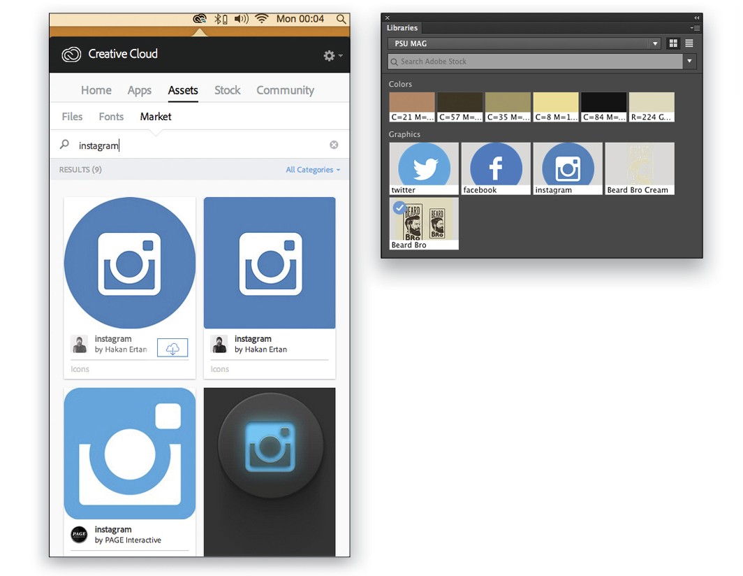
Step 22: Take Advantage of the Adobe Market
We’re now ready to start putting this poster together. We have our main image, our InDesign file set up, and our swatches and logo sitting ready in our CC Libraries panel. Before we start adding fonts, which we’ll select and sync from Adobe Typekit, we need one more thing for the bottom of our poster: some social media icons. To get these, jump over to your Creative Cloud application, click on Assets, and then click on Market. Here, you can find assets to use in your projects. I searched for social media icons by name so I could choose and sync only the ones I needed. In this instance, I selected Twitter, Facebook, and Instagram graphics from Hakan Ertan and synced them to my CC Library. When you find an asset that you want to use, hover over it to reveal the download icon (cloud with an arrow), click on the icon, and then select the Library to which you want to save it.
Step 23: Add Font for Header from Typekit
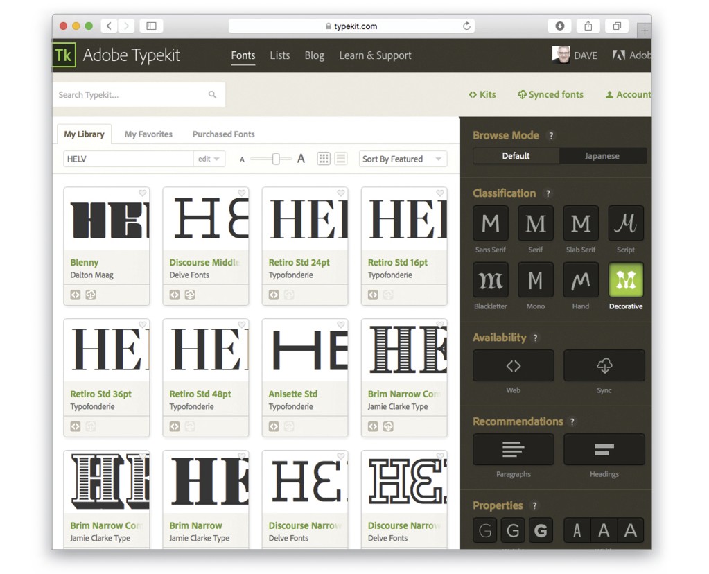
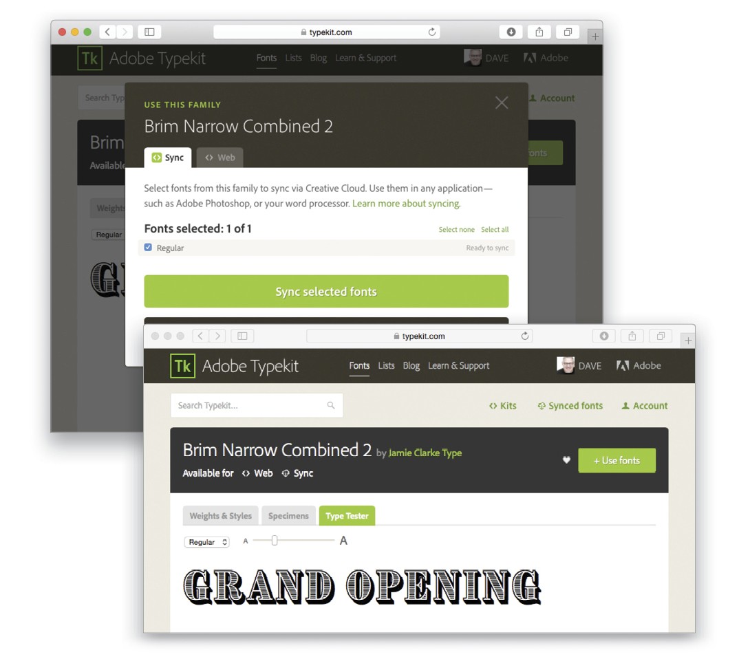
First let’s choose a suitable font for our header. In InDesign, switch to the Type tool (T), click on the down-facing arrow next to the name of the currently active font in the Control Bar at the top of the screen, and then click the Add Fonts from Typekit button. This will take you to the Typekit website where you have lots of fonts from which to choose. I’m going for Decorative under Classification for this project, and the first font that appealed to me was Brim Narrow.
When you’ve found the font you want to use, click on the Use Fonts button, and then click on Sync Selected Fonts. This means you’ve added the font to your font assets in CC and that it’s now available, not just in the Creative Cloud, but in all apps on your computer. I added both Brim Narrow Combined 1 and Combined 2. Tip: When selecting fonts in Typekit, click on the Type Tester tab and type in your own text to see what the font looks like for your headline or copy.
Step 24: Add Font for Secondary Copy
We’ll also choose a secondary font for the body copy on the poster. As we want a serif font, I’ll select Serif under Classification, and this time I picked Clarendon URW, which is classy and complements the style and feel. After both fonts have been synced, we’ll jump back to the InDesign document and start adding the logo and text. The beauty of Typekit is that you don’t have to download and sync all the fonts in the font family; you can just tick only the ones you want, adding the remainder later if needed.
Step 25: Set the Header
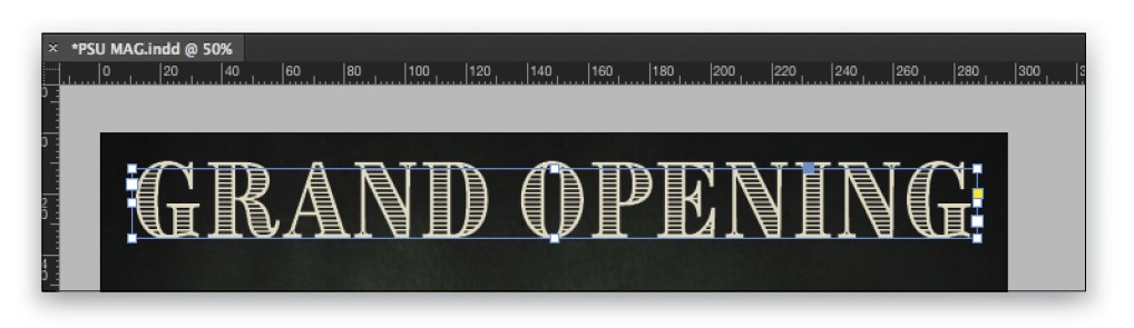
For our title, “GRAND OPENING,” start by selecting the Type tool (T) in the Toolbox and drawing a text box across the top of the poster from the left-margin line to the right-margin line. Next, go up to the type select menu in the Control Bar and choose the Brim Narrow Combined 1 font. We’ll start with a font size of about 60 pt, as we know our text needs to be large. Type the words, highlight them with the Type tool, jump into your CC Libraries panel, and click on the light-cream color swatch. Now you can adjust the size of the type until it goes from the left margin to the right margin.
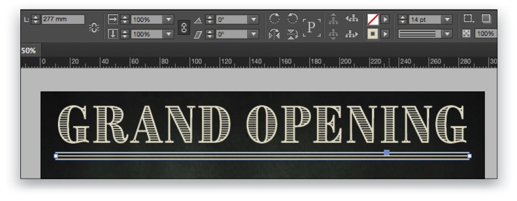
Step 26: Draw a Line Below the Header
Choose the Line tool (\) in the Toolbox and drag it across the document from margin to margin just below the title we added in the previous step. Up in the Control Bar, set the line to 14 pt, click on the drop-down menu just below the line size, and select Triple for the line style. To the left of the line size and style menus, set the Fill to None, and then set the Stroke to the light-cream color.
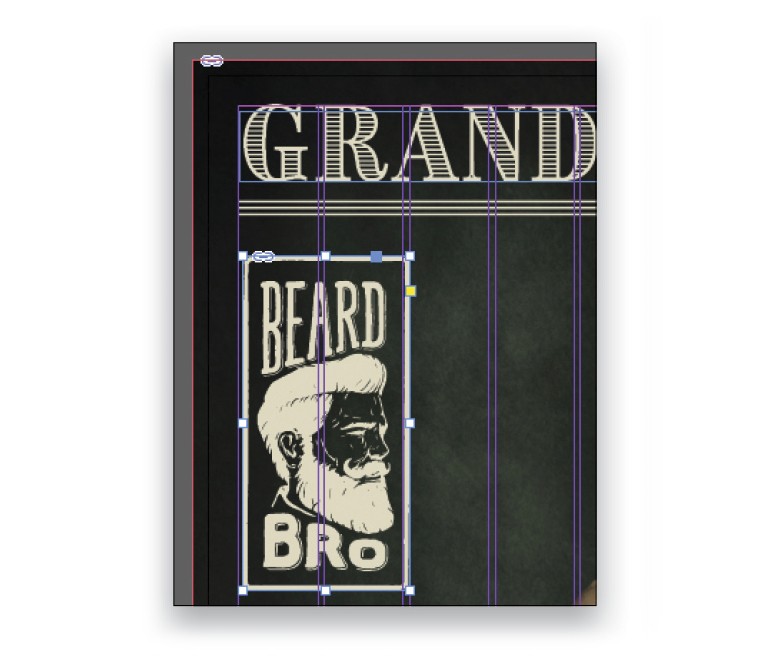
Step 27: Add the Beard Bro Logo
To add the Beard Bro logo, just drag it from your CC Libraries panel. You’ll now have the same place gun you had for the main image, except it’s loaded with your logo. Click-and-drag the logo out on the left side of the document below the title. Size isn’t critical at this point, just make it the width of two columns to begin with, and we’ll adjust it afterwards.
Step 28: Add Body Copy
Next we’ll add our strapline text and body copy. Using the Type tool, add another text box below the header copy that’s a little lower than the top of the Beard Bro logo. Set the text “Visit our new London store on 1st July 2016” at 30 pt using the Clarendon URW font in white.
Now, add your body copy below the strapline text. You can do this in one of two ways: either copy-and-paste the text from the Beard Bro Text file in the downloads folder, or make sure that nothing is selected on the canvas, go to File>Place, navigate to the text file, click Open, and drag out a text box in much the same way as an image, but this time it’s text. Line up the left and right edges of the text box with the strapline text above. Select all of the text, set it to white, then go to the Control Bar, and select Clarendon URW and a suitable font size to fit the area. I used 21 pt for the first paragraph and 16 pt for the remaining text just to make the opening introduction more powerful.
Step 29: Resize Logo and Text Boxes
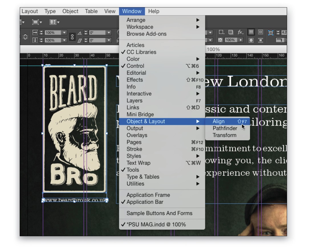
Now we’ll decrease the size of the logo so it’s better balanced with all the copy we’ve added. To do this proportionally, click on the logo with the Selection tool, hold Shift-Command (PC: Shift-Ctrl), and adjust the size from the bottom-right corner handle of the logo. Click on the strapline text, and then Shift-click the body copy so both text boxes are selected. Drag the left center point closer to the now smaller logo. Then, add the Web address under the logo at 10 pt. To center it under the logo, select both the logo and text, go to the Align panel (Window>Object & Layout>Align), and click on the Align Horizontal Centers icon.
Step 30: Select Social Media Icons
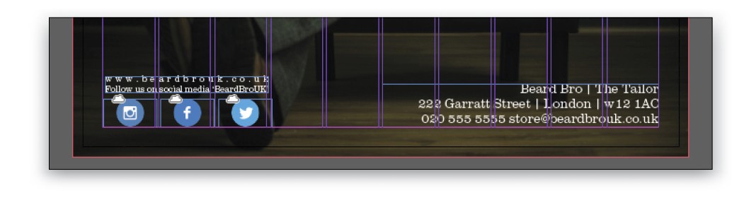
To finish the bottom of our poster, we’ll add those social media icons and the address of the store. To select the icons, just go to the CC Libraries panel, click on the first icon, hold Shift, and click on the other two icons to select them as well.
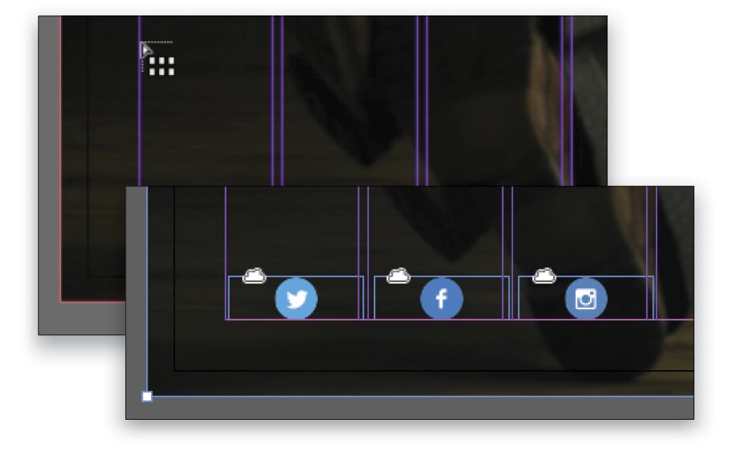
Step 31: Place Icons as a Grid
Drag the selected icons onto the canvas and you’ll see the loaded place gun. Hold down Shift-Command (PC: Shift-Ctrl) and the place gun will change to a grid icon. Just drag across three columns at the bottom left of the document and release. Now all three icons are placed evenly spaced. You can adjust this by clicking on an individual icon and moving it with the Arrow Keys on your keyboard. You’ll see small clouds in the corner of each icon; this means that they’re linked via the CC Library.
Step 32: Set Social Media Info and Address
Next, add some text above the icons to include the social media username “BeardBroUK” and the Web address. Then add the company name, street address, and other contact info in the bottom-right corner. By now you know how to add and resize text and choose the correct font.
Step 33: View Final Document
We now have our poster laid out and ready to save to our shared folder before packaging it all up for print. To see what the poster will look like without all the guides, just press W on the keyboard and you’ll see a guide-free version.
Step 34: Share with Collaborator and Client
I’ll save the final document to our shared CC folder in the Creative Cloud Files folder so that Glyn can see the final project, and then we can share the link with our client who can view the files in a Web browser—and they don’t need a CC account to view the file! To find the link, Right-click on your shared folder and select View on Website. Here’s a small “gotcha,” however, in Creative Cloud. We used two Typekit fonts in our design, but when viewing the InDesign document in the shared folder, you don’t actually see the fonts we used in the document; you’ll see two replacement fonts. To allow others to see the file as you intended, go back to the original InDesign file, choose File>Export, and select Adobe PDF (Print) in the Format drop-down menu in the Export dialog. Save this PDF version in the shared folder along with the InDesign file. This is probably the best practice, as your client most likely doesn’t have InDesign, and everyone loves a PDF!
Do any final tweaks you need and there you have it: a fine poster designed from photo shoot to print using Lightroom, Photoshop, Illustrator, InDesign, Adobe Stock, Typekit, CC Marketplace, and shared CC folders in your shared account cloud storage, all via Adobe Creative Cloud—the best collaborative tool for professionals.
I hope you’ve enjoyed this tutorial. If you haven’t signed up for the Creative Cloud yet, then I hope you can see the real benefits of the whole suite—and we haven’t even touched all the other apps, including the vast selection of creative mobile apps. We could have also laid out this poster in Adobe Comp CC with the image, fonts, and icons and saved it into the CC Libraries ready to pick up in InDesign, but that’s a different tutorial! [This article was from the May/June 2016 issue of Photoshop User.]