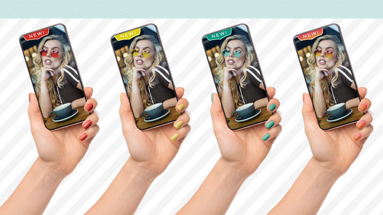
Which came first? The chicken or the egg? Well, for many of us the answer is whatever the client ordered. One role for many editors out there is to make marketing materials for products that aren’t actually being produced yet so clients can generate interest, test the potential of their products, and even begin taking orders. Oftentimes, these products need to be shown in a variety of colors. This has been a common practice for years with regard to makeup, fashion, automotive, paint, and just about anything that needs to show a variety of color options.
A company might start with a photoshoot of a prototype to share with potential customers, investors, etc. In the examples to the left and the previous page, you can see how the sunglasses, or the product, have been modified to show potential color options for tinted lenses. Normally, the original image will be delivered to the designer along with some type of art direction that includes markups and reference colors, as in the example above.
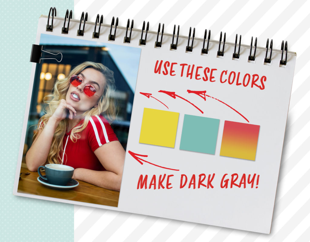
Something as vague as this isn’t uncommon, but in other cases you might receive very specific color values in the form of a Pantone swatch, an RGB value, etc., depending on with whom you’re working and what system they use for color. It could even be as crazy as receiving a CMYK mix or a web hexadecimal value, which is a color code used in websites. A company once actually sent me paint swatches from their local hardware store and said, “Use these colors.”
As production professionals, we’re expected to translate all that info into a final version that’s accurate enough to match the actual product when it gets made for real. Let’s go through multiple options for real-world color matching in product shots, from tricks for eyeballing the final color all the way up to diving into the numbers.
Technique #1: Colorizing from Nothing
It’s not uncommon that we have to apply a color to an image that has no color. Now this might not be the case for your shots, but there are still a few handy tips to learn here; essentially, if you can create a grayscale area of what needs to be colored, you have a luminosity map representing the shape of the product surface.
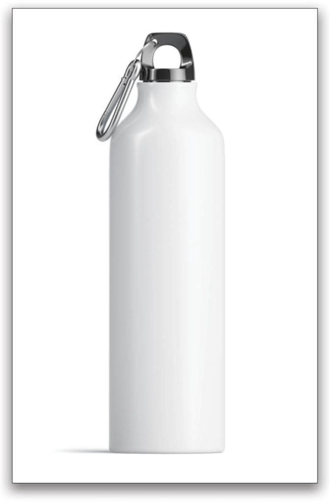
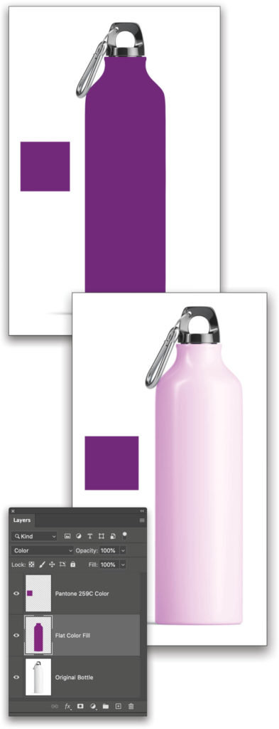
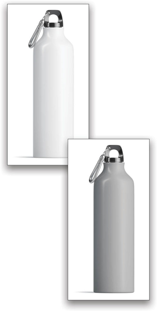
The water bottle on the next page is a great example of a blank product a company might send you to modify into versions of their final color products. If we start with a selection of the bottle and fill it with the sample color that the client sent, there are a few challenges that we’ll need to solve.
If you’d like to download the low-res watermarked version of this image to follow along, click this link, log in with your Adobe ID, and click the Save to Library button. Double-click the image in the Libraries panel (Window>Libraries) to open it in Photoshop. In the Layers panel, double-click the Background layer’s name and rename it “Original Bottle.”
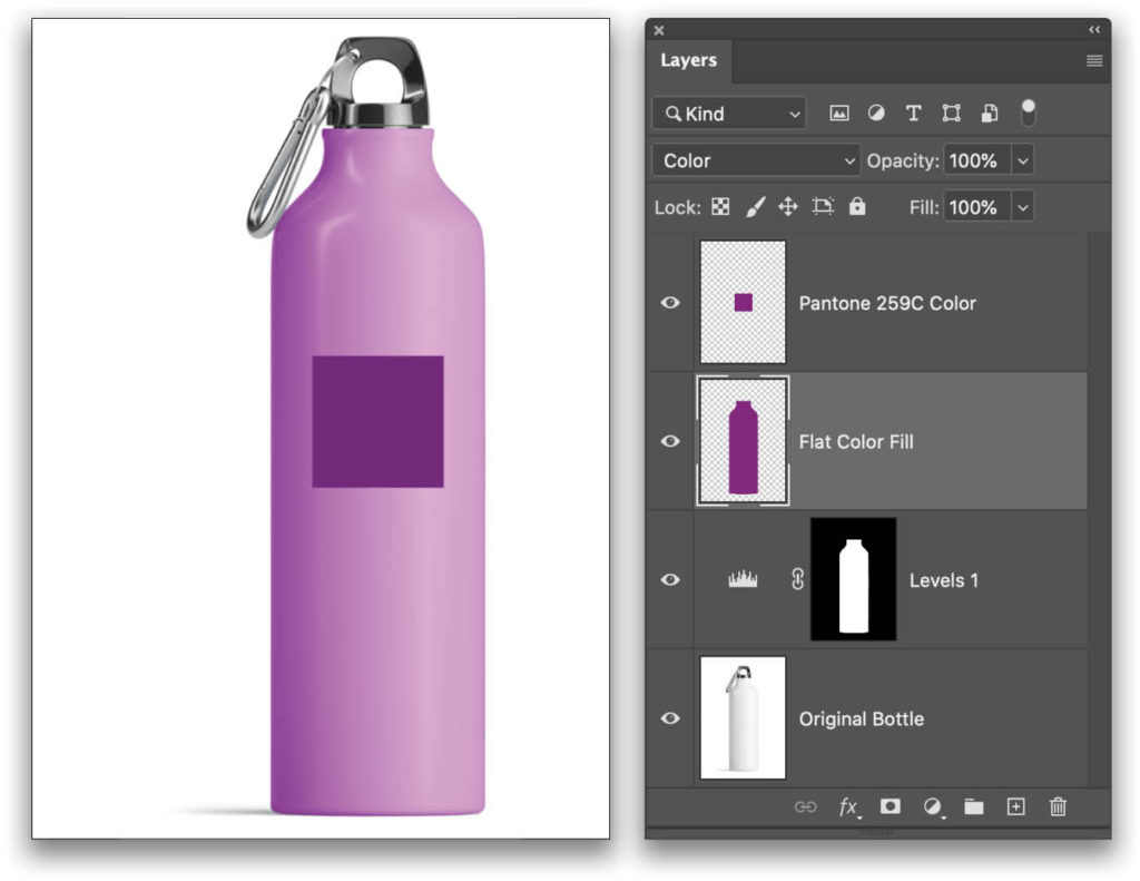
Step One: Let’s say the client sends us a simple note: “Make it PANTONE 259C; it’s a purplish color.” First, we need to find that color in Photoshop to work with it. To look up a Pantone color in Photoshop, first access the Color Picker by clicking on the Foreground color swatch near the bottom of the Toolbar. By default, the Color Picker is set to the HSB spectrum as shown below. If you click on the Color Libraries button on the right, it changes to a series of color strips. At the top, there’s a pull-down menu where you can select from which Color Book you want to work; in this case, it’s PANTONE Solid Coated. With any swatch highlighted, type in the number for the Pantone value, and it automatically jumps to that color swatch. In this example, type “259” and it’ll automatically go straight to that swatch. Click OK to make it your Foreground color.
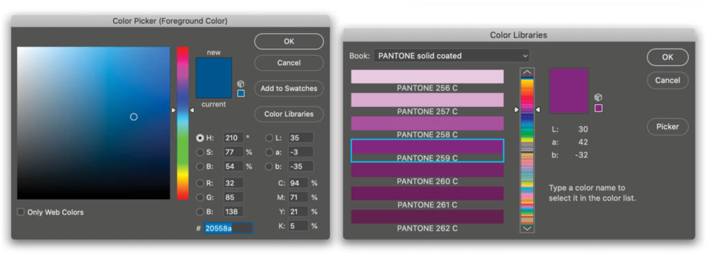
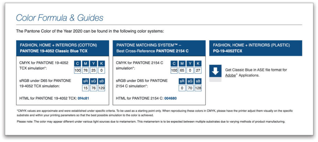
Important Note! Not all Pantone values are available within Adobe programs. In fact, the Pantone Color of the Year 2020 is Classic Blue, and that swatch doesn’t exist inside Adobe applications. To get those Color Book libraries updated, you have to buy the official software from Pantone, or if you own a printed Pantone book, it’ll offer you RGB, HEX, and possibly CMYK values for different use cases. Do a little Internet searching, though, and you can quickly find the values you need on the Pantone.com website.
Step Two: Back to colorizing! So now that we have the “purplish color” guidance from the client loaded as our Foreground color, we need to make a selection of the water canister, and then fill it with the suggested color. For the purposes of this tutorial, just use the Quick Selection tool (nested below the Object Selection tool [W] in the Toolbar) to make a rough selection of the bottle, add a new layer named “Flat Color Fill,” and then press Option-Delete (PC: Alt-Backspace) to fill the selection with the Pantone color.
The problem here is that it’s simply a flat hue value, and it doesn’t look convincing, because real-world products have a shape that’s defined by light and shadow. The darks, the median, and the highlights of the product are what give it depth. This can make color-matching tricky because you need to match your target color to a median value in the object so that shadows and highlights are extensions of that hue’s appearance.
One technique you can use to help you eyeball the level of accuracy is to create a new layer at the top of your Layers panel and fill a small square selection with the target color. Let this “color swatch” float directly above the canister as a reference for your target color. Name the layer to represent the target color.
Step Three: The simplest way to color match is through a mixture of blend modes and adjustment layers. If you’ve colorized a black-and-white photograph before, you probably painted on a new layer that was set to the Color blend mode in the Layers panel, or set your Brush tool (B) to Color in the Options Bar. Unfortunately, that doesn’t do a good job for our example.
Each blend mode will give you a different result. You could try Multiply, Darker Color, Hard Mix, Overlay, or any of the options available in the blend mode pull-down menu near the top left of the Layers panel, but with this sample blank product, you’ll find most of them don’t do you any good. The reason is that blend modes aren’t very effective on pixels that are near to white or black. Any form of colorization using blend modes requires some shades of gray. That’s why in the water bottle example with the Color blend mode, the shadowed side of the product is picking up some of the hue, but the rest of the canister isn’t.
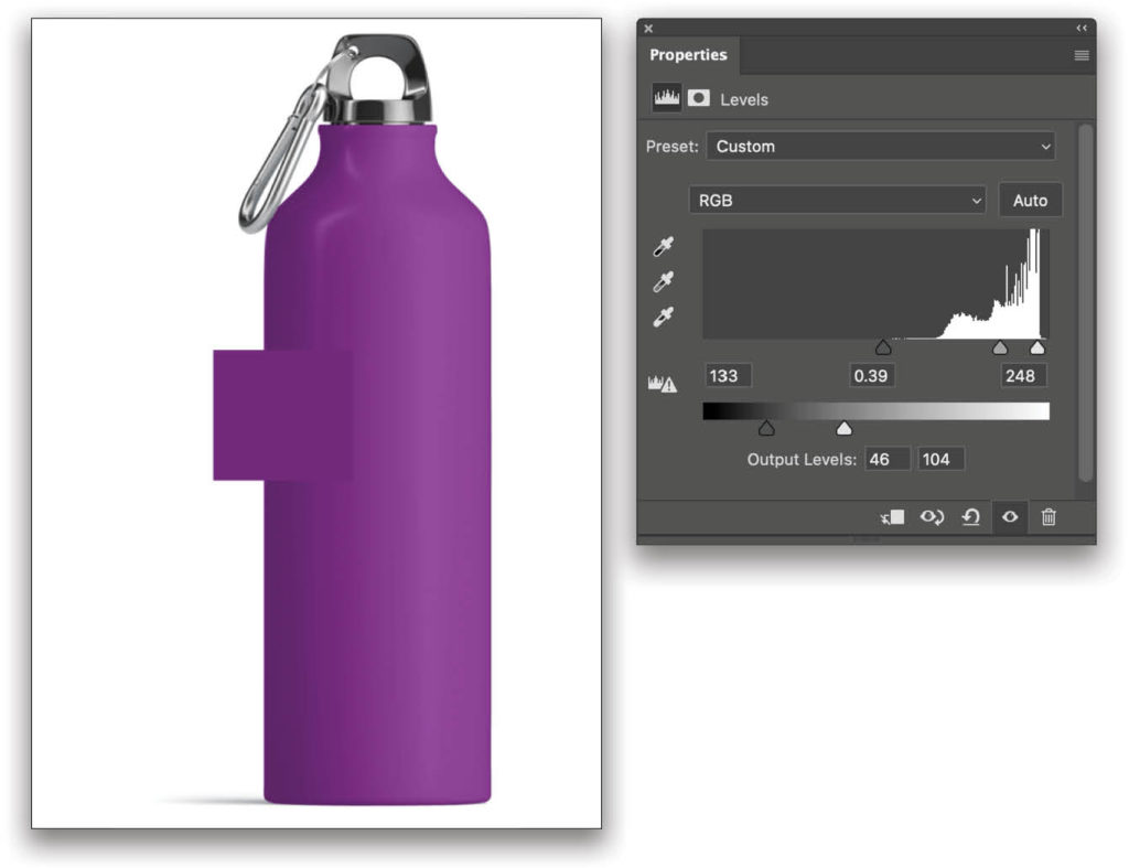
Step Four: What we need to do is darken the bottle so that there are more midtone values that can be colorized. Command-click (PC: Ctrl-click) on the Flat Color Fill layer thumbnail in the Layers panel to load it as a selection, and then click the layer’s Eye icon to hide it for now. Click on the Original Bottle layer to make it active and add a Levels adjustment layer (Layer>New Adjustment Layer>Levels).
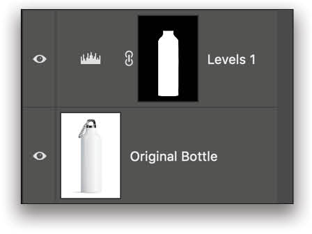
The active selection of the bottle will create a mask for that area on the Levels adjustment layer. Now, as you adjust the tonality of the image (see the next step), it’ll adjust the contrast or shade of the image.
In this technique, it’s key that the body of the bottle is grayscale. If you have any tint of color in the original product image, say reflections from a painted wall or someone on set wearing a brightly colored shirt (I swear if my assistant wears a neon-yellow shirt on set again…!), then you may want to desaturate that area first to make sure it’s all shades of gray. Simply click on the image layer and press Shift-Command-U (PC: Shift-Ctrl-U).
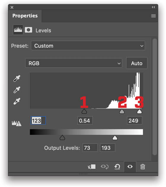
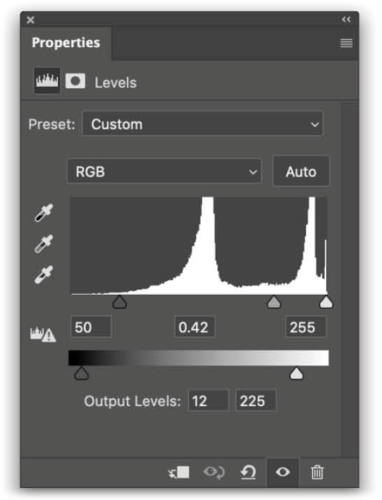
Step Five: In the Levels Properties panel (Window>Properties), we’ll make a few adjustments based upon the starting appearance of the bottle; for example, the parts that are very bright and white need to be darkened. Here are the settings we used, as well as a description of how each slider affects the image.
- Low-key slider increases the dark tonal contrast.
- Gamma slider shifted to the right allows more pixels to exist in the lower half of the tonal range, reducing the exposure and making all those pixels darker.
- High-key slider increases the bright tonal contrast.
- Low-frequency output target means that no pixel can be darker than this shade in the masked area.
- High-frequency output target means that no pixels can be brighter than this shade in the masked area.
This technique not only allows us to increase the contrast without losing our highlights and shadows, but also to limit the overall output range of grays. This way we won’t end up with any pixels near to a pure white or black value, which won’t take the purple color effectively.
Levels is a great way to affect tonality and control the input/output values independently of one another. This is a bit more complicated to do with Curves, but you could technically accomplish the same effect if you’re more comfortable with that tool.
In the before and after example shown here, you can see how using Levels has reduced the overall tonality and exposure to a lower gray value, but by increasing the contrast, we still have visible highlights and shadows on the bottle. This allows us to keep shape and form.
Step Six: Now if we go back to our Layers panel and turn on (click the Eye icon) our Flat Color Fill layer derived from the Pantone swatch, it will colorize the bottle more effectively. This is a good time to experiment with the various blend modes to see which one provides the best result.
If we try our original blend mode, Color, we can see the color is more evenly applied than before, but it’s still quite bright compared to the target color.
Step Seven: Let’s use the layer with the target color swatch to help us eyeball the level of accuracy. Go back to your Levels adjustment layer and adjust the input/output targets in the Properties panel. Here you can see how closely the swatch and the bottle are beginning to match. If you compare the adjusted Levels values to our original values, you can see we decreased the span of the Output Levels and made it a darker range. We also made adjustments to the Input Levels to ensure that there’s enough contrast to keep the highlight on the right side of the bottle; otherwise, the shape would look too flat with the new color.
Step Eight: What’s great about this technique is that you now have a template for any other color varieties of the product. Click the top layer in the Layers panel, and then Shift-click the Levels adjustment layer to select the three layers above the Original Bottle layer. Press Command-G (PC: Ctrl-G) to place them in a layer group, and rename the group using the name of the Pantone color.
Now each time you need a new color for the bottle, simply press Command-J (PC: Ctrl-J) to copy the layer group, and then make adjustments as needed. Be sure to name the layer group for the target color; that way you don’t lose track in your working file! And be sure that, while you’re working on a group, you turn off all the other groups.
Whatever color value you’re given, simply replace the Flat Color Fill layer with the new target color, and then adjust the Levels for best results. Once you have the right layers in place, this is completely nondestructive, and a very fast method. Tip: After you select your new Foreground color, you can fill the pixels on a layer, while preserving its transparency, by holding the Shift key when you press Option-Delete (PC: Alt-Backspace).
Using Non-Pantone Colors
What if your client gives you a color to match that’s not a Pantone swatch, such as a color swatch from their local hardware store or an image from the Internet? In the end, it’s all about sampling that color, preferably in Photoshop, and applying it to your product’s image. As long as you can sample the color value, you should be good to go. These days there are even apps for your phone, such as Adobe Capture, that will let you take a photo of anything, and it will give you the color values you need in Photoshop.
But What About Accuracy?
If you’re this far into the article (and I hope you are), I imagine there were a few people gritting their teeth every time I wrote “eyeball the level of accuracy.” Truth be told, there are a lot of things relating to color accuracy. I wrote all about it in an article called “The Science of Color” in a past issue of Photoshop User. If you want to go really deep, check out my KelbyOne course on A Guide to Commanding Color!
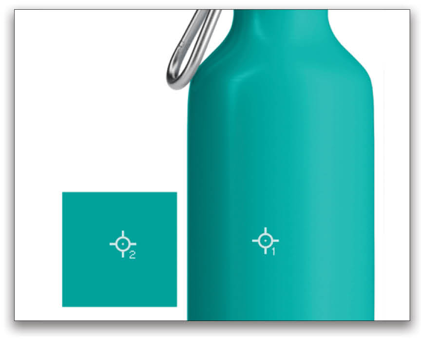
Let’s focus on the key thing for color accuracy: measuring both the source and target color properties. It’s a great way to test how good you can actually match a color by eyeballing it. For this, you’re going to need the Color Sampler tool (nested below the Eyedropper tool [I] in the Toolbar) and the Info panel (Window>Info). The Color Sampler tool allows you to place targets on your canvas at specific coordinates by simply clicking on the canvas.
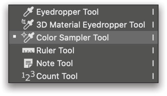
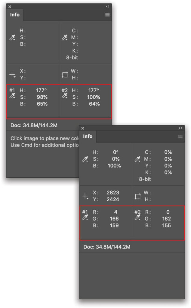
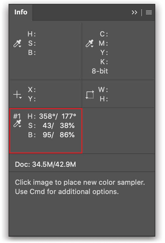
Each Color Sampler target you place on the canvas will have a number next to it. The corresponding number in the Info panel shows you the values for the colors below that target. Here you can see we placed a target on the bottle and one on the reference color swatch. In the Info panel, note that you can change the reading from HSB to RGB (or a number of other options) by clicking on the eyedropper icon below each Color Sampler number.
For best results, notice that the #1 target on the canister isn’t in the shadows or highlights, but, rather, is in a good median part of the image. This is the best place to attempt to match your target color.
Click on the Flat Color Fill layer and compare the two values for the Color Sampler targets. If you find that your color is off from the target color, either adjust your Levels settings to try and align it more closely with the target, or introduce other adjustment layers, such as Hue/Saturation or Curves. (Be sure to place any adjustment layers below the layer with the reference color swatch and above the Flat Color Fill layer; otherwise, the adjustment will affect the reference color swatch, as well.)
It’s best to first try to match the HSB values in the Info panel, then check your RGB values. RGB is really good for a quality check, but it’s much more challenging to mix and align the source color to the target color. Also, while the Flat Color Fill layer is active, jot down the numbers for the Color Sampler target on the reference color swatch so you know what numbers you’re trying to match when you’re altering the values of any adjustment layers.
You should use these Color Sampler measurements for editing accuracy with all the techniques shown in this article. Now let’s look at the next technique.
Technique #2: Starting with an Existing Color
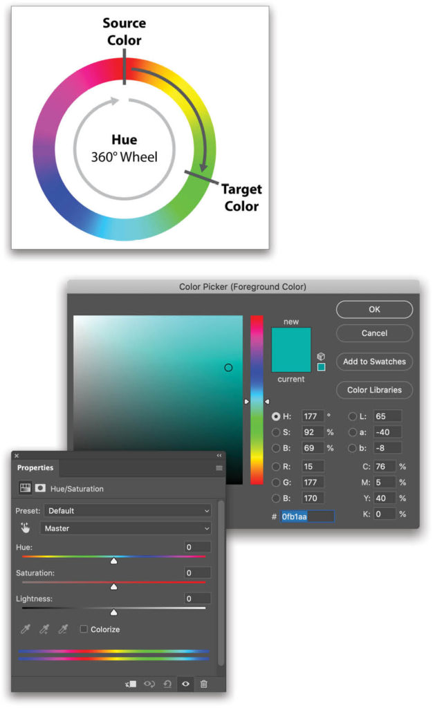
In other situations, you may be given a product shot that has color, similar to the example of the sunglasses at the beginning of this article. This is your prototype; sometimes it might be a photo and sometimes it could even be a 3D rendering. This technique differs from the previous water bottle example in that we aren’t going to reduce the color to gray and then build a color back in. The reason for this is that if a product shot already has a color in it, we can simply move that color to a new value, based on the hue wheel. The concept is actually quite simple. Here are the rules:
- All prismatic colors exist on the hue wheel.
- Hues are measured on a 360° wheel (0° is the same color as 360°).
- If you know the value of the original product color in hue degrees and your target value in hue degrees, you can push the distance between them to arrive at the target color.
- White and black are examples of no color, therefore these are represented by brightness.
- Saturation is the density of a chosen hue.
We can find this hue wheel in Photoshop’s Color Picker or in the Properties panel of a Hue/Saturation adjustment layer. Labels 1, 2, and 3 in the images here show the various areas where the hue wheel has been split and turned into a strip. You’ll notice the color strips are the same color at both ends. Whether you slide a hue controller to one end or the other, that end point will always be the same color.
Let’s look at how we can match colors in an image that already has an existing color.
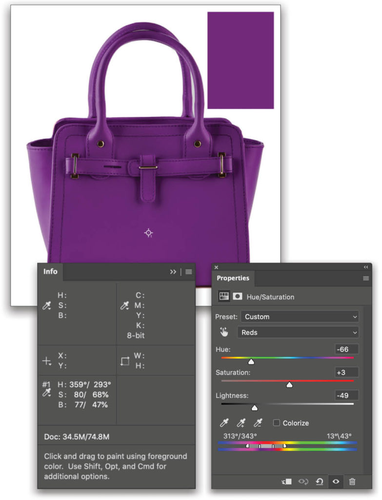
Step One: Here’s our starting product. (You can click here to download the preview image from Adobe Stock.) Some of the same rules apply here for sampling the colors that you’re trying to match; for example, when sampling a color on the product, make sure you’re basing it on a main area of color that’s a median value and not a shadow or highlight area.
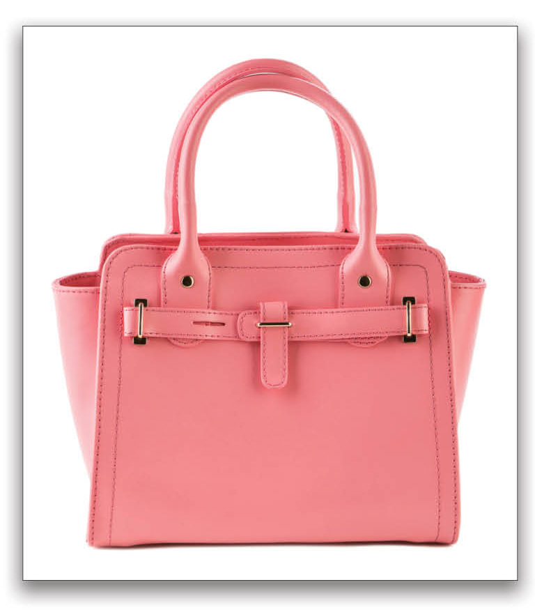
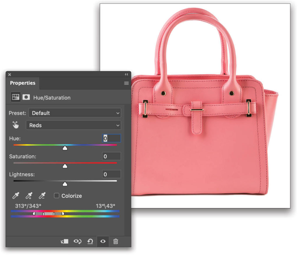
Step Two: Let’s start by adding a Hue/Saturation adjustment layer. We need to use the Eyedropper tool in the Hue/Saturation Properties panel, but it’s grayed out when the color pull-down menu near the top of the panel is set to Master. So change the pull-down menu to a color. We’ll use Reds for this example, but truthfully it doesn’t matter what color you pick because as soon as you sample a color with the Hue/Saturation Eyedropper tool, it’ll jump to the color range you sampled.
So in this example, click on the middle of the pink purse with the Hue/Saturation Eyedropper tool, and then take a look at the set of hue range bars at the bottom of the Properties panel. You’ll see that Photoshop automatically selected the range that will now be affected by the Hue sliders.
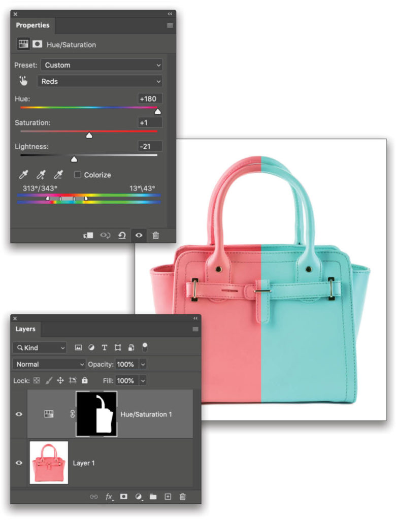
The area between the two middle bars represents the range of colors that will be modified 100% as you make adjustments to the sliders above. The two outer brackets represent the end points in which any hue outside of those won’t be edited in any way. The gap between the inner and the outer brackets will be blended from 100% edited to 0% edited, respectively, acting like a feathered adjustment. This is why it’s imperative to sample the original source pixel value as a starting point before trying to match the target color.
Step Three: Now as you adjust the sliders above, you should notice only the colors changing in your product that are relative to the sample point. The great thing about this is that if there are any areas you don’t wish to alter, you can simply paint with black on the Hue/Saturation adjustment layer’s mask to hide any adjustments being made. The example here has half the image masked out with black, revealing the original color on the left.
Using the Info Panel for Accuracy
Now you understand how to target the original color of your product and alter it to a new value; however, here’s the part where the workflow gets a little wonky because the numbers in the Properties panel are less helpful for what we want to accomplish. Like our earlier technique with the water bottle, we’ll need to rely on the Info panel to see the before and after values that we’re trying to match. Here’s the process you need to follow:
Step One: Write down the HSB values for your target color (the color from the client that you’re trying to match), so they’re easily accessible.
Step Two: Create a Hue/Saturation adjustment layer as described above and select the hue you want to adjust using the Eyedropper tool from the Properties panel.
Step Three: Bring up the Info panel.
Step Four: Before making any adjustments, use the Color Sampler tool to place a target on the product exactly where you sampled the hue spectrum in Step Two above. You’ll notice the Info panel HSB values will have a split line showing two sets of values, which represent before and after values.
Step Five: As you make adjustments to the Hue values in the Properties panel, the “after” numbers on the right in the Info panel should change to show you the new hue values.
Step Six: Now comes the tricky part. Based on those target values you want to match that you wrote down in Step One, make adjustments in the Hue/Saturation Properties panel until the numbers on the right in the Info panel line up with that target color. This number should, mathematically speaking, be the differential value in degrees from your source to your target. But remember it resets when you hit 360° on the hue wheel. This is why watching the Info panel is so helpful, because it allows you to see how close you are to the target color.
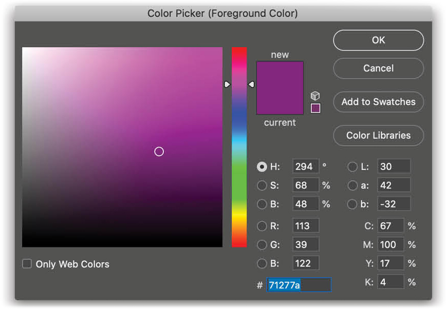
Earlier, we made our water bottle the same values as Pantone 259 C. Let’s use that same target color again for the purse. The HSB values for that color are:
- Hue: 294°
- Saturation: 68%
- Brightness: 48%
Step Seven: On our first attempt to match these colors, it became obvious that although we could match the Hue perfectly, the actual Saturation and Brightness were going to be a challenge because the target color (Pantone 259 C) is much darker than the original color. Therefore, just as before, we can use a Levels adjustment layer to darken the overall exposure of the product (below), and then use Hue/Saturation to match the numbers.
It’s a bit of a dance going back and forth between Hue/Saturation and Levels while also watching the Info panel numbers to see how close you’re getting to the target (remember you need to switch back to the Hue/Saturation layer to see the HSB numbers you’re trying to match). But after a bit of practice, you’ll find this fairly straightforward; it’s just really confusing the first time you do it. But don’t give up! You can match the target!
The Importance of True Colors
When a client says, “Just change it to purple,” it sounds fairly easy. And if all your client needs is to throw up a line of options quickly on their Amazon store, then you can make an eyeball adjustment using Hue/Saturation. But in other instances, there are liability risks for a color not being accurate.
Years ago I was the “Photoshop Guy” at Apple computer working on images for packaging, advertising, and web graphics. Can you imagine if I got the blue wrong on the old “blueberry” iMac? There are times when you have to be accurate to a finite level; and now you know how to connect the tools to do that for yourself.
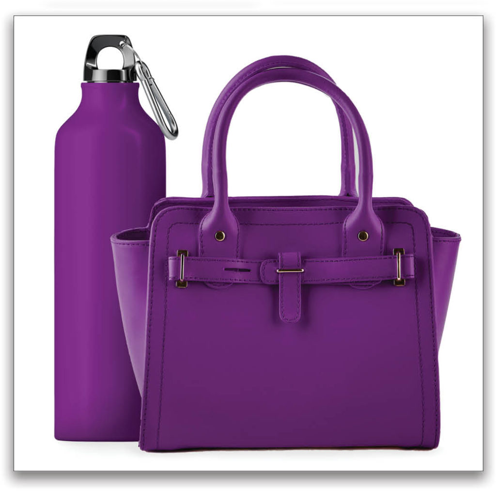
Here you can see the final result of the bottle and purse placed together using both color-changing techniques. This is why we love Photoshop!
This article originally published in the August, 2020 issue of Photoshop User magazine.


