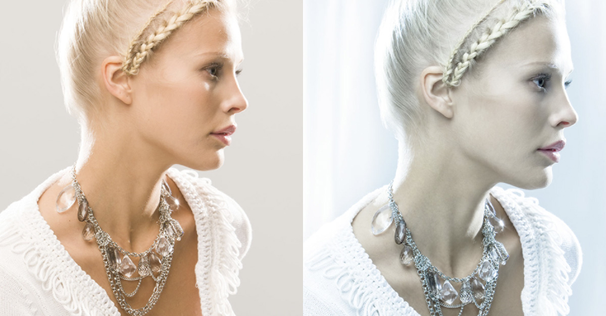
A few years ago I was looking to create a cover image for a new book and came up with the idea of a model in semi-profile, surrounded by a cool shimmering light. This is a look I’d used on a number of PR beauty photo shoots that had proved popular with a lot of clients. Essentially, I wanted to apply a cool white balance to a studio portrait photo of a model and overlay the image with a rippled lighting effect.
For the studio lighting setup, the main light came from a large softbox just above the camera. I also had a couple of lights to either side, bouncing off large white boards to provide the wraparound backlighting (these backlights were set one stop higher than the main front light). I captured the photographs in RAW mode, so it didn’t really matter how the capture white balance was set, as I was able to apply the desired white balance in Lightroom.
What I generally do on these types of shoots is to first take a few test shots using my assistant and work on the test image in Lightroom to get white balance and tone slider settings looking good. Once I’m happy with the Lightroom Develop settings, I save these as a new Develop preset. If I’m shooting with the camera tethered to the computer, I can select the saved Lightroom preset setting and apply it to the photos as they’re imported into Lightroom. On this particular shoot, therefore, the photographs initially appeared imported in Lightroom using the settings shown in Step Two below, although, if time allowed, I could have created a Lightroom preset that incorporated all the Lightroom adjustments in Step Six.
With clients who are eager to see what appears on the screen as you shoot, it helps to have the ph otos as finished as possible and get the client’s approval to carry on shooting. As the photos are imported, you’ll initially see the default previews, but these are quickly updated as the files appear in the Library Grid view.
The lighting effect image (see Step Eight) was created from a separate photo I took in the studio of a gobo projector spotlight pointed at a wall with the gobo filter defocused. These projector lights usually suffer from horrendous lateral chromatic aberration, so when processing this particular shot in Lightroom, I desaturated the image to remove the color fringing.
Step One:
Starting in the Develop module Basic panel, I adjusted the Exposure slider, dragging it to the right to lighten the image. I fine-tuned the Contrast, Whites, and Blacks sliders to set the tone contrast. I added a little bit of Clarity and applied a negative amount of Vibrance to desaturate.
![]()
Step Two:
I then went to the White Balance menu, where I applied a custom white balance to make the image cooler in color appearance. I did this by dragging the Temp slider to the left. I also dragged the Tint slider to the left to make the photo less magenta.
![]()
Step Three:
Next, I went to the Tone Curve panel, where I adjusted the tone region sliders to create the tone curve shape seen here. (Note: If you don’t see the sliders below the curve, click on the little icon at the bottom right of the Tone Curve panel.) I also selected the Crop Overlay tool (R) and dragged the bottom handle upward to trim the bottom of the image.
![]()
Step Four:
At this stage I liked the overall cool color mood of the image, but I specifically wanted to mute the skin tone colors to make them appear more subdued. To do this, I clicked on the Saturation tab in the HSL/Color/B&W panel and dragged the Orange, Yellow, Purple, and Magenta sliders to the left.
![]()
Step Five:
I then went to the Detail panel to apply an appropriate amount of sharpening for this portrait subject. Generally, I find the optimum Radius setting for such images to be between 1.1 and 1.3. I increased the Amount setting slightly, reduced the Detail, and set the Masking slider to 70. Adding more Masking helps protect the smooth skin tone areas from being sharpened.
![]()
Step Six:
In the Effects panel, I used the Post-Crop Vignetting controls to add a lightening vignette to the corners of the image. Normally I use these controls using either the Highlight Priority or Color Priority modes in the Style drop-down menu. In this instance, however, I chose to use the legacy Paint Overlay mode because I quite liked the hazy effect it applied to the corners.
![]()
Step Seven:
From Lightroom I selected Photo>Edit in>Edit in Adobe Photoshop CC. In Photoshop I started to retouch the image, building up successive layers. First, I added a spotting layer above the Background layer to remove the light spill on the model’s right cheek. Next, I added a face-retouching layer. Then I added layers to remove the fine loose hairs and the leg in the bottom-right corner. And, at the top of the Layers stack, I added a Curves adjustment layer to add more contrast to the model’s eye. I placed all of these layers in a layer group called “Retouching.”
![]()
Step Eight:
Finally, I opened the photograph I had taken of the defocused projected gobo filter and placed this at the top of the Photoshop layer stack. I then set the layer blend mode (near the top left of the Layers panel) to Screen at 100% Opacity and added a pixel layer mask (click on the Add Layer Mask icon [circle in a square] at the bottom of the Layers panel). With the mask active, I switched to the Brush tool (B) and painted with black to hide the ripple effects above the face and body. I also painted with gray to semi-reveal the rippled lighting effect on parts of the model’s body.
![]()
Post-Crop Vignetting Effects
The Post-Crop Vignetting controls can be found in the Effects panel. These can be used to lighten or darken the edges of a photo based on the applied crop setting. Therefore, as you crop an image, the post-crop vignette effect updates accordingly. It’s most useful for darkening the corners, which can often help make a central subject stand out more by drawing the viewer’s eye into the center of the image.
The Paint Overlay effect blends either a black or white color into the edges of the frame, depending on which direction you drag the Amount slider. The semi-opaque nature of this post-crop vignette mode can be useful if you wish to add a dreamy kind of vignette effect. The other two blend options are more suited for general use, where the darkening or lightening vignette effect is achieved by adjusting the Exposure.
![]()
The Highlight Priority mode tends to produce more dramatic results because it applies the post-crop vignette prior to the Basic panel Exposure adjustments and has the benefit of allowing better highlight recovery in burnt-out areas. This mode of post-crop vignette adjustment, however, can sometimes lead to color shifts in the darkened areas. The Color Priority effect meanwhile, applies a post-crop vignette after the Basic panel Exposure adjustments, but before the tone adjustment stage. This minimizes color shifts in the darkened areas but, as a consequence, it’s unable to perform any highlight recovery in areas that may be burnt out.
The Highlights slider can further modify the effect, but is only active when applying a negative Amount setting. Increasing the Highlights setting lets you boost the contrast in the vignetted areas. The effect is really only noticeable in subjects that feature bright highlights, lightening them to take them closer to their original exposure value. Overall, I find the Highlights slider has the greatest impact when editing a Color Priority post-crop vignette. In the last example below, I applied a negative Color Priority post-crop vignette combined with a +40 Highlights adjustment.
![]()
This article originally published in Issue 33 of Lightroom Magazine.