I’ve always loved the water. Something about its serene, sensory-deprivation-like qualities help me navigate through the noise inhabiting my brain, allowing me to focus, relax, and create. My passion project for the past five years has been the Mermaid Portfolio Retreat, where four other photographers/videographers, scuba divers, underwater models, and I set sail to the Exuma island chain in The Bahamas on a dive boat for a week. We catch up on what we’ve done over the past year, collaborate, and create images to keep us busy until the next trip.
Since I’m a retoucher by trade, I have a long history of making mistakes in-camera, and then fixing them in Photoshop. (Check out my KelbyOne class Master Post-Processing: 10 Mistakes Every New Photographer Makes and How to Fix Them.) The same rings true for my underwater photography. In this article, I’ll explain some of the most important techniques you’ll need to learn in order to edit your underwater images correctly.
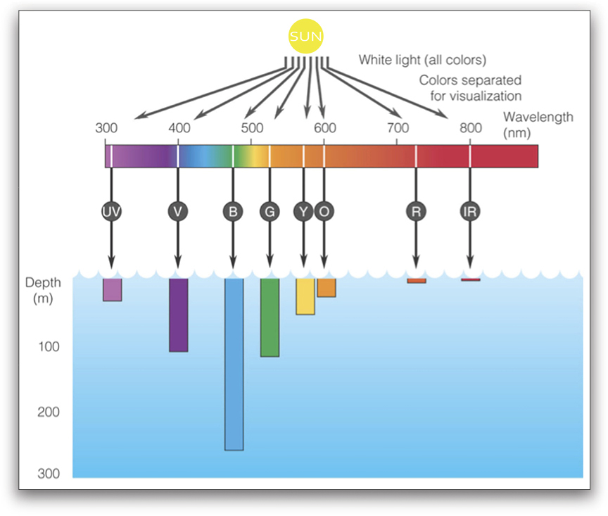
But first, let me explain the most important thing about color and water, and how they interact. If you’ve ever taken even a snapshot underwater, you’ll notice that the images have a greenish/bluish tint. Here’s why: Each color of light in the spectrum (ROYGBIV) has a different wavelength. Reds have long wavelengths (around 700nm) while blues and violets have short wavelengths (500nm and 400nm, respectively). Since water is 800 times denser than air, it’s harder for the wavelengths of some colors to travel through water. Think of it as if the longer/faster wavelengths exert more energy and get tired first. The colors with the shorter/slower wavelengths travel farther down into deeper water. The reds, oranges, and yellows get absorbed in shallow water, and the greens, blues, indigos, and violets penetrate deeper into the water.
My main objective for retouching underwater images is to bring the warmer colors back. If the image is taken close to the surface of the water where all the colors of the spectrum are visible, this is usually easy. It will just take the correct color balance. But as soon as you travel down even three to six feet, you’re going to start losing color. At that point, the objective quickly becomes re-colorizing the shot.
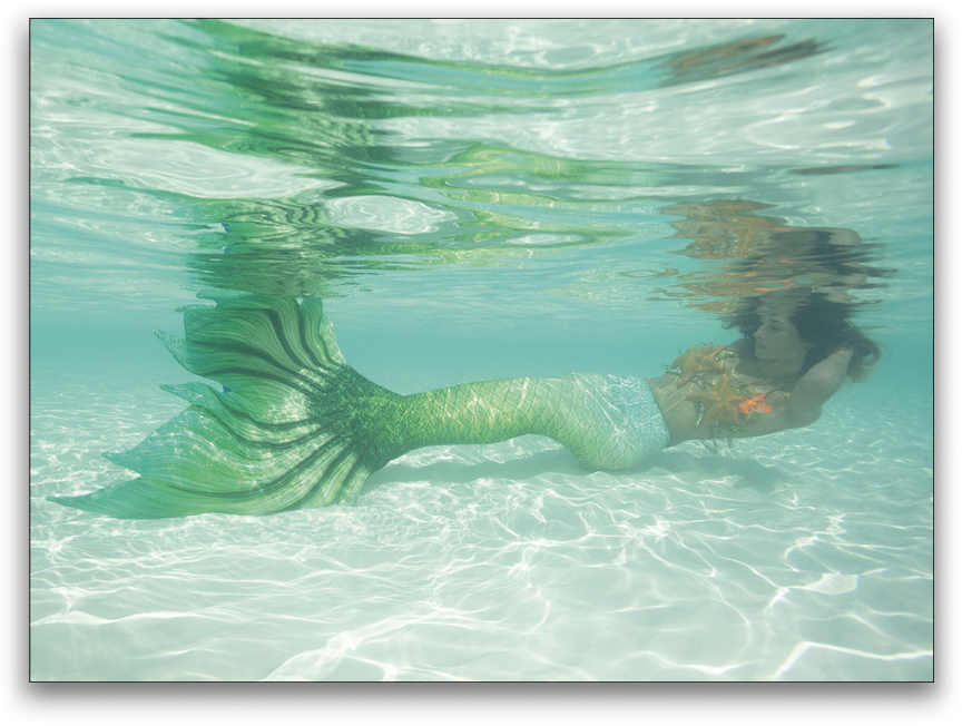
Here’s a recent image that I took in very shallow water. The water in The Bahamas tends to be very green. Let’s start off our editing in Adobe Camera Raw.
[KelbyOne members may download the JPEG version of the file used in this tutorial by clicking here. All files are for personal use only.]
Note: If you’re using the JPEG practice file, open the image in Photoshop, go to Layer>Smart Objects>Convert to Smart Object, and then choose Filter>Camera Raw Filter.
Step One: The first thing we want to do is color balance the image. If you have a gray or white card, this is when you use it! If you don’t, try starting with the white balance set to Shade or Cloudy (whichever looks best) and then tweak from there. For this particular image, we set the Temperature slider to 7379 and the Tint slider to +90 (if you’re using the JPEG practice file, set Temperature to +12 and Tint to +55). We’re already starting to get a more realistic color balance on the image.
Step Two: Next, let’s look at the Exposure, Contrast, Highlights, Shadows, Whites, and Blacks. If it’s a sunny day and you’re shooting in shallow water, you’re going to end up with dancing highlights all over your image. These can create a cool effect, but since I mainly shoot faces and portraits, I’m not a fan of them when they end up on the faces of my models.
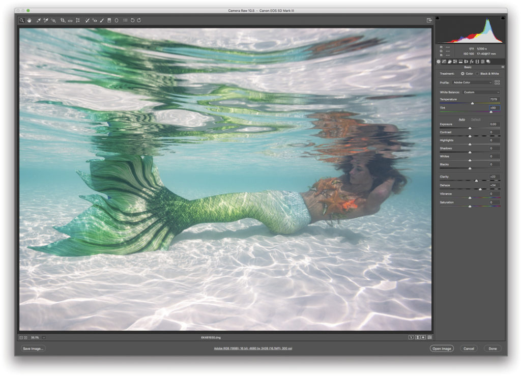
Here are the values that I used for these settings. I tend not to go too extreme on the black clipping, since the Dehaze slider is my new BFF when it comes to retouching underwater images.

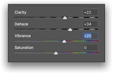
Step Three: Now comes the fun part! We’ll set our Clarity to +22, Dehaze to +34, and Vibrance to +20. Now we’re starting to see some real changes in the image. The Dehaze slider easily helps cut through visibility (or “vis,” as scuba divers like to call it) problems, and I’ve personally had great success with it.
With just a few tweaks in our basic panel in Camera Raw, we were able to go from drab to fab. Here’s what we were able to accomplish just in the Basic panel.
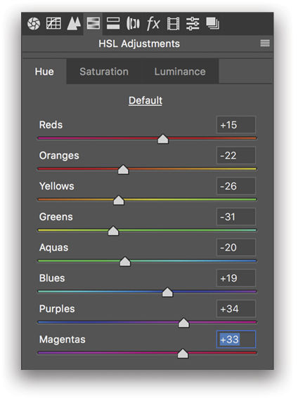
Step Four: We’re not done yet, though! Let’s move on to the HSL panel in Camera Raw. This is where I do a lot of my color work. Let’s start with the Hue sliders. Each of the colors here has a cooler tone and a warmer tone. Let’s nudge all of the colors so they’re slightly warmer. A fun exercise is to take each of the Hue sliders and drag them one by one from the extreme left to the extreme right while keeping your eyes on the image. This will help you learn the colors and how they change depending on the different hues applied. Here are the Hue values we used for this image.
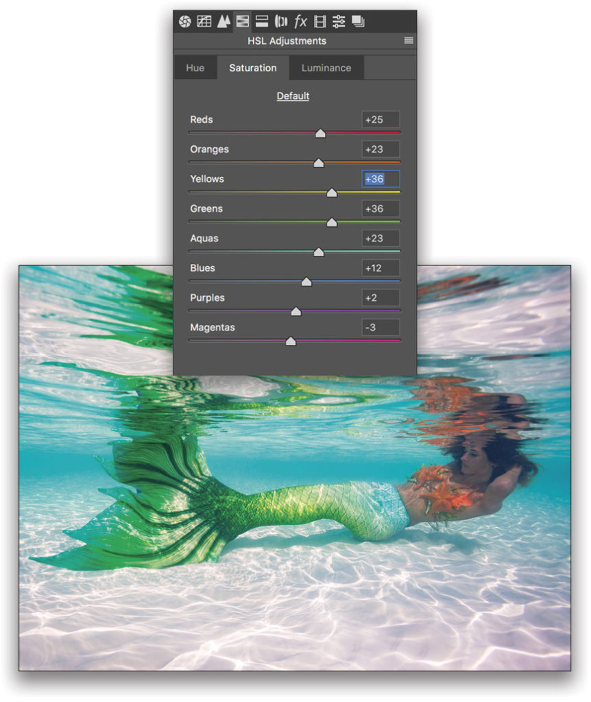
Step Five: Let’s move on to Saturation in the HSL panel. These color sliders also play an important role in editing underwater images. Since we learned above that warmer colors quickly lose saturation the deeper you go in the water, it makes sense for us to try to bring back some of those colors by increasing their saturation levels. Here are the Saturation values we used for this image.
Step Six: Let’s switch over to the Luminance tab in the HSL panel where I sometimes like to darken the Aquas and Blues slightly to create separation between the model and the background. This is a personal preference, and in this example, my values are: Aquas: –35 and Blues: –35. All the other values were left alone. I hope you guys are happy with how this image is turning out so far. I sure am!
Step Seven: Let’s open this image in Photoshop by clicking the Open Image button in the lower-right corner of Camera Raw (if you’re using the JPEG practice file, click OK). Now that our image is open in Photoshop, we have access to even more tools that are important for fixing the color in underwater shots.
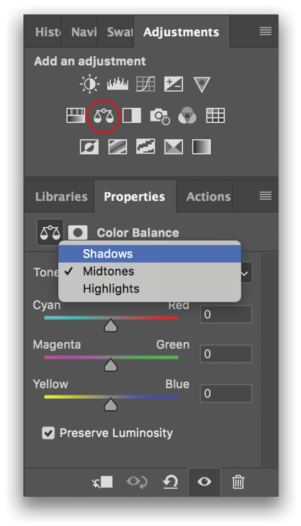
The first thing we should do is create a Color Balance adjustment layer, so click the Color Balance adjustment layer icon (the scales) in the Adjustments panel (Window>Adjustments). The nice thing about this tool is it allows you to change the colors of the highlights, midtones, and shadows independently of one another. In this mermaid image, the areas that are lit by the sun look correctly color balanced, but the shadow areas seem to be a little murky and still slightly too cool. Let’s fix that now. Choose Shadows from the Tone drop-down menu at the top of the Properties panel for your Color Balance adjustment layer.
Step Eight: Next, change the Cyan/Red slider to +7, the Magenta/Green slider to –5, and the Yellow/Blue slider to –20. Lastly, check the box next to Preserve Luminosity.
Step Nine: Our next step will be to add in some localized fill light and increased contrast. We’ll accomplish this with a Curves adjustment layer. Click on the Curves adjustment layer icon (curve on a grid) in the Adjustments panel. Here’s what the Curves adjustment should look like in the Properties panel.
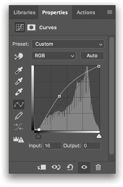
Step 10: We don’t want this adjustment visible on the entire image, so let’s paint the effect in little by little. First, we need to invert our mask so that it’s completely black. Click on the Curves 1 layer mask thumbnail (sorry for not naming my layers today!) and press Command-I (PC: Ctrl-I) to invert the mask to all black, which hides the Curves effect. Next, switch to the Brush tool (B), press D to set the Foreground color to white, and set the Opacity to 20% in the Options Bar. Paint in the effect where you want it to show up (mainly on the mermaid in this example). Here’s what my finished mask looks like.
Step 11: Okay, let’s move on. I may have saved the best for last! It’s definitely my favorite adjustment layer, and it’s extremely important when trying to color-correct underwater images. It’s called Selective Color. The reason I love it so much is because of how easy it makes isolating and modifying each color in your image. This tool really helps you get your colors spot-on.
Let’s start by clicking the Selective Color icon (it’s the second to last icon) in the Adjustments panel. In the Colors drop-down menu in the Properties panel, I like to start at the very top with Reds and work my way down to Magentas (I don’t modify Whites, Neutrals, or Blacks). With each color, I take each of the top three sliders (Cyan, Magenta, and Yellow) and pull them all the way to the left, and then all the way to the right to see their full effect. Then I settle on a setting somewhere in the middle that looks good. Here are the values for all six colors we used in this image.
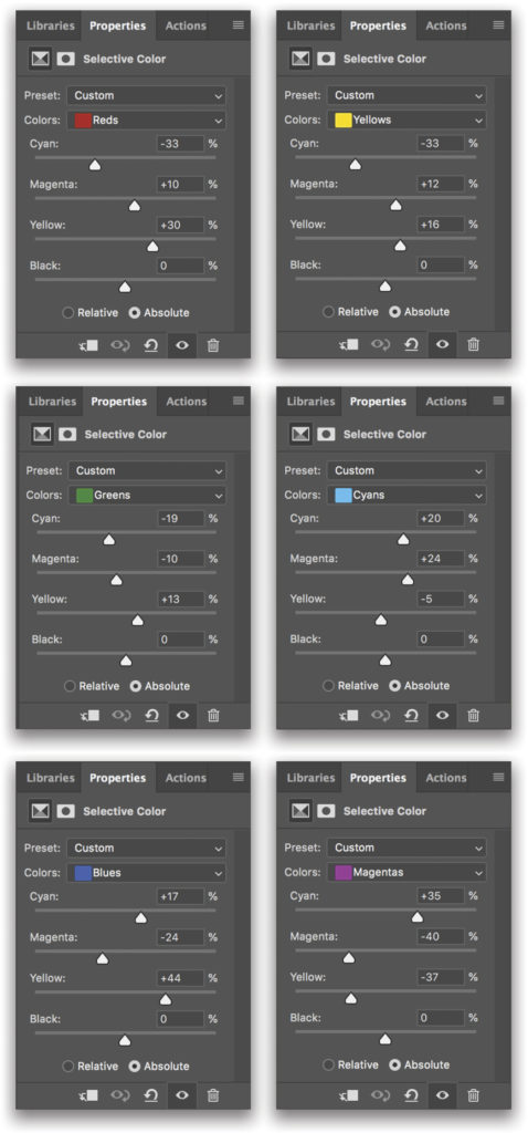
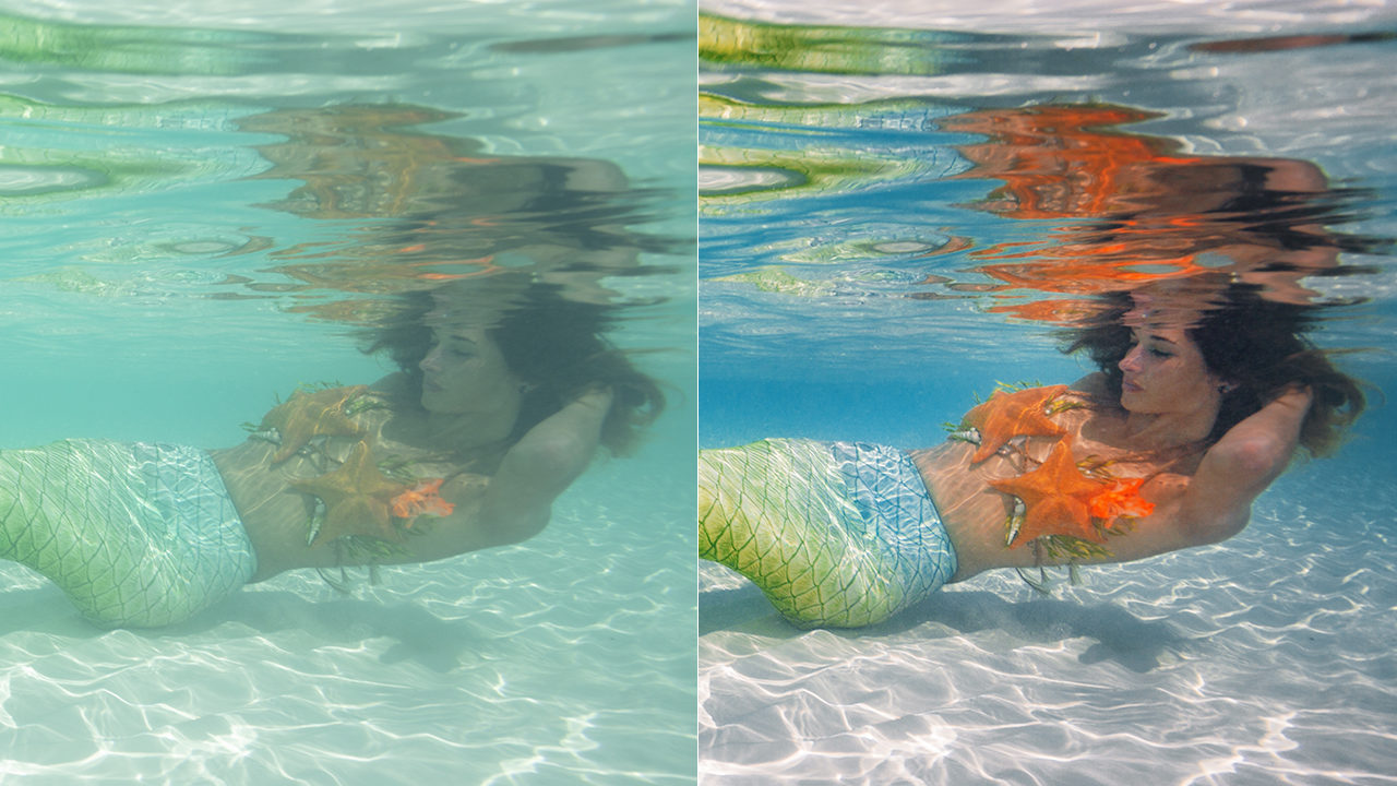
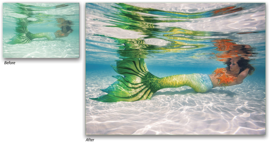
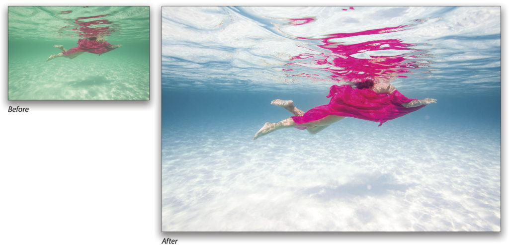
With this simple adjustment layer, we were able to independently modify each color and solidify the tone it should have been, and the results are amazing! Here’s the original and the final edited image. (Normally, I’d continue to fine-tune this image using dodging and burning, etc., but you should have the idea at this point.)
If mermaids aren’t your thing, here’s another image using the same techniques to completely clear out the water’s color contamination.
This article originally published in the October, 2018 issue of Photoshop User magazine.


