A well-done color grade can make the difference between an average image and an above-average image; it can take an above-average image and make it exceptional! Color grading, the purposeful shift of an image’s color tones, is used to create a specific mood, look, or feeling.
We’ll be using adjustment layers for the majority of the work on the image featured in this article. Adjustment layers make enhancing and fine-tuning images easy and flexible by keeping your workflow nondestructive. You can tweak adjustments to your heart’s content, and none of the changes are irreversible or baked into the image until you flatten and save the file. Even then, if you haven’t closed the image yet, you can backtrack substantially via the History panel, if needed. But once you close that saved, flattened file, your changes are forever locked in, so proceed with caution. (If you need to preserve the layers for future editing, save a PSD version of the file before flattening any of the layers.)
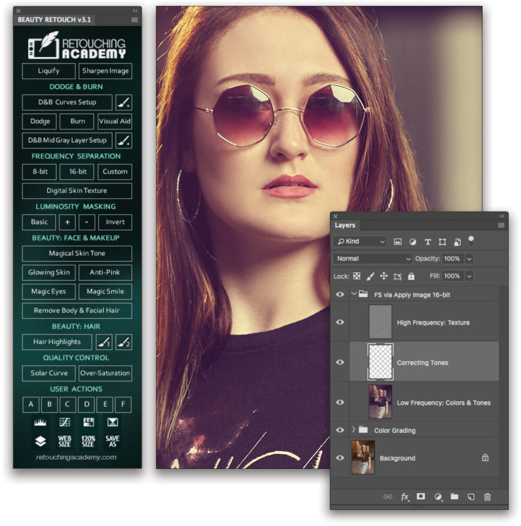
For the retouching and sharpening steps, I’ll be using Retouching Academy’s Beauty Retouch Panel plug-in. If this plug-in isn’t on your radar, it should be. At around 69 bucks, it’s amazingly affordable given what it does. But if you don’t own it, no worries; you don’t need it to work with the included exercise files. If you need a refresher on retouching and sharpening, I’ll refer you to one of Scott Kelby’s and Kristina Sherk’s many awesome courses here on KelbyOne.
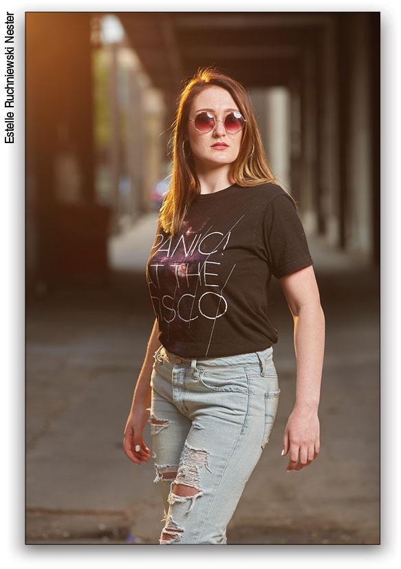
In the download section for this article, you’ll find three 16-bit, high-res TIFF exercise files: one straight out of the camera and unretouched, another straight out of the camera and retouched (for those of you who prefer to focus solely on color grading), and a third that’s the final color graded retouched image you’ll be striving to match.
[KelbyOne members may download the files used in this tutorial by clicking here. All files are for personal use only.]
Step One: The first step in any color grade is to assess the image, or series of images, and decide where you want to take it. If you’re working on a series of images, typically you’ll want a consistent look for the entire set. Color and tone shifts impart mood, drama, and emotion, and there’s no one-size-fits-all solution. Ideally, your color grade should support the image rather than distract from it by being overt or obvious. In other words, subtlety and a lighter touch go a long way.
Before we get to the meat and potatoes of the color grade itself (in Step Four), we have some building blocks to lay down in order to assure a great result. In Steps Two and Three, we’ll first boost the overall contrast and then desaturate the image to give it the beginnings of its eventual cool, edgy, editorial look.
Step Two: To increase the contrast, create a Curves adjustment layer by clicking on the Create New Adjustment Layer icon (half-black, half-white circle) located at the bottom of the Layers panel and choosing Curves. In the Properties panel (Window>Properties), click on the Preset drop-down menu and select the built-in Increase Contrast (RGB) preset. The effect will be way too strong out of the gate. Dial it back by simply adjusting the layer Opacity to 40% in the Layers panel.
Now you’ll have a pleasing increase in the overall image contrast, and you’re ready to move on to the next step. Keep in mind that any effect applied globally using an adjustment layer can also be applied locally by simply painting in black on its layer mask to hide the effect where needed.

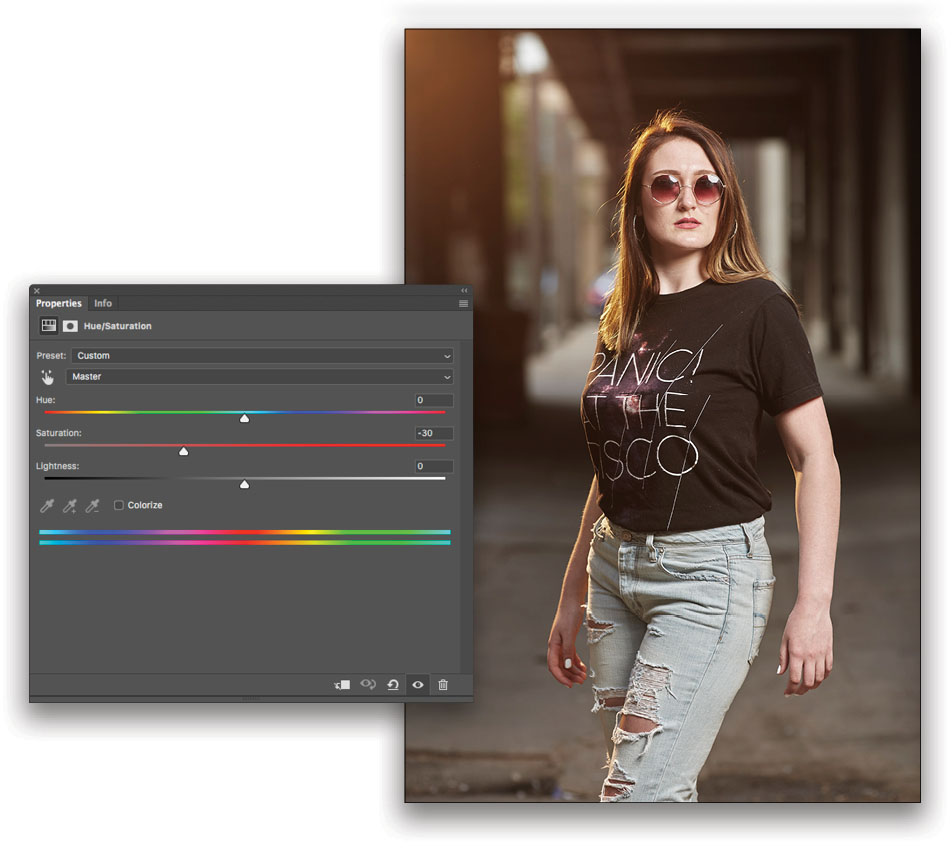
Step Three: We’ll start our color grade by actually removing some color from the image. This will help lay the foundation for the cool, edgy, editorial look desired for the final edit. To do this, we’ll use another adjustment layer, so click the Create New Adjustment Layer icon and choose Hue/Saturation. In the Properties panel, make sure the Preset drop-down menu is set to Default and the Color Selection drop-down menu is set to Master. You can modify individual colors if desired; however, for this image we’ll work globally with Master selected. Enter a value of –30 into the text field for Saturation and press the Enter key to exit the text field (or you can adjust the Saturation using the slider). Things are beginning to take shape!
Step Four: It’s time to color-grade the image. This is where the real magic happens! Great color grading doesn’t need to be complicated or onerous. You’ll see how, with just a few simple adjustments, we’re able to take the image to another level. With Photoshop, there are numerous ways to approach the same task, and it’s no different with color grading. For this image, we’ll use one of my favorite methods, Curves.
The great thing about working with Curves is that it allows you to make individual adjustments to the red, green, and blue channels using one or more Curves adjustment layers. What makes Curves even more powerful is that you can separately adjust and shift the color for each channel’s highlights, midtones, and shadows by simply dragging the corresponding points on the curve.
Begin by clicking the Create New Adjustment Layer icon and choosing Curves. In the Properties panel, make sure the Preset drop down-menu is set to Default, and click on the drop-down menu below it to reveal the individual color channels, with RGB at the top. If we leave the Curve set to RGB, any changes made will affect the red, green, and blue color channels in the same amounts and at the same time—this isn’t what we want. For our color grade, we want to work individually on the red, green, and blue color channels.
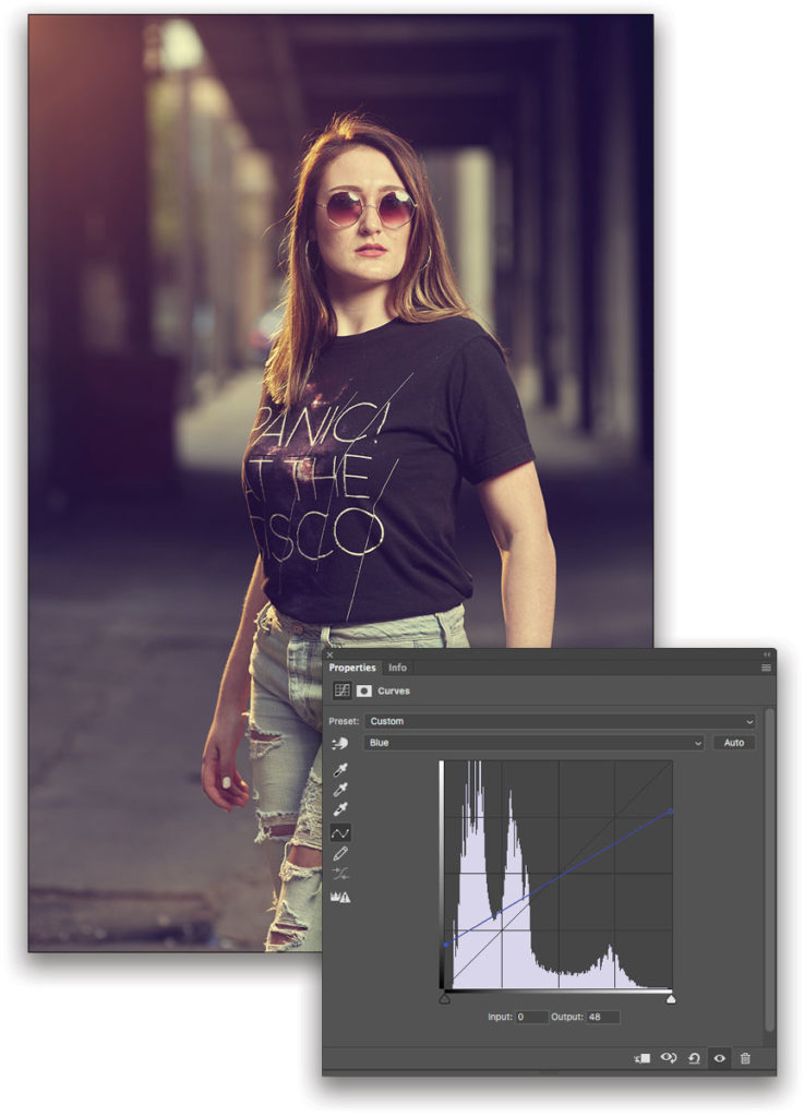
Select the Blue channel from the drop-down menu. You’ll see the same curve and histogram sliders you had when RGB was selected except that now any changes you make will only affect the curve for the Blue channel. The color of the curve and the histogram changes to reflect the channel you’ve selected. I can’t overstate how powerful this separate color control is: It only takes a few subtle moves to create something really special.
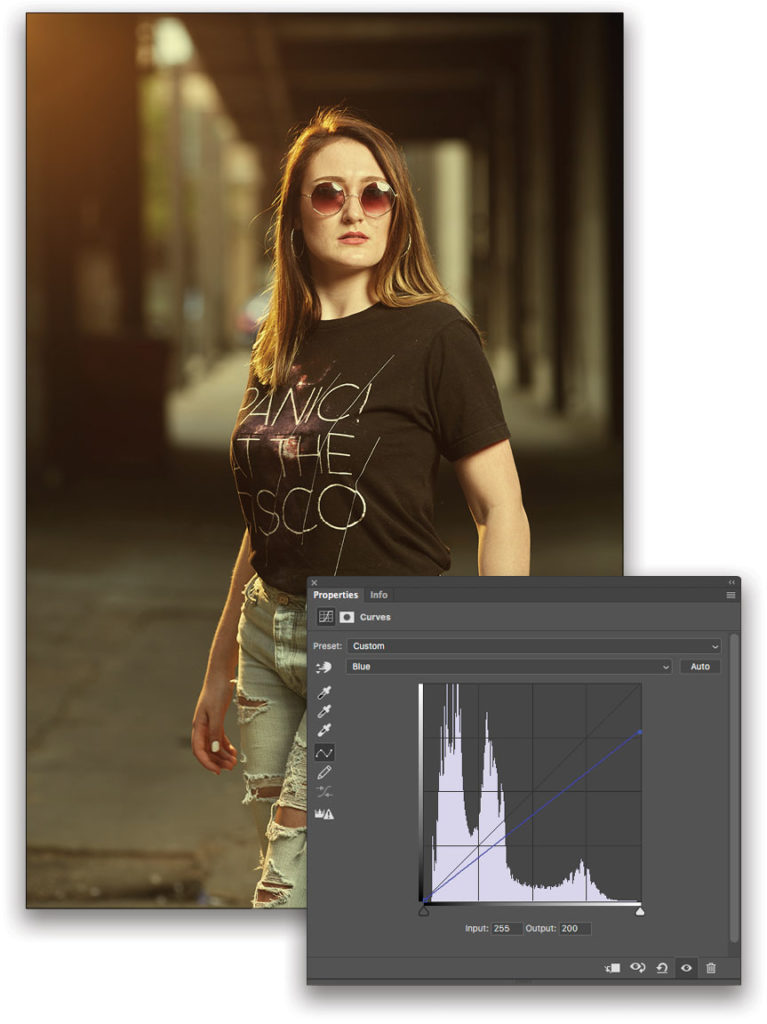
In the Properties panel, grab the curve control point at the top right of the curve and drag it straight down until a value of 200 is reflected in the Output value field. Be careful to move the control point straight down, and not to the left. Or you can just click on the point to make it active and type the value in the Output box. The image’s color will now shift to warmer greenish-yellow; don’t worry this is only our first step!
Step Five: Next, we’ll adjust the Blue channel’s shadows. Select the Curve control point at the bottom left and drag it straight up until a value of 48 is reflected in the Output field. (Again, make sure to move the control point straight up and not to the right.) Now we’re getting closer! With color grading, it’s always a balancing act. With this adjustment, we’ve shifted the image’s shadows back into cool territory, while maintaining what we did with the highlights. We have an edgy, cool-toned look and we’re almost done.
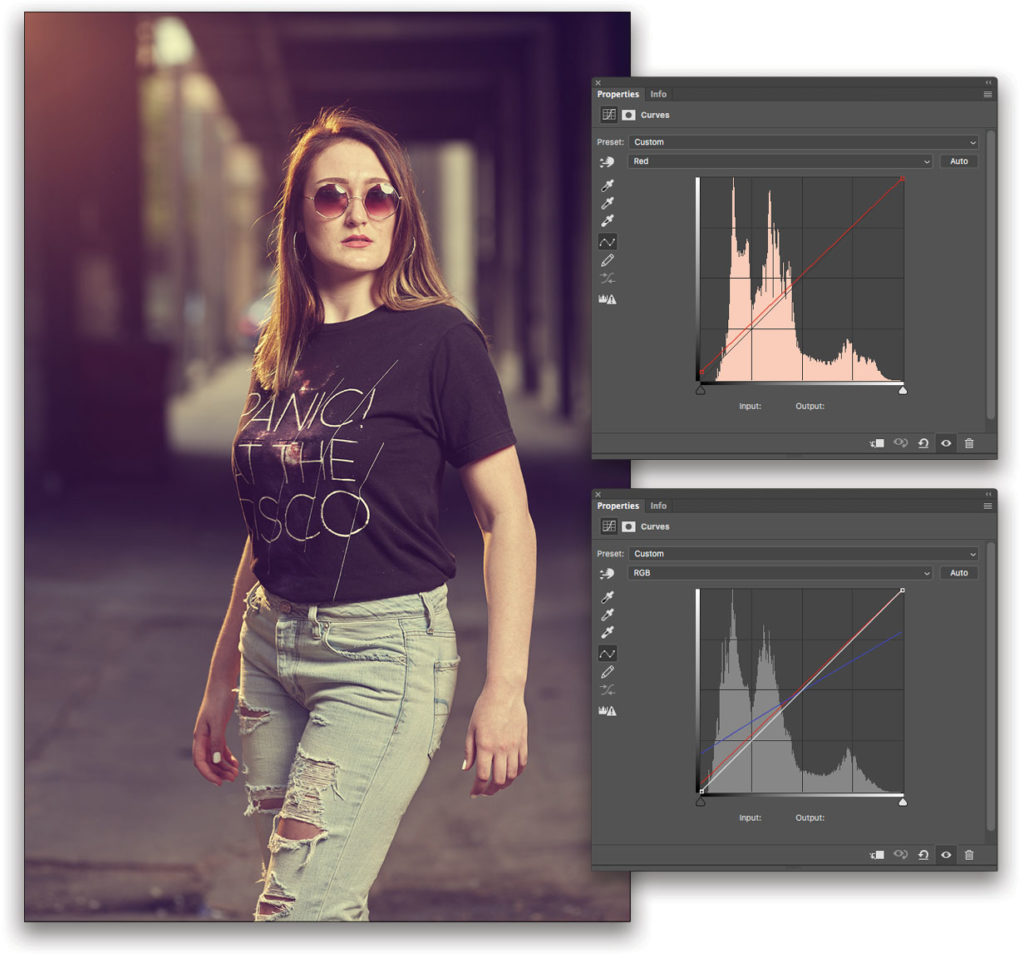
Step Six: The final step in our color grade will take place on the Red channel. Head back to the color drop-down menu and select Red. Here, a small move on the shadow end of the curve (Output value of 8) will give us the warm red haze we need to put the cherry on top of our image color grade. Now we’re talking! We have one super-cool, edgy, editorial-style color grade created simply, quickly, and easily. Switch the Curves color drop-down menu back to RGB to see all of your changes reflected on one curve.
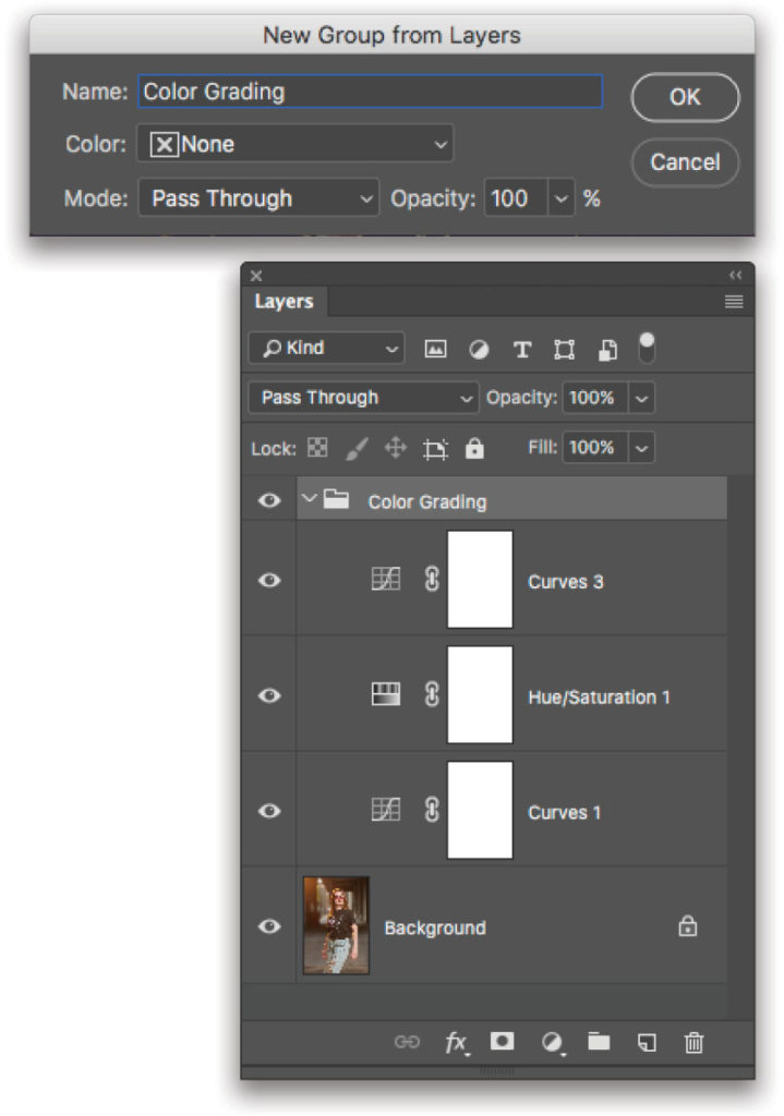
Step Seven: Create a layer group for your color-grading layers—it’s easy! Layer groups not only help you stay organized but they also allow you to toggle on/off all of your color adjustments at the same time. You can adjust individual layers as needed. Simply Shift-click to select all the layers you want to add to a group, Right-click on any of the selected layers, and choose Group from Layers. Name your group, click OK, and you’re done! You now have a layer group folder in your layers stack containing all of your color-grading adjustment layers. Click the Eye icon to the left of the group in the Layers panel to turn the entire group on or off; click the disclosure triangle to collapse or expand the folder group.
Step Eight: The next step is a quick skin retouch via Beauty Retouch Panel’s 16-bit Frequency Separation tool. This plug-in does the heavy lifting for you by setting up all the layers needed for frequency separation. Unlike tightly framed close-ups and beauty images, the level of retouching doesn’t need to be as extreme for this editorial-style 3/4-length shot. Use the Healing Brush to make adjustments to the tone layer and the Clone Stamp tool (S) to clean up the detail layer. Here you can see the final skin retouch.
Step Nine: The lens used, pose, and angle of the model’s body in relationship to the camera position made her appear thicker than she actually was. Using the Rectangular Selection tool (M), drag a marquee selection around her body from just below her chin to the bottom of the image. Make sure the image layer is active in the Layers panel, and duplicate the selection onto a new layer by pressing Command-J (PC: Ctrl-J). Note: In my workflow I like to flatten the image as I go, to reduce file size and expedite processing, but again, if you need to preserve the layers for future editing or client approval, keep the layers and save the file as a PSD.
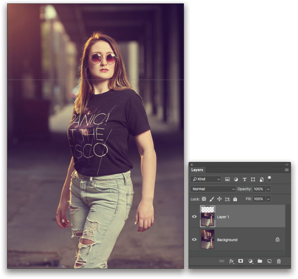
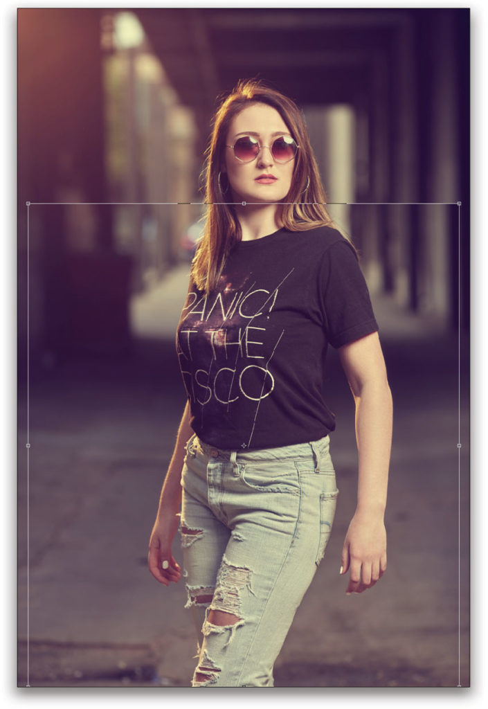
Step 10: With this new layer active, invoke Free Transform by pressing Command T (PC: Ctrl-T). Hold down the Option (PC: Alt) key and move the middle control point on the right side of the transform bounding box toward the center of the selection. This will contract both the left and right sides of the selection, and in the process create a thinner appearance for the model’s figure. Press Enter to commit the transformation.
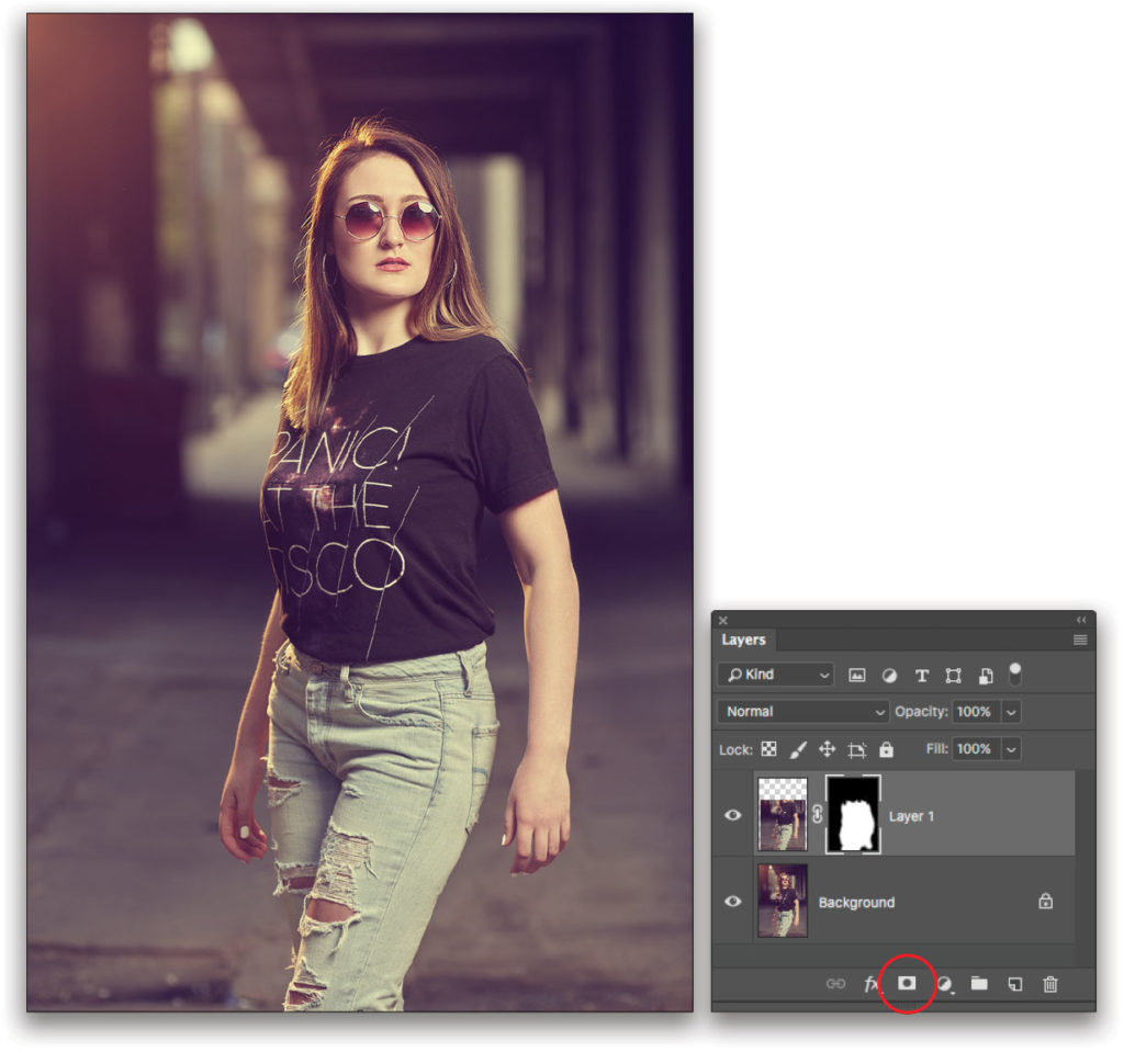
Step 11: Next, hold the Option (PC: Alt) key, and click the Add Layer Mask icon (circle in a square) at the bottom of the Layers panel to apply a black mask to the layer. This will hide the transformation. Select the Brush tool (B), and press D to set the Foreground color to white. In the Options Bar, choose a soft bristle brush from the Brush Preset Picker and set the Opacity to 100%. Start brushing in the duplicated and reshaped body layer. Make sure not to reveal any of the areas where the duplicate layer transitions to the original layer below, and that everything lines up and looks natural. If you do reveal too much, press X to switch the Foreground color to black, and paint those areas away.
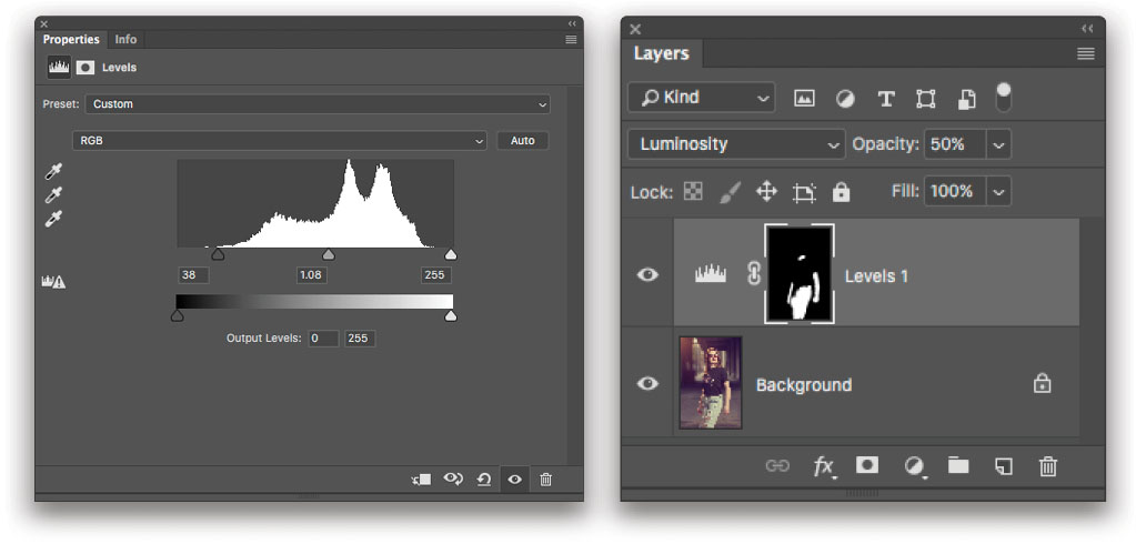
Step 12: For darkening or “burning” down bright areas in an image, my preferred method is using a Levels adjustment layer and then painting on its layer mask. The same technique can be used for brightening or “dodging” sections of an image as needed. Apply a Levels adjustment layer, and in the Properties panel, slide the leftmost triangle below the histogram to the right; this will darken the image globally. I dragged the midtones slider slightly to the left as well. Most of the time, you’ll only want to darken small trouble spots in an image, so click on the Level adjustment layer’s mask thumbnail and press Command-I (PC: Ctrl-I) to invert the mask to black and conceal the changes you just made.
Next, choose a soft bristle brush set to 20% Opacity and loaded with white paint. Make sure the layer mask thumbnail for the Levels adjustment layer in the Layers panel is highlighted, and brush in the correction where needed. Use multiple brushstrokes to build up the effect. For this image, I darkened the model’s jeans, arms, and the lower portion of her neck. When changing tone like this, unwanted color shifts can occur. To avoid this, set the layer blending mode (near the top left of the Layers panel) to Luminosity.
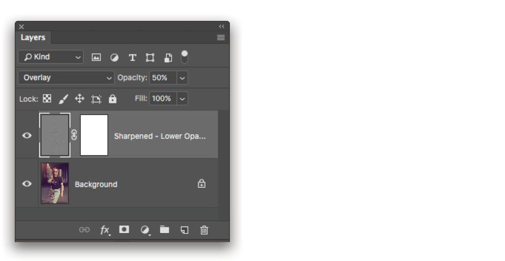
Step 13: The Beauty Retouch Panel also includes a really good one-button Sharpening tool. With sharpening, you definitely want to season to taste, with less-is-more serving as your guideline. For tightly framed close-ups, you’ll typically want to add a mask and apply sharpening where needed in the correct amounts by painting it in on the mask. For 3/4-length images like this one, I often apply sharpening globally and knock it back with a layer Opacity setting somewhere between 25–50%. The sharpening sweet spot for this image ended up being 50%.
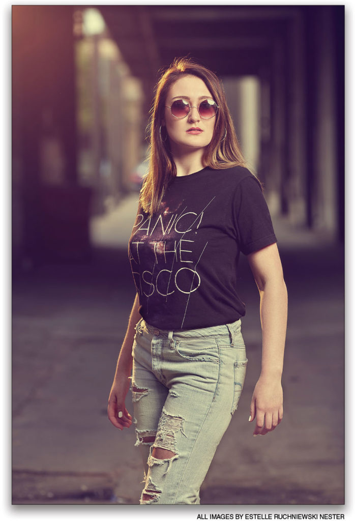
That’s the whole enchilada! In the final image shown here, it’s easy to see the impact subtle color grading can have on an image’s look and feel.
This article originally published in the August, 2018 issue of Photoshop User magazine.


