When first starting out in black-and-white photography, it’s easy to think that you just need to desaturate a color image in Photoshop to get a great result. While that’s one option, there’s a lot more that should be done to really get the most out of your images. In fact, black-and-white photography almost always benefits from a heavier editing style, due to the fact that, once converted to monochrome, images already look “otherworldly” because of their lack of color. For instance, adding a large amount of contrast to a color image can often make it look too saturated; but with black-and-white images effectively being just various shades of gray, they can sometimes look a little flat or dull without additional postprocessing.
Monochrome conversion can be applied to pretty much any type of image. The type that really sticks out for me, though, is architecture. The way we can use various editing techniques to sculpt and manipulate the light that hits a building’s many angles and facets to create an almost 3D effect has always fascinated me, which is why I always find myself drawn to man-made structures when out shooting.
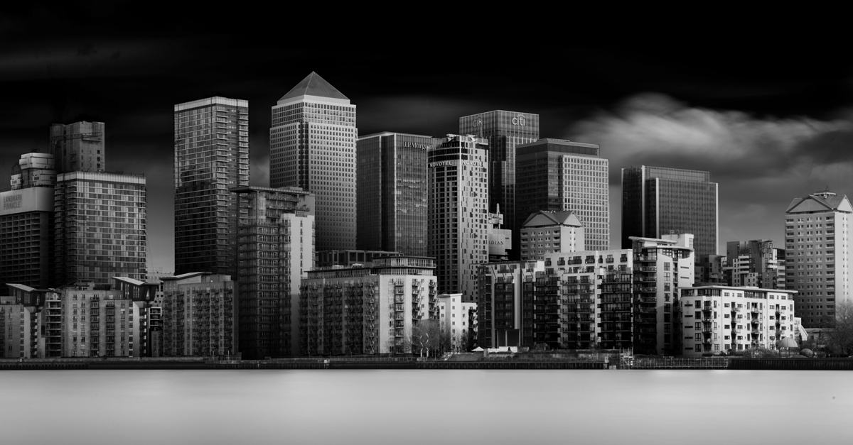
If you add black-and-white postprocessing to images taken with neutral-density filters for long exposures, your shots have an even more ethereal feel. The image we’re using here was taken using a 10-stop neutral-density (ND) filter with an exposure time of 141 seconds at f/22 and ISO 100.
It’s important to mention that the following process can take hours to complete because of the many selections you’ll need to make. Less busy images or those with fewer buildings will be faster. That said, once you see the final result from using this technique on an image, I think you’ll find it incredibly rewarding.
You’ll end up with multiple adjustments and many duplicated layers, both of which can greatly increase your file size. Having previously saved similar images as PSD or PSB files, I’ve found that for file sizes more than 2 GB, the TIFF format works best. Be sure to save your image often throughout the process!
[KelbyOne members may download the file used in this tutorial by clicking this link or at http://kelbyone.com/magazine. All files are for personal use only.]
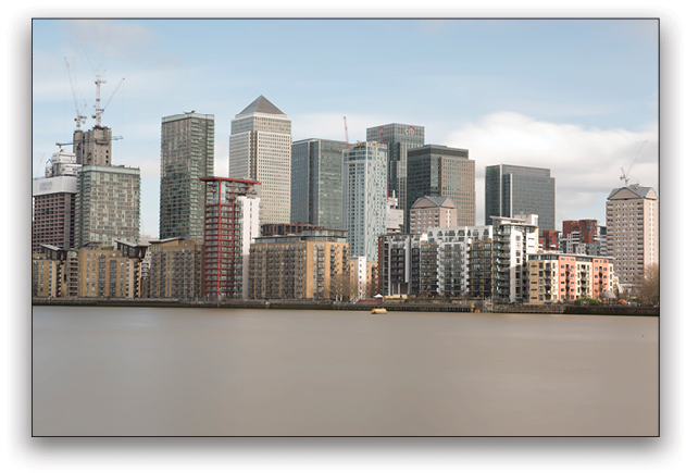
Step One: First, we’ll need to set the correct white balance, so open the RAW image in Adobe Camera Raw (ACR), and change the white balance settings to suit your personal taste, depending on the image. For this image, the As Shot values with a Temperature of 5300 and a Tint of –10 work quite well as they are.
It may seem odd to change the overall color of the image when we’ll just be converting it to black and white anyway, but different tones and hues in your color image can have a huge effect on your monochrome conversion. (We’ll go into this in greater detail later.)
Step Two: Next, we want to ensure that we have a well-exposed image by changing our global settings to the following: Exposure –0.20, Contrast +13, Highlights –100, and Shadows +22. Just like white balance, these settings have an effect on the result of a black-and-white conversion. There are no right or wrong settings though so, while the above numbers are provided as a base, play with the sliders until you’re happy with the image.
Step Three: Next, we need to change our Whites and Blacks sliders to guarantee that the brightest and darkest parts of the image aren’t clipped (either too bright or too dark that they lose detail). To make it easier to define how much you should change either setting, simply hold down the Option (PC: Alt) key and drag the sliders. When dragging the Whites slider, the image will turn mostly black; when dragging the Blacks slider, the image will turn mostly white. For the most correctly exposed images, you’ll want to slide the Whites toward the positive end and Blacks toward the negative end until you see some part of the image burn through, and then stop.
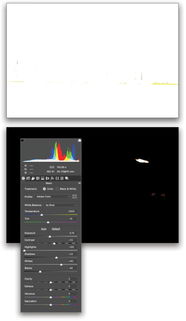
You should now have the full spectrum of white and black in your image without any loss of detail. For this image, the settings should be somewhere around the following: Whites +40 and Blacks –40.
Step Four: Hold down the Shift key to change the Open Image button to Open Object in ACR. Now when you click this button, the image will open in Photoshop as a smart object. This allows you to come back to ACR at any time by double-clicking this layer’s thumbnail in the Layers panel. From there, you can change any of the above settings, should you wish. You’ll note that your layer now has a symbol in the lower-right corner of the layer thumbnail, indicating that it’s a smart object.
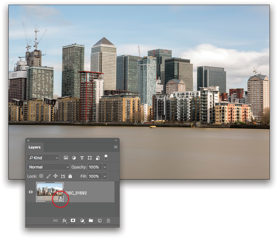
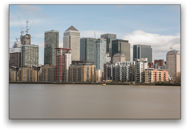
Step Five: This next step is purely personal preference, but if you’re like me, you’ll want to rid the image of any distracting elements, such as cranes and things floating in the water. You can do this using the Clone Stamp tool (S) and the Spot Healing Brush tool (J).
To do this nondestructively, press Command-J (PC: Ctrl-J) to duplicate your layer and work on the duplicate layer. To use the Clone stamp tool, press-and-hold Option (PC: Alt) and your cursor will change to a small crosshair. Position the crosshair in an area of your image near the element you wish to remove, and then click to sample that area. Make sure that your sample area has a similar background to the unwanted element, or otherwise matches the area you’ll be cloning over.
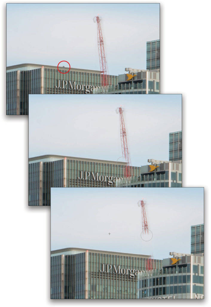
For the red crane in this image, zoom in, sample along the top edge of the building, and then use the preview inside the cursor as a guide to clone out where the crane meets the building. When you first click to paint away
the crane, Photoshop tells you that you need to rasterize the smart object layer. Just click OK. Keep brushing and resampling as necessary until the distraction is gone.
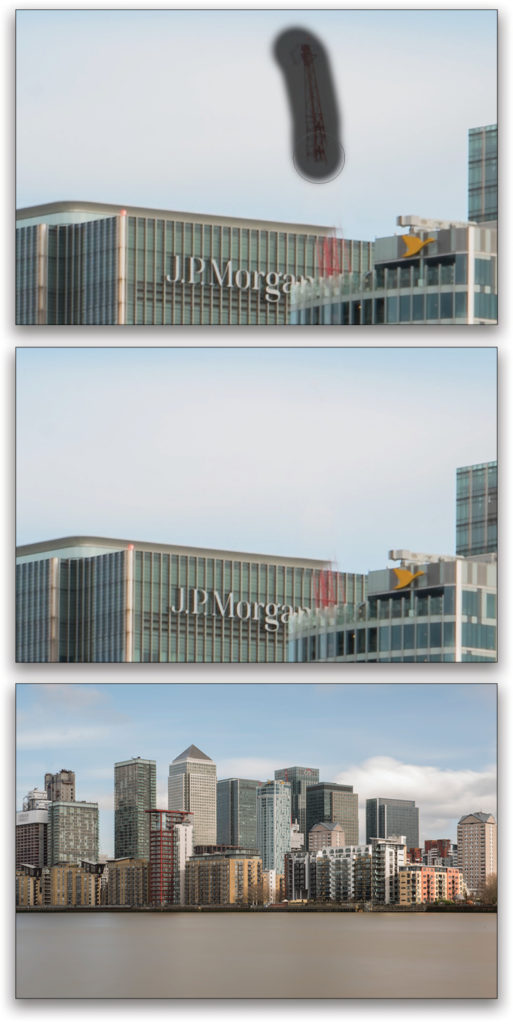
Step Six: To use the Spot Healing Brush tool, you don’t need to specify a sample area. You simply brush over the element you want to remove, and it uses content-aware fill to guess the best place from which to sample. This obviously gives you slightly less control than the Clone Stamp tool, but it works well for elements in your image that don’t have busy or complicated backgrounds. Once you’ve removed all of the distracting elements, your image should now look much less cluttered, ready for you to convert to black and white.
The horizon could use a little straightening before we convert it, though, so go to Filter>Camera Raw Filter. Press Shift-T to select the Transform tool. Select the Guided icon near the top right of the Transform panel. Draw a horizontal guide along the water’s edge where it meets the docks, and a horizontal guide along the right edge of the tallest building in the image. ACR will automatically straighten the horizon. Click OK to return to Photoshop.
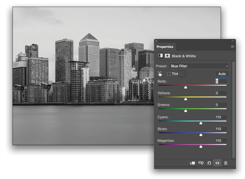
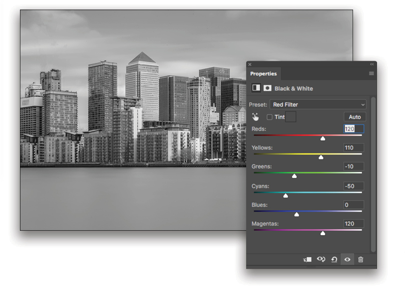
Step Seven: In the Adjustments panel (Window>Adjustments), click on the Black & White adjustment layer icon (half-black, half-white square in the second row), and your image will immediately convert to a default monochrome setting. You’ll also notice that the Properties panel appears. Click on the Preset drop-down menu and you’ll find a number of color options.
Remember that in Step One I mentioned that different colors and tones could affect your converted image? Click through the presets, and you’ll see just how much they do, as each preset highlights one color over another. I settled on the Red Filter.
Hearkening again back to the start of the article, at this stage you could just say you’re done, save your image, and walk away; however, that wouldn’t make for a very good article and, more importantly, wouldn’t give you a particularly memorable image. So, here comes the good stuff!
Step Eight: If you’ve been afraid of using the Pen tool, now’s the
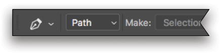
time to face your fear. To really get the most out of your image, you’ll need to mark out all of the individual elements to edit them separately. With an image like this, the most accurate way of doing that is with the Pen tool, which you can find in the Toolbar by pressing the P key. Once you’ve selected the Pen tool, make sure that the drop-down menu at the left of the Options Bar at the top is set to Path.
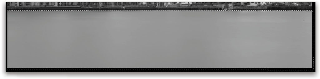
It’s always best to start with the largest part of the image first, so with this shot, we could choose either the sky or the water. For the sake of simplicity, we’ll start with the water.
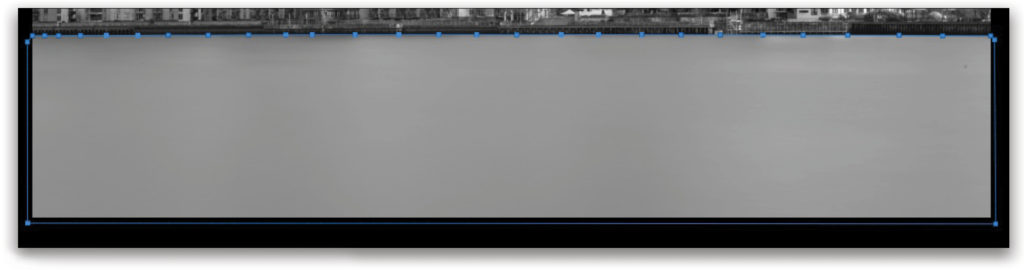
It usually makes sense to start your path at the edge of the image, so click the cursor once on the left-hand side of the image where the water meets the quayside and a small blue square, or path node, will appear.
Keep clicking along the bottom of the quay, making sure to stick to the line between the water and the land as closely as possible. You may have to zoom in to around 200% at times to do this with precision.
Step Nine: Once you’ve clicked the whole way across the image, it’s time to select the rest of the water. To save time, however, you don’t need to click precisely around the edge of the image. Zoom out, and drag out the bottom-right corner of the image window so you can see the canvas around your image. Click crudely around the outside of your image, encompassing the water. When you get back around to where you started, click again on the first node to complete the path.
Pen Tool Tip: As you move along creating more path nodes with the Pen tool, you’ll find that parts of the image require a curved rather than straight path. Click-and-hold past the curved section, and drag the node outward. Two handles will appear from the node, and by moving the one that you’re holding, you’re able to affect the shape of the bend. The more you pull the arm up or down, the more the line will bend.
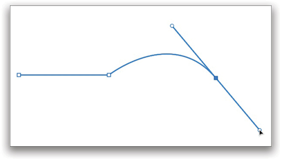
Once you’ve bent the path suitably to line up with the curve in the image, you’ll need to clip one of the two arms coming out of the node; otherwise, you’ll find the Pen tool trying to guess where you want the path to go with your next click—it never gets it right. So, just hold down the Option (PC: Alt) key and click the central node to which the arms are attached, and one of the handles will disappear. Now you can continue creating straight lines until you need another curved one.
Step 10: Press Command-Return (PC: Ctrl-Return) and the path will turn into a marching ants’ selection.
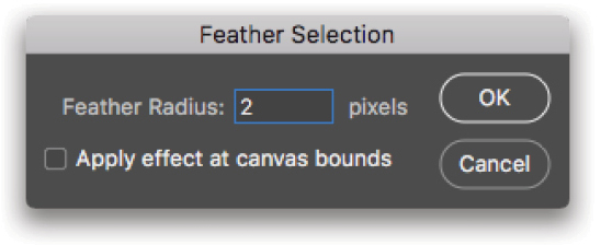
Step 11: Finally, with your selection still active, go to Select>Modify>Feather, set the Feather Radius to 2 pixels, and click OK. This will reduce the likelihood of there being any harsh edges to your adjustments when you add them later. You’ll also notice that the selection snaps to the edges of the image.
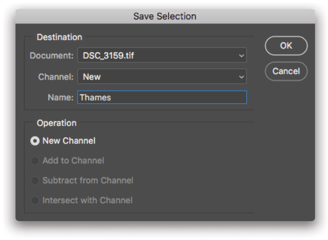
Step 12: It’s likely that you’ll be making multiple adjustments with this same selection, so you’ll want to save it by going to Select>Save Selection and then naming it to make it easy to identify later. As this is the River Thames, I named it “Thames,” and clicked OK.
Step 13: Repeat Steps 8–12 for every individual element in the image; that means the sky and every building. This is where the majority of your time will be spent (as I mentioned at the beginning of this article). It may take upwards of an hour, but it’s an essential part of the process. You can see my list of selections below left. Once you’ve made and saved all of your selections, you’ll generally only use three things: Curves, Levels, and the Gradient tool.
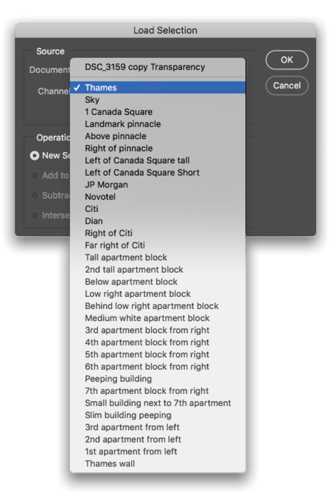
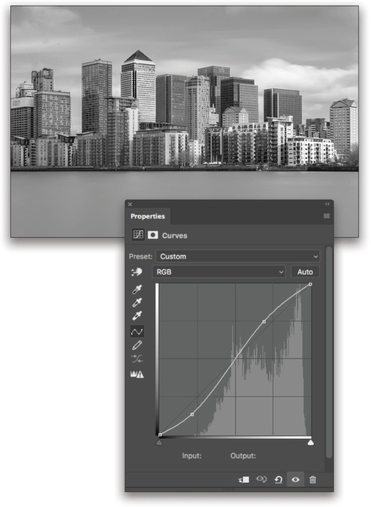
Step 14: Reselect one of your saved selections by going to Select>Load Selection, choosing one of the areas you previously saved in the Channel drop-down menu, and clicking OK (I’ve selected the tall building with the triangular roof). Select the Create a New Curves Adjustment Layer (the icon with the curve in the top row of the Adjustments panel). In the Layers panel, you’ll see that Photoshop has generated a mask for the Curves adjustment layer using your selection. In the Properties panel, create a slight S curve to add a little contrast, as shown here. To change the settings of this layer at any time, simply double-click the Curves layer thumbnail in the Layers panel to reopen the Properties panel.
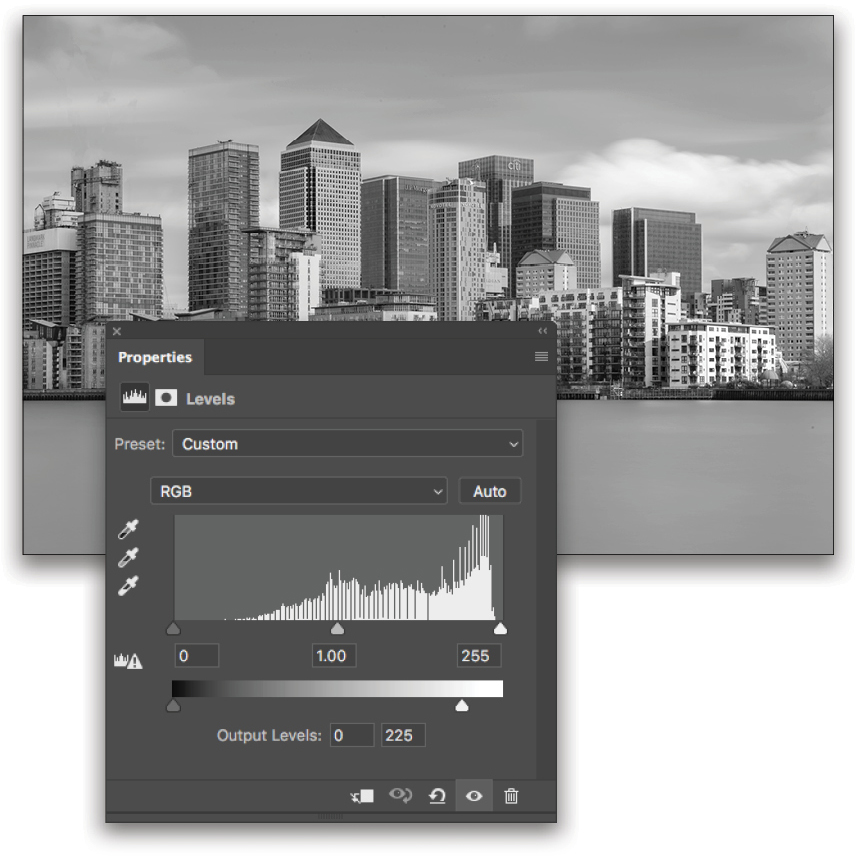
Step 15: Reselect the same area as before, either by going back to Select>Load Selection or by pressing Shift-Command-D (PC: Shift-Ctrl-D). Now, create a Levels adjustment from the Adjustments panel (second icon in the first row). In the Properties panel, you’ll see a histogram with some slider handles underneath it and another slider below.
Levels is another way of changing the white and black points (as well as midtones) in your image, allowing you to stretch brightness, contrast, and tonal range values. Presuming the white and black points were correctly set in ACR at the beginning, we can largely leave the Input sliders (the ones under the histogram) alone, and concentrate on the Output Levels sliders at the bottom. Move the white end of the slider to around 225. This will have the effect of reducing the stark brightness of the previous Curves adjustment, while retaining some of the contrast in the tall building.
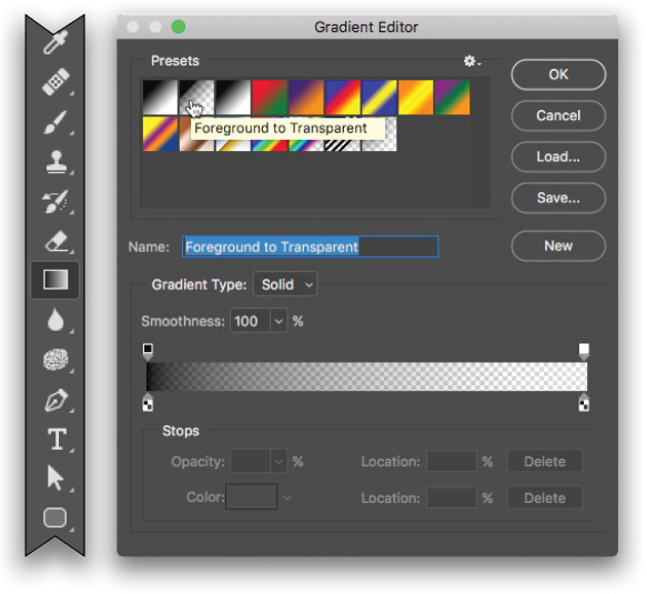
Step 16: The last of the three adjustments that you’ll be making to each of your selections is a gradient. This is what really brings the image together, giving it an almost 3D effect. Press Command-Shift-N (PC: Ctrl-Shift-N) to create a new blank layer, and then select the Gradient tool (G) from the Toolbar. Press D to set your Foreground color to black.
In the Options Bar at the top, click on the gradient preview to open the Gradient Editor, select the Foreground to Transparent preset, and click OK. With these settings, we’re now able to add directional shadows to each building, as though mimicking light falloff.
Step 17: Making sure you still have your new blank layer highlighted in the Layers panel and your chosen building selected from your list of saved selections, click a point somewhere southwest of your building and drag a line up at a 45° angle across the building.
Adding this effect can take a few goes, as you work out which direction you want your gradient to go and how much of the building you want it to cover. As such, judicious use of the Undo command (Command-Z [PC: Ctrl-Z]) is advised.
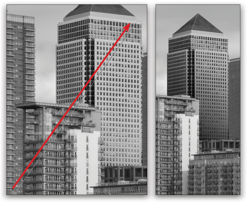
Once you’ve nailed it, though, your building should look something like this. Now you just need to repeat this process of adding Curves, Levels, and a Gradient for every element in your image. It may take some time, but it’s as simple as that!
Step 18: The final step of the edit is the thing that’s so often seen in fine-art images, and I think it really finishes the shot. Of course, I’m talking about a stark, black sky. Achieving this is no different than adding the same Curves and Levels adjustments as you’ve been using on the buildings, just with more extreme editing.
With your sky selected, create a Curves adjustment layer and make a deep downward curve, which will drag a lot of the highlights out of the image.
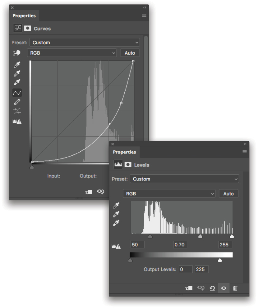
Then, reselect your sky using Command-Shift-D (PC: Ctrl-Shift-D) and add a Levels adjustment layer. Similar to before, we’ll drag the whites on the lower (Output Levels) slider to 225, but this time we’ll also drag the blacks on the Input slider to around 50 and the midtones to 0.70. This will drag the last of the highlights out of the sky, but leave the brightest highlights in interesting elements, such as the clouds, showing through.
As one last touch, I created a new layer and added a gradient using the same settings that we used on the buildings at the bottom of the river.
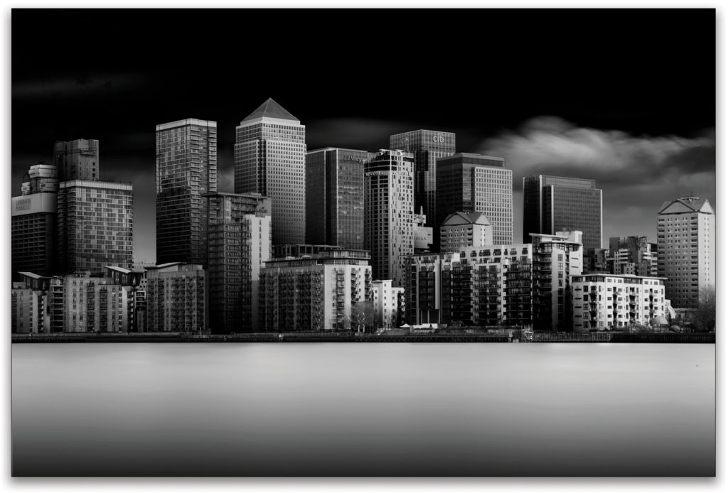
And there you have it! This is an undoubtedly labor-intensive edit, but one that will leave your friends and peers awe-inspired.
This article originally published in the August, 2018 issue of Photoshop User magazine.


