I’m privileged to work in the film and TV business here in Canada. It began as a dream that took eight years to become reality when I was inducted into the Cinematographers Guild of Canada as a “stills photographer.” For those not familiar with the job, I go on sets during production, and photograph the action. I process the images and turn them over to the publicity department who in turn send production picks to the various media outlets around Canada, or in the case of the U.S. shows, to the newspapers and online publications around the country.
On some shows, I also do the studio gallery photography, which is usually photographed on a seamless background and then the images are turned over to the broadcaster’s art department for processing into the “key art” for the show or film. Key art is used for both print and digital media, and in some cases for billboards.
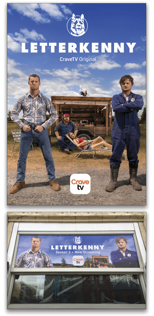
It’s great to see my work displayed: When I walk downtown in Toronto, I get to see a giant billboard on Queen Street outside the broadcaster’s location. This has been the case with the Screen Award winning comedy, Letterkenny, which airs on CraveTV in Canada.
Director of Photography
Every show I work on has a Director of Photography (DOP) who works with the film or show’s Director to create the lighting for each scene. The job of the DOP is to create lighting that matches the mood and feel of the script and story.
My job is only to make the lighting decisions on the publicity shoot for the broadcaster. The rest of the time I photograph the scenes, matching the Kelvin scale choice from the A and B camera, and then making a lens choice based on depth of field and exposure needs.
Every DOP tells me they first light a scene, then slowly remove the light with scrims, flags, barn doors, cine foil, gels, and circular diffusers that reduce the output of a lamp by various stops (single, doubles, and combinations thereof). This is fantastic work by skilled craftsman, who always work with either continuous or available light. With this in mind, I often take the approach with my own work to light a subject, and then work to diminish the lighting to create the shot that I imagine.
Key Art
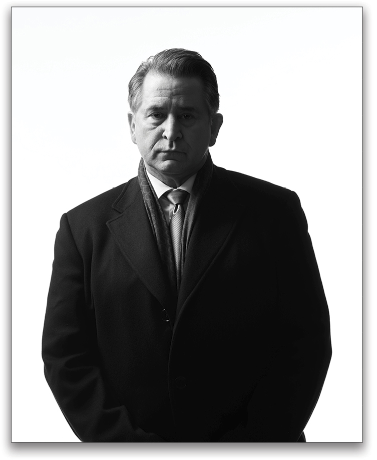
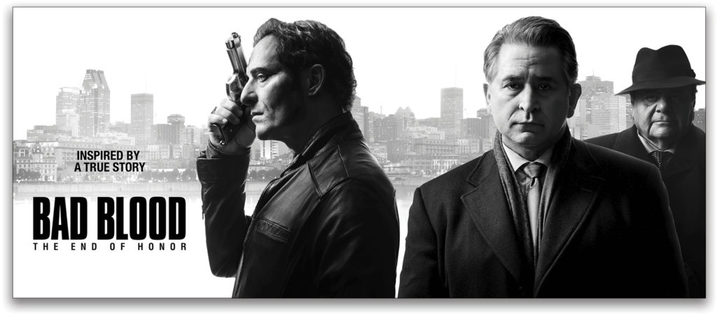
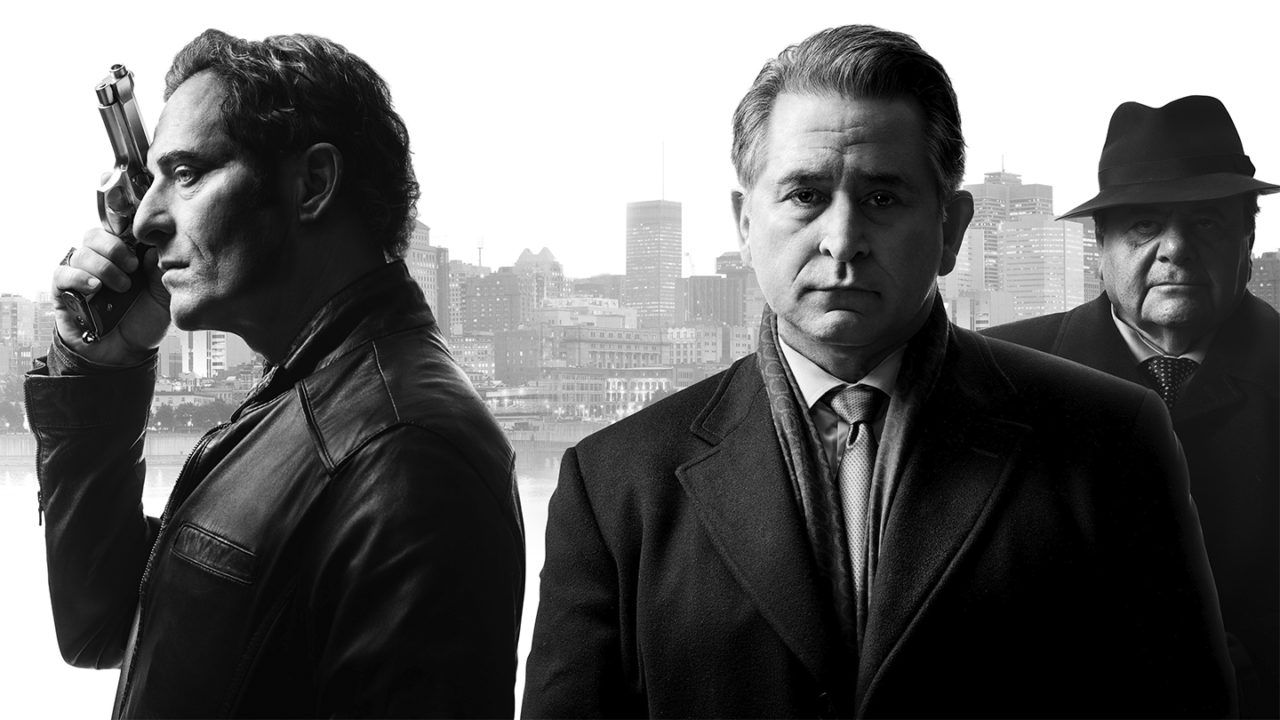
Here’s an example of the artwork for the new CITY/Rogers TV series in Canada, Bad Blood, starring Paul Sorvino, Anthony LaPaglia, and Kim Coates.
I was initially presented with artwork that was completely different from the key art that I shot. On the day of the gallery, the producer decided he wanted more moody and shadowy photos, so I had to switch gears from the idea of wide-open daylight lighting with an imaginary Montreal cityscape to very moody gangster-looking characters that you see in the photos.
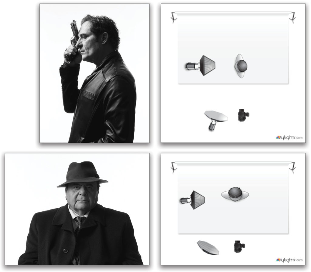
We created these singles on the spot, which became the key art for the posters and publicity. I used one gridded Profoto 2×3’ softbox as the key light at camera left at a 90° angle, and one Octa softbox for fill and catch lights slightly camera left of camera. The single setups became the key art for the art department to create the poster campaign.
The challenge I faced was to limit light spill and get the dark shadows the producer was after in each shot. I accomplished this by limiting the output of the fill light (Octa) to about four stops below the key. Because the lighting for the background was hi-key, I used 8×4’ flags with skirts to prevent the background light from highlighting the actor from behind. This can also be accomplished by making sure the subject is far enough away from the background to prevent any bounced light to reach him or her.
This is the kind of challenge that’s often given to photographers when the art department and producer suddenly change their minds and decide on something else. I actually relish these challenges, as it draws out my photography skills on the spot.
Back to the 40s
At the end of production on Bad Blood, I approached one of the actresses, Angela Asher, to see if she’d like to go into the studio and work with me on some 40s looks. Angela is a wonderful Canadian actress and really looks the part from that era. She agreed, and I decided to go for some low-key lighting, removing a lot of the light to create mood. Unfortunately, Angela had a bad slip on the ice and we didn’t get as much accomplished as I’d hoped. She’s recovered since then and is back at work on a number of TV projects.
For Angela’s shoot, I used a vintage 1930s Clarence S. Bull Hollywood photo as a template and idea reference. This idea initially came about because I chose a studio space that was completely black. The black floors, black drapes as the background, a grid on the Profoto Magnum Reflector to limit spill and control direction, and dark wardrobe, gave me the opportunity to totally control the output and location of where the light was directed at Angela.
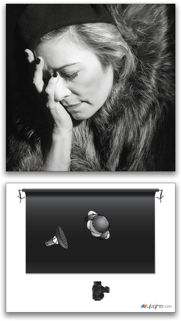
Sometimes, but not in this case, I may use black cinefoil over the reflector to cut down and control the output of the light even further. Flags, cinefoil, and grids are great ways to remove light and limit spill so that you have total control over the direction and look of each photo. This is also an important technique in avoiding extra postprocessing work. I know lots can be accomplished in post, but your mantra should always be, “Get the shot in-camera!” Make the effort; believe me it’s worth it. This is how all the pros approach photo shoots when limiting and removing light is necessary for the shot they’re after.
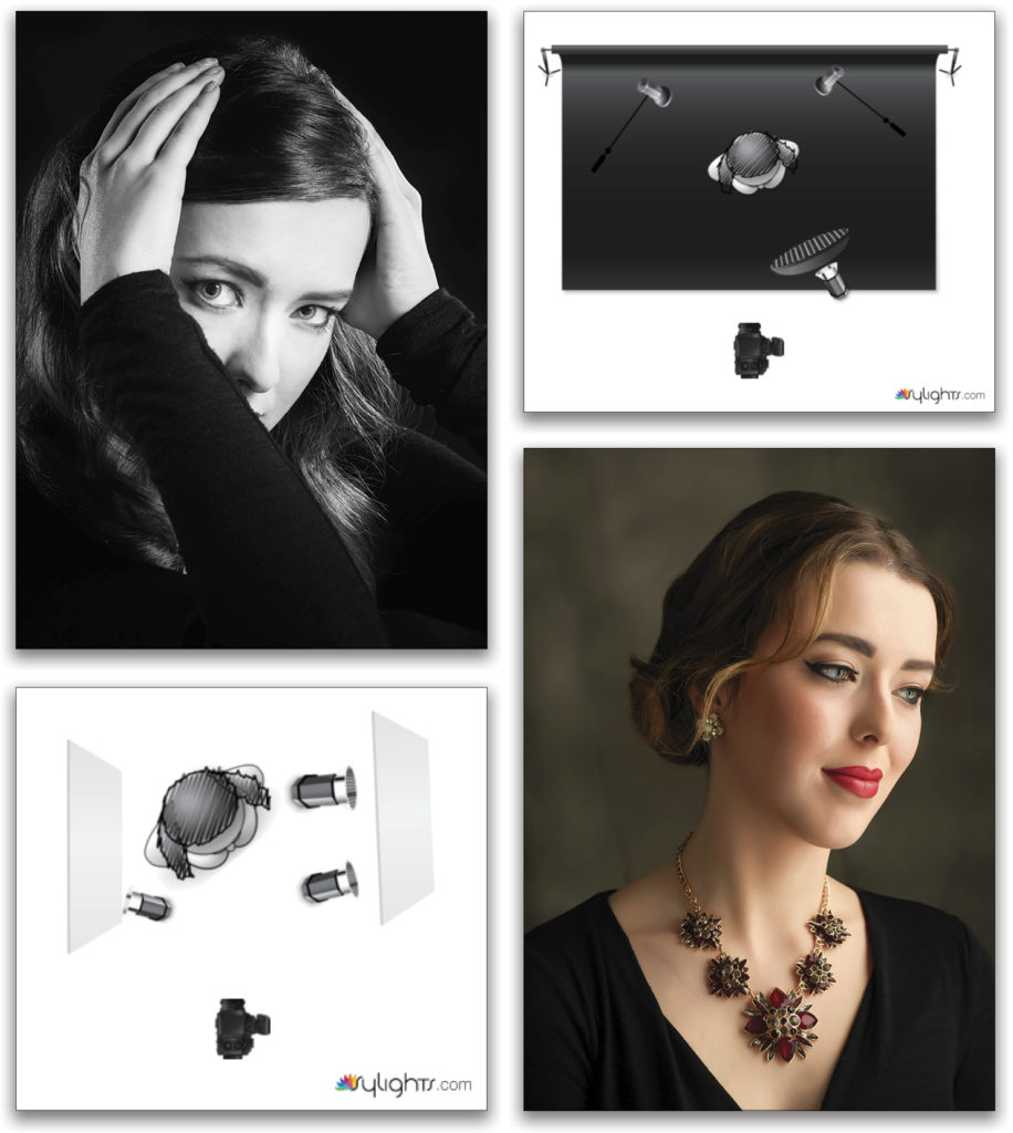
I also asked actress Kelly Lamb to do some retro work with me, and she was happy to help. Images were created with one key light, the Profoto Magnum Reflector (or gridded Beauty Dish in the case of Kelly Lamb), with two reflectors for kickers. I was in a studio this time that wasn’t black, so all the windows were covered to eliminate light from outside, and the background, while not black, was dark enough for me to get a more contrasty look with Kelly. I used small enough light sources for the hair light, and the grid gave me enough control to avoid spill. (These images were inspired by George Hurrell and C.S. Bull’s work with Hollywood actors from the 1930s and 40s.)
Location, Location, Location
Removing the light can often start with the location. Dancemakers Theatre in Toronto has been one of the studios I’ve used in the past five years when I needed a space large enough to create a completely black set. The floor has reflective tiling on it but that’s the only challenge I have for flagging off the lighting to reduce reflections.
I don’t mind the floor reflection from the dancer, but backlighting and lighting from high above, which is pointed on a steep angle down toward the subject, requires a flag. I use a couple of 4×4’ Floppy’s with a 4’ square skirt attached. I also use 4×8’ foam core board, as well as smaller flags. Barn doors on continuous lighting can work as well.
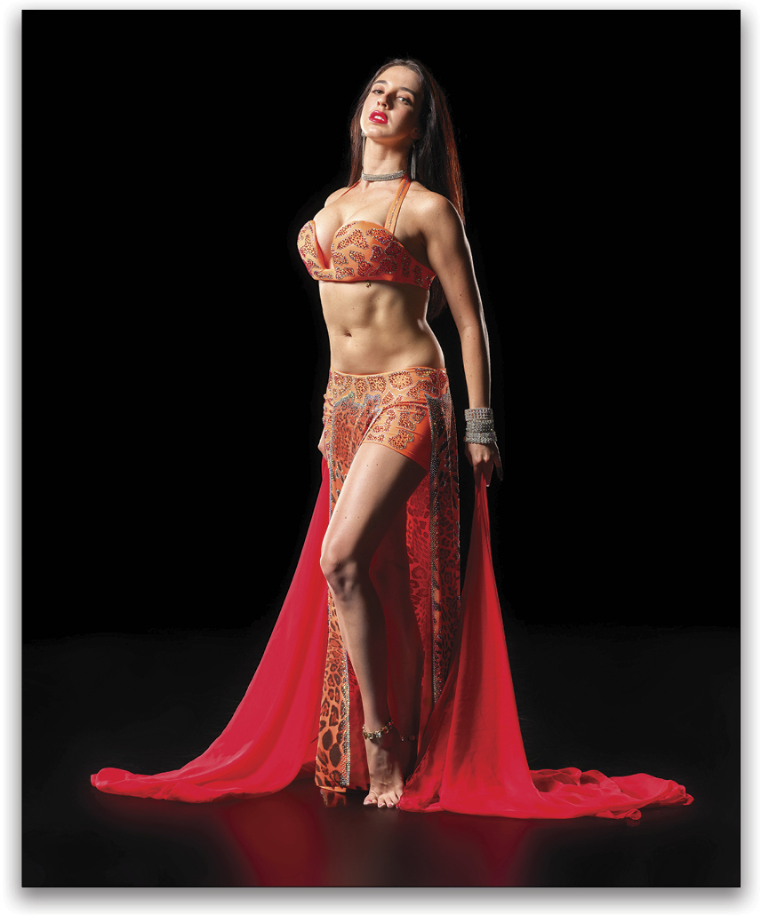
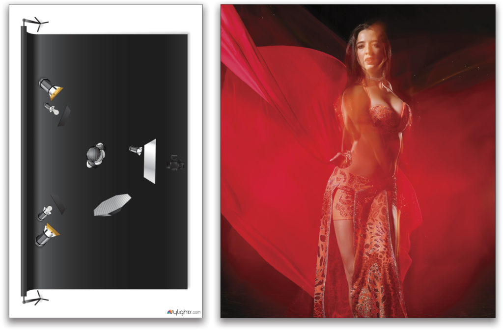
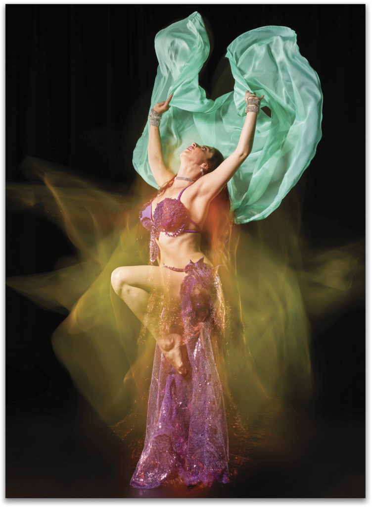
These photos of belly dancer Anjelica Scannura were are all shot with flags and lighting with a 5-second Bulb setting to create a sense of movement, as well as a faster shutter to create sharp images. You can see how the light didn’t spill at all; it just illuminated the idea I was after with nice shadows and subtle highlights. This wasn’t an easy setup but the diagram shows how I lit these shots.
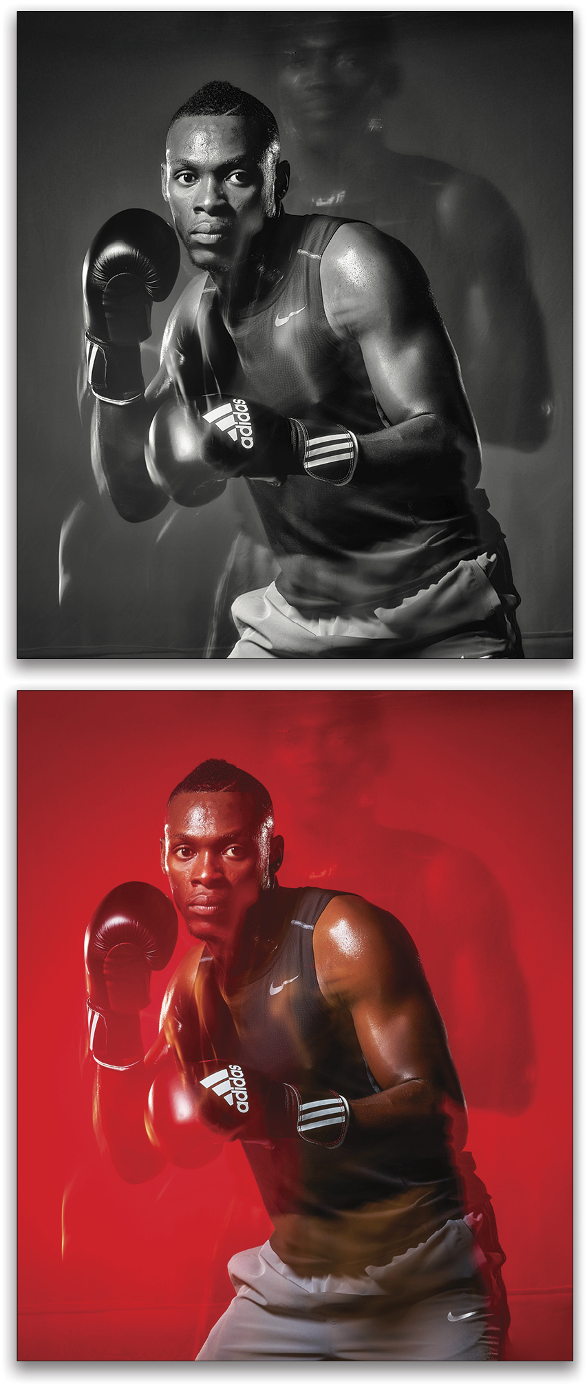
On the same day I photographed Anjelica, I also had fun with Jean T. Shimp doing his boxing thing. Using a slow shutter speed of 5 seconds on a tripod, the effect is eerie, as we can see his other persona looking over his shoulder. I used the same setup, described above, that I used with Anjelica. At times, I pulled the camera behind two curtains, using them as flags to prevent my picking up the back lighting. Fun times lighting and then removing the light for the shot I imagined!
This article originally published in Lightroom Magazine, Issue 35.



Love this – a great read for someone like myself looking to get awayt from weddings and into cinemaic portraits