You’re probably well aware that there exists no less than 1.274 gazillion ways to convert your photo from color to grayscale, and that you should know at least one-third of them so you can handle any situation. But what if you want to add your own custom technique? You’ll need to know something about how Photoshop “sees” color and how it manages the change from color to gray.
Let’s start with why we generally work in RGB (red, green, blue). RGB is a system that attempts to mimic the way our eyes detect color. Both cameras and monitors are set up for recording or displaying mixtures of red, green, and blue to simulate the colors that can be seen by normal human vision. Different color spaces are intended for different workflows or to better mimic color perception, but we tend to stick with RGB for the vast majority of work in Photoshop.
RGB is an additive color model, meaning that you get other colors by mixing or adding together some combination of these main colors. Equal input from each of these colors gives you gray, and 100% of all three gives you white. Of course, 0% is black. Photoshop uses this model to present you three channels, one each for red, green, and blue.
When you look at channels in Photoshop, you’re not looking at gray representations, you’re looking at how much of that channel’s color is involved in the final color on the canvas. White represents as much of that color as is possible, and black means none. Lots of you know this, but I wanted to make sure we’re all starting from the same spot.
What this means is that Photoshop shows you color based on this mixing, not as a discrete, individual color. Therefore, in order to change any specific color, you need to work with the combinations. Fortunately, Photoshop gives you an embarrassment of riches in terms of how many tools you have available. And all of these tools give you control over one or more channels in varying degrees.
Different Colors Can Have the Same Gray Value
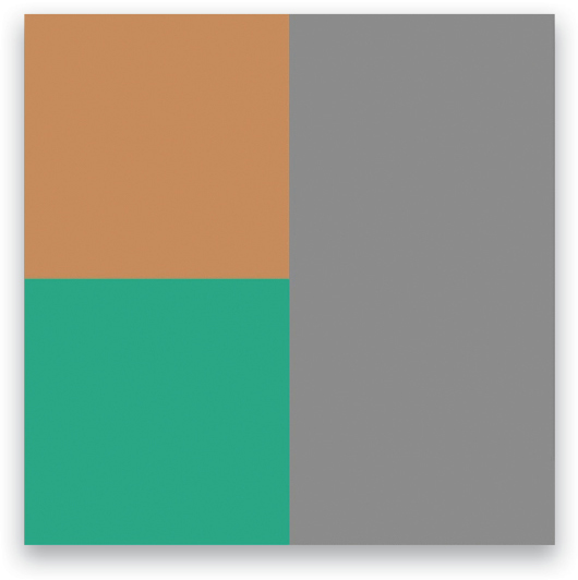
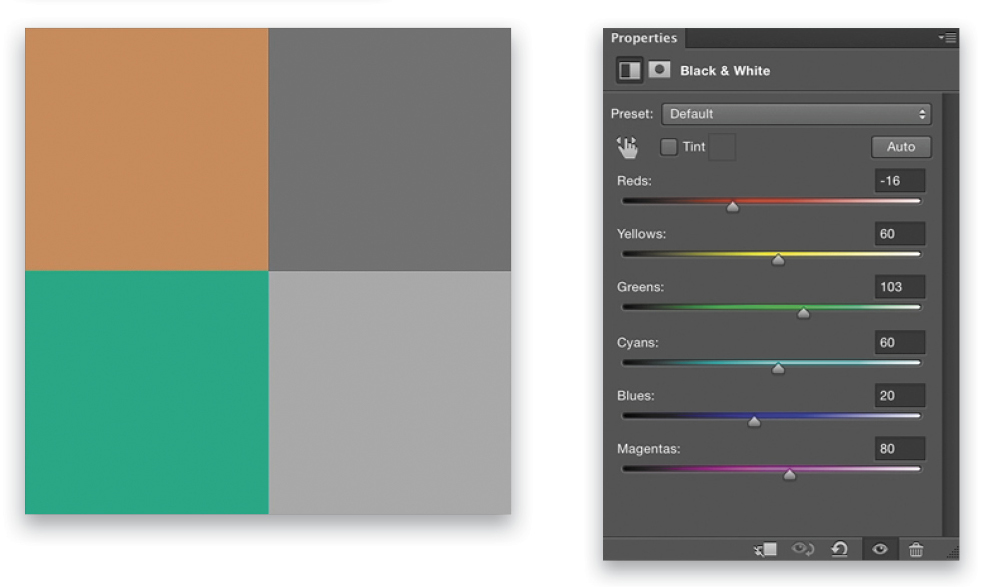
So what happens when you let Photoshop make the decisions about converting a given color, which is a mix of three channels, to a single level of gray? Simply desaturating the image averages the colors by using the gray values from each channel. That is, given a pale brown with RGB values of 184, 139, and 91, adding all three numbers together then dividing by 3 gives you a gray value of 138. Of course, that means that cool green with RGB values of 91, 184, and 139 also averages to 138. (Note: Open the Info panel [Window>Info], switch to the Eyedropper tool [I], and hover over your image to see the RGB values.)
That’s fine as far as it goes, but what if you remembered the scene a little differently? What if that particular color should draw more attention and be a little brighter because it’s on a subject that’s more important to you?
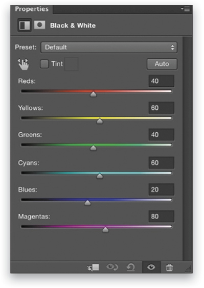
If we add a Black & White adjustment layer (Layer>New Adjustment Layer>Black & White) above a layer filled with the pale brown color above, the default preset gives us a gray value of 138. But notice that the sliders for each color in the Properties panel aren’t zero.
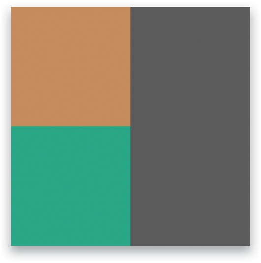
In fact, if we drop all of those sliders to zero, the gray value becomes 91. This is closer to a luminosity value, which is different than brightness. Let me explain.
Brightness vs. Luminosity
You see, Photoshop tries to preserve the apparent brightness, not luminosity, of a given color when converting to gray. Brightness is based on human perception, not a strict mathematical formula. The luminosity of a given color (setting aside reflectance and diffusion of the surface) is based on a measurement of power, and that power is made up of the energy involved. Energy varies with frequency, with blue being high energy and high frequency, and red being low energy and low frequency by comparison. Human perception, however, doesn’t distinguish luminosity directly, because our eyes are more sensitive to some frequencies (mostly green) than others, so we use the term “brightness” when talking about how we perceive a particular color.
When you average the color values using channel brightness, you’re giving all the channels equal weight. Luminosity attempts to give a more technically accurate representation, but it’s generally not how we actually perceive the scene in front of us.
A common formula for getting the luminosity of an RGB color is 0.30*R+0.59*G+0.11*G; that is, 30% of the red value, 59% of the green value, and 11% of the blue value. Applying this to our example color, we get:
- 0.3*184=55.2
- 0.59*139=82.01
- 0.11*91=10.01
Adding these up, we get 147.22. Now, if we divide this number by the sum of the original RGB values (414), this gives us a luminosity value of about 35.5%. Taking that percentage of pure white (255) gives us roughly 91 (both the brown and green above give the same results). Very dark, indeed, and probably not how you’d remember those colors. The Black & White adjustment layer’s default settings give us a really good approximation of brightness (perception) simply by using the average of the channels. But it’s important to know how these values are calculated, because how you control the conversion from color to gray should be a reflection of how you remember, or want to portray, a given scene. What we need to do is manipulate the color controls to distinguish these two hues. Moving the Reds slider to the left and the Greens slider to the right in the Properties panel separates them. Remember that the brown has more contribution from the Red channel and the pale green naturally relies more on the Green channel.
Demo File and Homework
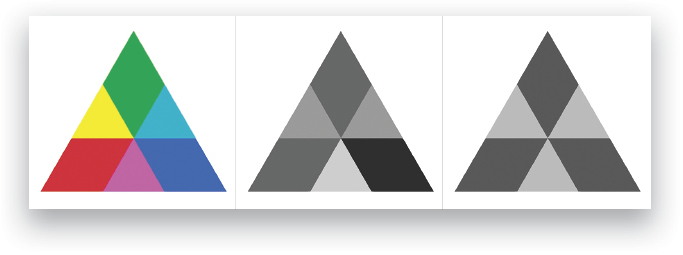
Check out this colorful triangle. The original has red, yellow, green, cyan, blue, and magenta. When I add a Black & White adjustment layer with default settings, I get four different values of gray—two pairs of shapes are the same. But I can balance the color sliders to give me just two shades. I’ve effectively wiped out any distinction of color, but have I ignored perception? Probably.
The spectrum version has similar results.
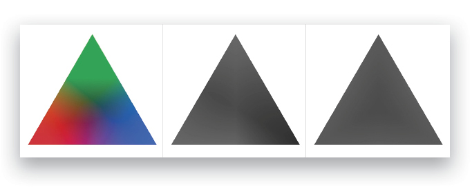
But if I add Selective Color and Color Balance adjustment layers between the spectrum triangle layer and the Black & White adjustment layer, I get fine control over the conversion process, and now I can pull out very specific colors so the gray triangle has some interest and variation. (In the demo file, see the layers in the Creative layers group.)
Here’s your homework for this month: Grab the download file and check out both the solid color and spectrum triangles.
Try out various conversion methods and see how they’re affecting various colors. Do you want two colors to have the same importance and the same level of gray? Do you need to carve out similar colors and give them a lot of distinction from each other? Start with the exercise file and see which method gets you closest, and how it affects other colors.
Bend your brain a little and try finding isoluminous solutions with your favorite conversion technique (where the conversion process gives every color a very similar gray value so all detail is wiped out), then pull out individual colors for enhancement. You’ll need to think about the original color and what channels contribute to make it show up on your screen. Once you start getting a feel for how Photoshop sees things, you’ll be in a position to absolutely master both color and grayscale images.
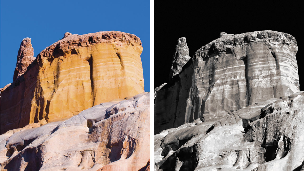
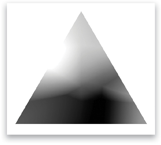
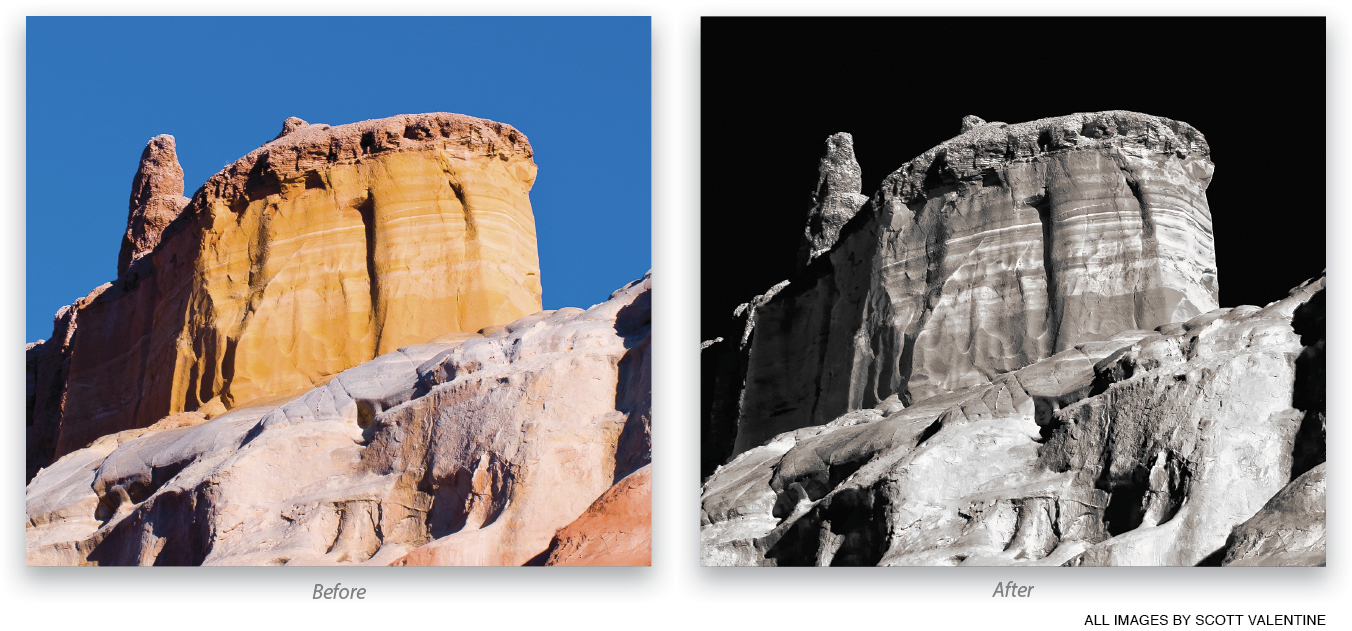
Here’s how the image at the beginning of the article started. Notice how similar colors were drawn out to very different gray values.
This article originally published in the November, 2015 issue of Photoshop User magazine.


