It’s often worthwhile to take a look at and explore tools that don’t get much attention. This month, I want to take the Difference blending mode out to the “Photoshop Proving Ground” and show off some of its potential.
Difference blending mode uses a simple mathematical formula that returns the absolute value of the difference between two pixel color values. Let’s take an example of two gray layers: the top is RGB (128, 128, 128), and the lower is RGB (51, 51, 51). The difference between these values is 128–51 = 77, or RGB (77, 77, 77). When these layers are swapped so that the darker gray is on top, we still get the same result. This is different from Subtract blending mode, which would give 51–128 = –77. But in Photoshop’s world, you can’t get darker than 0 or full black, so any negative result gets clipped.
Traditionally, Difference blending is used to align layers for compositing, such as stitching together screenshots when you can’t get everything in one pass, and often when stacking astrophotography layers. The idea is that there’s no difference between identical elements, so you can use those points for alignment. In these cases, you usually switch back to the Normal blending mode after you align the layers.
Difference for Contrast
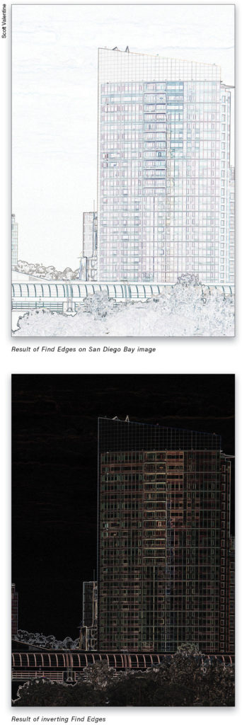
But there are a few other uses that are a little less obvious. A quick way to increase edge contrast in hazy images, for example, is to duplicate the photo layer (Command-J [PC: Ctrl-J]), then apply the Find Edges filter (Filter>Stylize>Find edges).
From here, press Command-I (PC: Ctrl-I) to invert the filtered copy.
Finally, set the copied layer’s blending mode to Difference. Lower the Opacity to 0%, then slowly bring it back up until you get contrast in areas of interest. Use a layer mask to hide the effect where you don’t want it.
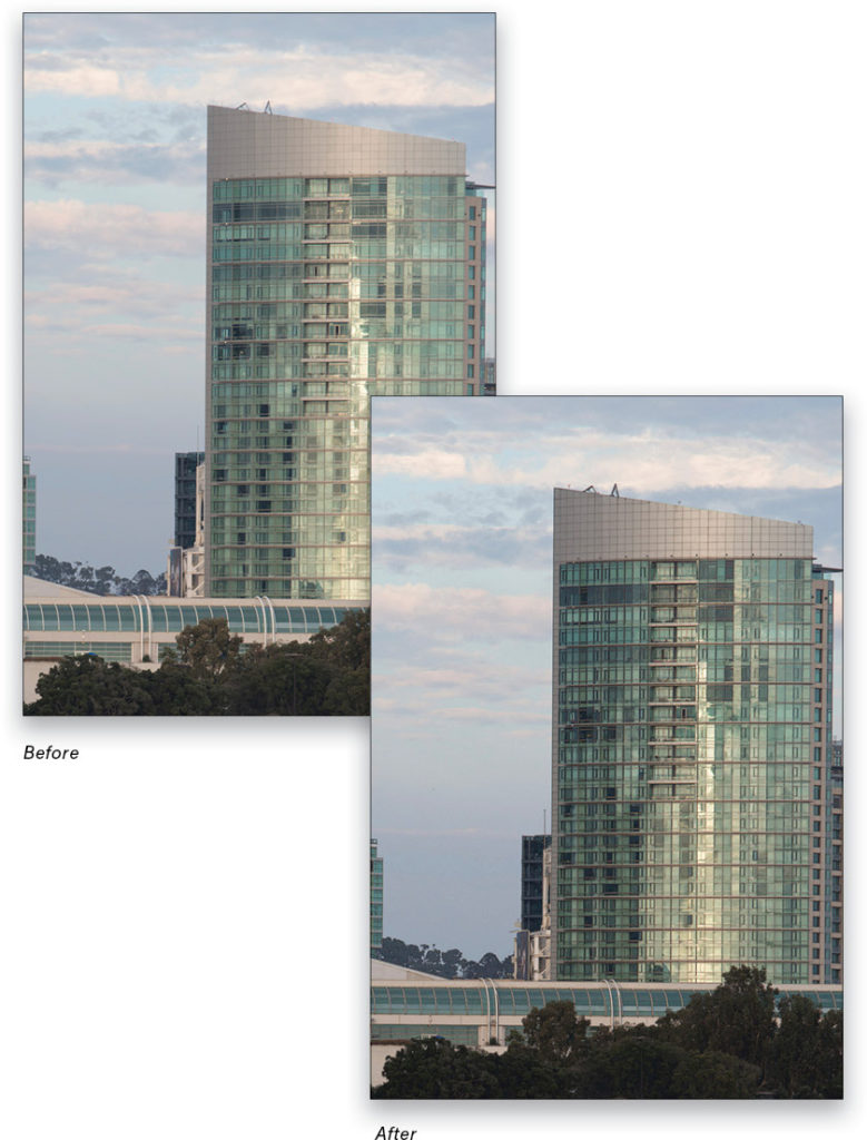
Notice that Difference has no effect where the blend layer is black. That’s because black is zero in RGB, and subtracting zero doesn’t change anything. Everything else gets blended with the base layer, increasing contrast along the edges. As mentioned, the Opacity of the Difference layer controls the strength of the effect.
Difference for Color
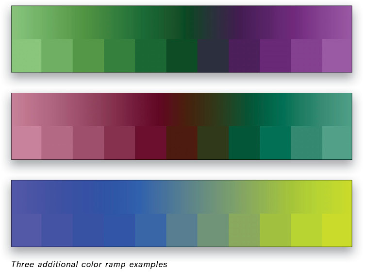
Let’s move into a more practical and creative use of Difference: color! First, we need to take a look at a more concrete example of what Difference actually does. In this image, the bottom layer is a black-to-white gradient for reference, with a Solid Color fill layer (Layer>New Fill Layer>Solid Color) above that (KelbyOne members can download a copy of this file by clicking here).
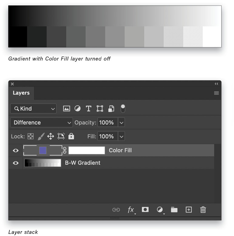
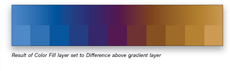
When you set the Color Fill layer to Difference blending mode, it suddenly becomes a range that turns out to be a suite of complementary pairs. In the example image shown here, the solid fill color is R: 63, G: 117, and B: 190. Notice that where it’s black (R: 0, G: 0, B: 0) on the left side of the gradient, nothing changes; you see the original blue color of the Color Fill layer. Blending with white (R: 255, G: 255, B: 255) on the opposite end of the gradient creates an inversion, and the result there is R: 192, G: 138, and B: 65. Each of the other gray values are similarly paired up, creating color inversions for each set of two moving in from the ends.
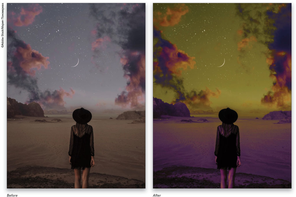
There are two really useful ideas that come from this result: we can easily create a complementary color palette; and we can apply the results to photos. Here’s an example of placing the Color Fill layer (set to Difference blending mode) above a desaturated photo to add mystery and drama.
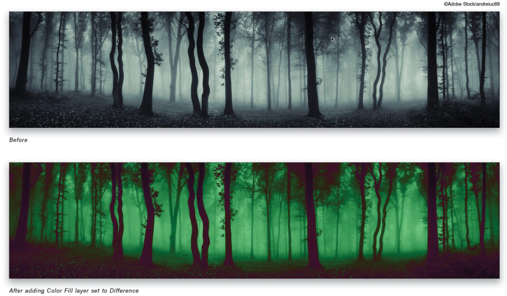
The color fill is a deep plum (R: 64, G: 11, B: 62). Again, the black areas take on the fill color directly, while the lighter shades take on the inverse color. Built-in color harmony! This technique tends to work best on images that have low saturation but high contrast in large features. When you apply this trick to color images, the results can be unexpected—which isn’t always a bad thing. It’s just more difficult to control. To preserve the duotone effect with complementary colors, work with a gray or very desaturated image.
Tip: You may find it necessary to add a Black & White or Hue/Saturation adjustment layer between your photo and Color Fill layer. This will help you control any odd or unexpected color conversions by first letting you create a black-and-white version of your image.
To start your fine-tuning, double-click on the Color Fill layer thumbnail to open the Color Picker so you can adjust the color settings. You’re going to work with the HSB set of controls for this part. Start with relatively dark, saturated colors so that the dark areas stay dark. Click the radio button next to (H)ue and start adjusting the vertical color slider to find a general range you like. While you can click in the Color Picker area directly, I find that this particular technique is best approached by changing only one parameter at a time.
When you have the basic colors you want, choose the (S)aturation radio button and make further adjustments. Finally, move to the (B)rightness control and fine-tune if necessary.
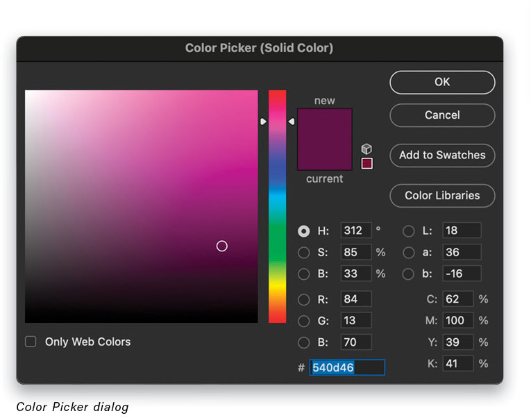
At this point you should have a reasonably good idea of the color range, so close the Color Picker and reduce the Fill slider in the Layers panel to decrease the effect. If you find you still want some blacks to show through, use Blend If on the Color Fill layer: double-click to the right of the layer’s name to open the Layer Style dialog, and drag the Underlying Layer black slider a little to the right. Hold Option (PC: Alt) and click on the slider to “split” it and drag each half for a graded transition from black to color.
Experimenting with Different Types of Images
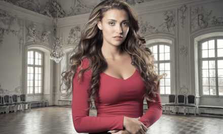
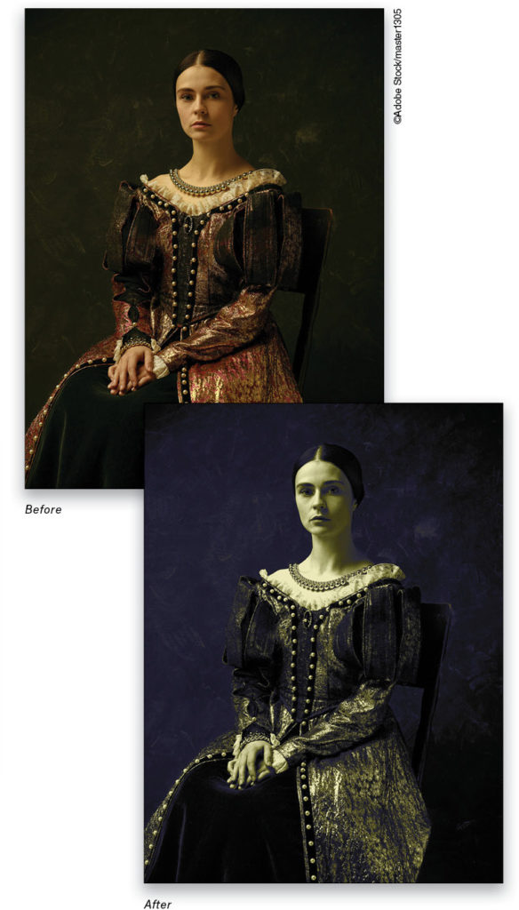
The same technique can be used with portraits, although I find that even more restraint is necessary to keep things from getting muddy and unappealing. In this Adobe Stock image, I needed both Black & White and Curves adjustment layers below the Color Fill layer to control saturation and contrast.
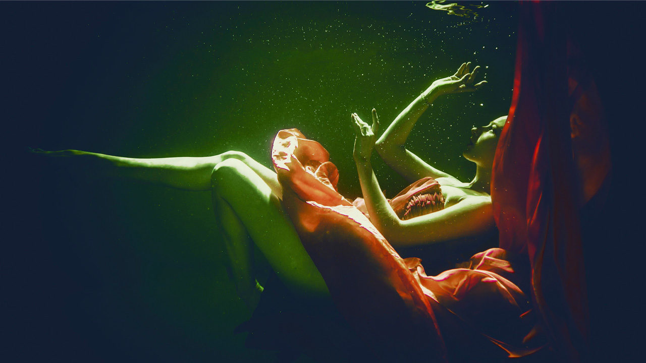
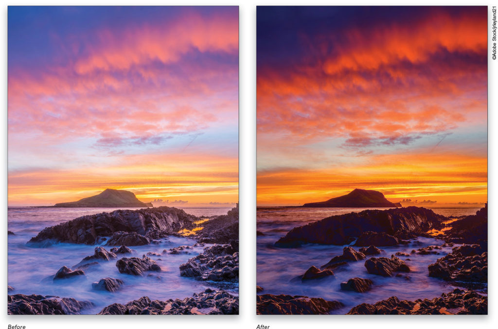
Of course, nothing says you have to stick with classical color toning. You could use bright, vibrant colors to create some eye-catching graphic looks.
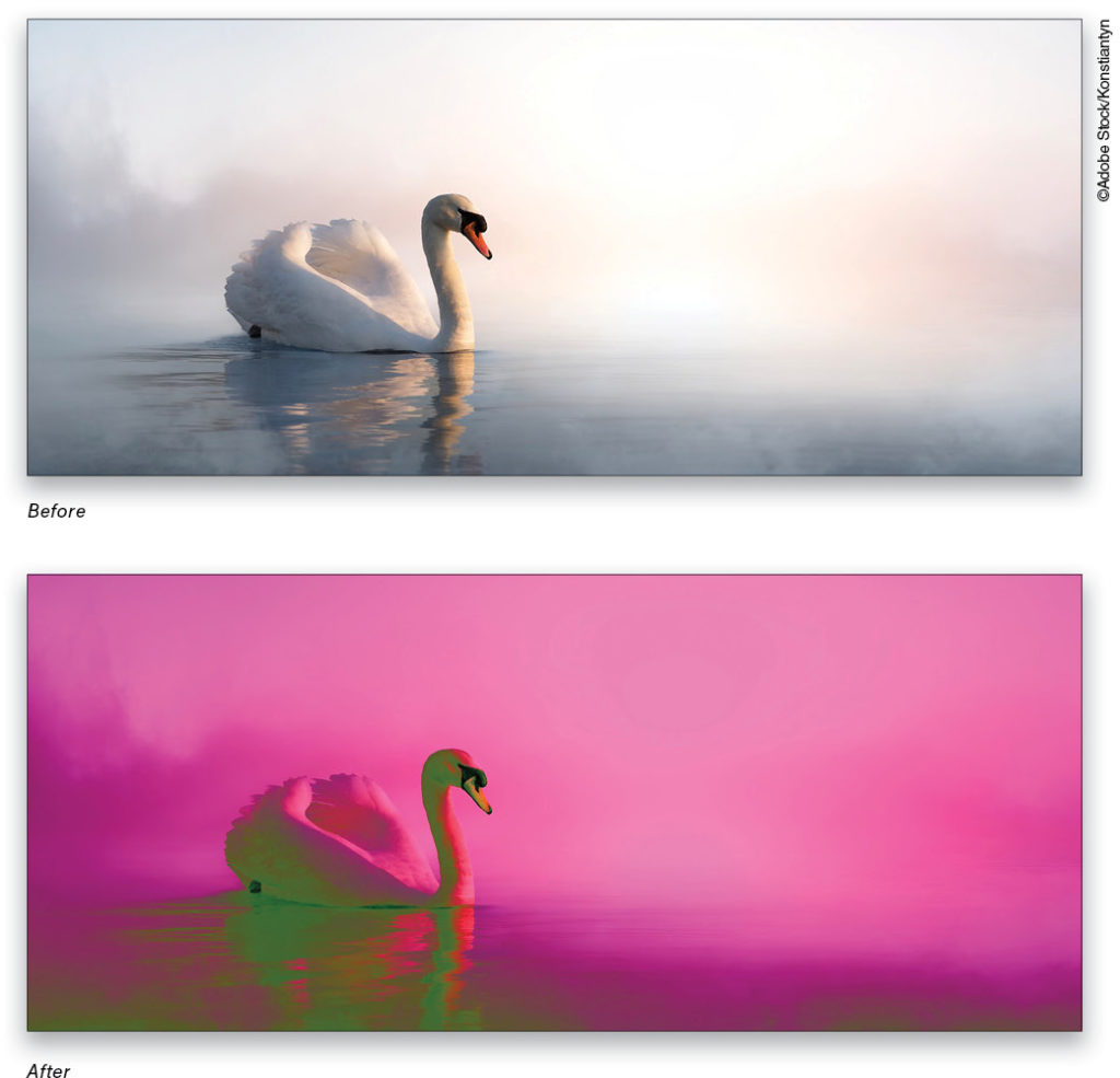
Here are a couple more examples showing the flexibility of using Difference blending with a solid color.
Creating Complementary Colors
I mentioned earlier that you can also use this trick to generate complementary color palettes. Using the provided PSD file, simply choose different colors for the Color Fill layer following the same method above: Select your Hue, then adjust Saturation and Brightness. You can also create pastel colors this way by lowering Fill.
Using this approach, you can create custom gradient maps by assigning sampled colors. Just keep in mind that the left side of the gradient maps to black, exactly as in the example gradient above. With your own gradient maps, you can get exquisite control over your color treatments, and push into more complex color-grading options.
When using Difference, keep in mind that anything blending with black remains unchanged, and anything blending with white is inverted. Use this knowledge to guide your base image adjustments, so that you can control the blending more precisely.
Bonus Trick! A great way to explore different looks and just idle away some time is to play around with patterns. Grab the Gradient tool (G) and load up any preset color gradient. Set the tool blending mode to Difference in the top Options Bar, and get to work: Drag out in random directions on the same layer. The gradient you create will interact with whatever is already on the layer and, after a while, you’ll find that you can create interesting patterns and color ranges. Start with a simple Black, White gradient in one direction, then drag 90° to that. Once you’re comfortable, start trying new gradients or mix things up with other blending modes. Have fun with it!
This article originally published in the April, 2021 issue of Photoshop User magazine.