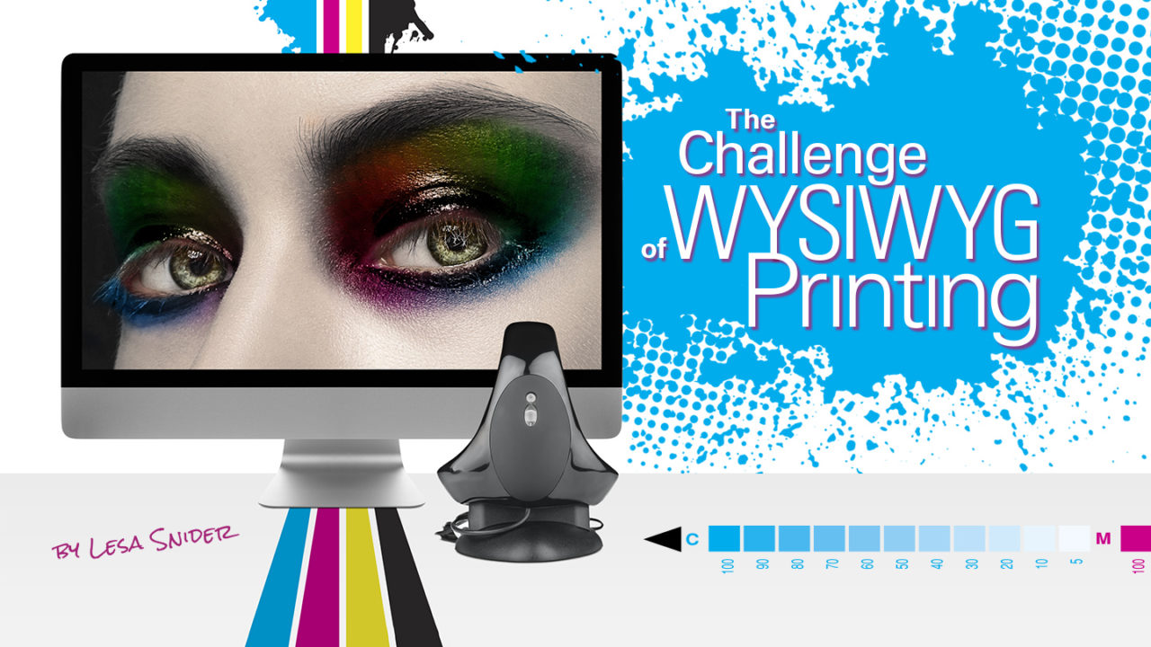
WYSIWYG (pronounced “wiz-e-wig”) is an acronym for “What you see is what you get.” For image-editing buffs, it describes the elusive goal of getting prints to match what’s onscreen. When you think about the different ways that monitors and printers produce colors, the problem starts to make sense.
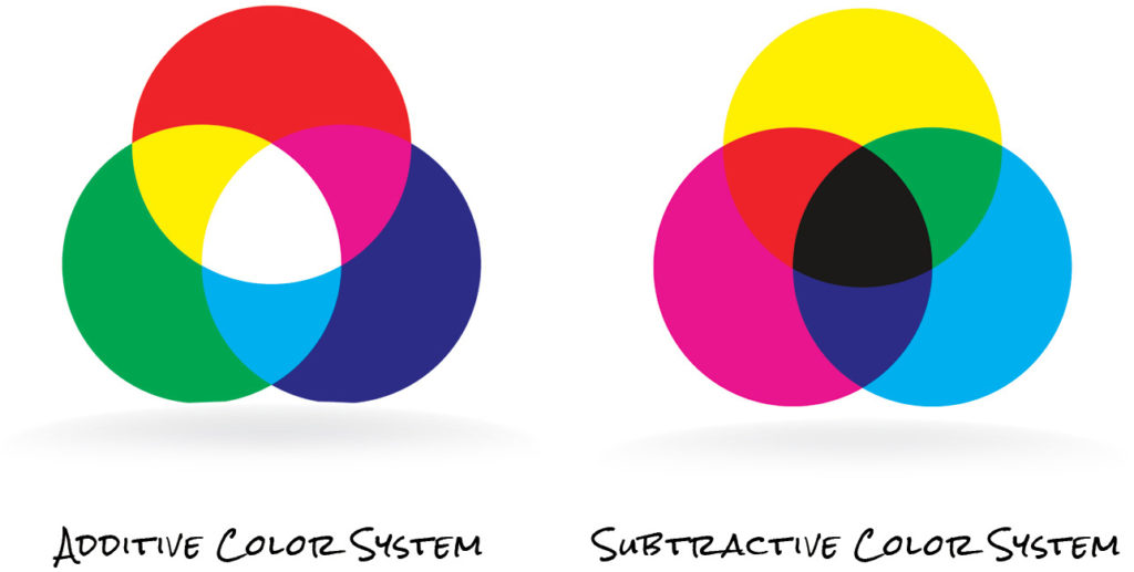
A monitor’s surface is made from glass or some other transparent material, and it produces colors with phosphors, LCD elements, or other light-emitting doodads, which is called an additive color system. In this system, the areas where red, green, and blue lights overlap appear white. Does that ring a bell from high school physics? Think about it this way:
If you aim red, green, and blue spotlights at a stage, you’ll see white where the three lights overlap. Interestingly, you’ll also see cyan, magenta, or yellow where two of the three lights overlap. Areas where no light is shining appear jet-black.
In contrast, printers use a combination of paper, reflected light, and cyan, magenta, yellow, and black inks, which is called a subtractive color system. In this system, different-colored inks absorb different-colored light. For example, cyan ink absorbs red light and reflects green and blue light back at you, so what you see is a mix of green and blue—in other words, cyan. Similarly, magenta ink absorbs green light and reflects red and blue light—in other words, magenta. One last example: A mix of cyan, magenta, and yellow ink absorbs most of the primary colors—red, green, and blue—so you see what’s left over: dark brown. To extend the range of colors, some printers use additional colors such as light cyan, light magenta, several varieties of black, and so on.
Given these two completely different approaches to creating colors, it’s a miracle that the images on your monitor look remotely similar to the ones you print. And, because there are a bazillion different monitors and printers on the market (each using different technologies), you can see a big difference in how your images look depending on the monitor or printer you use. Heck, even changing the paper in your printer affects how your colors print.
The only way to get consistent prints is to have a calibrated and profiled monitor of decent quality (you’ll learn about that stuff shortly) and to know the following: which printer your image is headed for; in which color mode that printer wants the image to be; which range of colors that printer can reproduce; and exactly what type of paper you’re using. Whew! Once you have all that info, you need to communicate it to Photoshop.
Understanding Color Gamut and Profiles
As a first step toward WYSIWYG printing, remember that, in most cases, your image starts life in RGB color mode and eventually ends up being converted to some variation of CMYK when it’s printed (the image’s colors can be converted by the printer or you can do it manually, though these days digital printers generally prefer to do the conversion themselves). The next step is to understand more about how those two color modes differ. Enter the concept of color gamut.
A color gamut is the range of colors a given device can reproduce. An RGB monitor, for example, can reproduce one range of colors, and a CMYK printer can reproduce another (and there’s not a monitor or printer on the planet that can produce a color range as wide as your eyes can see). While the color gamut of monitors and printers frequently overlap, they’re never identical. Your printer’s color gamut depends on the specific combination of printing technologies you’re using, including:
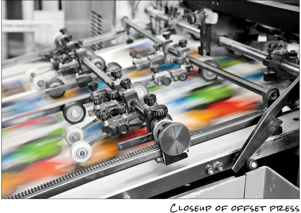
• Colorants (color-producing substances): Some printers, like commercial offset presses (shown here), use pigment-based inks to produce color. Others, like inkjets, use either dye-based or pigment-based inks, and still others—like laser printers and digital presses (which are like fancy laser printers)—use powdered toners.
- Dot pattern: All of the printers mentioned above use a pattern of dots to reproduce images. Commercial offset presses typically use halftone dots that are commonly made from ellipses and diamonds.
- Paper type: Each printer can also use a wide range of paper, from plain to matte to super high-quality glossy. (Quick Tip: You’ll usually get much better quality using glossy paper.) If you want your inkjet printer to reproduce its full gamut of color, you need to use a specially coated paper made to work with your inks.
To account for all these variations, you can use color profiles to tell Photoshop exactly which colorants and papers you want to print with. Color profiles contain detailed info about the printer’s color gamut and, in some cases, the paper you’re using, although that info usually lives in a separate file called a paper profile. Photoshop comes with a variety of all-purpose, generic profiles, but you can also get profiles from printer and paper manufacturers.
Finding and Installing Drivers and Color Profiles
Most of the time, you can download printer drivers—the software that lets Photoshop communicate with your printer—right from the printer manufacturer’s website, though you might have to poke around a bit to find them. It’s always best to get printer drivers straight from the company that made the device. The manufacturer’s site should explain how to install them.
Similarly, you can typically download color profiles from the paper company’s website (be sure to get the profile for your printer), though you can also get custom color profiles from professional printing companies (they’re usually happy to share them with you if you ask). Luckily, the profiles you get from larger companies, such as Canon and Epson, come with an installer program. If yours doesn’t, ask the company it came from where you should put it on your computer (it depends on your operating system).
Every printer and paper manufacturer’s website is different, but they all have similar options. Typically, drivers and profiles live in the download or support section of the site, but it’s usually easiest to Google your printer’s name plus the item you’re after, such as Canon PIXMA profile, Epson R3000 profile, and so on. Once you’ve installed the appropriate color profile, you can access it via the Printer Profile menu in Photoshop’s Print Settings dialog.
Tip: For high-quality ICC profiles—color profiles that have been vetted by the International Color Consortium Registry—visit their website (www.color.org/registry/index.xalter). The ICC’s website also has a ton of great (and heady) info about color management.
Profiles Aren’t All Equal
It’s shocking but true: Some profiles are just plain wrong. Photoshop comes with many built-in color profiles—such as Adobe RGB (1998) and sRGB—that include general color-mode info for displaying images, as well as slightly more specific (though still generic) color profiles (e.g., U.S. Sheetfed Coated v2) that contain gamut information for printing on a “typical” sheetfed press using standard inks and coated paper. If your printing conditions are indeed standard, you may get decent results by using one of these built-in profiles.
You can also use printer-and-paper-specific profiles, commonly referred to as paper or output profiles, created by such manufacturers as Epson and Canon, who make profiles to match almost every kind of paper they sell: glossy, luster, matte, and so on. The more closely a profile matches your printing conditions, the more accurate and useful it is. You’ll find that high-quality paper profiles, like the ones from Epson and Canon, provide invaluable help with proofing and printing. In fact, when you’re shopping for paper, it’s wise to confirm that the paper manufacturer offers paper profiles that match your printer and ink. And be wary of buying paper from companies that don’t!
You’ll also want to test the profiles by actually printing with them. If you’ve been printing with other paper and profiles, print some test images using the same image for both sets of papers and profiles, and then compare the results. You’ll probably find that some paper manufacturer’s profiles are better than others.
Calibrating Your Monitor
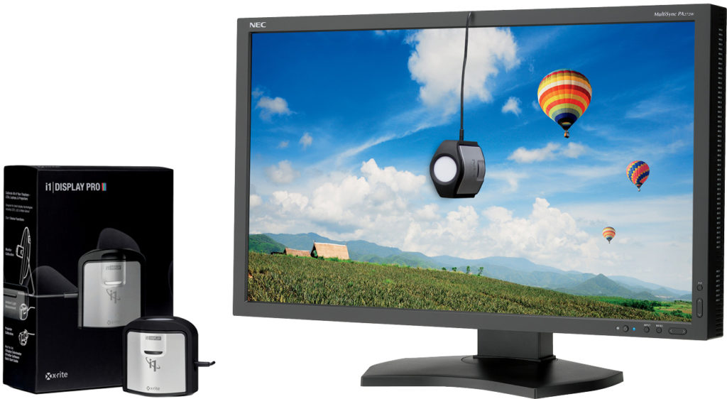
To ensure accurate prints, it’s also important to make certain that your monitor is displaying colors accurately. Both the Mac and Windows operating systems come with built-in calibration programs, though for best results, you should use an external measuring device like a colorimeter or spectrophotometer (hand-sized gadgets that clamp onto your monitor and measure the colors it displays). The calibration process involves adjusting your monitor so that it displays a series of colors and images consistently. Having a calibrated monitor also lets you preview more accurately how images and colors will print (a process called soft-proofing, discussed later in this column).
As of this writing, you can buy a calibrating device for your monitor for around $100, although the more sophisticated ones cost a little more. There’s no harm in starting with an affordable model: Pantone’s ColorMunki Smile (www.pantone.com
/pantone-colormunki-smile) or Datacolor’s Spyder5EXPRESS (http://spyder.datacolor.com/portfolio-view/spyder5express) come to mind. But to be able to truly trust the colors your monitor is showing you, you’ll need to spend more. Options include the Spyder5PRO, which runs about $190, or the Pantone i1 Display Pro (www.pantone.com/pantone-i1display-pro-2), which is around $270.
A simpler and perhaps more accurate solution, however, is to buy a monitor that comes with its own calibration software and colorimeter, such as an NEC model with SpectraView II (www.necdisplay.com/support-and-services/spectra-view-II). You can pick up a 27″ model for around $1,550 (the 30″ version is $2,250).
Another step toward seeing your images the way they’ll look when printed is by telling Photoshop what color workspace your monitor should use. Choose Edit>Color Settings and, in the Working Spaces section of the resulting dialog, choose a profile from the RGB menu. These color workspaces differ greatly in color gamut, and here’s what you need to know about choosing the one that’s right for you:
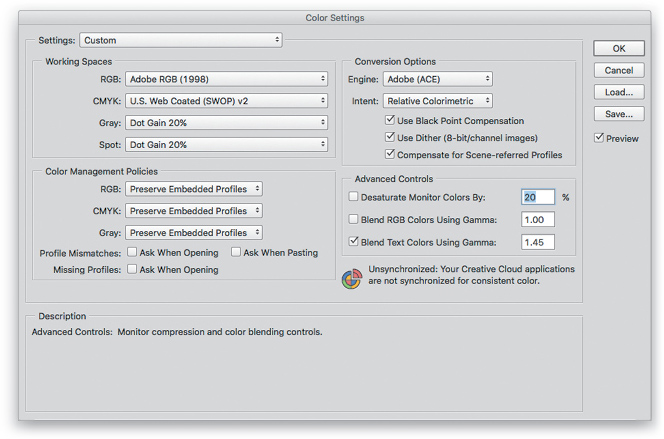
Photoshop Color Settings
- Adobe RGB (1998): To date, this is the most popular workspace, and it includes a wide range of colors, so it’s perfect for designers and photographers. It’s also great for printing on inkjet printers and commercial presses.Tip: You can also change your digital camera’s color profile to match what you use in Photoshop. For example, most cameras are initially set to sRGB mode, but you can switch to Adobe RGB instead. Alas, you’ll have to dig out your owner’s manual to learn how, but the increased range of colors and monitor consistency is worth it!
- Apple RGB: This workspace was designed for use on small Apple monitors. It’s slightly smaller than Adobe RGB (1998) in that it contains a narrower range of colors. So, unless you’re rocking a vintage 13″ display, steer clear of this workspace.
- ColorMatch RGB: Designed to match the colorspace of the old Radius PressView monitors, this workspace has a slightly smaller gamut than Adobe RGB (1998). If you’re using one of those Radius monitors, this workspace is a good choice.
- ProPhoto RGB: Currently the largest workspace in use, this one is used by software that processes RAW images. It’s the native workspace of the Camera Raw plug-in and Photoshop Lightroom. Choose this mode if you’re a pro photographer shooting in RAW format and working with 16-bit files in Photoshop. In the infographic shown below, the ProPhoto RGB workspace is shown in white with the other workspaces superimposed on top of it. The bottom image shows the ProPhoto RGB workspace compared to the color gamut of the truly incredible human eye.
- sRGB: Also slightly smaller than Adobe RGB (1998), this workspace is great for prepping images for use on the Web, in presentation programs, in videos, and submitting to online printing companies (labs such as www.mpix.com). This is the RGB workspace Photoshop uses unless you pick another one.
The CMYK workspace, on the other hand, represents the smaller number of colors that are reproducible with ink on a commercial printing press. If you routinely edit CMYK images, then pick a profile from the Color Settings dialog’s CMYK menu that most closely describes the kind of press on which your images will be printed. If you don’t know which one to choose, ask your print shop.
![]()
Printing on an Inkjet Printer
If you’re a photographer, you probably use an inkjet printer, most likely one with an expanded-gamut that uses 6–8 inks, rather than the standard 4 (most folks call them inks, but they’re technically dyes). The most common combination of expanded-gamut ink includes the four standard process colors—cyan, magenta, yellow, and black (CMYK)—plus light cyan and light magenta. You may also have a choice of black inks; for example, glossy or photo black, matte black, light black, and even light-light black.
Nearly all expanded-gamut inkjet printers can convert RGB images to CMYK (plus any additional inks they may have). For the brightest and most saturated colors, let the printer convert the colors for you; however, to get the most accurate results, manage the conversion yourself in the Photoshop Print Settings dialog. Here’s how to do that when printing a high-quality image on an expanded-gamut printer:
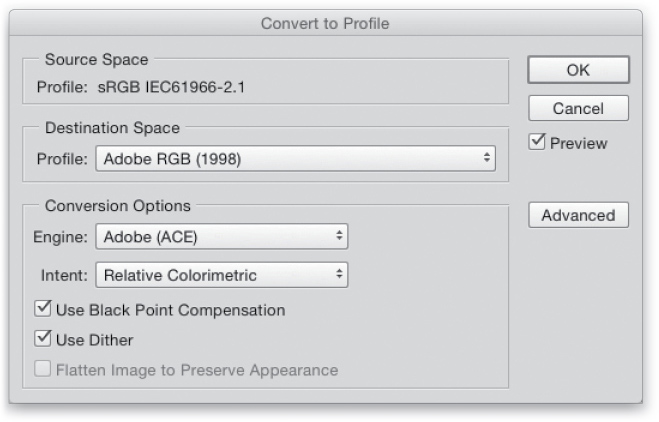
Tip: If you’re working with an image with a different profile than you want to print—say, the image is Adobe RGB (1998) and you need it to be in sRGB because you’re having an online lab do the printing—you may want to view it in that other color space first and then convert its profile. To do that, choose View>Proof Setup>Internet Standard RGB (sRGB) or whatever colorspace you want to soft proof. Next, choose View>Proof Colors or press Command-Y (PC: Ctrl-Y) to see your image in sRGB. If the image looks good, you’re done. If it doesn’t, use the method of your choice to make the colors look like you want (say, using a Hue/Saturation adjustment layer). When you’re finished, choose Edit>Convert to Profile, and in the resulting dialog, choose sRGB (or whatever colorspace you soft proofed) from the Profile drop-down menu in the
Destination Space area, and click OK.
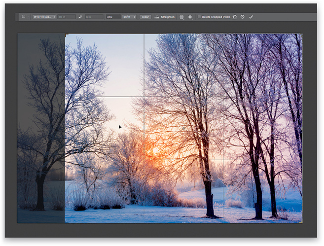
Step One:
Make sure you’ve cropped, corrected, and resized the image and set its resolution (pixel size) to be appropriate for your printer. Press C to activate the Crop tool and choose W x H x Resolution from the crop size drop-down menu in the Options Bar. In the fields to its right, enter your dimensions, including the unit of measurement for the width and height fields: 10 in x 8 in at 350 ppi in this example. Resize and reposition the crop box to your liking and then press Return (Enter) when you’re finished.
Step Two:
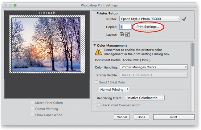
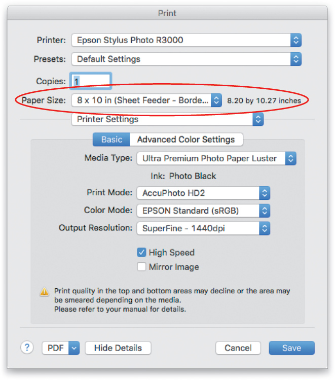
Choose File>Print or press Command-P (PC: Ctrl-P). From the Printer menu at the top of the dialog, pick your printer. (If your printer isn’t listed, visit the manufacturer’s website and download the latest driver for it.) Click the icon of the layout you want, portrait or landscape, and then click Print Settings. The resulting dialog belongs to your printer, not Photoshop, so the settings you see may be slightly different from the ones shown here.
Step Three:
From the Paper Size menu, choose your paper’s dimensions. If you’re printing borderless, be sure to choose a borderless version of the paper dimension you picked. Next, choose Printer Settings from the menu in the middle of the dialog. The wording of your printer’s dialog may vary, so you may have to root around for these, or similar, settings.
From the Media Type menu, pick the paper you’re printing on (say, Ultra Premium Photo Paper Luster). Leave the Print Mode menu alone, as your printer automatically sets it to the appropriate mode for the Media Type you choose. The Color Mode menu is controlled by the Color Management section of the Photoshop Print Settings dialog (discussed next). Think of the Output Resolution menu as a quality setting; your printer automatically adjusts it based on the Media Type you chose earlier so you don’t need to change it. The High Speed checkbox lets your printer’s print head print while it’s moving in both directions instead of one. (If you turn it off, your image will print more slowly, but it might look a little better.) Click Save (or OK, or the equivalent button) to close your printer’s dialog and return to the Photoshop Print Settings dialog.
Step Four:
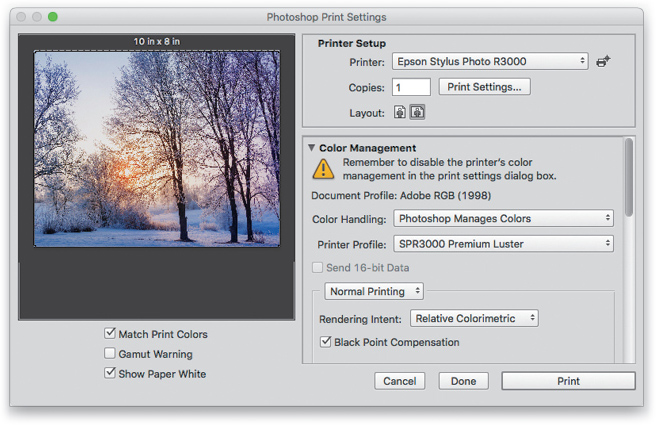
In the Photoshop Print Settings dialog, make sure your image perfectly fills the print preview area at left. If it doesn’t, you may need to adjust the size or resolution you used in Step One, or you can turn on the Scale to Fit Media checkbox in the Position and Size section farther down in the dialog (see image in Step Five) to make the image fit the paper. (If you go that route, make sure the Print Resolution that Photoshop reports to the right of the checkbox is high enough to produce a good print.)
Next, use the Color Handling menu to control whether Photoshop or your printer driver converts the image’s colors from RGB to the printer’s colors. For the brightest and most vibrant colors, choose Printer Manages Color, and then skip to Step Five. For more accurate results, however, choose Photoshop Manages Colors, and Photoshop automatically turns off the Color Mode menu in your printer’s dialog (mentioned in the previous step).
It’s worth experimenting with both options, but you’ll likely find that letting Photoshop manage colors gives you higher quality and more consistent results if you’re using paper-specific profiles. If you pick Photoshop Manages Colors, take a peek beneath the print preview and make sure Match Print Colors and Show Paper White are turned on, which gives you a decent onscreen proof in the preview area.
Tip: You can drag the lower-right corner of the dialog to enlarge it, and the preview area, to get a good sense of what the print will look like.
From the Printer Profile menu, pick the profile that matches the paper you picked in the previous step. From the Rendering Intent menu, choose Relative Colorimetric, and then make sure the Black Point Compensation checkbox is turned on. These options help maintain the color relationships in your image, and preserve contrast by making sure that the black shadows in your original RGB image are black in the final print. If you’re printing a 16-bit image, be sure the Send 16-bit Data checkbox is turned on.
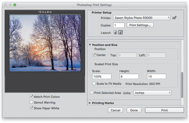
Step Five:
Scroll down in the dialog and in the Position and Size section, make sure the Center checkbox is turned on. If you didn’t crop your image before starting this process, this setting makes your image print from the center outward—as much of it as will fit on the paper size you picked—instead of aligning the upper-left corner of the image with the upper-left corner of the paper. In the Scaled Print Size area, make sure the Scale option is set to 100%.
Step Six:
Click Print and listen for the pitter-patter of your printer firing up.
When it’s finished, you’ll finally see the fruit of your hard WYSIWYG labor in the form of a gloriously accurate, high-quality print. Until next time, may the creative force be with you all!
This article originally published in the January, 2018 issue of Photoshop User magazine.


