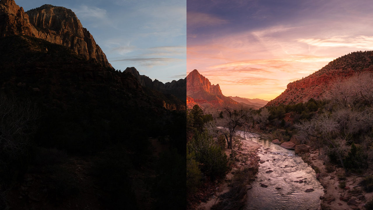
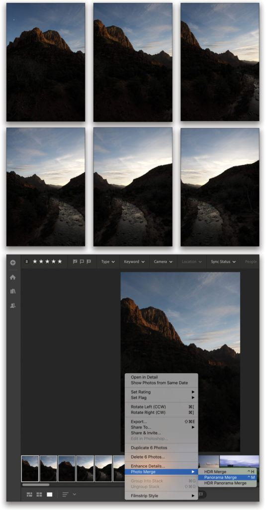
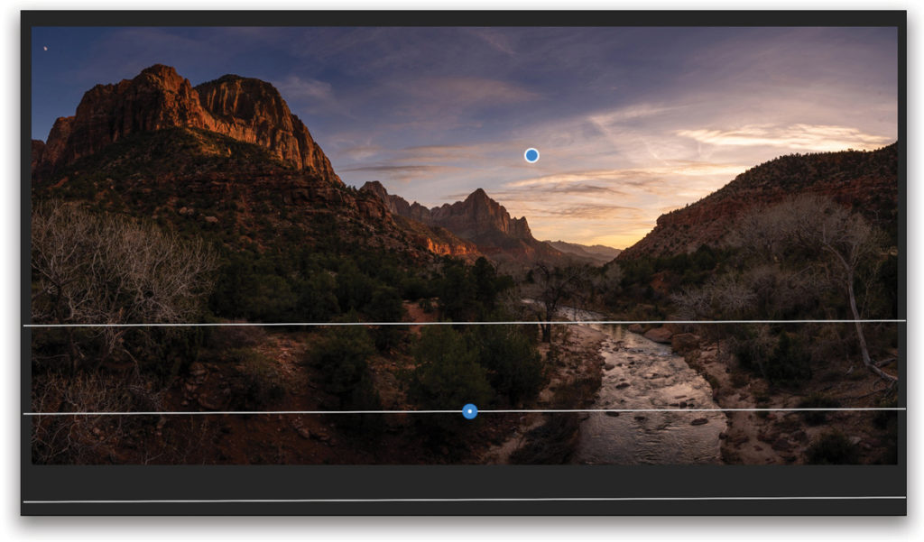
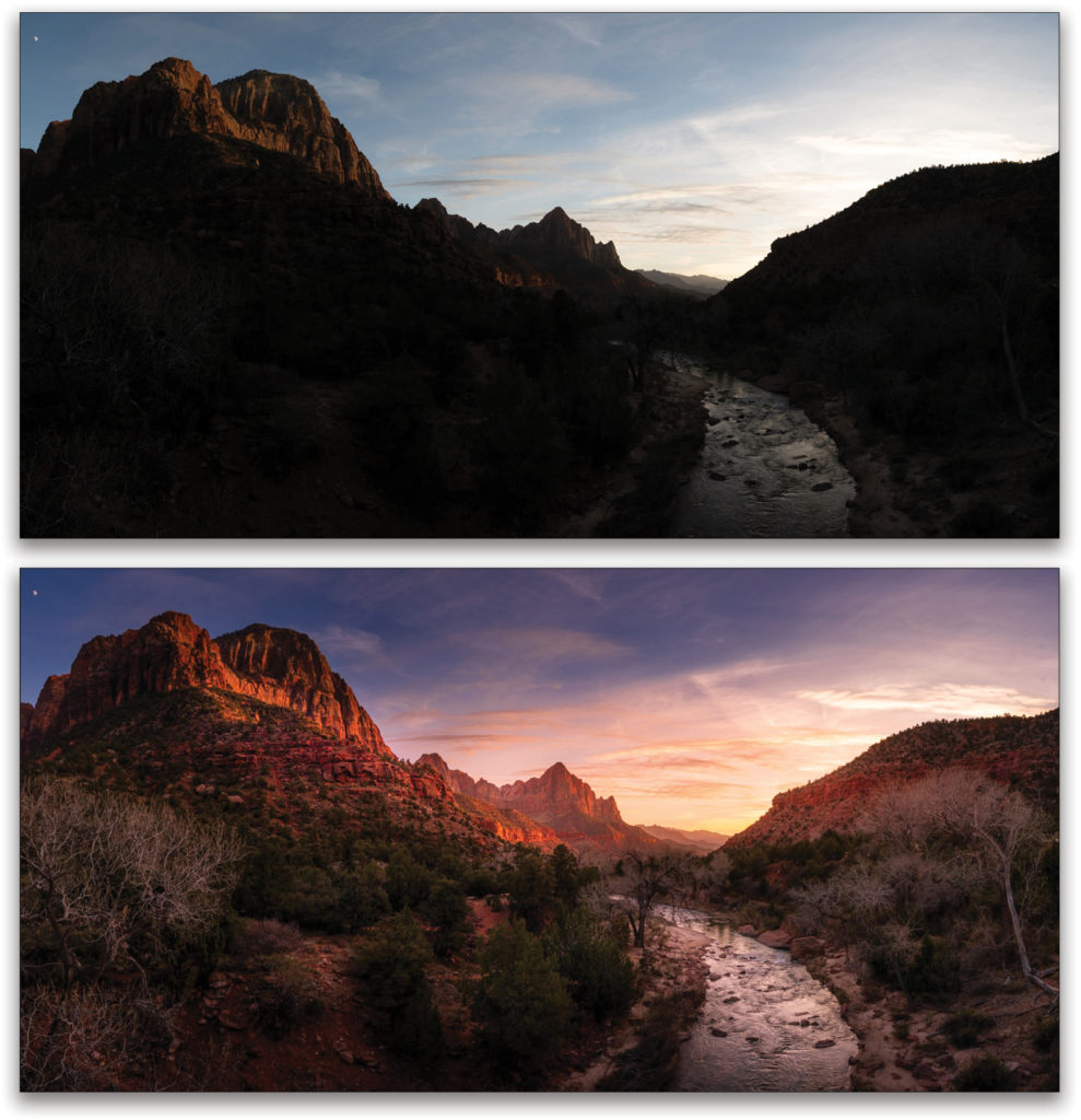
This is a panorama taken in Zion National Park, Utah. I shot this panorama by taking six portrait (vertical) shots of the scene. They’re very underexposed because they were shot toward the sun and I didn’t want to do HDR, so the best option to get as much data as possible was to underexpose. In this article, I’m going to show you how I created and retouched this panorama in the cloud-based version of Lightroom.
Step One: Once you have your photos for your panorama, you can import them into the cloud-based version of Lightroom by going to File>Add Photos, or clicking on the plus icon at the top left of the interface. Once imported, click on the first image and Shift-click the last image to select all your photos for the pano. Then Right-click on one of the selected thumbnails and choose Photo Merge>Panorama Merge.
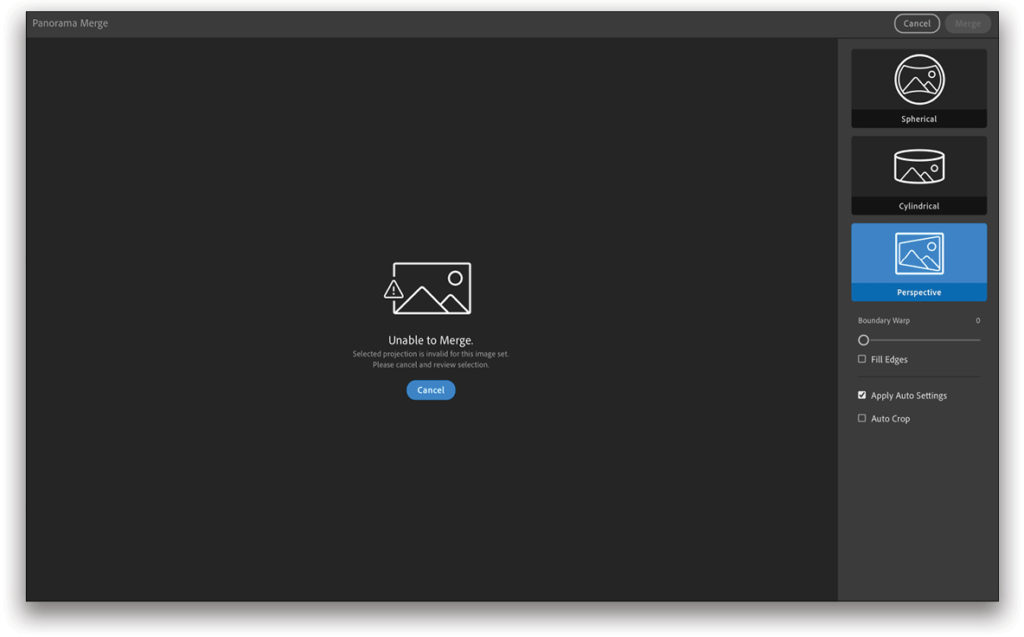
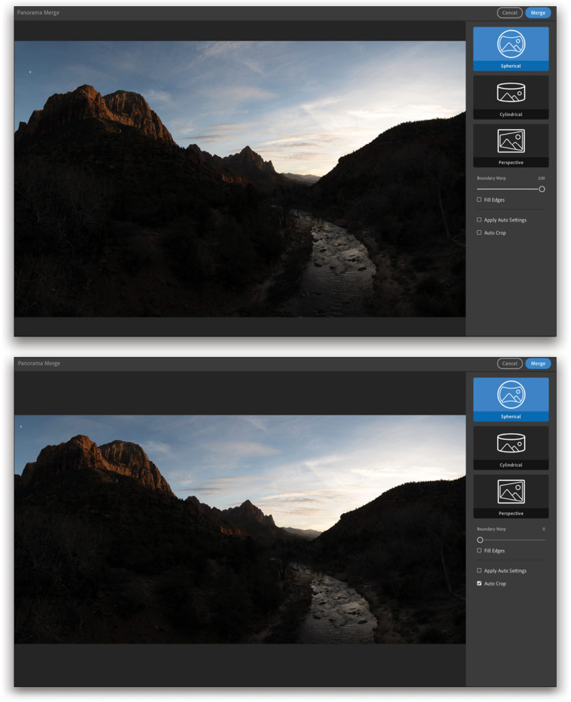
Step Two: You’re now in Panorama Merge. Here, you have different kinds of projections from which to pick, depending on your photos: Spherical, Cylindrical, and Perspective. Projections are simply different ways of stitching the photos together. Note: If you shot at too wide of an angle (like I did in this example), you won’t be able to use Perspective. Instead, you’ll get an error message. To use the Perspective projection, you need to shoot your photos at around 35mm or above—50mm would be perfect.
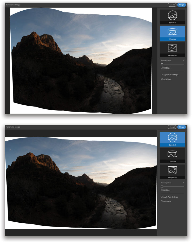
Step Three: This panorama is a wide-angle shot, so it works well with the Spherical and Cylindrical projections. Try both projections with your images to see what works best. You can see in this example that I get a bit more sky with the Cylindrical projection than with the Spherical projection. But I really want to go for the pano look, so I think Spherical looks more appropriate on this specific example.
Step Four: You can drag the Boundary Warp slider to the right to extend your photo and fill in the missing information around the edges. You can also choose the Auto Crop option instead, and Lightroom will crop your photo for you, giving you a shorter, wider image. For this photo, I went with Auto Crop because I don’t really need the extra pixels created by Boundary Warp. When you’re happy with the settings, simply click the Merge button in the top-right corner.
Step Five: Now that we have our panorama created, we can go into development! Whenever you have a lot of dynamic range in the highlights and the shadows, you can underexpose your photo as I did here. Just by opening up the shadows in Lightroom, you can get a lot of data back. So, click on the Edit icon at the top right (it looks like three sliders), expand the Light section, and drag the Shadows slider to +100.
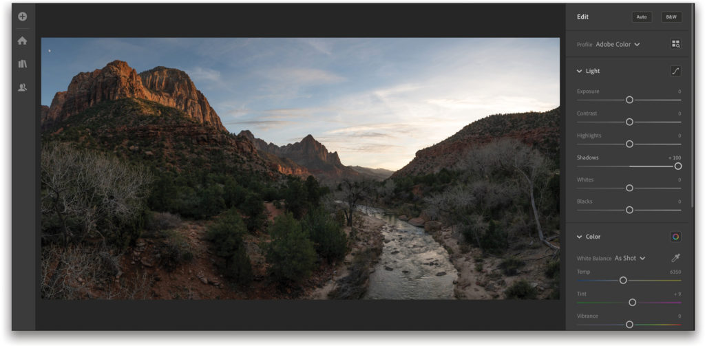
Step Six: Next, we want to bring down the highlights, but we don’t want to overdo it. For this example, I set the Highlights slider to –60. This number will depend on your photo and its light situation.

Step Seven: To finish the basic retouching of the exposure, add some contrast. In this example, I dragged the Contrast slider to +36.
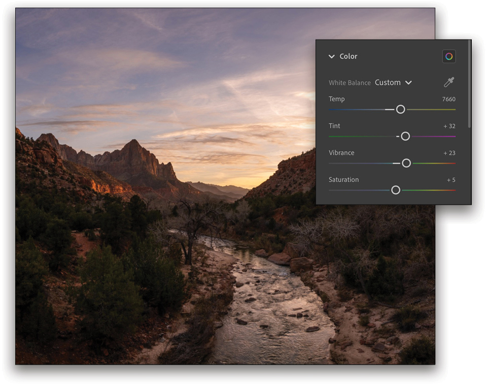
Step Eight: Now expand the Color section so we can go into the white balance. Personally, I love a sky that’s orange around the horizon, but where the top of the sky is bluer. If you drag your Temp slider too far toward yellow, you’ll have a great sunset, but the blue in the sky will look grayish. To fix that, let’s set a not-too-dramatic white balance: drag the Temp slider to 7660, and then for the pop, set the Tint to +32 to add a little bit of magenta. Also add a little bit of Vibrance (+23) and Saturation (+5).
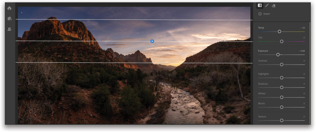
Step Nine: Moving on to local adjustments, let’s start by clicking on the Linear Gradient icon (the square) on the right (you can also press the letter L on your keyboard). First, make sure that all the sliders are set to 0. Tip: If a slider is set to any value other than 0, hover over its name, and its name will change to Reset.
Let’s get back to that blue sky that I mentioned earlier. For that, simply drag the Temp slider to –10 and lower the Exposure slider to –0.68. Then, click near the top of the image and drag down to add the filter, which creates a nice gradient on top of your sky (as shown here).
Step 10: To really close your image and attract the eyes of your viewer into the photo, you can add another Linear Gradient filter using the same settings at the bottom of your photo. This time, start just below the photo and drag upward.
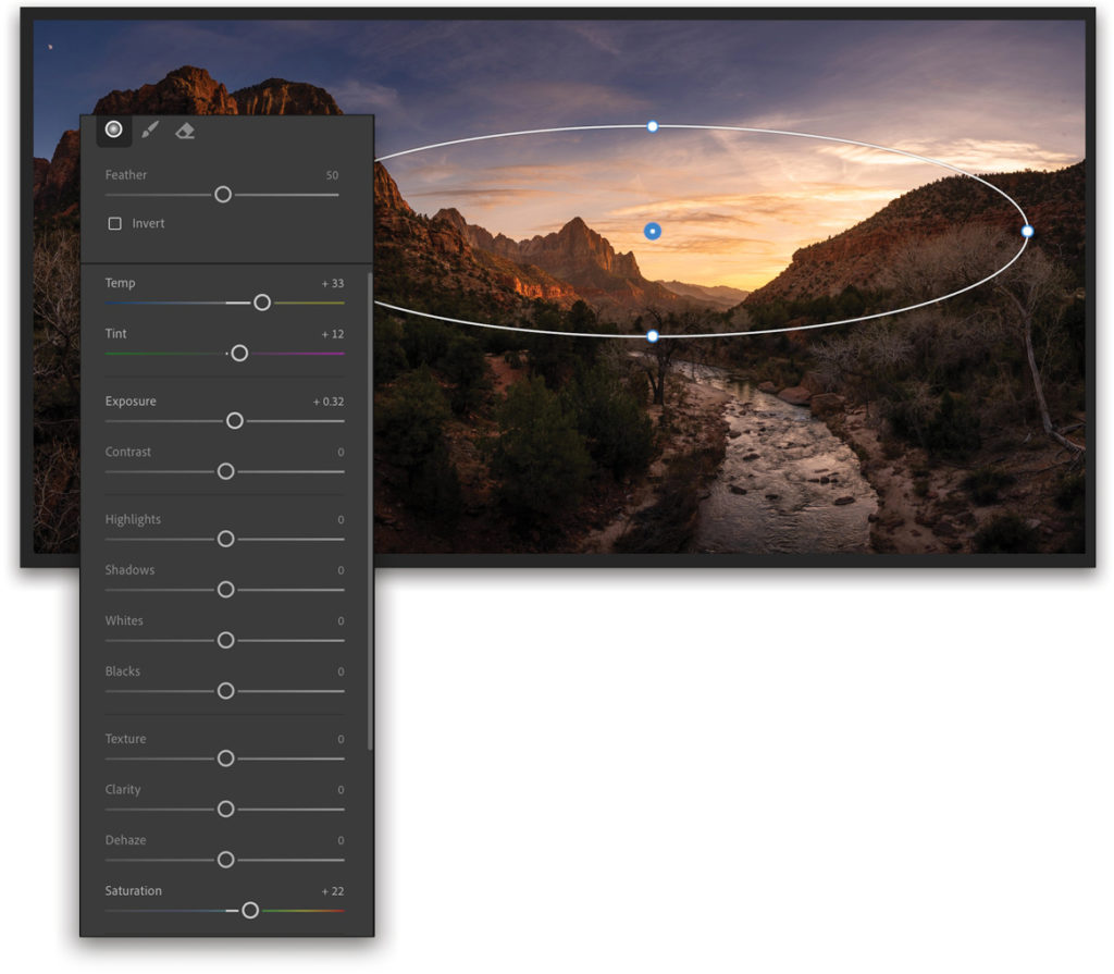
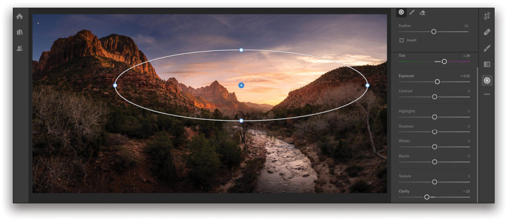
Step 11: For a sunset that pops more, click on the Radial Gradient icon (the circle) on the right (or press the R key on your keyboard), place your cursor over the sunset, and click-and-drag outward. Then, you can play around with the sliders until it looks good. For this shot, I set the Temp to +33, the Tint to +12, the Exposure to +0.32, and the Saturation to +22.
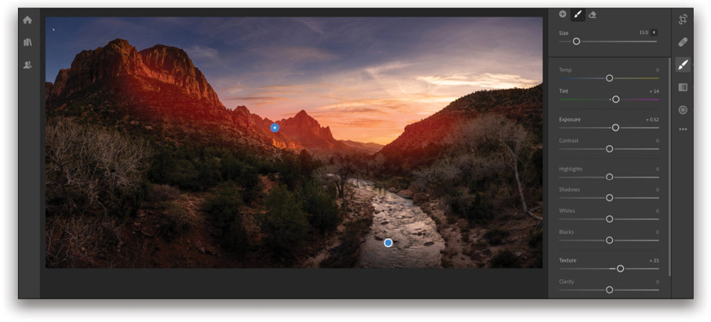
Step 12: Now let’s use the Brush tool. What I love about the Brush tool is that you can really tailor your photo, highlighting some parts of it to make it more interesting, so this is exactly what we’re going to do. Click the Brush icon on the right (or press the letter B), reset all the sliders to 0, then boost the Exposure to +0.52 (not much more than 0.50 or you’ll notice the brush too much and it becomes distracting) and the Texture to +23. Now you just have to paint the areas that you want to enhance, such as the river, some of the bushes, and the mountain in this scene.
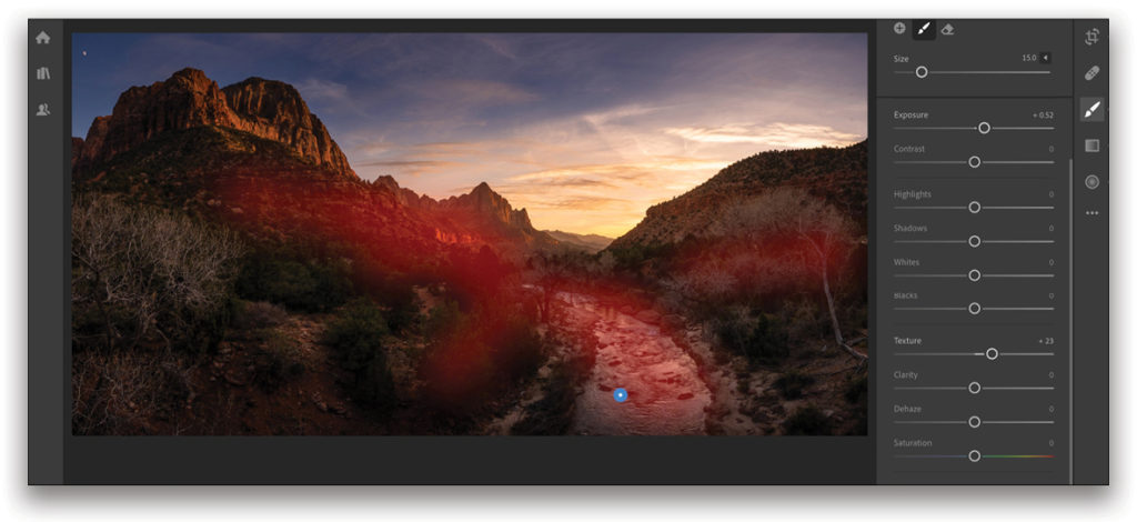
Step 13: You can create a new brush for each item you want to paint by clicking the + (plus sign) icon at the top of the Brush settings. That way, it’s easier to fix individual areas with different brush settings; for example, I want to add some magenta (set the Tint to +14) in the area of the sunset to really enhance this photo.
Step 14: From here on, it’s just a matter of tweaking the photo the way you want. I went back to the Radial Gradient and boosted the Tint to +29 to add more pop, and then lowered the Clarity to –23 because I wanted to make the clouds more puffy and less defined. It really makes a huge difference. Having too much contrast and definition in the clouds is a common mistake that people make. It automatically looks like your photo has been highly retouched. So our purpose here is to create something pleasing to the eyes, not something distracting because of the retouch.
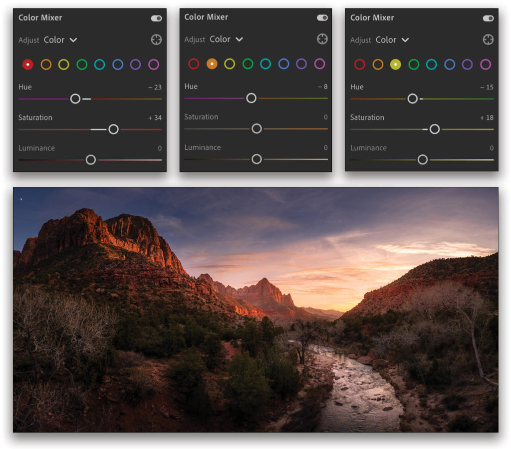
Step 15: If you love colors like I do, you’ll be interested in this cool feature called Color Mixer. You can intensify your colors by making them more saturated or changing their hue. I love doing that with sunsets, so click back on the Edit icon on the right, and under Color, make sure Color Mixer is turned on. Here I chose Color from the Adjust menu, then picked red, and set the Hue to –23 and the Saturation to +34. For orange, I set the Hue to –8. I finished with yellow, and set the Hue to –15 and the Saturation to +18. I feel the rocks and the sunset stand out more with that technique. You can turn the Color Mixer off and on to compare the differences.
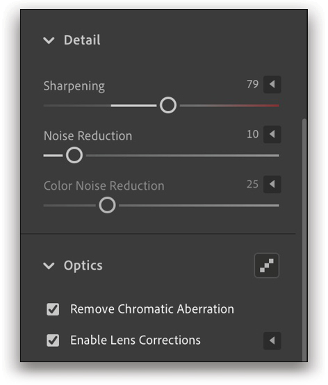
Step 16: The final touch is to step back and take a look at the overall photo. Here, let’s add some more Vibrance by dragging the slider to +39. Also, let’s not forget the Detail and Optics sections. Under Optics, you can turn on the Remove Chromatic Aberration and Enable Lens Corrections checkboxes. Under Detail, you can sharpen the photo. My magic formula is that the sum of Noise Reduction and Sharpening should equal around 100, so in this example, I set the Noise Reduction slider to 10 and the Sharpening slider to 79. I also set the Color Noise Reduction to 25. And here’s the final result!
Now you can truly say that you shoot and edit panoramas like a pro. Have fun with those techniques and make some incredible panoramas!
This article originally published in Lightroom Magazine, Issue 58.


