We’re amazingly fortunate to wander our planet with our cameras in hand to bring back to others the wonders that we witness. It’s a very passionate affair, which greatly influences how we see and make our photographs. We all know the process we go through to bring back our stories in our photos, and we’ve all experienced the moment when showing our photos to others that we’ve said, “This doesn’t do the scene justice.”
If we could share our photos from our memories, they’d always look perfect, but we have to rely on what I affectionately call “the cold-hearted bastard” (the camera) to do the job. Compared to our eyes, mind, and heart, sometimes the camera needs a helping hand. That’s why when we’re processing landscape photos to try and bring them back to where they represent what we saw and felt when we took them, we must understand that the key to finishing is to know where we started!
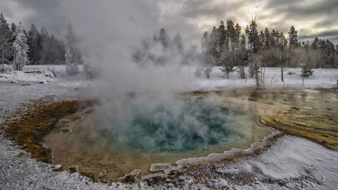
Yellowstone National Park
There’s a magic to Yellowstone National Park, which is magnified when it’s blanketed in white. Many of its unique and subtle colors become emeralds against the white backdrop, instantly grabbing the eye and heart when bringing the camera up to take the shot. With exposure and white balance set, and all the wanted elements included and unwanted elements excluded, we make the click to the best of our ability. This gives Photoshop the best data in which it can perform its finishing magic.
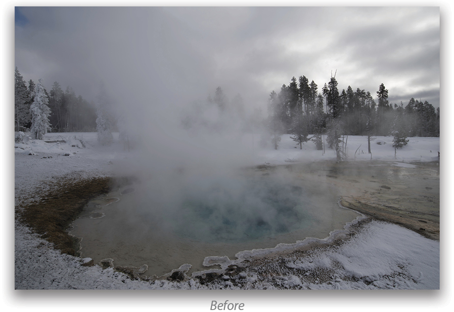
For many reasons, the scene that you witnessed isn’t the photo the camera brought home, and once you understand that, you can quickly and easily bring that memory back to your photo. You could ask, “Which came first, the pixel or the egg?” You need to start by understanding that our mind’s eye sees all the right colors, whereas our cameras—which aren’t influenced by physiology, but rather run on numbers—can be easily influenced. In this case, it set the white balance lower than it really was.
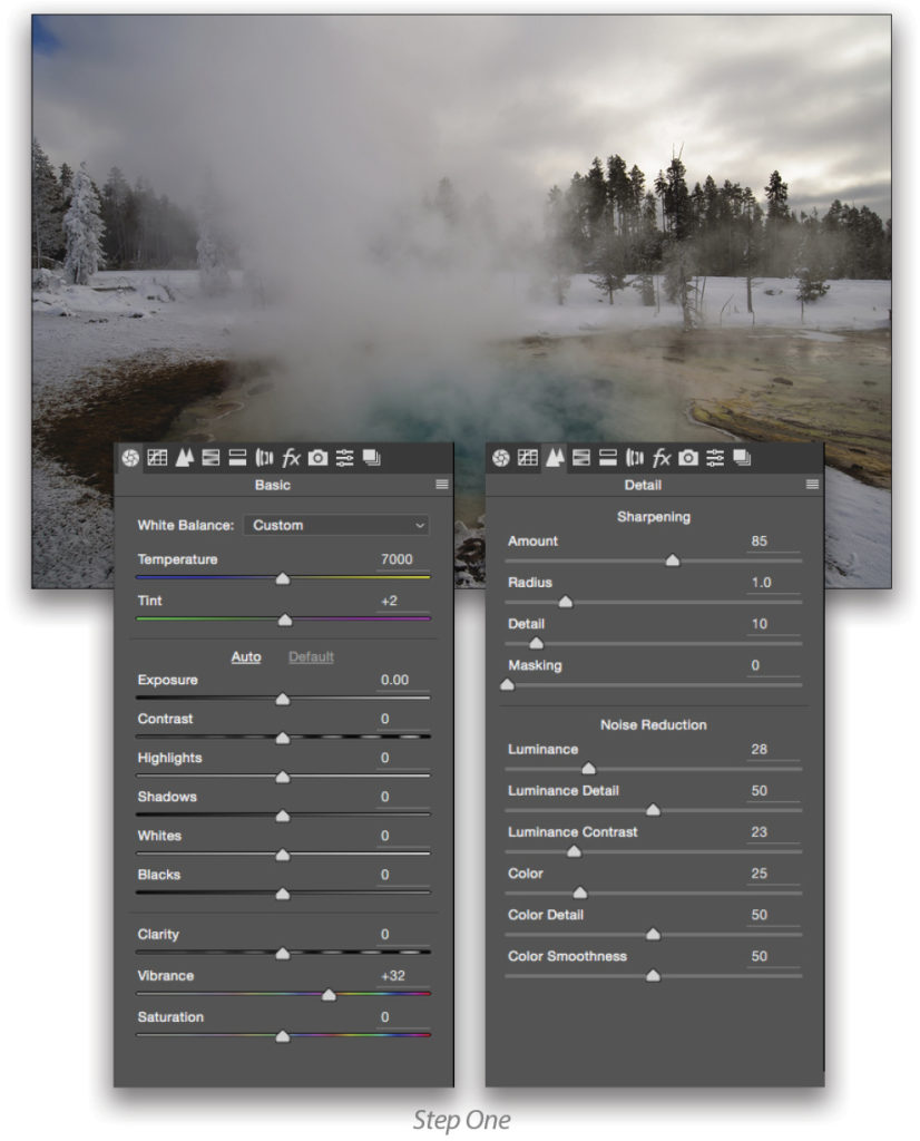
Step One:
I started by opening the NEF file in Adobe Camera Raw (ACR) and applying my Landscape preset (which you can learn more about in my KelbyOne class Landscape Photography: Post-Processing in Camera Raw) and on my website). This preset is set up to mimic the setting in my camera when I took the picture. My Landscape preset sets the Vibrance to +32 in the Basic panel, and applies sharpening and noise reduction. Next, I clicked on the snow in the lower-right corner of the thermal with the White Balance tool (I). That brought the white balance up to 7000, but more importantly, it brought back some of the rich tones that made me stop to shoot this scene in the first place.
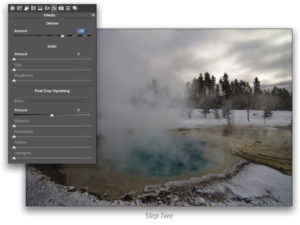
Step Two:
After setting the white balance, I used the Dehaze slider in the Effects panel (fx) to decrease the overall haze in the image created by the steam, which in turn added contrast to the image.
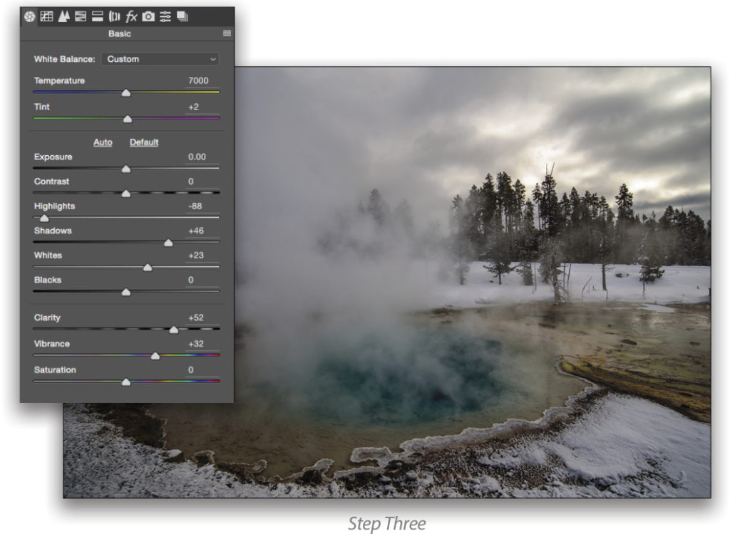
Step Three:
With these basics in place, we can start finishing. The light was on the flat side so exposure-wise, the photo still lacked contrast, but there’s tons of color contrast. That’s what made me stop in the first place and which I’ll now bring to life. In ACR, the sliders in the Basic tab aid us in bringing out that color contrast. In the screen grab below, you can see a whole bunch of movement in these sliders. Understand that these are for this photo and how the scene emotionally moved me; these aren’t magic numbers to be used with every photo you take. What you should take away from this is the relationship of the sliders; for example, how Shadows and Whites are opened up, but the Highlights are brought down. That combo makes the thermal, its steam and color, jump in the photograph.
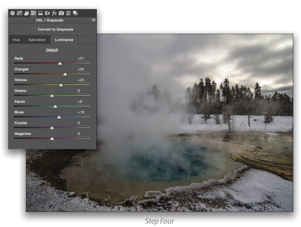
Step Four:
We aren’t done, though, as we can easily bring out that color contrast even more in ACR. Why is that important? The shades of color in the thermal, which indicate just how bloody hot it is, are important to speak of that heat, as well as what attracted me to it in the first place. So listen carefully, because this is what I like to think is one of my greatest secrets to finishing: the HSL/Grayscale tab. Click on Luminance first, as this permits you to target specific colors and affect their luminance—and that’s a beautiful thing.
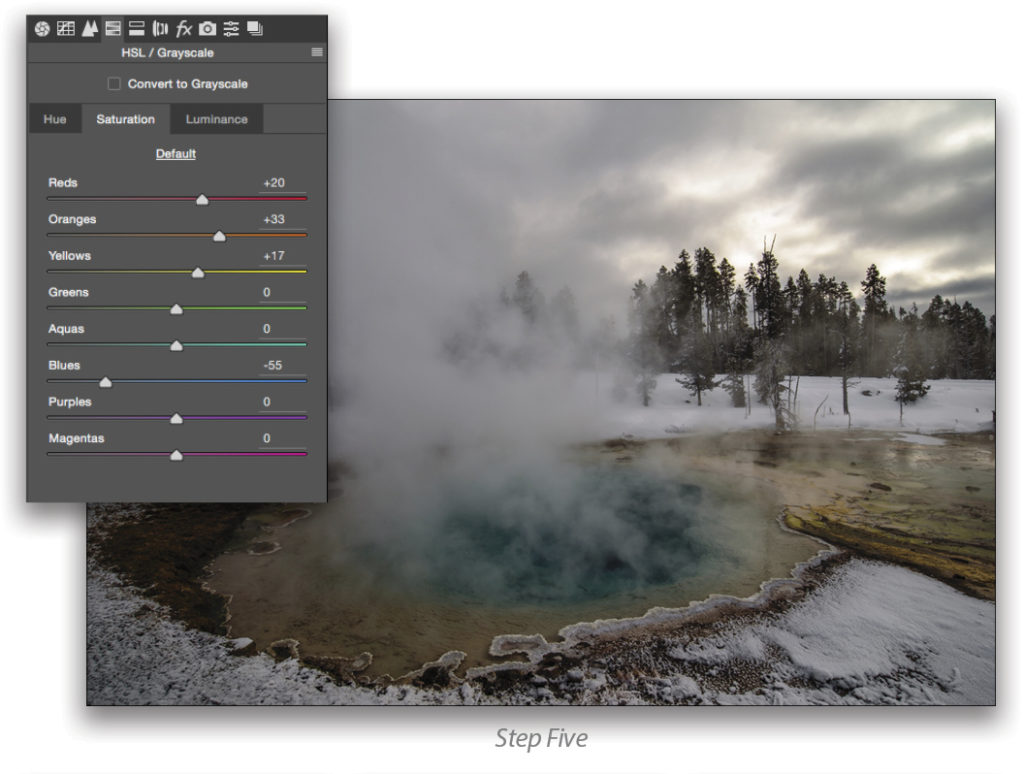
Step Five:
With that done (and you’re doing it for your photographs, not some specific number), I headed to the Saturation tab to deepen specific colors and remove the influence of a bad color. Look at the Blues slider. I desaturated it. Why? The scene has enough cold, so I wanted to bring it down a notch, which warmed up the other colors. Also, all of the other adjustments that I had made up to this point had made the blue sky look like something from a bad HDR. Skies don’t look like that, so that one slider took care of both warming the photo and fixing the sky in one fell swoop.
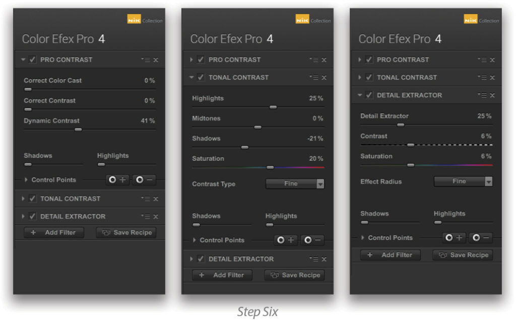
Step Six:
When in ACR, make sure that the option is checked to Open in Photoshop as Smart Objects. You can find this option by clicking on the link at the bottom of the ACR window to open the Workflow Options dialog. Once in Photoshop, it’s time for the final coup de grâce. What might that be? Well, Nik Color Efex Pro 4, of course! As you probably know by now, the Google Nik Collection is free to everyone.
I do have a specific recipe for these that you can download from here. In this case, applied the Pro Contrast, Tonal Contrast, and Detail Extractor filters.
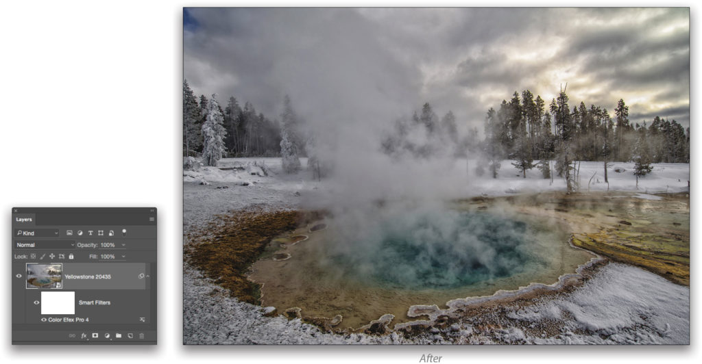
And that’s it, the photo is finished and it took less than a minute total of digital darkroom time. The key is connecting the dots of what you saw and felt, and understanding what the camera did and didn’t connect in that process. Knowing where you started makes your finishing so much simpler!
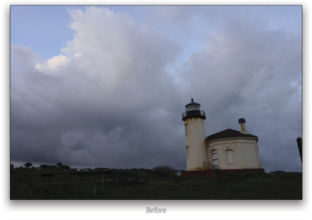
The Lighthouse
Our finishing is only as difficult as we want to make it. As an example, I offer up the Coquille River Lighthouse, a longtime favorite of mine. Located on the Coquille River in Bandon, Oregon, it’s no longer in operation. And there isn’t a single squared-up wall or line anywhere in the structure. But it’s located in an incredibly moody place just screaming to have its photograph taken. You might see its shape and the mood and wonder how you can bring that home with you. Actually, it’s really easy. Here are some ideas how you can do it.
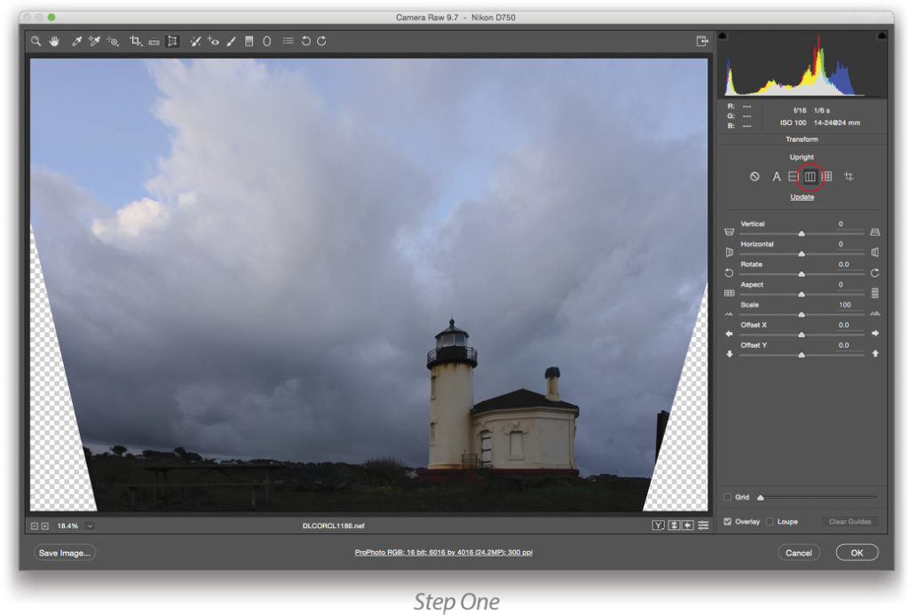
Step One:
You just can’t make this stuff up. To clean up all the lines, I simply went into ACR, activated the Transform tool (Shift-T), clicked on the Vertical icon below Upright, and I was done. (I’ll fix the resulting transparency in the bottom corners later in Photoshop.)
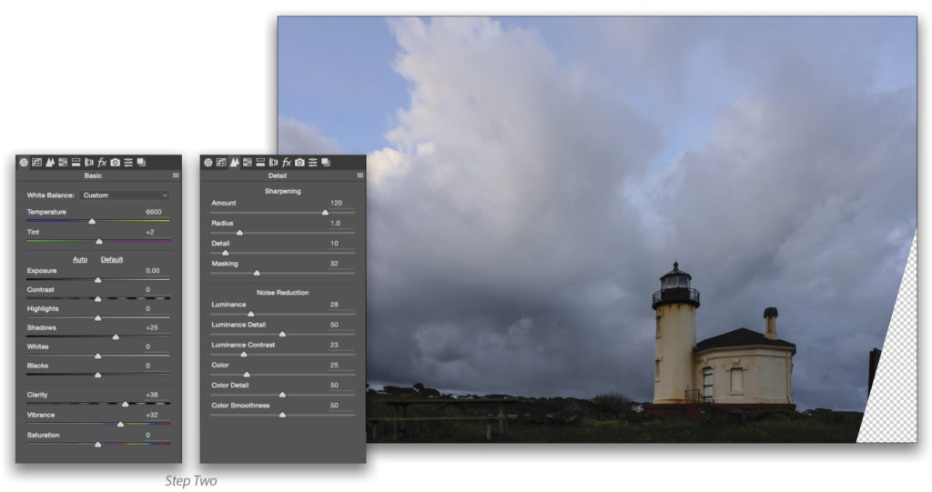
Step Two:
Then, after a little work in the Basic and Detail tabs (like in the Yellowstone National Park photo above), into Photoshop I went.
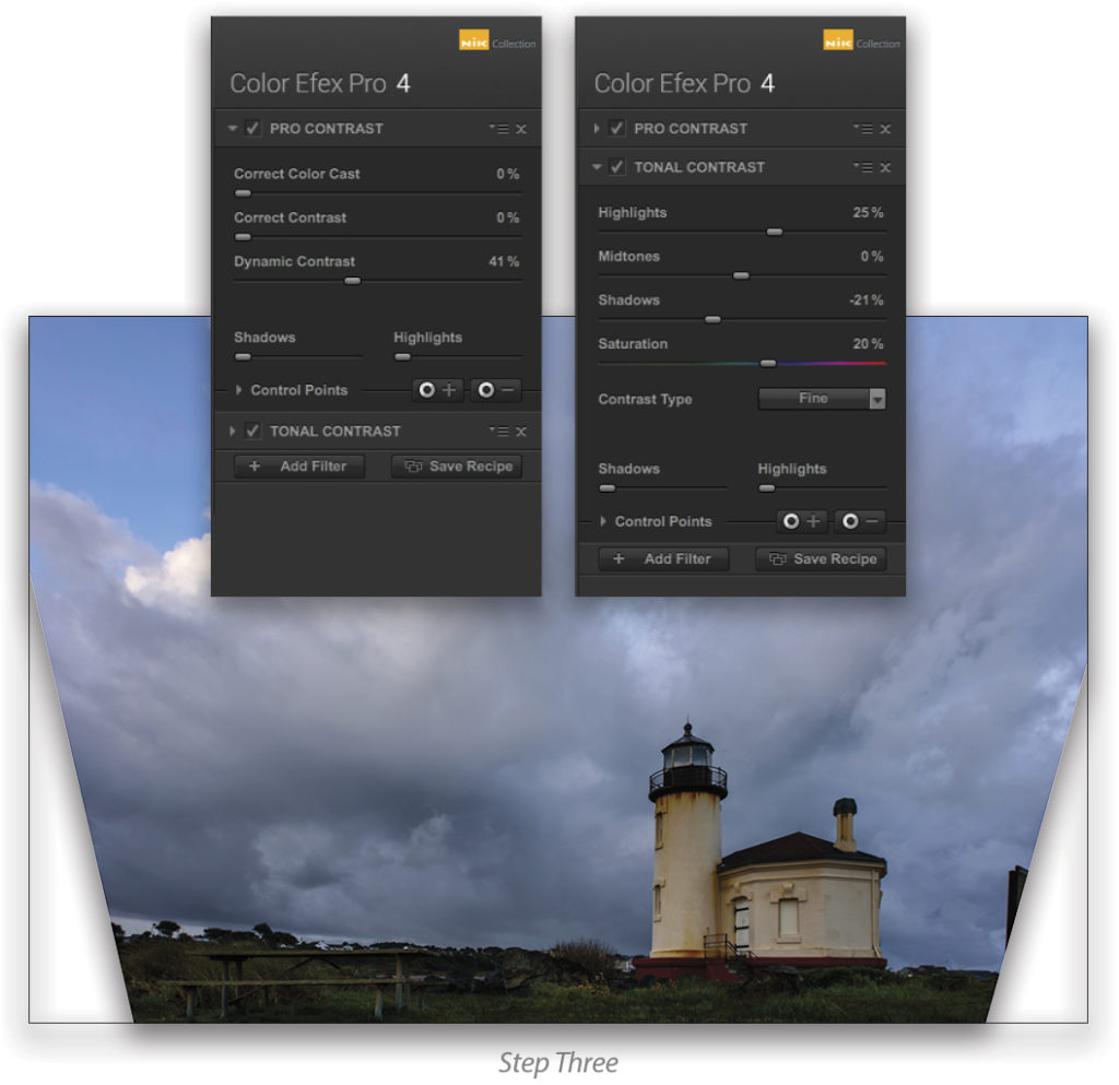
Step Three:
Once in Photoshop (working with a smart object as in the previous example), I applied the Pro Contrast and Tonal Contrast filters in Color Efex Pro 4. With this, the sea mist and stormy skies started to come to life in our photo.
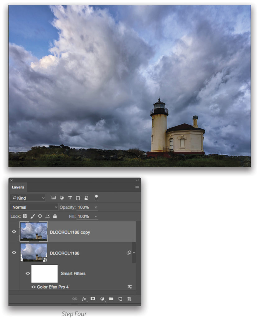
Step Four:
Now you might be wondering about those transparent areas in the left- and right-bottom corners. Well, knowing where I wanted to go and using the power of Photoshop, I took care of two finishing steps in the next single layer. Photoshop needs a layer with a thumbnail for these next two steps. To get that layer, simply press Command-J (PC: Ctrl-J) and rasterize it (Right-click on the layer in the Layers panel and choose Rasterize Layer). Now, grab the Lasso tool (L), select the right corner, and press Shift-Delete (PC: Shift-Backspace) to open the Fill dialog. Choose Content Aware in the Contents drop-down menu, check on Color Adaptation, click OK, and bang! The corner is now populated with mood. Repeat for the left corner. You gotta love how easy Photoshop makes it for us!
The last step for this same layer is to quickly select just the clouds (using the Quick Selection tool [W]) and apply the Detail Extractor filter in Nik Color Efex Pro 4 to the selection. You could stop there, but when it comes to romance and mood, you gotta go black-and-white (B&W). And since that takes only seconds, let’s do it!
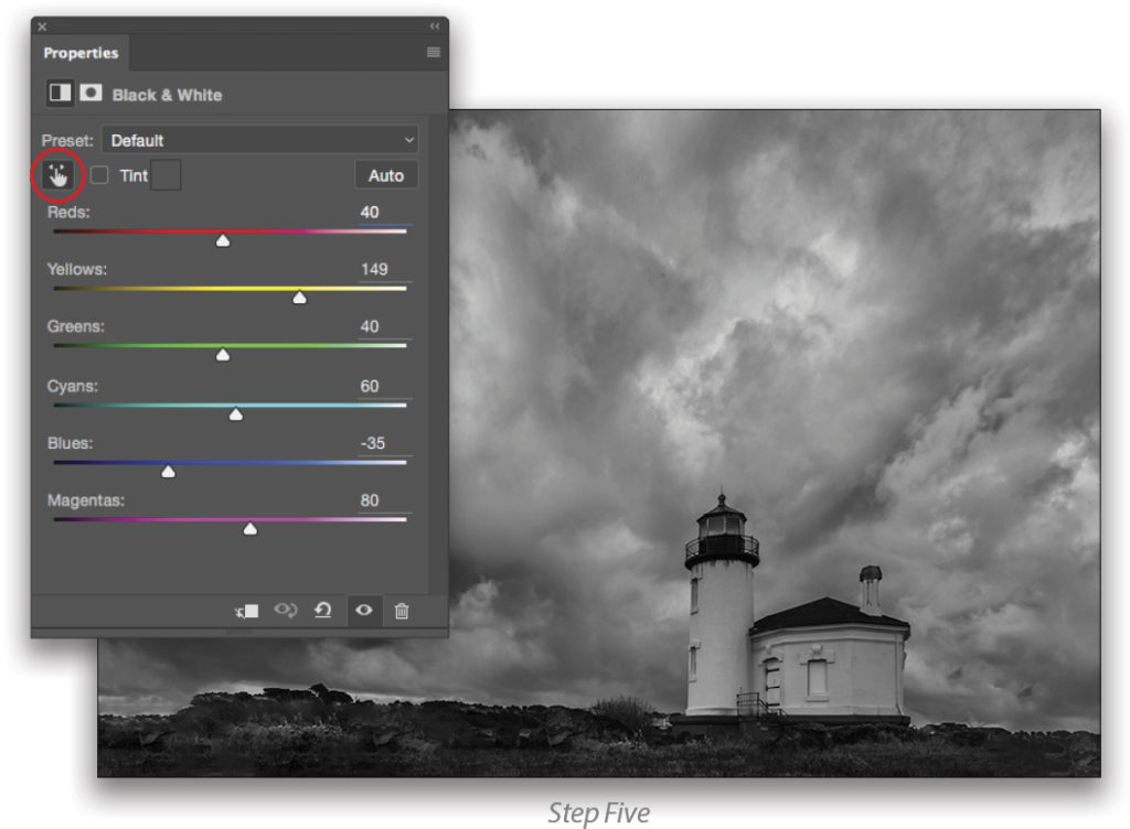
Step Five:
There are lots of ways of converting a photograph to B&W, and I’ve probably used them all. This is my current favorite, which is to say that I think more methods are still coming. It takes only seconds. Start by going to Layer>New Adjustment Layer>Black & White and clicking OK. Then click on what I call, “The Fickle Finger of Fate” near the top-left corner of the Properties panel. Click on the tones in your photo that you want to bring out, and drag left or right. In this case, I grabbed the gray in the left clouds and then the whites in the lighthouse. You can see the outcome in the sliders in the Properties panel from doing this.
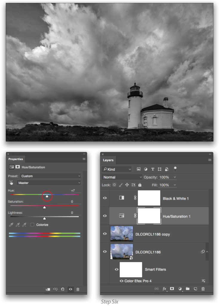
Step Six:
Next, go to Layer>New Adjustment Layer>Hue/Saturation and click OK. This layer will appear above the B&W layer you just created in the Layers panel, but you want to drag it down below the B&W layer. Click-and-drag the Hue slider back and forth in the Properties panel, and you’ll see your B&W image dance. Once you like what you see, stop making it dance, and you’re done.
The one camera setting or Photoshop slider you didn’t read about here is probably the most important one of all in the whole process: the heart! Since I was at these locales and knew where it all started, it was easy to finish. You can do the same thing with your photography because it’s your photography. What you’ve read here is just a start to the possibilities, both at the camera and the computer. Keep it simple and make it fun and you’ll find that finishing for the heart is photographically rewarding.
This article originally published in the December, 2016 issue of Photoshop User magazine.