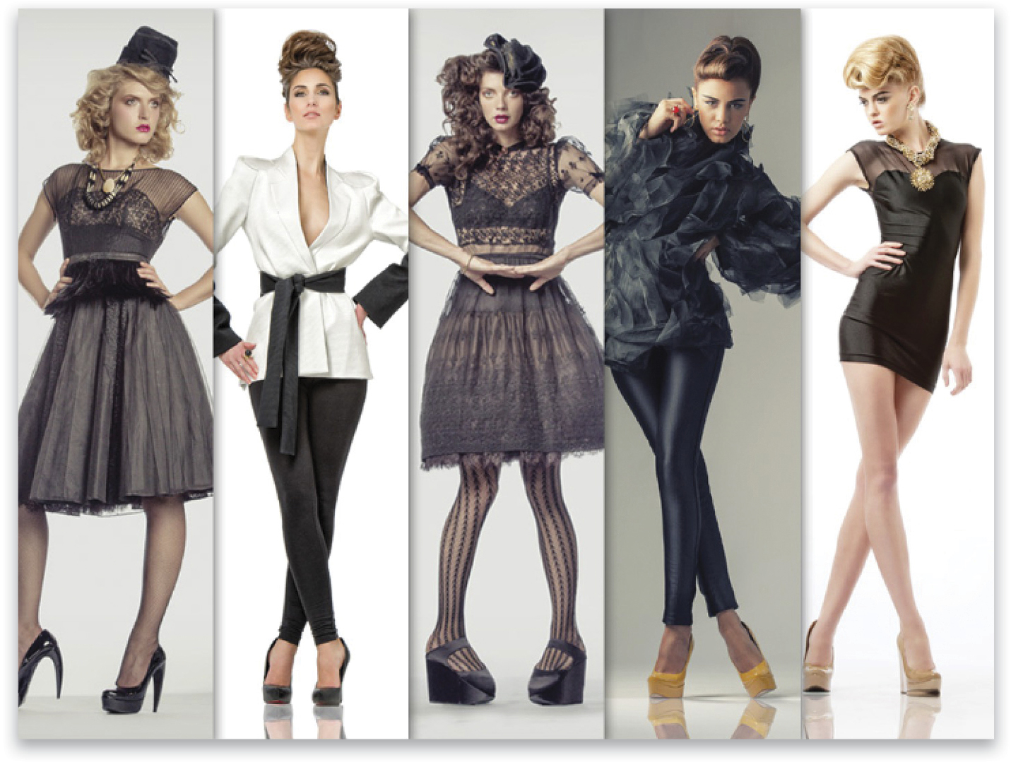
In this “Down & Dirty” we’re creating a multi-photo layout that you could use for anything from the front of a business card to a website slash page to the opening for a slide show or presentation. Setting it up the first time is easy—it just takes a couple of minutes, but the nice thing is that once you’ve created it, you can save it as a template. (If you’re comfortable with using smart objects, you could import each image as a smart object, rather than just opening them normally, which will make switching out the images in the future even easier.) Here we go:
Step One:
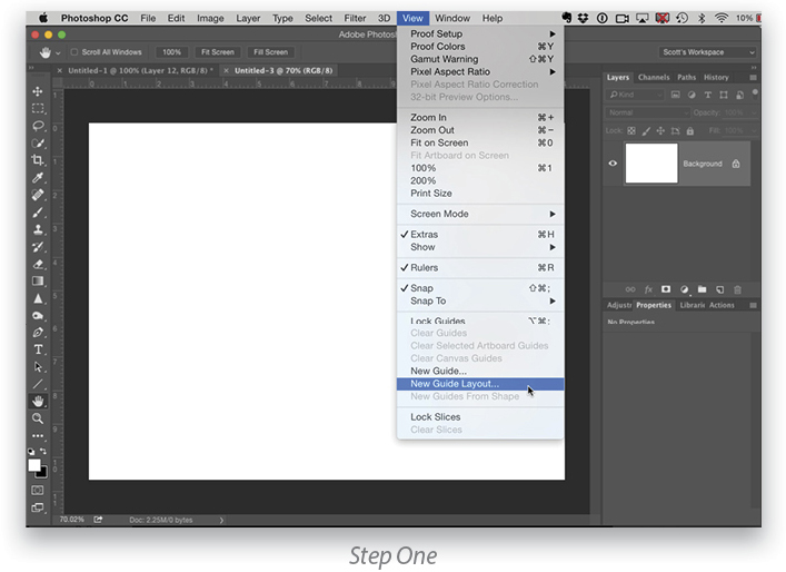
Create a new document (File>New) at the size that you want, then go under the View menu and choose New Guide Layout.
Step Two:
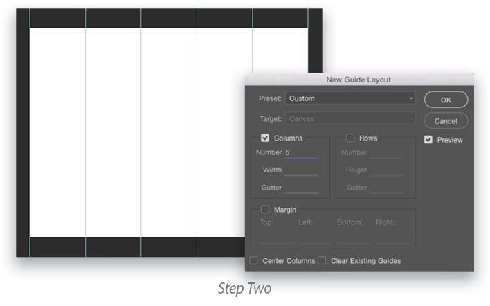
When the New Guide Layout dialog appears, enter the number of columns or rows you want. In this case, we’re going to do 5 columns, so enter 5. I set the Gutter to zero so there will just be one guide between each column. Click OK and it will divide your document into five even columns.
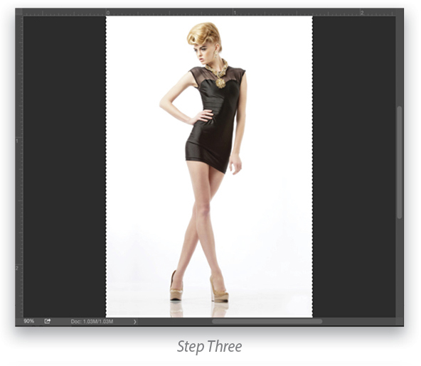
Step Three:
Now open the first image you want to appear in your layout (or go under the File menu and choose Open as Smart Object if you want to go the smart object route). Press Command-A (PC: Ctrl-A) to Select All and then Command-C (PC: Ctrl-C) to Copy that image into memory.
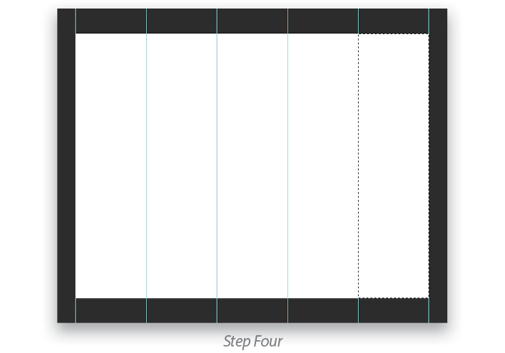
Step Four:
Return to the document that has your original layout, get the Rectangular Marquee tool (M), and make a rectangular selection of the entire far right column (as shown here). By the way, it makes things easier if you build this from right to left, and you’ll see why a little later.
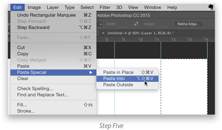
Step Five:
Now go under the Edit menu, under Paste Special, and choose Paste Into. This will paste the image that you have in memory into that tall rectangular selection you made just a moment ago.
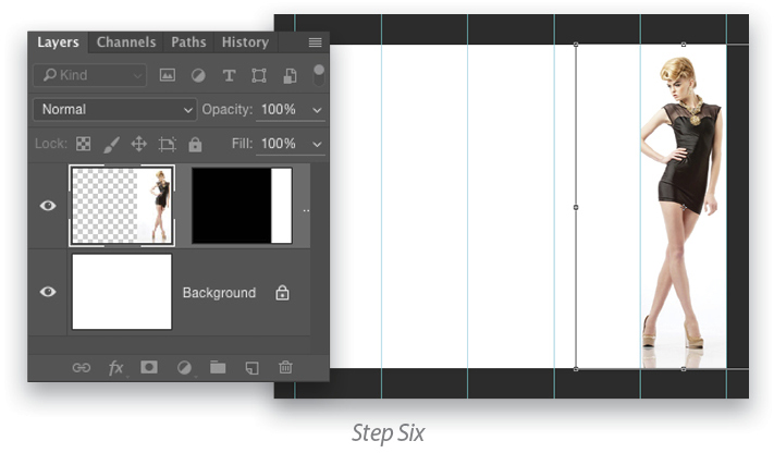
Step Six:
Once the image appears inside the selected area, you can use Free Transform to scale the image down to fit. Press Command-T (PC: Ctrl-T) to activate the Free Transform handles so you can resize the image. Hold the Shift key and drag a corner point to resize it proportionally. Once it looks good, press the Enter key to lock in your transformation.
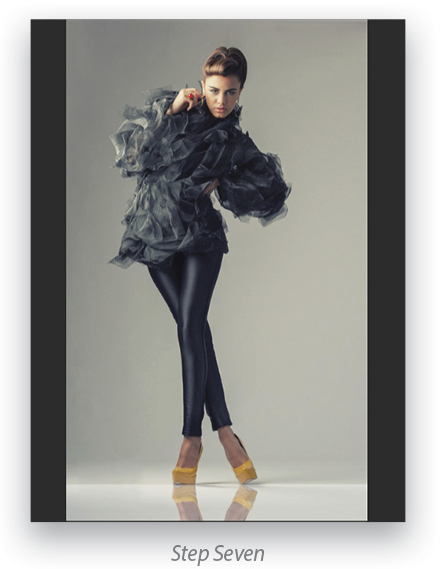
Step Seven:
Open the next image that you want to appear in your layout. Select it and then copy it into memory like you did with the first image.
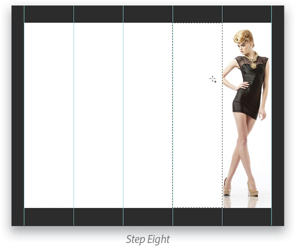
Step Eight:
Return to your layout document and make a rectangular selection of the second column from the right, as shown here.
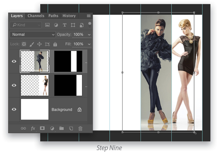
Step Nine:
Now choose the Paste Into feature again to paste the image from memory into that second column from the right. You’ll also need to use Free Transform again to make sure the size is consistent with the first image.
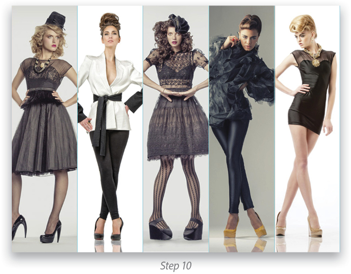
Step 10:
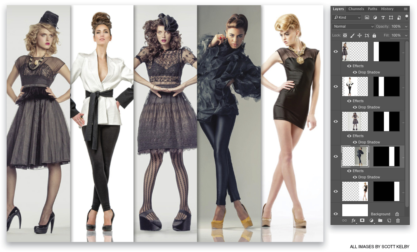
Now you’re just going to repeat the same process of opening an image, copying it into memory, returning to your layout, making the tall rectangular selection, and pasting your image into that selection. Here’s what it looks like after I’ve pasted all five images.
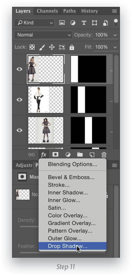
Step 11:
Now we’re going to add some depth starting with the image on the left. This is where starting on the right pays off. We’re going to add drop shadows so it looks like the image on the left is the frontmost image, and because you built this from right to left, they’re already stacked in the right order in the Layers panel. With the top layer active, click on the Add a Layer Style icon (fx) at the bottom of the Layers panel, and choose Drop Shadow. When the dialog appears, you can either click OK or you can add your own settings. I just clicked OK using the default settings.
Step 12:
Right-click on the name of your top layer where you’ve added a drop shadow and choose Copy Layer Style. Then, Right-click on the names of each of the other layers, choose Paste Layer Style, and it will paste that same exact same drop shadow onto those layers. That’s all there is to it.
Originally published in the May/June 2016 issue of Photoshop User magazine.