We see the world in color; and for over half a century, our cameras, whether film or digital, have rendered scenes in vibrant color photographs. Early practitioners, because of the limitations of their technology, were relegated to just black-and-white photographs, while modern photographers have the creative choice to create images either in color or black and white.
I emphasize the word “creative,” because the decision to use either method of reproduction is rooted in my intent. With the power and sophistication of today’s cameras, software, and printers, we can render a scene/subject in any way. We can strive for an “accurate” representation of the subject, or manipulate colors and tonality to produce a more subjective interpretation. The choice to work in either color or black and white is just one of the many decisions we make between conceiving a photograph to creating a final print. It comes down to what we want to communicate to the viewer.
As the photographer, I can make the choice based completely on aesthetics. “I think it just looks better as a black and white.” That honest and uncomplicated response is a valid one and sometimes that choice is made for that simple reason. For the majority of my work, the choice between color and black and white comes down to how I want the viewer to experience the photograph. I’m trying to create an experience for the viewer, so I have to use every tool available to do so successfully; and that includes deciding whether color or monochrome serves that intent.
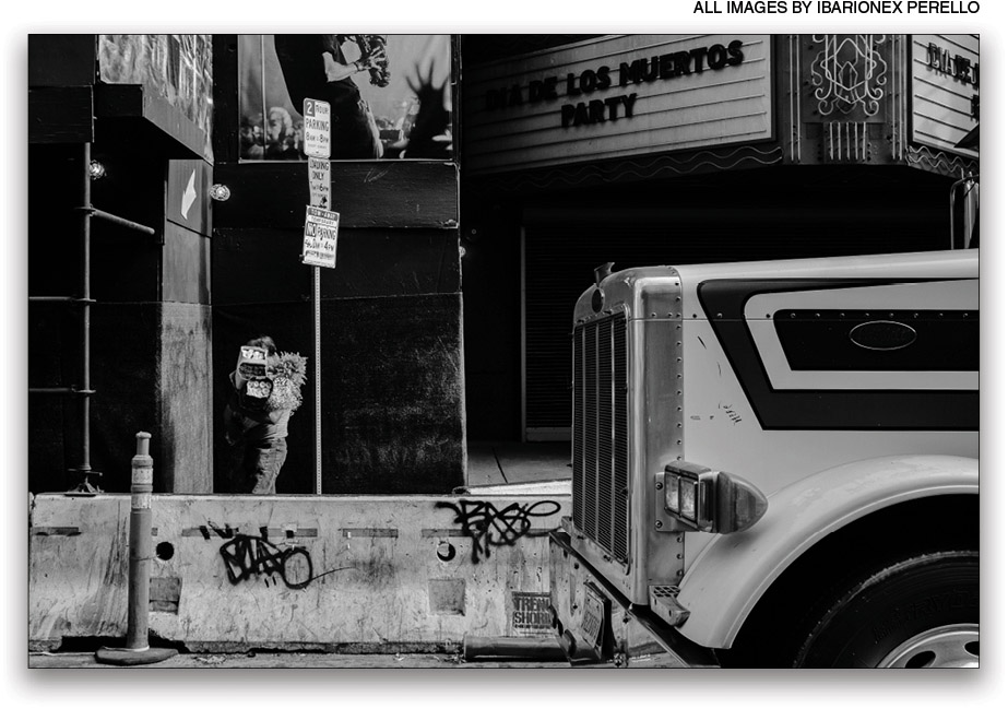
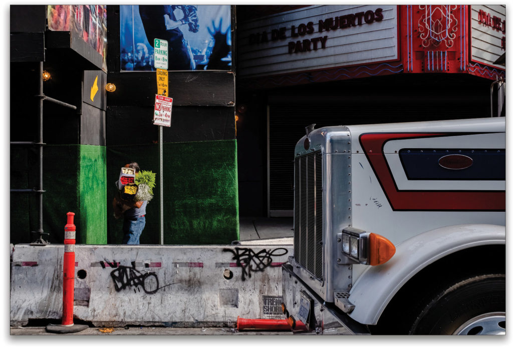
This image uses the important graphic elements of light and shadow, line and shape, and gesture. Yet, it’s the presence of color, especially the boxes of flowers the man is carrying that provide an important anchor point around which all the other elements revolve. Understanding this makes the choice of the color image an easy one.
All of the images produced by my digital camera are rendered by default in color, so I always consider color’s impact on my photographs. I make the same considerations with color as I do with exposure, focus, depth of field, lighting, and more. Each of those visual elements has an impact on how the viewer looks at, and navigates the composition. If I didn’t think about how color affects the image, I’m leaving an important decision to chance.
Understanding Color
I don’t have an advanced degree in color theory, but I do have a sense of how human beings respond to color; for example, I understand that the human eye is attracted to saturated colors. If my photograph includes a woman in a red coat or a man carrying a yellow umbrella, the viewer’s eye will make a beeline for those elements, especially if the other colors are neutral or muted.
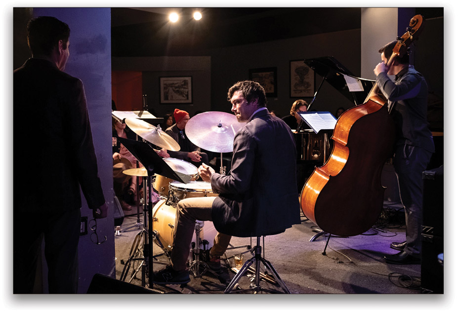
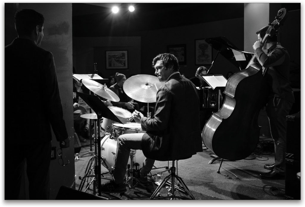
Here, the color image of the jazz quartet is an accurate representation of the scene, but colors can create points of distraction, especially the red wool hat near the center of the frame! The black-and-white version creates greater emphasis on the drummer and his relationship with the rest of the musicians, resulting in a more effective photograph.
As well as attracting the viewer’s attention to a particular area in the composition, color also has the power to establish a mood. A landscape or a portrait photographed under warm, directional light will be experienced differently when produced under cool, even light. In these and many other photographs, color can be used as a language by which the photographer expresses mood, tone, and emotions.
When making color photographs, I ask myself: What role is the color playing? Is the color the subject itself? Am I exploring the contrast of a red door against a blue wall? Or am I using color as another graphic element, such as line, shape, and contrast, to control how the viewer navigates the frame?
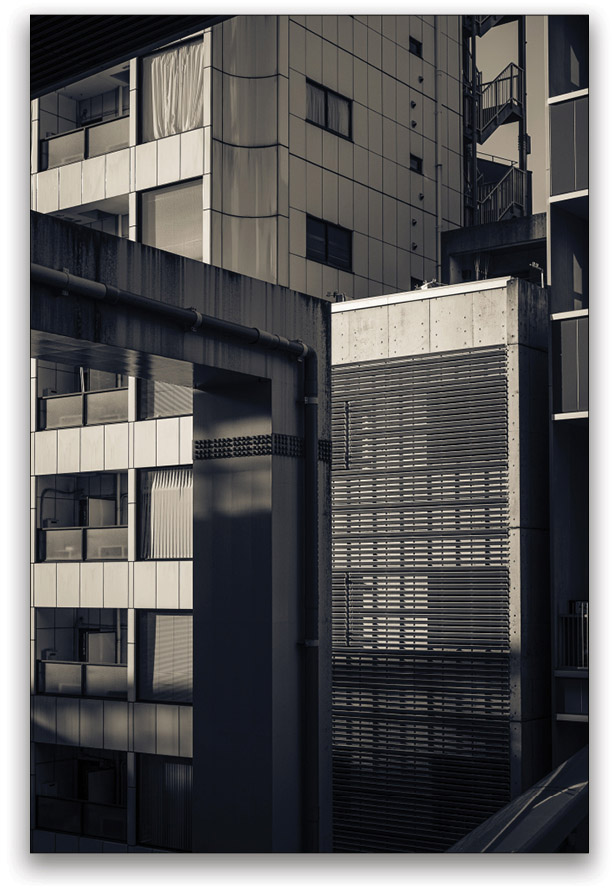
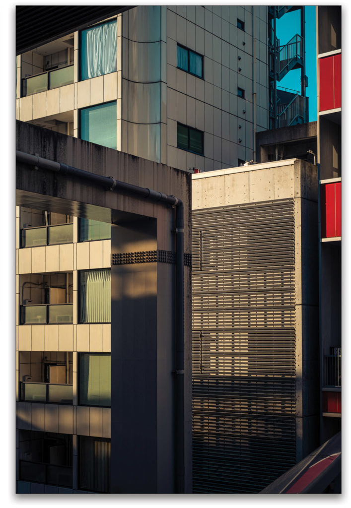
Shot in Tokyo, this architectural image is built largely on shape and line, light, and shadow. Though it works well as both a black-and-white and color image, the presence of color adds another graphic element, which reinforces the underlying strength of the composition.
Another aspect of color that I always consider is the subject’s relationship to the other elements of the frame. I examine whether light and shadow, line and shape, color and gesture are drawing attention to the subject or serving as a distraction.
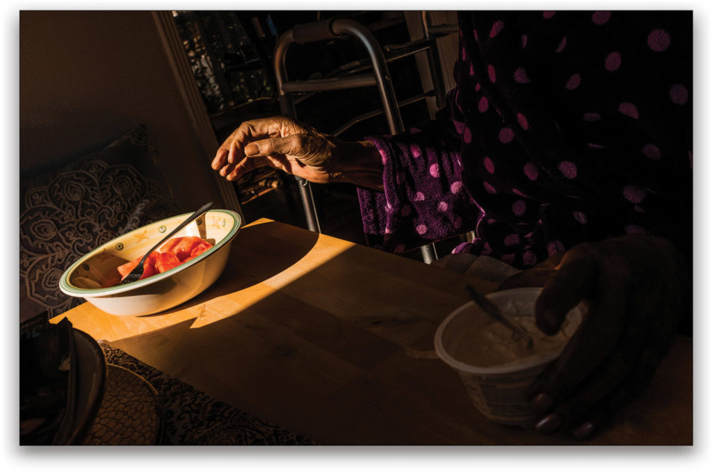
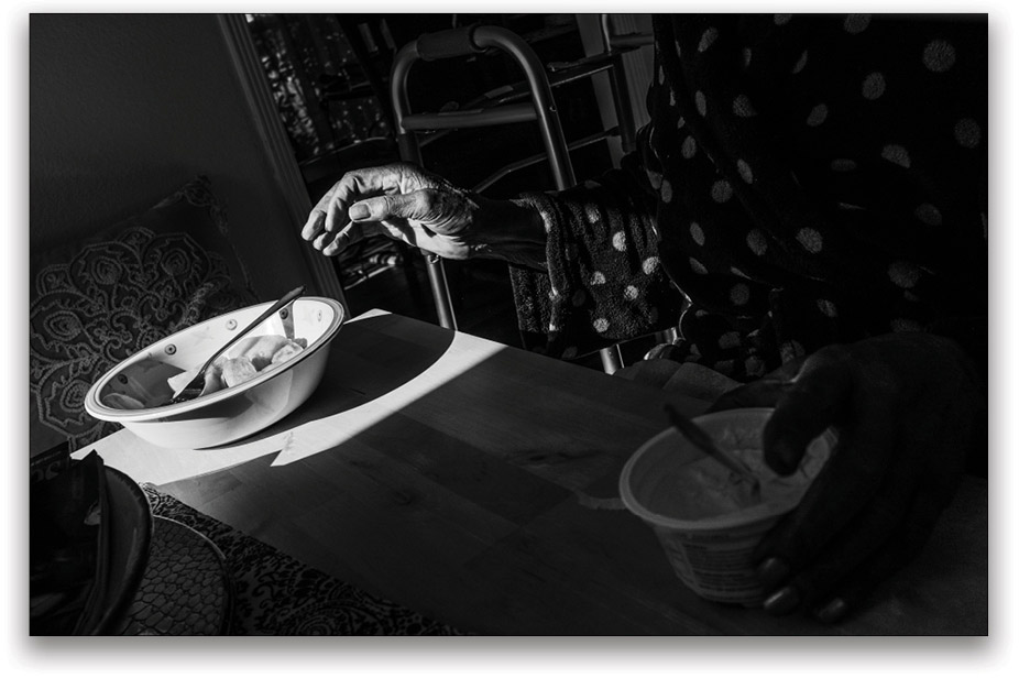
There are scenes where color is the heart of the image as with this scene of a hand reaching out toward a bowl of fruit. The colors hold the visual weight that leads the viewer’s eye. Although the high-contrast light plays a role in this as well, the absence of color (in the black-and-white) results in an image where the point of interest is completely lost.
If other elements, especially in the background, reflect higher color saturation, sharpness, or brightness, they may compete with the main subject for the viewer’s attention. The subject doesn’t have to possess all those graphic qualities to be effective, but the visual weight of the subject is increasingly diminished if other elements in the composition do have these qualities.
In making this photograph, knowing that the color was what was important to me helped me make choices, including exposing it to emphasize the highlights over the shadows. Although I knew that a human presence would help complete the composition, it was the presence of the color, and building a composition around it, that led to the success of this image.
Despite the fact that this photograph heavily leverages light and shadow, line and shape, as well as gesture, it’s the color that serves as the underlying visual anchor. Though the image is graphically interesting in black and white, the color provides the photograph its spark.
All of this has made me a more effective color photographer. It allows me to easily identify scenes when black and white may be a better choice.
Choosing Black and White
Modern cameras capture beautiful color, but there are times when color becomes a distraction: Its visual weight becomes so significant that the photograph becomes more about the color than the rest of the content. This is an issue when photographing under a variety of different light sources. Under such conditions, varied color temperatures not only impact the appearance of individual photographs, but also a sequence, or an entire body of work.

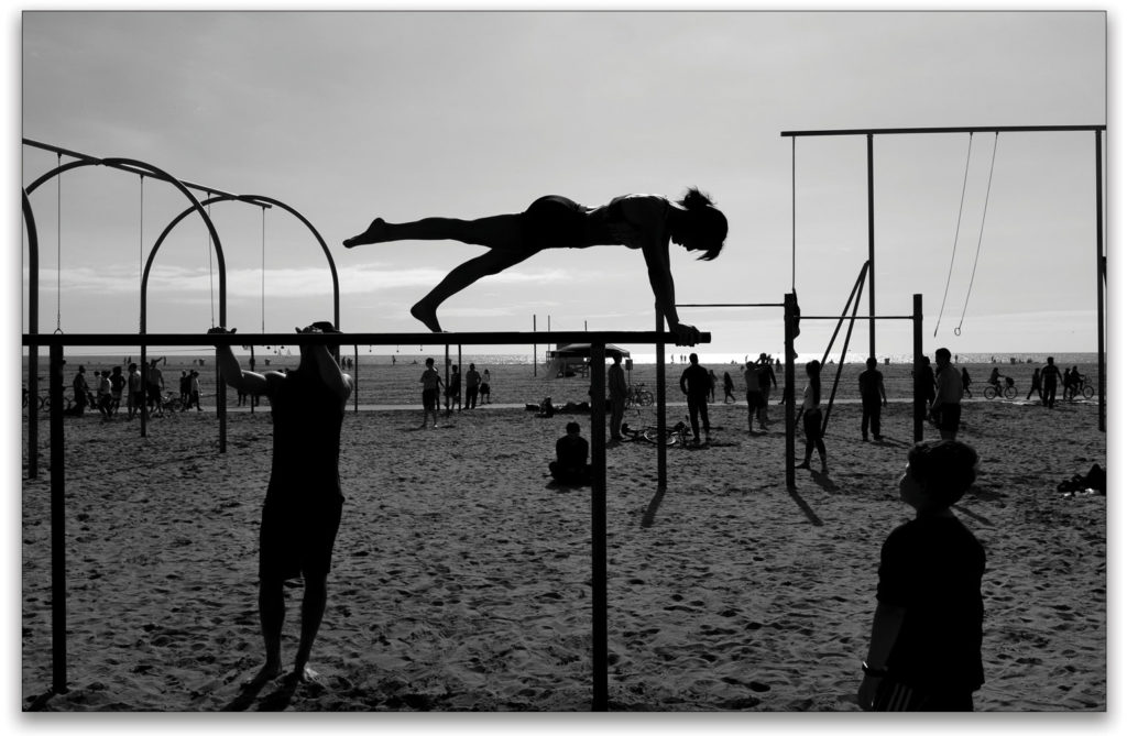
In some cases, I’ve made the choice to convert to black and white because I wanted to emphasize the lines and shapes or the contrast between light and dark. With such images, the emphasis on light/dark contrast better served my intention, rather than the inclusion of color. For example, the image of a young woman practicing on the parallel bars plays well in both color and black and white, but my decision to emphasize the shapes and lines led me to choose the black-and-white version over the color. Even though the range of colors is limited, the monochrome image more accurately represents what drew my attention to the scene.
Sometimes the better choice for me is a black-and-white image, because I want to emphasize moments that evoke feelings and relationships. For certain documentary projects, I produced black-and-white photographs because I felt they better captured human relationships or expressed the feelings behind the imagery.
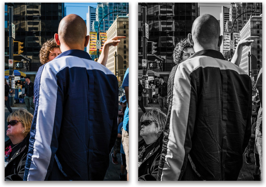
The choice between a black-and-white or color image is often subjective: Certain photographs play just as well in monochrome as they do in color. The focus on the woman giving directions to the man (see below) remains the anchor of the composition, but the other elements take on more or less significance based on whether you prefer the color or the black-and-white.
A black-and-white image is also more conducive to aggressive dodging-and-burning, which provides me even further control over the finished photograph. That’s not possible with color photographs, as such changes in density impact the appearance of the photograph’s colors.
Black-and-White Conversions
The majority of my workflow involves the use of Adobe Lightroom for culling, editing, and processing my images. And I leverage the flexibility that it offers for producing great black-and-white conversions. Yet, it’s not enough to just desaturate the color in a photograph, because this often results in a flat, uninteresting black-and-white image. Instead, Lightroom provides a selection of presets that provide a good starting point. A personalized look comes from using the controls available in the Basic, Tone Curve, and B&W panels. The B&W panel is especially important, as it allows for adjustments to the individual color channels for a more refined look. There are no uniform settings that are equally good for all photographs; the adjustment will differ from image to image. [See “Lightroom Laboratory” on in this issue for one method of converting an image to B&W.—Ed.]
Nik Silver EFEX Pro is a plug-in and a standalone application that provides one of the best tools for great black-and-white conversions. DxO Software, which purchased the rights of production and distribution from Google several years ago, has recently made some improvements to the application, making it more stable and powerful. If you regularly convert your images to black and white, you should seriously consider investing in this powerful software. [Check out the “Maximum Workflow” on in this issue for a tutorial on using Silver EFEX Pro 2.—Ed.]
Understanding Your Choice
As with some of the examples I’ve included in this article, you can see instances when either the color or the black-and-white delivered the better result; however, there are times when either would be satisfactory. In such cases, the question of which one is “better” comes down to my intention: What is the most important thing that I want to emphasize in my photograph? And, are the decisions, including whether or not to publish an image in color, serving that goal? Knowing the answer to those questions, I’m better able to leverage my tools to create an image that reflects my desire as the photographer.
In making this photograph, knowing that the color was what was important to me helped me make choices, including exposing it to emphasize the highlights over the shadows. Although I knew that a human presence would help complete the composition, it was the presence of the color, and building a composition around it, that led to the success of this image
This article originally published in Issue 59 of Lightroom Magazine.