One important aspect of design is controlling and managing color. Creating color swatches is a great way of building libraries of color that you can use over and over again. Quite often, when you’re handed a design project, you aren’t given any brand colors with which to work, or it may be a brand-new project for which you’re tasked with creating specific colors. In this tutorial, we’re going to look at a couple of ways to extract colors from photographs to add to your Swatches panel.
In both Illustrator and InDesign, there are ways of extracting colors from artwork that aren’t available in Photoshop. One of my favorites (which I hope to see in Photoshop one day) is the Color Theme tool in InDesign. When you click on an image with this tool, it automatically creates a five-color swatch set based on the strongest complementary colors, plus four additional sets with various hues and tones, and you can easily save these sets to the Swatches panel and CC Libraries. But since this is Photoshop User, we’re going to use Photoshop to create our color swatches.
METHOD ONE: CRYSTALLIZE
Launch Photoshop and open an image. If you’d like to download the low-res watermarked version of the image we’re using here to follow along, click this link, log in with your Adobe ID, and click the cloud-with-an-arrow icon next to Save Preview to My Library to download the file to your Libraries panel. Double-click the image in the Libraries panel to open it in Photoshop.

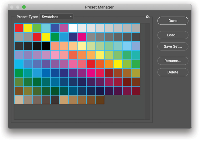
Step One: Open the Swatches panel (Window>Swatches) to see what swatches are currently in the panel. I have a ton of swatches in my Swatches panel, which doesn’t make for a great workflow, so I want to get rid of everything and start a new set.

Step Two: A quick way to delete all the swatches is to use the Preset Manager (Edit>Presets>Preset Manager). In the Preset Type drop-down menu, choose Swatches to bring the current swatches into view. Just click on the first swatch, Shift-click the last swatch to select all of them, and then click the Delete button. Click Done to close the Preset Manager.
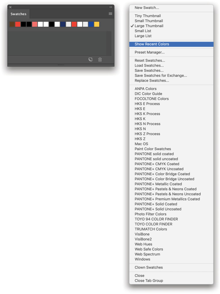
Step Three: Now you have a nice clean Swatches panel, aside from the swatches at the top that show recently used colors. If you like, you can turn these off by clicking on the flyout menu at the top right of the panel and selecting Show Recent Colors.
Step Four: Now let’s grab some colors from our image. We could the Eyedropper tool (I) and click around the image to manually sample colors, which is fine, but there are a lot of different colors. In this method, we’re going to use a filter to help us reduce the amount of colors from which to choose.
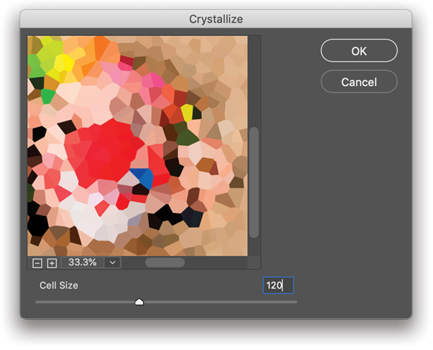
Go to Filter>Pixelate>Crystallize. You’ll be presented with a dialog that has a sliding scale to adjust Cell Size. This reduces the image into crystal-like pieces—the higher the number, the larger the pieces. For a high-res image, slide it up to 120 to get some nice large fragments (for the low-res practice file, try 40 for the Cell Size). As you increase the Cell Size, you’re almost creating a strangely shaped set of swatches. Go ahead and click OK. Now your image is a large collection of colors based on the original image.
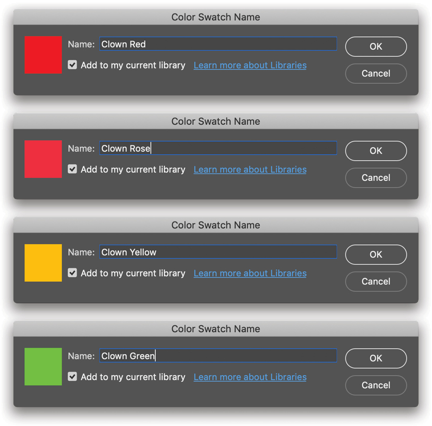
Step Five: Now you can use the Eyedropper to select the colors you’d like to use in your project. Simply click on the color you want to add, and then click the Create New Swatch of Foreground Color icon at the bottom of the Swatches panel to bring up the Color Swatch Name dialog. In this example, I called my first color “Clown Red.” Click OK. Repeat this process until you have all the sampled colors you need for your project.
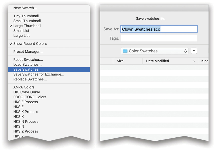
Step Six: Now that you have your desired swatches, you’ll probably want to use them again, so let’s save them. Click the flyout menu at the top right of the Swatches panel, choose Save Swatches, and name your collection (in this example, we named it “Clown Swatches”). The location should already be set to the Color Swatches folder inside the Presets folder, and the file extension for swatches is .aco. Click Save.
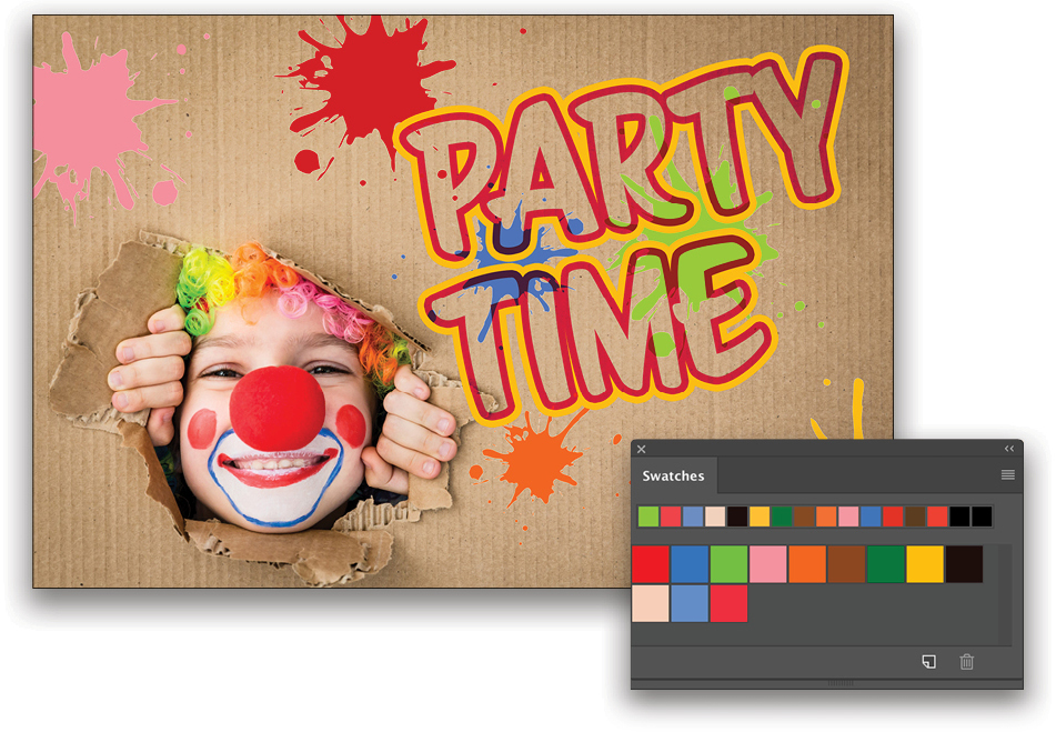
Step Seven: To prove this worked, go back to the Preset Manager, clear all the swatches again, and click Done. Click the flyout menu in the Swatches panel, and this time choose Load Swatches. Choose the Clown Swatches.aco file, click Open, and it’ll drop them straight back into the Swatches panel. Now you can add shapes and text using these complementary colors to create a flyer or poster. Note: You should also see your new swatch set listed near the bottom of the flyout menu in the Swatches panel.
METHOD TWO: INDEXING
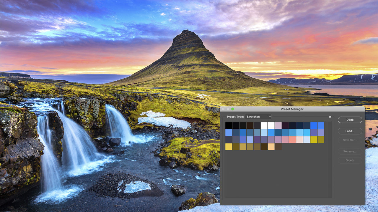
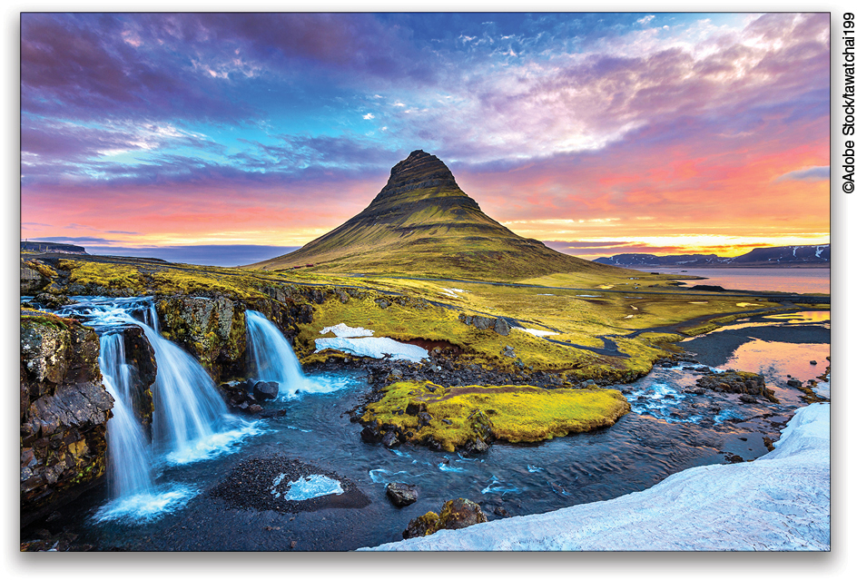
For our next method, we’re going to use a different setting that extracts colors from the image automatically, but we’ll need some workarounds along the way. Go ahead and open another image. This time we’re using an image with a lot more color—a landscape shot taken in Iceland, a favorite location for many photographers. You can find this image on Adobe Stock by clicking this link.
Step One: We’re going to grab a lot more colors from this image. Instead of having to click each one with the Eyedropper tool and manually adding it to the Swatches panel, we’re going to use the Indexed Color setting in Photoshop by going to Image>Mode>Indexed Color.
This brings up a dialog where you can specify the number of colors. The default is 256, but we don’t need that many, so go for 50 for this example. Once you’re familiar with this technique, you can try different amounts for different images. Click OK.
Step Two: Now go back to Image>Mode, but this time choose Color Table. This brings up a dialog with the 50 colors that are now in your image. So what do we do with this information since it isn’t the Swatches panel? First, we need to save this Color Table.
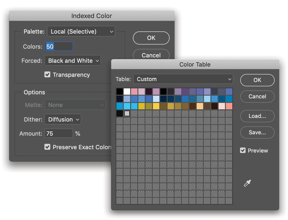
Step Three: In the Color Table dialog, click the Save button, give it and name, and save it to your Desktop for now. Then, navigate to your Applications folder, find your version of Photoshop, and then locate the Presets folder, followed by the Color Swatches folder. Drag the .act file that you just saved into the Color Swatches folder. Note: If you try to save the Color Table file directly to the Color Swatches folder, you’ll most likely get a warning dialog saying the file is locked or in use. Just save the file to your Desktop and drag it into the Color Swatches folder to avoid the warning dialog. Also note that this Color Swatches folder is actually a different folder than the one mentioned in the Crystallize method above. That Color Swatches folder is buried several folders deep in the Application Support folder.
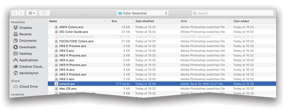
You’ll see other swatch files in the Color Swatches folder with .aco extensions. We’re dropping in an .act file, but that’s okay, as we’re saving the whole color table for now.
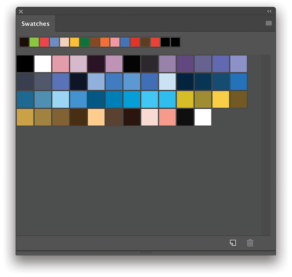
Step Four: Now you can close your Iceland image without saving it. In the Swatches panel, choose Replace Swatches in the flyout menu, navigate to your .act file in the Color Swatches folder, and click Open. The Color Table creates the actual batch of swatches. Note: Because it’s an .act file, if you choose Load Swatches instead of Replace Swatches, Photoshop won’t present you with the standard dialog asking if you want to append or replace the current swatches as it does when you load an .aco file. It automatically appends the .act swatches.
You can perform this method on multiple images and change the number of swatch colors you want from each image—always experiment; you never know what you’ll find that you can use over and over.
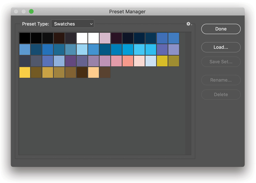
Step Five: With your Swatches panel open and your 50 colors on display, you may want to reorder or delete some of them. You can’t reorder them in the Swatches panel, so you need to go back to the Edit>Presets>Preset Manager. Here you can drag the swatches into any order you like and delete any that you don’t want, possibly ones that are similar in color. Once you’ve done this, select all the swatches in the Preset Manager, click the Save Set button, and save the new set to your Desktop. Drag this file into your Color Swatches folder and you now have a new version of the swatch collection, as well as the original Color Table. And because you saved this new set from the Preset Manager, it’s an .aco file, which means the next time you launch Photoshop, it will appear in the list of color swatch sets in the flyout menu of the Swatches panel.
You can go deeper into creating groups of complementary colors in Photoshop by using the Adobe Color Themes panel (Window>Extensions>Adobe Color Themes), but that’s a discussion for another day.
In this tutorial, you’ve learned how to create a swatch collection by using Crystallize to reduce the image down to its basic colors, plus the Index method, which is a little more work, but a good way to collect lots of colors from an image. If you have a CC subscription, you can also save these swatches in the CC Libraries, which will make them available in your other applications, such as Illustrator and InDesign.

I hope you found these methods interesting and useful. If you know of other ways to create and save swatch libraries, please share them on the KelbyOne Community member’s forum. See you next issue!
This article originally published in the February, 2019 issue of Photoshop User magazine.


