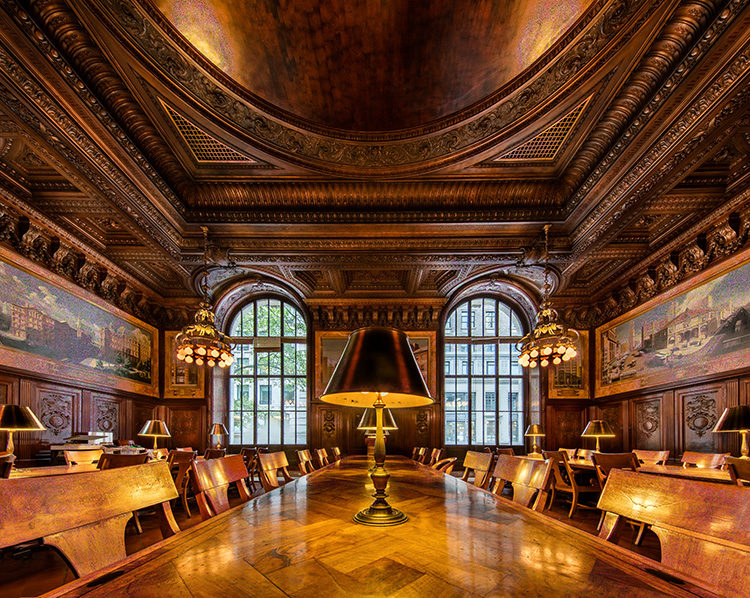
Above: The Dewitt Wallace Periodicals Room at the New York Public Library on 5th Ave. in Manhattan, taken with a Canon 11-14mm super wide-angle lens on a Canon EOS 5Ds.
Hi gang, and happy Monday. I shared the image you see above on Instagram this past weekend, and as expected, one of the photographers that follows me there wrote:
“Lightroom can easily straighten the verticals with just a few clicks, hint hint.”
Of course! I know that: I’ve written about it in my books, talked about it in my online classes, etc., but it was nice of him to let me know, anyway. 😉
Here’s the thing…
I like it just the way it is, or I would have fixed it before I posted it on Instagram.
Even though the verticals are not “technically correct” (meaning the walls are leaning inward) I love the look a super wide angle gives. I know the verticals aren’t straight, but I love that look. It’s breaking the rules on purpose.
It’s just like breaking the “rules of composition” — if you don’t know what you’re doing and you break the rules, you’re a “goober.” If you know what the rules are, but you break them intentionally because you like the way it looks, then you’re an artist.
If I wanted the straight verticals look, I would either have used a tilt-shift lens when I shot it, or I would have fixed it in Lightroom, but I left the verticals untouched (and I generally do), in all my super wide angle images unless (and this is a biggie) it looks bad to me. That’s the “art” part of it, and a decision the photographer taking the image makes. In this case, I don’t believe the “technically correct” shot looks better. You might feel differently. See below.

Above: Here’s what the same shot looks like when you fix the verticals in Lightroom. This is a more “technically correct” shot, but I don’t like it nearly as well.
Yes, the walls are now straight and not leaning inward. But, to me, the shot lost some of it’s “epicness.” It’s now cropped almost into a square, and I had to use Content Aware Fill and some Cloning to fill the edges. It’s really not a super wide-angle shot any longer. I don’t like what it did to the ceiling, and I just don’t like it in general. I miss my bendy walls. 🙂
Now, all that being said…
…it’s very possible that you prefer the second shot (the shot with corrected verticals) better and I’m OK with that. That lens distortion in the first shot (the walls leaning in) doesn’t agree with everybody — though one guy on Instagram wrote:
“…the distortion really draws me into the photo.”
I dig that guy. Plus, I agree, and I think that is part of the power of not correcting — it kind of draws you in. Anyway, when you take images really wide like this, this is a call (to correct or not correct) you’ll get to make, and I’m sure a lot of people will choose to fix the verticals. I’m cool with that too.
My style is to not fix the verticals (scroll through the images on my Instagram page and you’ll see this look again and again, along with the occasional corrected shot, too, but for me, that’s rarely the call I make). That’s the awesome thing about creating art. Everybody gets to do their “own thing.” If we all saw art the same way, what a boring world this would be.
Technically Correct vs. Artistically Correct?
Does your photo look better to you a stop under-exposed? How about 2-stops over-exposed? There’s a difference between a mistake, and an artistic decision. At the end of the day, this is a call only you can make, and as long as you’re making the call intentionally, then go make your art. 🙂
A Quick Shout Out….
…to the super friendly folks in Little Rock, Arkansas who came out to catch my keynote presentation at Photo Expo 2016 last Friday night. I met so many wonderful photographers, and enjoyed the Little Rock hospitality (and the entire audience “calling the Hogs”) very much indeed. Also, a big thanks to Canon for inviting me to be there in the first place.
Have a great Monday everybody, and I hope I have given you something to think about today. 🙂
Best,
-Scott


Hi Scott.
I so much agree with you. I love the weird look shooting my fisheye for sports and action, but also use it for landscape and for weddingreceptions. Never ever correct anything, if i wanted something that is not “fiesheye-looking” I would use some other lense instead.
The point is, as you mention, this is a choice you make and an expression you want to show. Nothing wrong or right here, just an individual artistic choice.
I agree as well. My father is an ex photojournalist and traditional Olan Mills portrait photographer. And he was a Navy photographer in Vietnam. He’s old school. But his artistry never fully developed. For a long time he was telling me to do things in a certain way. And I politely ignored him on a lot of it, except the technical stuff. Last year he said I was better than him. I asked him why. He said I ‘see’ things he doesn’t. I said he could get that if he tried. He asked me a few weeks ago why did I often put my subject to one side with empty space. And I think now he sees there is an art to seeing that isn’t the same everywhere.
We love that your dad opened his eyes to the way you were photographing. Thanks for sharing that story with us, Tammy.