The Hue tab and all its sliders in Adobe Camera Raw are easy to misunderstand and are therefore often overlooked. The power to change colors lies in these sliders, and to best understand the Hue tab, it’s important to understand color.
“The degree to which a stimulus can be described as similar to or different from stimuli that are described as red, green, blue, and yellow.” That’s hue—now you know! That definition tells us that hue describes the appearance of color. You can switch out the word “color” with “hue” in the sentence “What color is that?” without changing the meaning.
So how does this translate into Adobe Camera Raw? Well, hue is represented as a series of color sliders, which in turn are simply adjustments along sections of the color wheel.
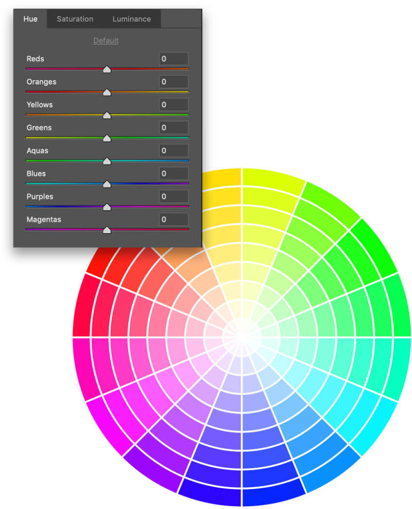
Check this out: The Hue sliders are simply a linear representation of the color wheel. If you place the sliders end to end and then bend them around into a circle, you have a color wheel. When adjusting these sliders in Adobe Camera Raw, we’re simply redefining the colors, shifting the hue around its respective section of the color wheel.
The purpose of this article is to arm you with the knowledge of how the Hue sliders work, which will empower you to make significant changes to the overall look of your images, transforming the temperature, the ambience, and their appeal. It’s an incredibly powerful tool in post-processing that can have a compelling, monumental effect on your images to the extent that it can change the time of day, the season, and even the climate.
When you’re done reading this article, make it your goal to understand how color works. Color literally changes how people feel. It changes their moods and emotions, and it can influence their decisions. This is reflected in the world around us—brands choose their color palette based on the values they want to convey, and retailers use color to influence our purchasing decisions.
Photographers can harness the influential power of color if we understand its application, not only with hue but also with tint, tone, and the relationship between different colors. We can employ our knowledge of color to keep people’s eyes on our images longer, and I’ll show you how to use the Hue sliders in Adobe Camera Raw to do that right now.
Shifting Colors
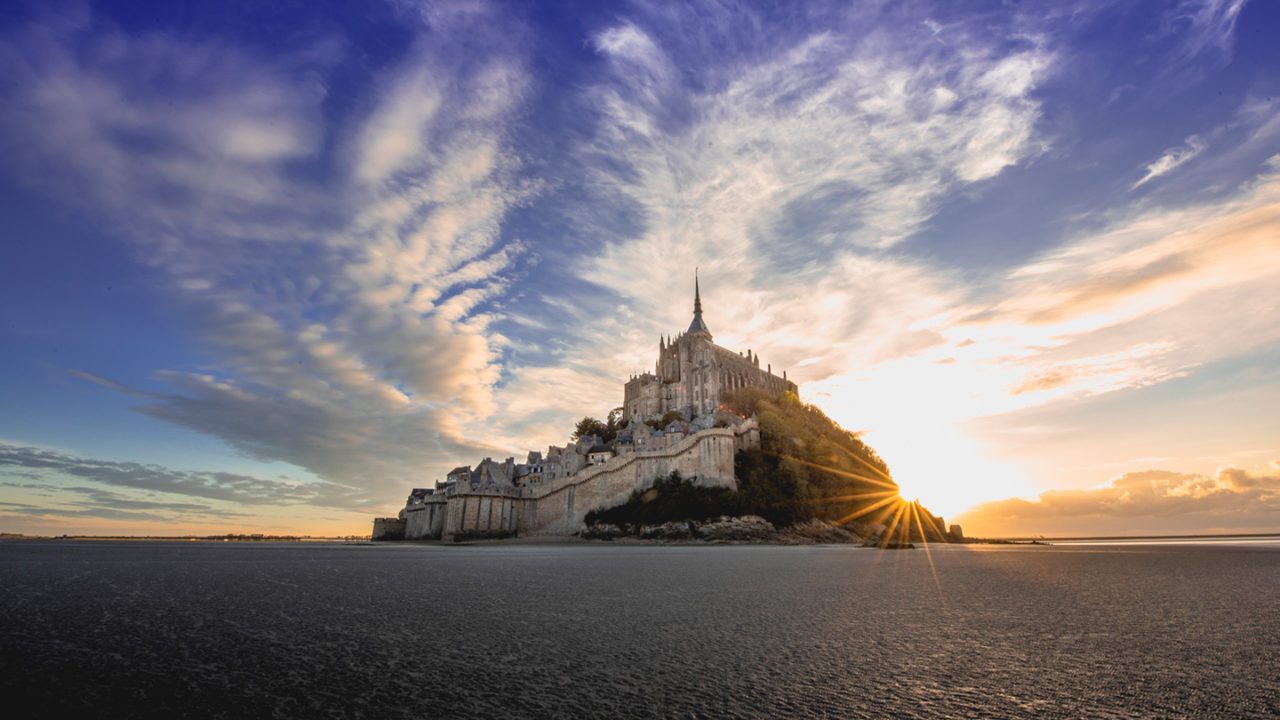
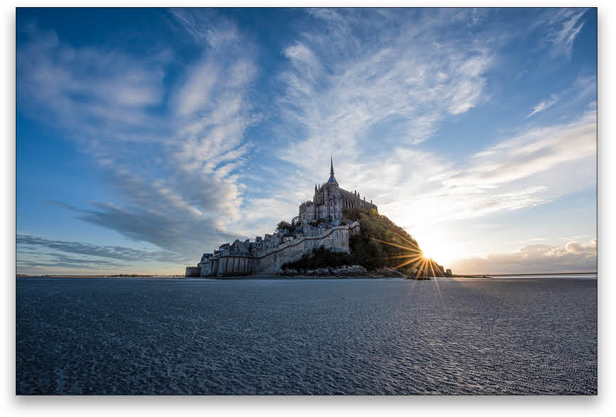
Take this image of Mont-Saint-Michel in Normandy, France, for example. It’s a beautiful sunset on a sunny day, right? Actually, no. It was a glaring sunset shining unfiltered through a cold, blue winter sky. The sun was so bright it became white, and as much as my mind was enjoying the walk around the sands surrounding the mount, my fingers weren’t enjoying the cold! The image I caught has a great subject; however, the creative elements were lacking and needed to be addressed. To step it up, I needed to make something much more appealing, warmer, and more vibrant.
Here’s how to do it, but bear in mind that this is not a one-size-fits-all method; each image needs to be processed on its own merit.
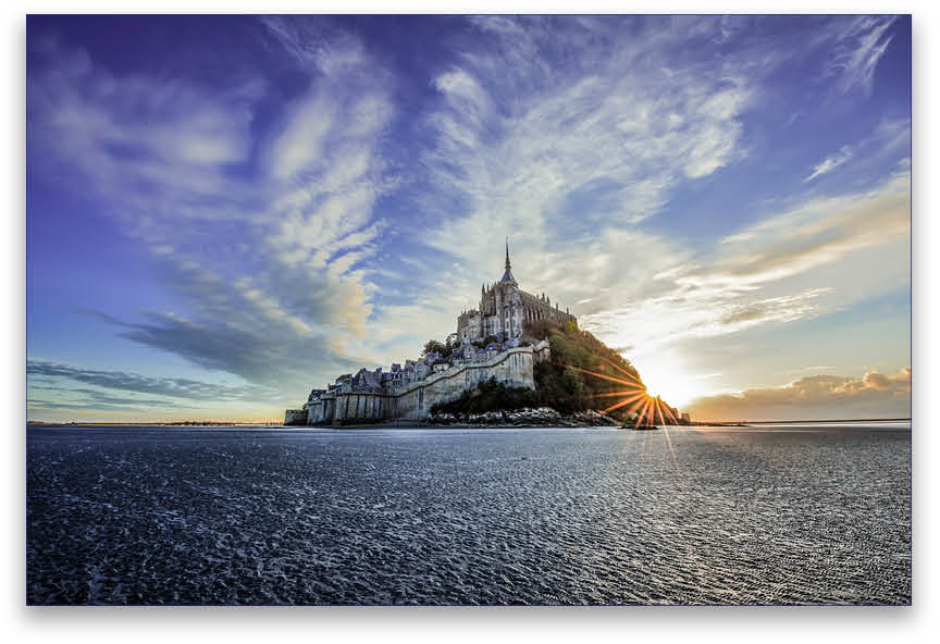
First, open the image in Camera Raw and make the general adjustments in the Basic panel to bring out the shadows, adjust the white balance, set the brightness, adjust the black and white points, etc. It’s important you’re happy with the general look of your image before you begin adjusting the color, or you’ll end up going back and forth, which invariably ends up with a confusing and often unresolvable situation. [Above]
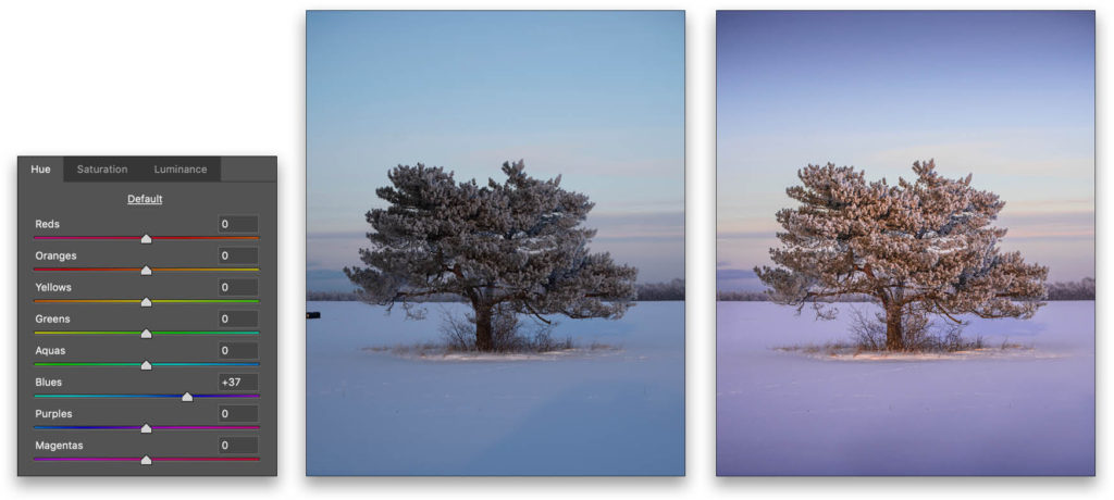
When you’re happy with the basic edits, you can start adjusting the Hue. As I explained earlier, when you move the Hue sliders, you’re adjusting the point at which a color sits within the color wheel. We’re essentially transposing the color’s relationships with other colors. In this case, we’ll give the sky more warmth by moving away from blue toward purple, a warmer variant of the same color because of its relationship to the color red. There is such thing as too much, so a rule that I live by when retouching images fits perfectly here in this situation:
Make an edit with a slider, and then half it! This prevents an unrealistic look that it’s easy to end up with when adjusting sliders.
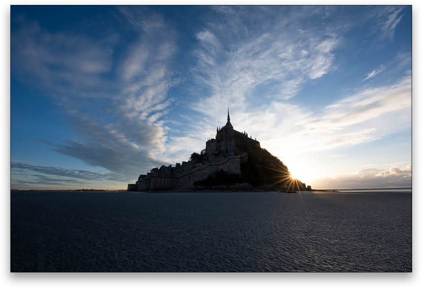
With the Hue sliders, it’s a case of trial and error. Finding the right color is achieved by simply moving the sliders until you get the desired result—that’s why there’s no one-size-fits-all method. [Below]
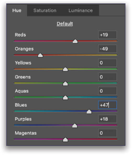
As you can see from the adjustments here, I’ve moved the Blues toward purple and the Purples toward magenta (away from blue), giving the sky much more warmth than it had previously. With the sun glowing a bright orange, I’ve also warmed that aspect of the image by moving the Oranges toward red, which resulted in the oranges appearing slightly purple. I countered that by moving the Reds away from magenta, where the top left of our linear representation of the color wheel meets the bottom right (magenta), retaining the warmth of the red but countering the coolness from the purple/blue.
Make Your Final Edits
Having changed the appearance of the colors with the Hue sliders, you can apply your final edits to further add creativity to the scene. In this example, I’ve drawn the sky in by using a Graduated Filter (G) with a negative Exposure, and I’ve done likewise with the sand in the foreground, both of which draw the viewer’s eyes to the main subject of the image. The reason this works is twofold: It works creatively because it adds a sense of depth to the image, and it works psychologically because the viewer’s eyes are drawn to the brightest part of an image—that’s just how our brains work.
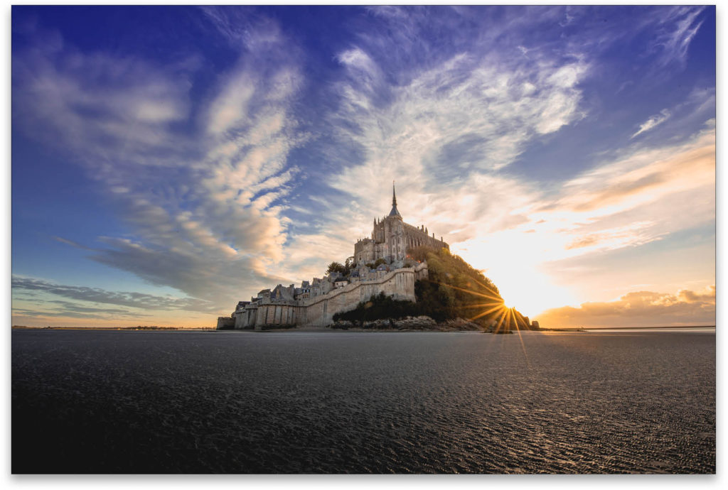
I’ve also painted over the wettest part of the sand with the Adjustment Brush (K) set to +100 Clarity, and then added a new Adjustment Brush pin and painted a second application of +100 Clarity to intensify the effect. This is a great technique for making shiny things appear even shinier! Here’s where the image ended up:
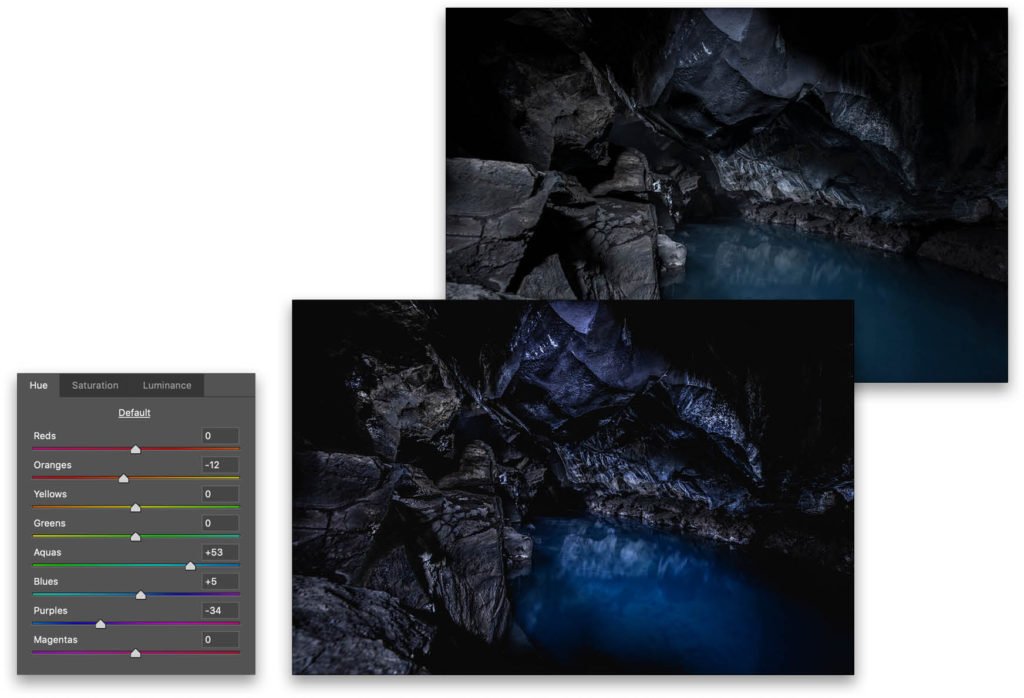
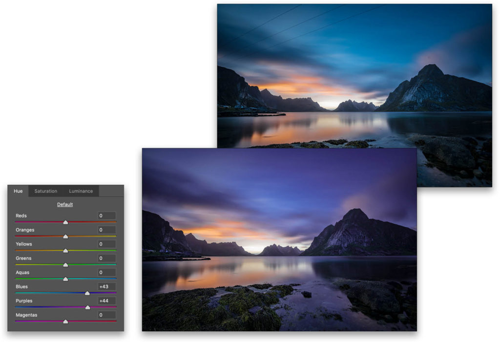
I wish there were a way I could show you how to employ this technique in a failsafe way on every image, but it’s just not possible. It’s one of the things in Adobe Photoshop that requires image-specific adjustment. Here are a few other examples of how I’ve used Hue adjustments on other images from around the world.
This article originally published in the March, 2019 issue of Photoshop User magazine.


