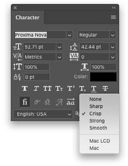
You know the drill. You spend an inhuman amount of time putting together a perfect design that looks really nice, but for some reason the type looks jaggy around the edges. You wonder, “How can this be? Type is vector and vectors don’t get jaggy; they look smooth all the time, right?”
Yes, that’s true, but don’t forget you’re working in a raster-based canvas, even if type is vector. In such a world, if something falls slightly off a perfect pixel, like half a pixel or .999 of a pixel, it still has to be displayed somehow, so it can look jaggy. Fortunately, there’s an option in Photoshop called anti-aliasing (aliasing is what makes type look jaggy). With the Type tool (T) active, you can see this in the Options Bar at the top, or in the Character panel (Window>Character). See the little AA icon? Pop that open and you’ll find several options. Chances are if your type is jaggy, it’s set to None. Change it to Sharp or Crisp for small type, and audition the other options for larger type, choosing the setting that looks best.

This tip previously appeared in Colin Smith’s Photoshop Tips column, in the April, 2019 issue of Photoshop User magazine.


