A lot of people like to create their own style, while some may be inspired by images on 500px.com or Instagram looks. Here, we’re going to create the famous desaturated urban look. You’ve probably seen this style in photos all over social media, where there’s no detail in the sky, the blacks are really dark, and there’s not too much saturation—or sometimes there’s just undertones of reds or yellows.
Step One:
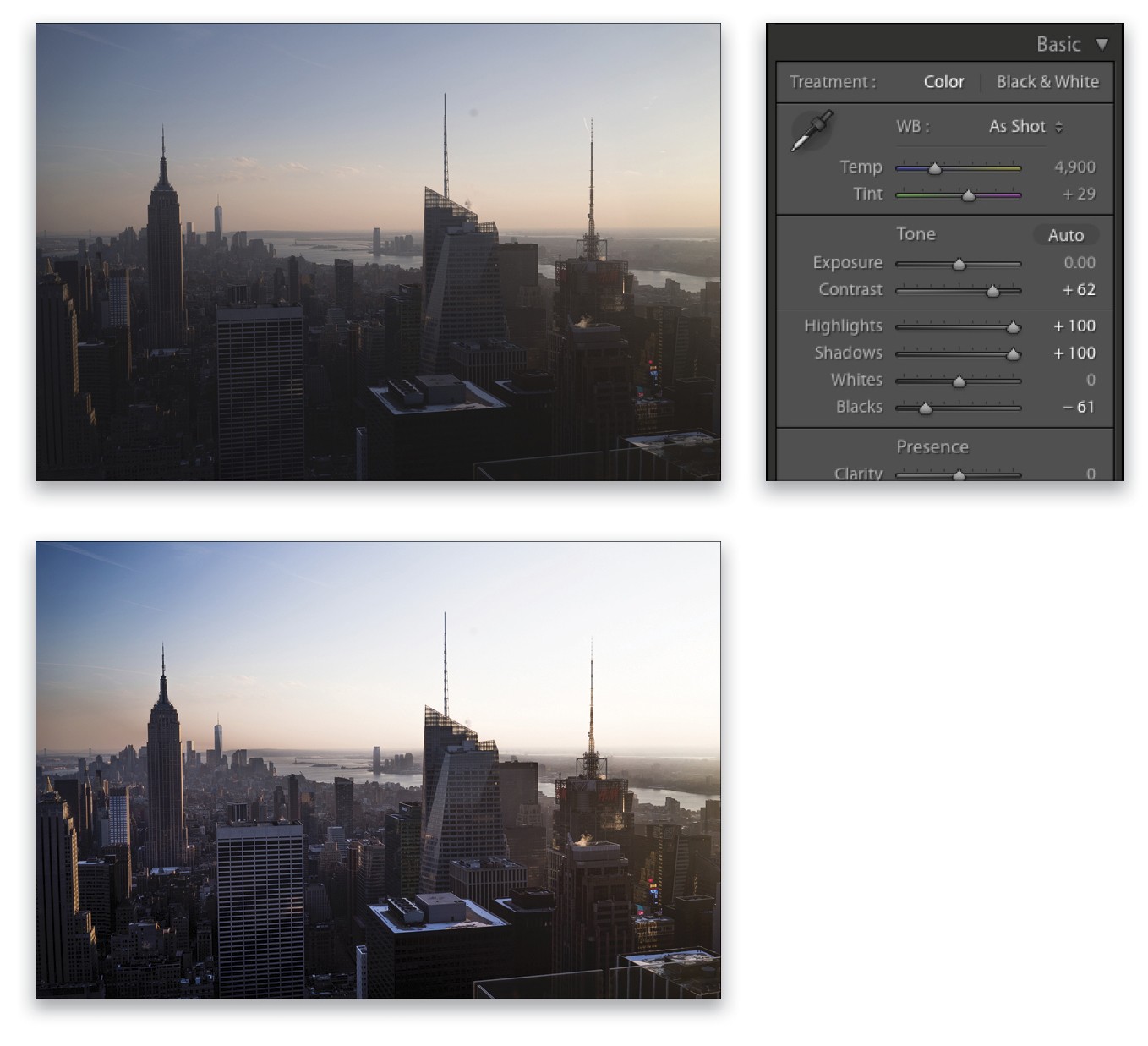
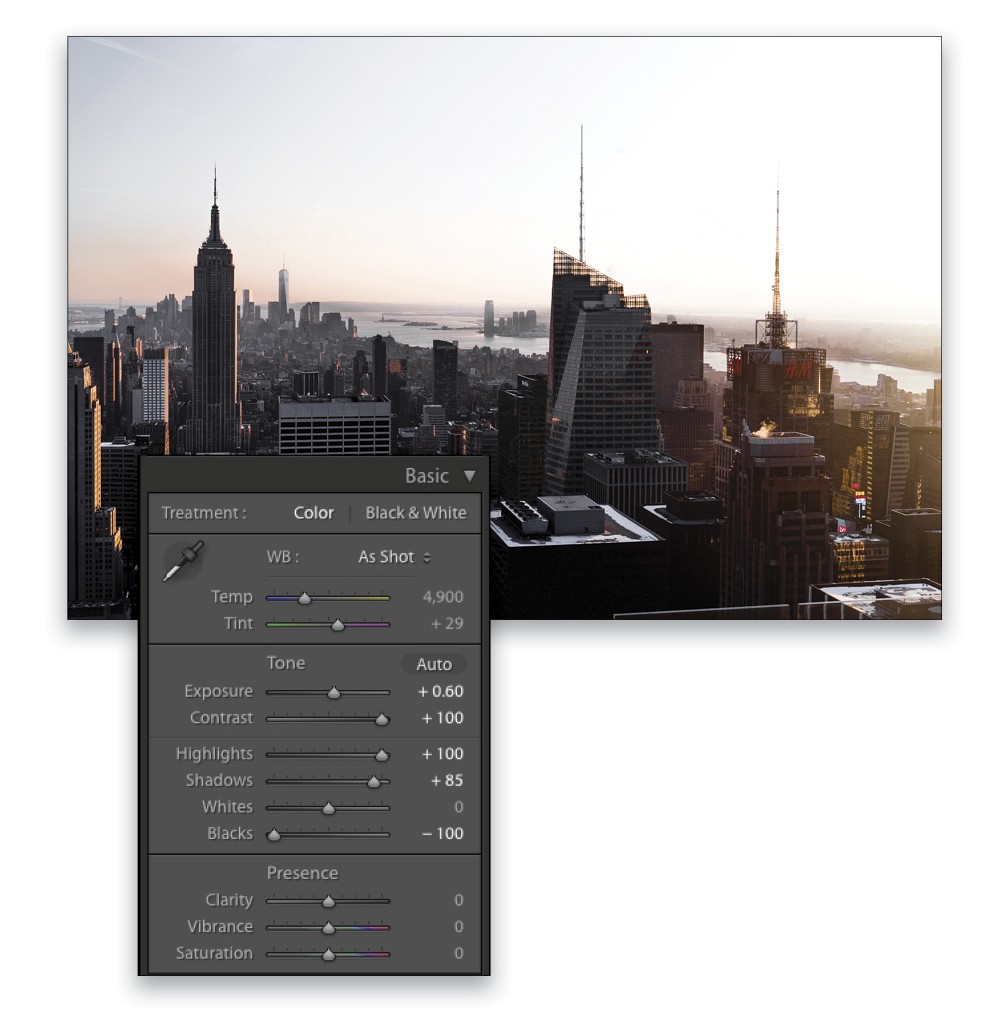
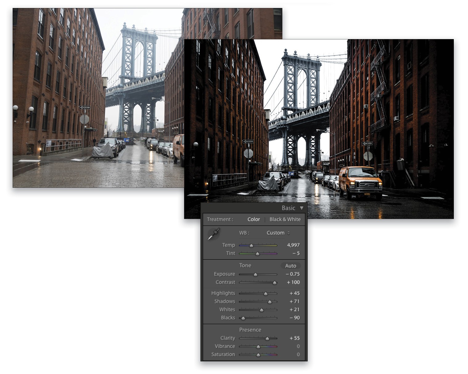
I took this photo in New York, and this is how I re-created this look:
First, go to the Basic panel and open up the Shadows to +100, crush the Blacks to –61, blow up the Highlights to +100—we want no detail in the sky—then boost the Contrast to +62.
We’re starting to get the look we want, but the problem is when you boost the contrast you usually get more saturation with it, and we don’t want that. So, the trick is to selectively desaturate.
Step Two:
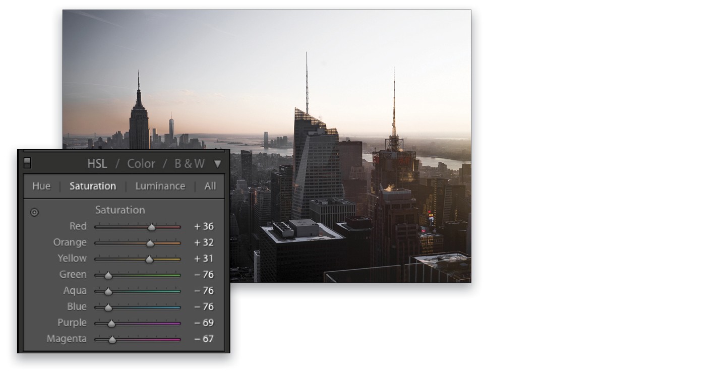
To do this, head to the HSL/Color/B&W panel, click on HSL, and in the Saturation section, desaturate all the colors we don’t want. Here, I lowered the Green setting all the way to –76, along with Aqua and Blue. Lower the Purple setting to –69 and Magenta to –67. Since we want to have a warm undertone, boost the Yellow setting to +31, Orange to +32, and Red to +36.
Step Three:
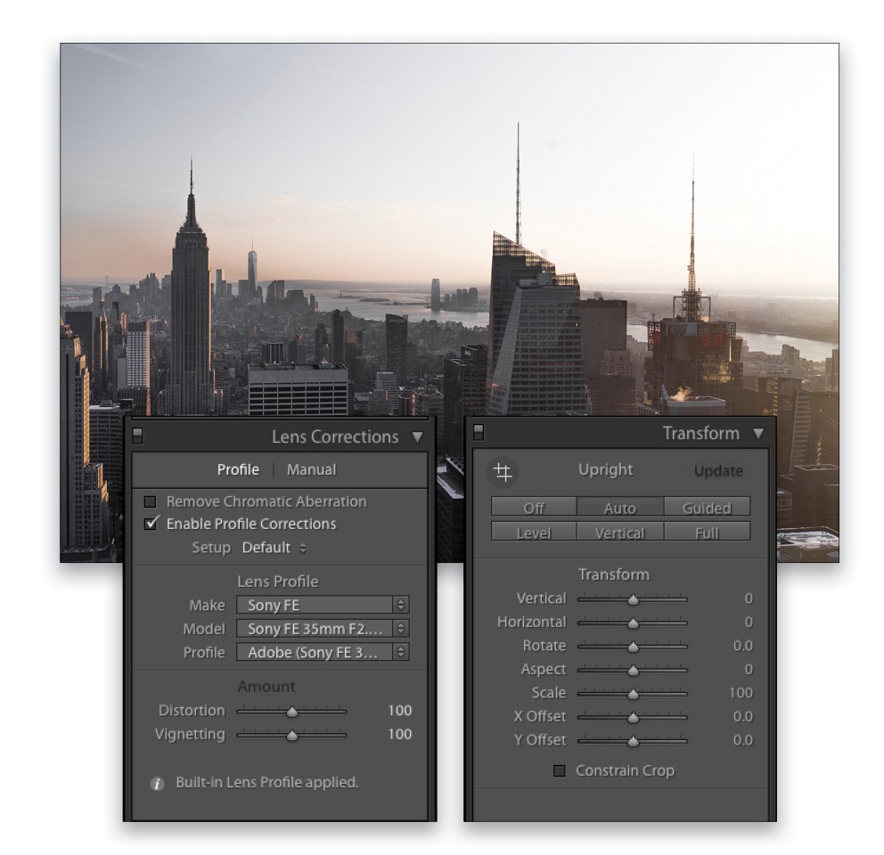
We’re almost there! Now we can enable the lens profile correction by going to the Lens Corrections panel and, on the Profile tab, turning on the Enable Profile Corrections checkbox. Then, go the Transform panel and click on the Auto Upright button.
Step Four:
To finish up, you can go back to the Basic panel and crush the Blacks even more, to –100; boost the Exposure to +0.60; and lower the Shadows to +85. Finally, let’s go crazy on the Contrast, to +100 (or until it feels right to you).
Step Five:
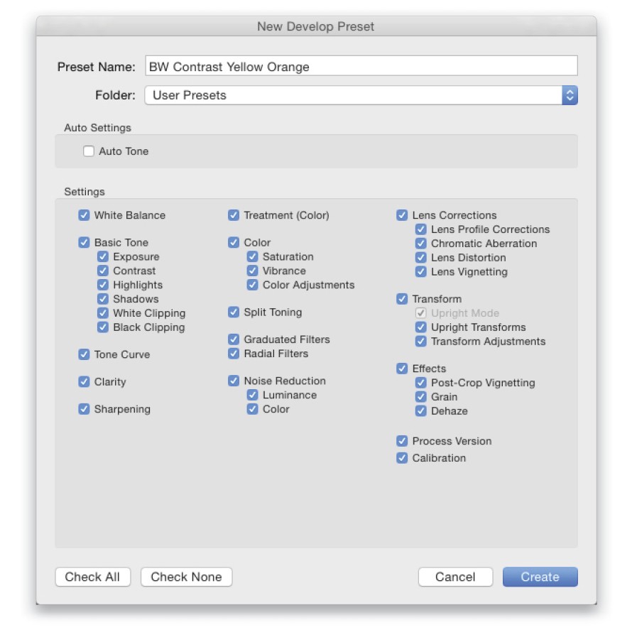
When you like a look, I’d advise you to save it as a preset, so you can apply it to another photo (in the left side panel area, click on the Create New Preset icon in the right of the Presets panel header to open the New Develop Preset dialog). Here, I’m going to name this one “BW Contrast Yellow Orange.”
Step Six:
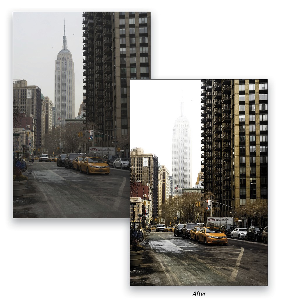
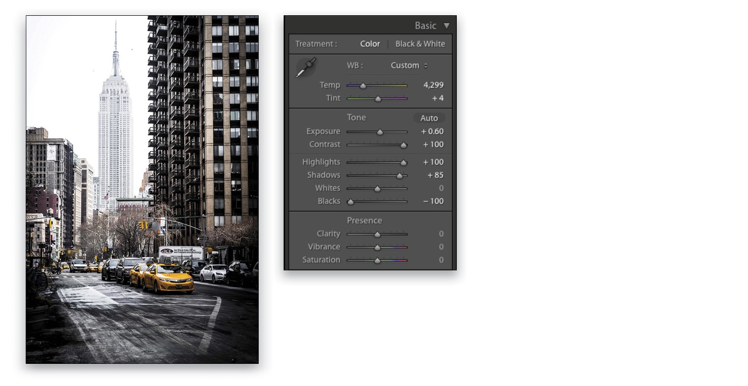
Let’s look at another photo I shot in New York. And, here it is with the BW Contrast Yellow Orange preset applied (just click on the preset you just saved in the Presets panel to apply it).
Step Seven:
This is a good starting point. It’s not bad, but the overall photo is too yellow. It would look nicer with only the cab in yellow. You can just make a White Balance adjustment, because in your preset, you boosted the yellow. So, if you drag the Temp slider to the left, it will lower the yellow. Here, I set the Temp to 4,299. Now you get the decontrasty look with only the cab in yellow, and we can see how presets are a good starting point.
Step Eight:
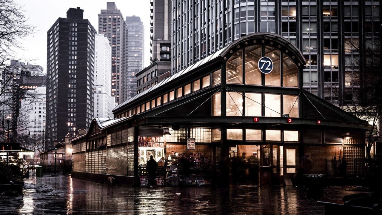
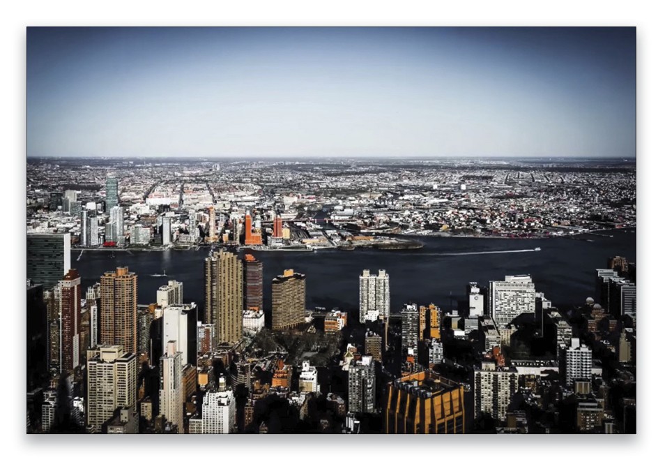
Here’s yet another photo shot in New York.
Step Nine:
I applied the same preset to this image. (I love Lightroom presets; you can get an amazing look in a few seconds.) On this one, though, I’d lower the Exposure a little bit, down to –0.75, along with a few other adjustments (seen here), but it depends on what you want to create and your taste.
Step Ten:
Here’s another one with the BW Contrast Yellow Orange preset applied.
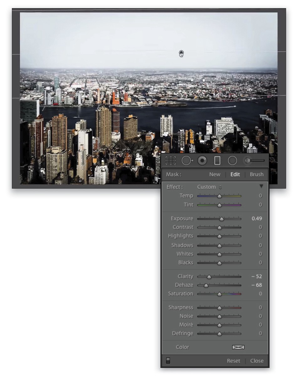
Step Eleven:
A great trick for this one, if you want to remove any detail in the sky, would be to apply a Graduated Filter (M) adjustment to the top of the image, and then boost the Exposure to 0.49. For this filter’s adjustment, I also decreased the Dehaze setting to –68, as well as the Clarity, to –52. The cool thing about Lightroom is that you can create tons of cool presets and create amazing looks very quickly—just apply them and see what looks best.
Step Twelve:
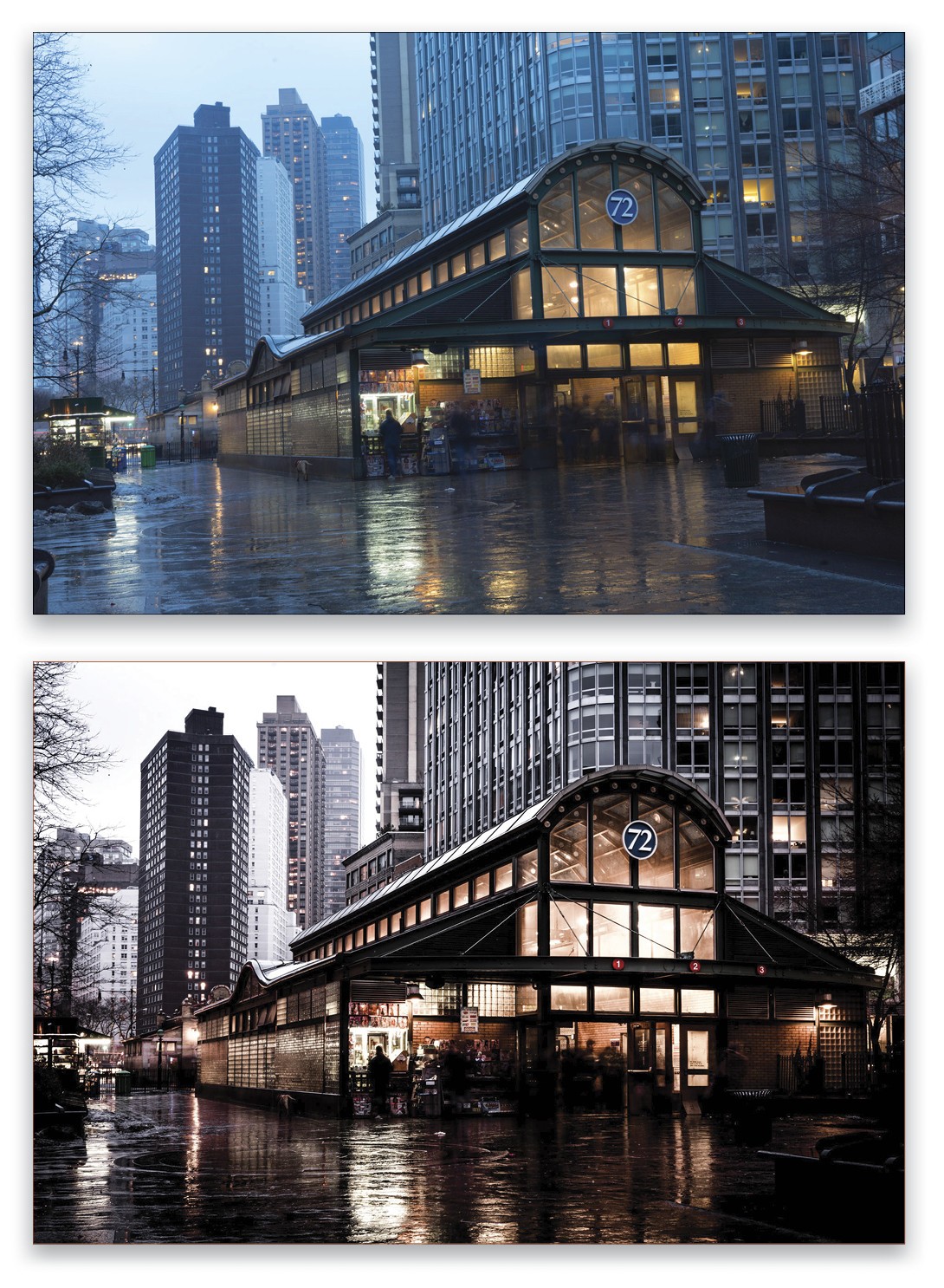
Finally, here’s the preset applied to this photo, along with a White Balance adjustment. Pretty cool.
There you go, guys. I hope this inspired you to create some presets. I think they also work very well when you want to retouch a series of photos very quickly and get the same feeling on all of them!
This article originally published in Lightroom Magazine, Issue 27.


