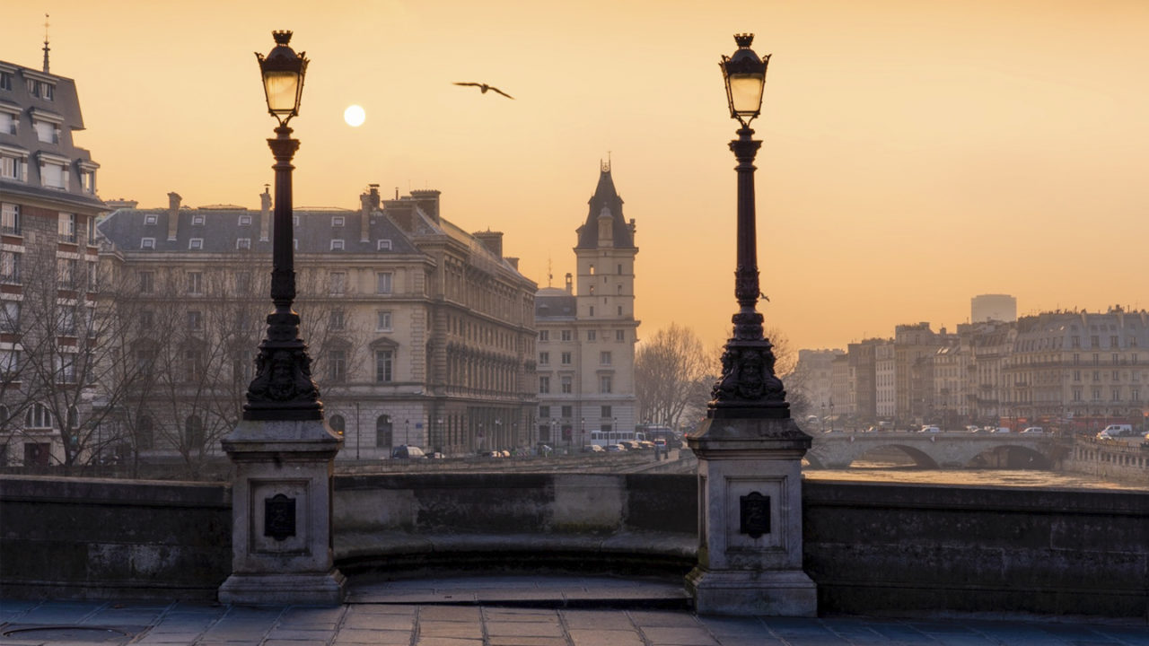
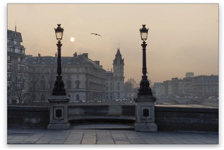
In this article, I’ll show you a cool trick to add depth to your images in Lightroom. Many people send me their photos so I can review them, and a common mistake I see in a lot of those photos is that too much drama has been added. With this photo taken in Paris, I want to show you how you can make a photo stand out without adding crazy drama that can look fake.
With this photo, I made sure that I had a good composition. When you have nice lighting, such as a great sunrise or a beautiful sunset, try to find an interesting foreground element. In this example, the two city lights worked well.
Step One:
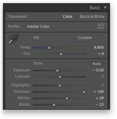
The first thing I want to demonstrate is my basic retouching: Open up the shadows to +100, boost the Whites to +29, and lower the Blacks to –23. Because the entire photo is too dark, I also boosted the Exposure to +0.50.
Step Two:
Now let’s use a Graduated Filter (M) to create my secret effect. Drag out a linear gradient starting in the lower portion of the sky and drag down so the gradient covers about two-thirds of the image. Double-click the word “Effect” at the top left of the Gradient Filter panel to set all the sliders to zero, and then lower the Exposure to –0.39 to darken the sky.
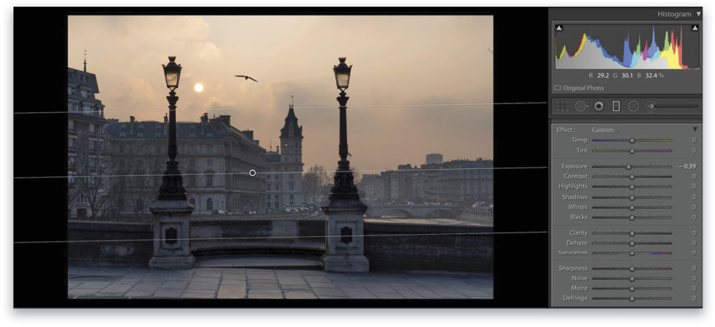
Step Three:
That’s good, but it’s making everything darker. To add some depth to the photo, I want the foreground to be sharp and the background to be diffused. If everything is super sharp and contrasty in your photo, you don’t have any depth, so the viewer has no notion of what’s closer or farther away.
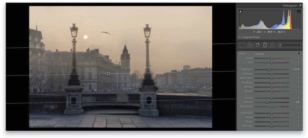
To fix that, let’s darken the linear gradient Exposure even more to –0.59, and then we’ll use the Dehaze slider. People usually set Dehaze to a positive value to add contrast and drama, but for this photo, let’s drag the slider in the other direction to add haze, which decreases the contrast. Here, we used –28.
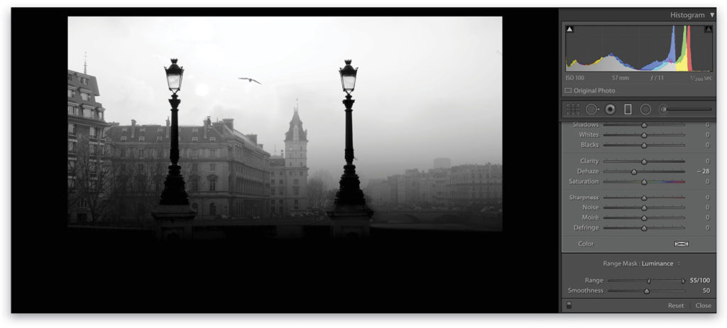
Step Four:
The problem now, as you can see, is that the Dehaze setting is also affecting the lamps in the foreground. You can fix this by setting the Range Mask option to Luminance and dragging the left Range slider to the right. To see what your mask is doing, hold the Option (PC: Alt) key as you drag the slider (just as a reminder, black conceals and white reveals). When the lamps turn black, they won’t be affected by the Dehaze anymore.
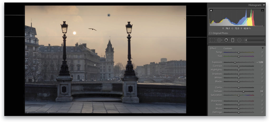
Step Five:
Dehaze removed some of the drama, but it looks great with the hazy buildings. You can also click New at the top of the Graduated Filter panel to add another linear gradient in the upper part of the photo. Lower the exposure to –1.09 just to close the top of the photo. You can also go the other way with the Dehaze slider (34) to add some texture in the sky.
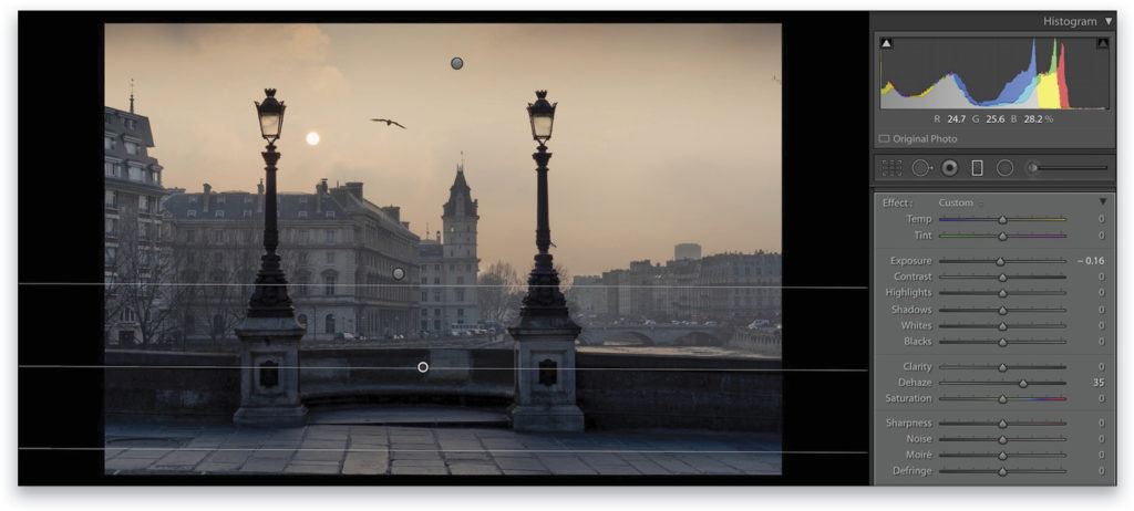
Step Six:
But the main idea here is to make the buildings in the background fade out. To increase that effect even more, let’s create another linear gradient on the lower part of the photo. Lower the Exposure to –0.16 and boost the Dehaze to 35. You can now press M to exit the Graduated Filter tool.
Step Seven:
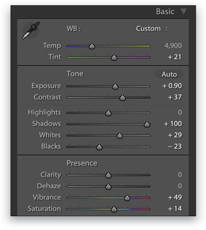
As the image is lacking color, let’s boost the Vibrance to +49 and the Saturation to +14. And, because I’m “Mister Magenta” and tend to go crazy with the magenta, I also boosted the Tint to +21 (but you don’t have to follow me here).
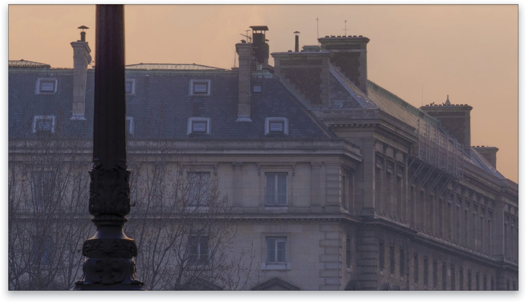
Step Eight:
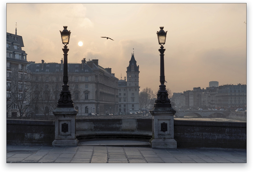
You can see that this really warmed up the photo. Just by playing with colors and the Dehaze slider, we’ve given the image more dimension. Here we’ve zoomed into the photo so you can see that the buildings are fuzzy and the foreground element is very sharp!
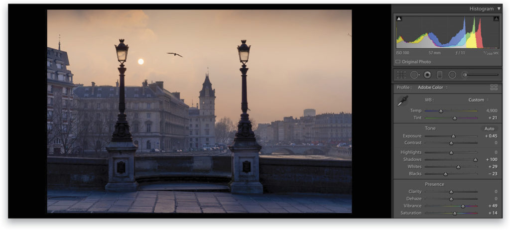
Step Nine:
This is a pretty nice result, but I like to fine-tune things once my overall retouch is done; for example, I added some Contrast (+37) and boosted the Exposure a bit more to +90.
Step 10:
The colors aren’t great in this photo, so let’s go to the HSL panel and select the Saturation tab. Click on the Targeted Adjustment tool (the little round icon to the left of the word “Saturation”), click on the part of the photo where you aren’t happy with the colors, and drag up or down: If you go up, it will increase the saturation; if you go down, it will lower the saturation of the color that you clicked.

Step 11:
When your photo is a bit too blue as this is, use the Temp slider to make it warmer. I set it at 5,734.
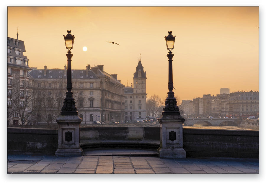
Note that we don’t have a crazy dramatic sky, but it works for this style—the contrast between the sharp and hazy looks pretty good. I hope this tip will help you to add more dimension and depth to your photos and that you learned something new. Have a great day and keep on taking photos!
This article originally published in Issue 40 of Lightroom Magazine.


