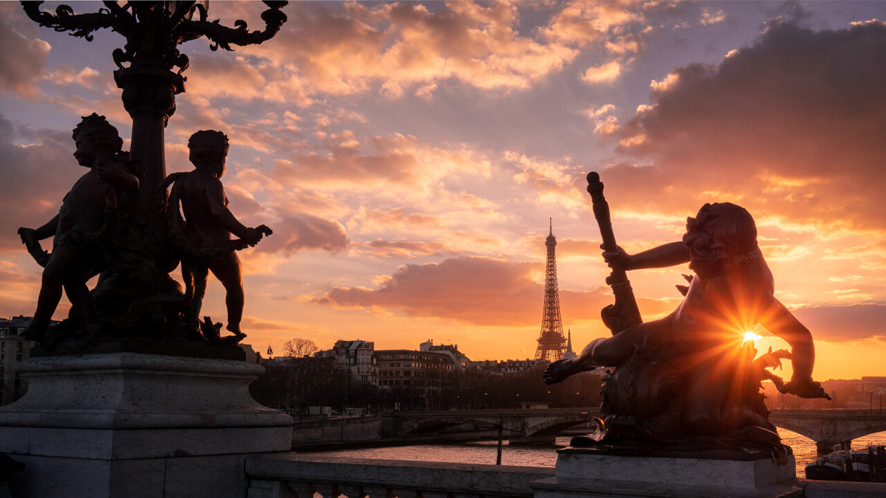
I’m going to show you how you can get the best out of your photos. I’ll use a photo that I took many years ago of an incredible sunset in Paris on the Pont Alexander III bridge with my Canon EOS-5D Mark II at the time. The following includes my best advice to capture and develop nice shots.
1. Correct the Exposure for the Story You Want to Tell
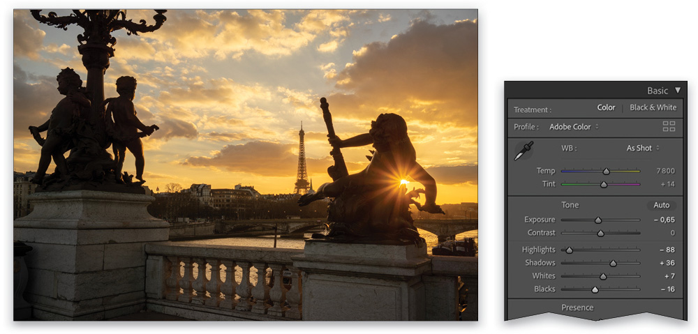
Here I want to tell a simple story of a beautiful sunset in Paris. I like the idea of having the statues as a silhouettes in the foreground; it really contributes to the aesthetics of the photo.
The best way to capture a scene like this is to take bracketed exposures: one normal, one overexposed, and one underexposed. Then you can merge them in Lightroom Classic for a super RAW file with which to play.
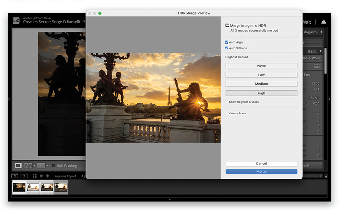
After you import your bracketed shots into Lightroom, select the three photos in the Library module, Right-click on one of the images, and select Photo Merge>HDR. One important point in the HDR Merge Preview dialog is to select High for the Deghost Amount, as it will remove any distortions created by movement between the exposures. I also turned on Auto Align to make sure the three exposures are perfectly aligned, and Auto Settings, which is like clicking the Auto button in the Basic panel. Now click Merge.
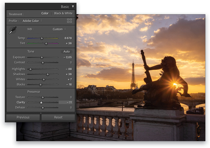
To establish a good exposure in your image, start finessing the settings in the Basic panel. In this example, we brought down the Exposure to –0.65, opened up the Shadows to +36, and dragged down the Highlights to –88. You also need to set your black point (Blacks) and white point (Whites), which we set to –16 and +7, respectively.
2. Adjust White Balance for Aesthetic
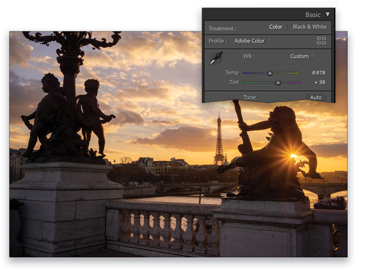
In Lightroom Classic, you can start with white balance presets, such as Daylight, Cloudy, Shade, etc., but I advise setting the white balance manually so you can get exactly the right Temp and Tint to re-create the feeling and emotion you had while taking the photo. In this image, we used Temp 6,678 and Tint +36.
It’s key to stay realistic and use the correct colors because you don’t want to distract your viewer from your message. Also, if you add too much yellow, the blue of the sky can turn a bit gray, so make sure you don’t do that!
3. Don’t Overuse Clarity and Saturation
I used to make the mistake of oversaturating my photos and pumping up the Clarity to make them spectacular, but people would comment that I was “good at Photoshop,” and they didn’t focus on the photo itself. Now, instead of boosting Clarity like crazy, I tend to use a negative Clarity (–11 here) on the overall photo, and then use the Adjustment Brush (A) to boost the Clarity on the parts of the image that I want to appear sharper so they grab the viewer’s attention. The same goes for Saturation: you need to make sure that your viewer can fully experience the colors captured in your photos and not be distracted by the postprocessing.
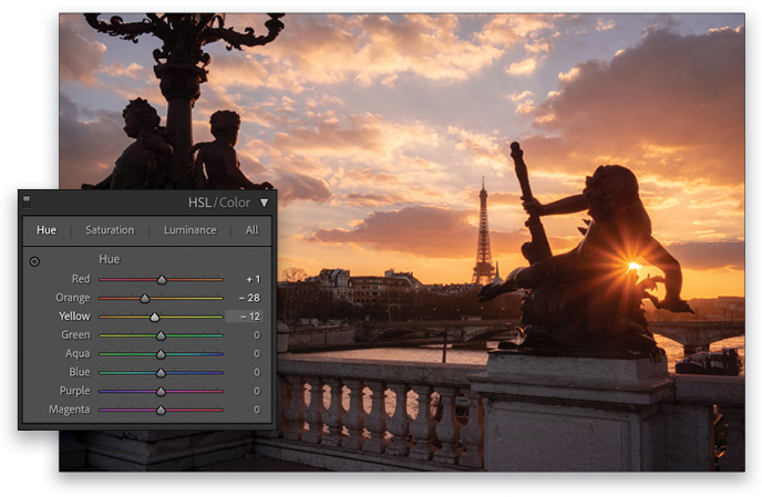
4. Adjust Hue Sliders to Your Liking
In the HSL/Color panel, you can adjust the Hue sliders to nail the colors that were there when you captured your photo. Try not to go over 40 on any of the sliders because it can create some weird colors; otherwise, you can enhance the colors any way you want. If you’re developing a sunset shot, as we are here, try Red (+1), Orange (–28), and Yellow (–12).
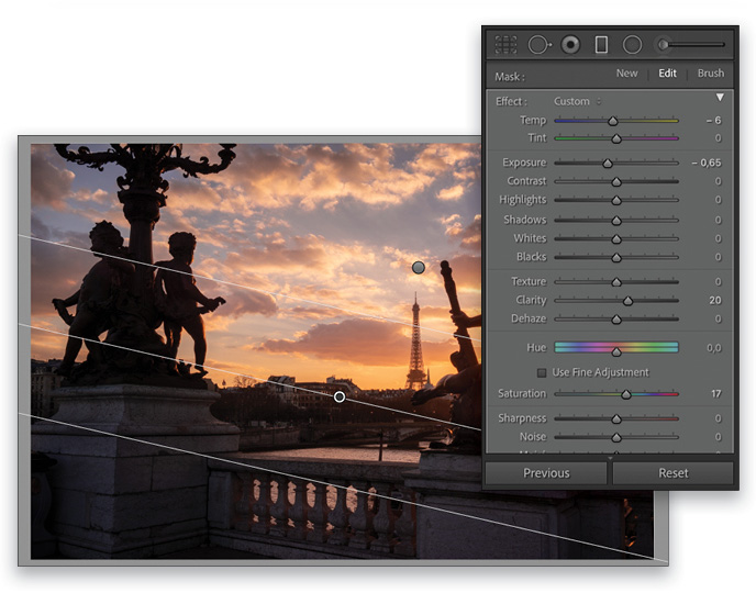
5. Use the Local Adjustment Tools to Guide the Viewer’s Eyes
This is one of the most important tips because it can make the difference between an okay shot and a fine-art photo. Use the Gradient Filter (M) to “close up” your photo so the viewer’s eyes are drawn into your main subject. Set one Gradient Filter at the top, lowering the Exposure to –0.65; set the Temp to –6 as well. Then Right-click on the Gradient Filter’s pin, and choose Duplicate. Drag this Gradient Filter to the bottom of the image and rotate it so the darkening Exposure affects the bottom of the image. So now the top and bottom of the image are darker, focusing the attention on the lighter parts of the image in the center.
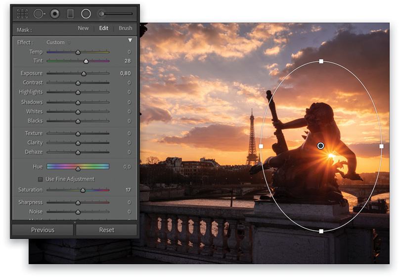
You can also use a Radial Filter (Shift-M) to enhance the sun. First, check on Invert and Feather it to 100, then boost the Exposure to +0.80 and the tint +28 to add some more colors.
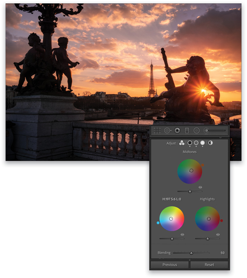
Bonus Tip: Use Color Grading to Correct the Colors
Color Grading comes in handy when you want to play with the colors in the shadows or highlights in the overall photo. As it was very magenta, we set the Shadows to more neutral tones and colder colors here. For the Highlights, you can really re-create the sunset mood by adding some more warmth to it, which also increases the warmth of the overall photo.
Note: In the Color Grading panel, the inner circles on the color wheels control the Saturation, and the little circles outside the wheels control Hue.
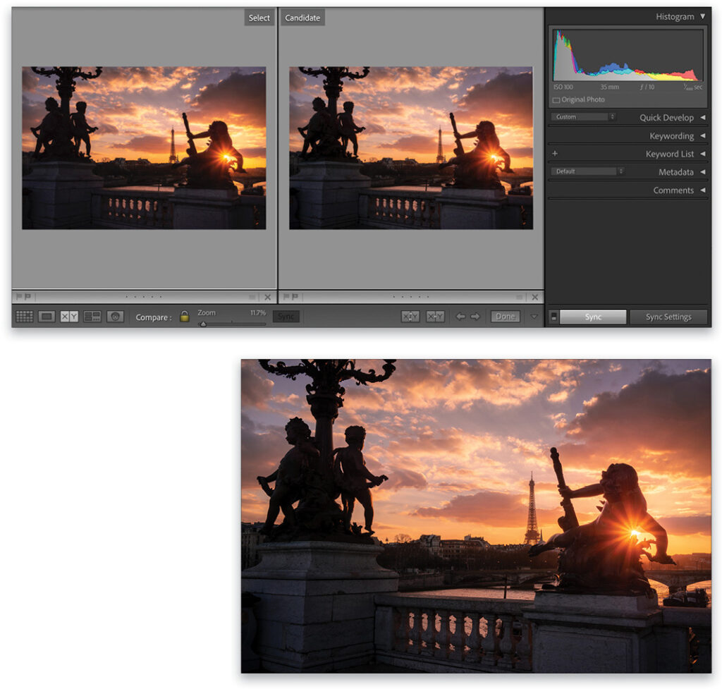
Once you’re satisfied with the retouch of your HDR image, one thing you can try is to copy your settings onto your underexposed photo (depending on the look you’re going for). A quick way to do that is to click on the underexposed thumbnail in the Filmstrip, and then go to Settings>Paste Settings from Previous. With some basic adjustments to Exposure (+1.80), Whites (+46), and Blacks (+3), you can sometimes get a great result with less noise, as well. You can see the comparison above.
And here’s the final result from our super RAW file.
I hope you find these tips useful and that you’ll be able to use them in your retouching workflow. I’ve learned a lot from my mistakes on my photography adventures, and these techniques have been very successful for me. Here’s to getting some great shots!
About Photoshop User and KelbyOne
Photoshop User magazine comes out digitally 12 times a year and is part of KelbyOne, the leading educational resource for Photoshop, Lightroom, and photography. Pro members have access to more than 900 video courses and 100 back issues of Photoshop User. To learn more about KelbyOne, click here.