Tip Tuesday: Move Anchor Point While Creating a Path
Each Tuesday we share a Photoshop Tip on the Insider Blog!
Read More
Each Tuesday we share a Photoshop Tip on the Insider Blog!
Read More
If you look closely at a professionally printed newspaper or magazine, you’ll notice the images are made from millions of tiny dots (typically circles, but sometimes diamonds or squares). To prevent overlap, the dots are printed at specific angles according to ink color, creating a pattern called “halftone” (versus the “continuous tone” of an inkjet print). In this issue you’ll learn two ways to create a halftone pattern for a pop-art feel.
Read More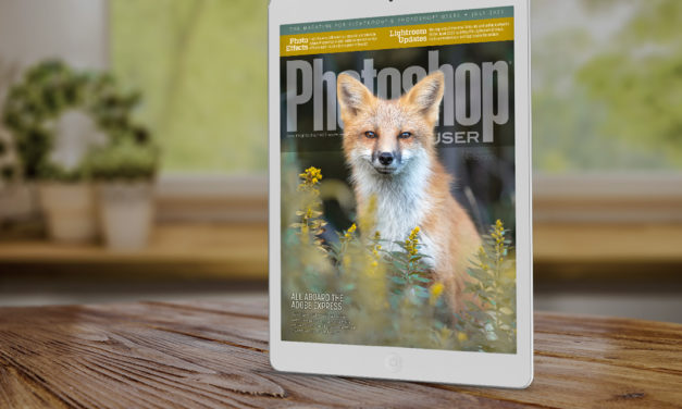
The July 2022 issue of Photoshop User is now live on the KelbyOne site and KelbyOne Mags for iOS...
Read More Each Tuesday we share a quick tip on the Insider Blog!
Read More
My first visit to the United States was in the early 80s on a trip to the southern counties of Georgia. At the time, I was assisting an advertising photographer who had been booked to photograph the “Big D” peanut calendar. This was courtesy of the Peanut Commission of Georgia, who were our hosts and looked after us incredibly well, treating us like minor celebrities.
Read More